Windows Errors? Fix Them Before They Spread
Repair common Windows errors and clear accumulated junk for a smoother, more stable PC - no reinstall needed.Free scan · no reinstallOutdated Drivers Are Slowing You Down
One free scan finds every outdated or missing driver and matches the right update for your exact hardware.Free scan · exact hardware matchSpecify billboard type by the physical height of its letters, not by a point-size number. The Out of Home Advertising Association of America (OAAA) 2023 planning guide lists minimum readable character heights from 1–2 inches at 5–50 feet to 24–40 inches beyond 600 feet. For a typical roadside board viewed from 300–500 feet, begin with 10–20-inch letters, then test the finished design from the site’s farthest normal reading point. Increase that height when traffic is fast, the sign is seen at an angle, lighting is weak, contrast is low, or the message must be understood almost instantly.
OAAA minimum letter heights by viewing distance
The most defensible starting point is the OAAA distance table. It describes minimum readable character height, not a promise that every message, typeface, road or lighting condition will be equally legible. Use the farthest distance at which an ordinary driver or passenger is expected to read the board, rather than the distance from which the sign is merely visible.

As an Amazon Associate I earn from qualifying purchases.
| Farthest normal viewing distance | Minimum readable character height | How to use the band |
|---|---|---|
| 5–50 ft | 1–2 in | Suitable for very close approaches, entrances and low-speed situations. |
| 50–100 ft | 2–4 in | Use the upper end when the viewer has little time or the sign is oblique. |
| 100–200 ft | 4–8 in | Measure the actual capital-letter height on the artwork. |
| 200–300 ft | 8–10 in | Do not let a crowded layout force the letters below this floor. |
| 300–350 ft | 10–15 in | A common range for roadside boards near the approach zone. |
| 350–500 ft | 15–20 in | Use 20 inches when speed, angle or contrast reduces reading time. |
| 500–600 ft | 20–24 in | Allow extra height for complex surroundings or nighttime viewing. |
| 600 ft and farther | 24–40 in | Use the site’s actual geometry; the upper end may be necessary for rapid traffic. |
These are OAAA’s 2023 minimum bands. They are a floor for planning, not a universal law. A board at the top of a crest, beside a multilane highway, or viewed through glare can require larger letters than a board at the same measured distance on a straight, well-lit approach.
Why point size is the wrong specification
Desktop publishing point size does not describe a consistent visible letter. Two fonts set to the same point value can have different cap heights, x-heights, stroke widths and built-in spacing. A 120-point face with a short cap may produce visibly smaller capitals than a 100-point face with tall capitals. Rasterization, the sign material and the distance at which the proof is viewed add further variation.
#1 Best Overall

- [Ultra-Lightweight Ear Buds Designed for Small Ears] Each earbud weighs only 3.7g and features a compact, ergonomic in-ear design made especially for small ears. Secure, low-profile, and comfortable for workouts, all-day wear or overnight sleeping.The ultra-slim profile sits flush in your ear with no hard edges poking or rubbing, so you can even sleep on your side without discomfort.
- [Immersive Stereo Sound with TOZO OrigX Technology] TOZO OrigX tuning delivers clear vocals, balanced mids, and natural stereo sound for music, podcasts, and videos.
- [Long Battery Life for Daily Use] Get up to 7 hours of playtime on a single charge, with up to 32 hours total using the charging case—ideal for workdays, commuting, and extended listening sessions.
- [Bluetooth 5.3 & Stable Connection] Bluetooth 5.3 provides fast pairing, stable wireless performance, and reduced dropouts as you move around home or office.
- [Deep Bass with Clear Vocals] High-performance drivers produce punchy bass while keeping vocals clean and detailed for everyday listening.
Specify the design by measured capital-letter height (often called cap height) or by a production-scale equivalent. Ask the designer or fabricator to identify the height of a representative capital on the full-size file and on the printed or rendered output. Check the smallest important words, not just the headline: a disclaimer or URL set below the headline can become the message that fails first.
If a vendor gives only a point size, request the resulting physical height in inches. Keep that measurement with the artwork approval so a later font substitution cannot quietly reduce readability.
Choose the correct viewing distance
Use the farthest normal reading point, not the nearest point at which the board can be seen. Map the approach in the direction of travel and identify where a driver first has a clear, unobstructed view and where the board leaves the normal sightline. The greater of the ordinary reading distances in either direction should guide the principal message.
Free tools Windows power users keep installed
One-click scans. No signup required.
Distance alone does not describe reading time. A vehicle moving quickly covers a given distance in fewer seconds than a slow vehicle, so a fast road calls for more than the band minimum. A sign seen at a sharp angle presents less apparent letter width than one viewed straight on. Curves, hills, trees, overpasses and adjacent signs can shorten the usable interval even when a map shows a long line of sight.
Rank #2

- 【IP68 Waterproof Multifunctinal Smart Watch】Torjalph fitness activity tracker smart watch is IP68 waterproof technology ,you can wear it when swimming,handwashing,it's rain-proof which means that you perform multiple exercise modes outside without worrying about sweat or rain corroding your fitness smart watch,and this watch equipped with a 230 mAh large capacity battery magnetic charging ,and this sports activity tracker watch can be used 5-7 days If fully charged.
- 【Larger 1.83'' Full Screen Watch & Multi-dial Selection】1.83 inch full HD color touch screen smart watch for men / women provides excellent 240*284 resolution image quality ,This Bluetooth smart watch offers a better touch experience and remarkable immersion and ,more than 200 watch faces for you to choose from App"Da Fit ", you can change the dial style according to your mood to wear keeping the world on your wrist
- 【Accurate Activity Tracker Smart Watch 】sports watch activity tracker uses sweat and dust resistant breathable silicone strap, our Fitness Tracker Smart Watch for Android iOS Phones supports 12 sports modes,walking,running,bicycle,swimming,badminton,basketball,football,rope skipping. This bluetooth calls smart watch for men women is lightweight and stylish, bringing more convenient and relaxing sports experience while also providing more protection.
- 【Your 24 Hour Personal Daily Health Monitor】Fitness watch for women men full touch screen IP67 waterproof bluetooth smartwatch for Android iOS Phones with heart rate blood pressure monitor multifunction Andriod smart watch with steps counter sleep monitor sports fitness watch, monitoring blood oxygen saturation allows you to understand your physical condition in real time to track fitness progress ,to know your health status in time.
- 【More Functions Bluetooth Call Smart Watch】This fitness activity smart watch full screen for iPhone and Android phones includes a bunch of new features including:The bluetooth smart watch can hang up the phone, receive and display WhatsAPP /Text /Facebook /Twitter /Messenger reminder.Support sedentary reminder, alarm clock, stopwatch, timer,weather information,music control, remote camera control compatible with Android 5.0 and above or iOS 9.0 and above smartphones.
When the board serves pedestrians or low-speed traffic, measure the typical stopping and approach points separately. A close-range sign can use the lower bands, but it should not be sized from a theoretical distance that ordinary visitors never occupy.
Roadside thresholds from OAAA
OAAA gives a useful roadside warning: When designing for roadside displays, letter height less than 8" is unreadable while a two foot letter height is acceptable. A letter height greater than three feet is clearly readable.
This statement is a practical threshold, not permission to use 8-inch letters at every roadside location. Its implication is that a board read from several hundred feet should generally move into the 10–24-inch range, with 24–40-inch characters for distances beyond 600 feet when the design permits.
Apply the threshold to the actual character that carries the idea. If the headline is 24 inches high but the product name or call to action is 6 inches, the smaller element may determine whether the message works. A short message with uniformly large letters is usually more effective than a long message that preserves a large headline by shrinking everything else.
Typography that survives distance
Use simple, robust letterforms
Select a face that remains recognizable when reduced to a few visual strokes. OAAA advises large, legible type and cautions against thin strokes and ornate scripts. Very delicate weights can disappear against the sky or foliage. Extremely heavy weights can also close counters and make letters such as e, a or R lose their basic shapes, so judge the chosen weight at full scale rather than assuming “bold” is always better.
Rank #3
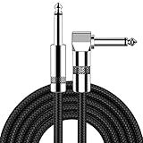
- [Low Noise High Fidelity] New bee guitar cord with 22AWG oxygen-free-copper center conductors provides enhanced signal transfer, the PVC insulation material and the high-density stranded copper double shield provide noise rejection for quiet operation
- [Ideal for Choice] New bee 1/4 straight and right angle metal connectors, ensures a secure connection in any instrument, pedal, or amp jack. L shape great fro on stage guitar stands
- [Wide Compatible] Suitable for mixer, power amplifier, microphone, effector, decoder, equalizer, electoronic organ, electric guitar, electric bass and other electronic equipments. Widely used in the installation of smart home, karaoke speaker, professional stage audio, etc
- [Easy Disassemble] Making incidental repairs quick and easy! Very nice, flexible cable
- [Dont Hesite to Order] 24 hours customer services and professional technology team are standing by
Prefer normal upper-and-lowercase forms
Words using upper- and lowercase characters are generally easier to read than words set entirely in capitals. Mixed case gives words distinctive outlines that can be recognized quickly. Reserve all capitals for very short labels when the design has been tested; do not turn a long sentence into a block of equally shaped rectangles.
Protect spacing and kerning
Leave enough space between letters, words and lines. OAAA notes that sufficient kerning preserves legibility from far distances, while tight kerning can make adjacent letters appear to attach. Check pairs such as A/V, T/o and L/T at the intended viewing distance. A technically large word can still fail when its counters close or its letters merge.
Keep the message in one fast-to-scan line when possible
OAAA says a single horizontal line is assimilated faster than multiple stacked lines. A one-line headline is not mandatory, but every line break adds another visual decision. If the message must occupy two lines, make the hierarchy obvious, keep line spacing generous and avoid splitting a familiar phrase in an awkward place.
Recommended Free Tools
Contrast, background and lighting
OAAA states that readability depends on color contrast: higher contrast can allow smaller text, while a complicated background reduces readability. Treat that as a reason to simplify the field behind the words, not as a reason to shrink the type. A dark, uniform panel behind light letters or a light field behind dark letters is easier to preserve than text laid directly over a photograph, tree line or changing sky.
Rank #4

- Digital Family Calendar: BSIMB digital calendar wall touch screen puts an end to your chaotic life. Designed for busy families, the digital calendar keeps you organised and in step with your family. Assign different colours and tasks to each family member to make family scheduling easier and more intuitive.
- Easy Setup and Auto-Sync: Plug in, connect to WLAN and auto-syn your electric calendar in minutes. Digital wall calendar compatible with Google calendar, iCloud calendar, Outlook calendar, Cozi calendar and Yahoo calendar. Add events directly on the device or through the ecalendar app. Electronic calendar stays current whether you're at work or traveling—no manual updates needed.
- All-In-One Home Assistant: Smart calendar builds habits and encourage independence with personalised chores. Display daily meal plan to reduce the daily ‘What's for dinner?’ stress. To-do lists keep track of everything you want. Turning chores into valuable achievements with stars and rewards, making life easier and more enjoyable.
- Manage Anytime Anywhere: BSIMB electronic calendar for family stay connected with the powerful ecalendar app. Access and manage your digital wall calendar anytime, anywhere with free features like stars & rewards, photo screensaver, chore charts, meals plans, to-do lists etc. Electronic planner paid features like Magic Import tailor advanced tools for users with special needs.
- Stay in Touch with Loved Ones: Share photos or videos from your phone to electronic wall calendar with app, instantly update your life moment, and keep in touch with your family, especially those who are far away; you can also surprise your smart calendar digital wall by sending him a wish card; it's also great for keeping tech-illiterate elders in touch with the youngsters.
Evaluate contrast in the conditions in which the board operates. Daylight glare, wet surfaces, backlighting and nighttime illumination can all reduce the effective difference between letters and their surroundings. A color combination that looks strong on a monitor may lose separation when printed, illuminated or viewed through a windshield. If a photograph is essential, reserve an uncluttered area for the text and keep fine image detail away from letter edges.
Do not rely on an outline or shadow to rescue a weak color choice. Effects can add visual noise and make counters smaller. Test the complete treatment—including outline, glow, shadow and lighting—at the farthest normal reading point.
A practical sizing workflow
- Map the approach. Record the farthest ordinary point from which the board is unobstructed and in the viewer’s forward field. Note separate distances for each traffic direction if they differ.
- Select the OAAA band. Use the distance table to establish a minimum physical character height. If the site falls between bands, use the next larger band rather than rounding down.
- Adjust for reading time. Move toward the upper end when vehicles are fast, the message is long, the board is visible for only a short interval, or viewers must make a decision such as an exit or turn.
- Adjust for geometry and light. Increase height and simplify the design when the viewing angle is oblique, the background is busy, glare is likely or nighttime contrast is uncertain.
- Set the type by cap height. Specify the measured height of the key capital letters in inches. Confirm the smallest essential text separately.
- Build a full-scale or accurately scaled proof. View it from a distance that preserves the same visual angle as the installed board. A small print viewed from a correspondingly shorter distance can reveal spacing problems, but it cannot replace an on-site check.
- Review from the road or approach path. Have an observer read the message once, without being told what it says. Record the first and last points at which the complete idea is understood, not merely the point at which the colors are noticeable.
- Revise before production. If the observer misses a word, shorten the copy, enlarge the letters, improve contrast or remove background detail. Do not solve a legibility failure only by adding decorative effects.
Worked planning examples
| Site condition | Distance-based starting point | Design decision |
|---|---|---|
| Board read at about 120 ft on a slow approach | 4–8 in characters | Use the upper part of the band if the message has more than one short phrase or the approach is angled. |
| Roadside board first read at 300 ft | 8–10 in minimum; consider 10–15 in if the effective distance extends beyond 300 ft | Keep the headline brief and verify that the call to action is not smaller than the supporting copy. |
| Highway board read from 450 ft | 15–20 in | Favor 20 inches when traffic is moving quickly or the board is seen obliquely. |
| Board with a 600-ft approach | 20–24 in | Use a simple typeface, strong contrast and minimal background detail; test both daylight and night conditions. |
| Large board beyond 600 ft | 24–40 in | Choose within the range from the actual reading time and geometry; farther distance and faster traffic push toward 40 inches. |
The examples apply the OAAA minimums; they do not replace a site review. A 300-ft measurement on a straight, slow road is a different reading problem from 300 ft on a high-speed curve.
The Tool Desk
Outbyte PC Repair FREERepair Windows errors before they cause bigger problemsFix Now →Outbyte Driver Updater FREEScan for outdated or missing drivers - takes under a minuteDriver Scan →How to compare two billboard concepts
When two layouts use different fonts or copy lengths, compare the factors that determine whether the message can be understood, not just which headline looks larger in a design file.
| Comparison axis | What to measure or ask | Why it matters |
|---|---|---|
| Farthest normal reading distance | Where is the first clear, ordinary view in each direction? | It sets the applicable OAAA height band. |
| Actual cap-letter height | How many inches high are the smallest essential capitals? | Point size alone can hide a short cap height. |
| Reading time | How many seconds are available at the roadway speed? | Less time favors shorter copy and larger type. |
| Contrast and background | Are letters separated from photographs, sky, foliage and glare? | Higher contrast supports readability; clutter reduces it. |
| Stroke and typeface | Do counters remain open and strokes remain visible? | Thin or ornate forms can disappear; excessive weight can close shapes. |
| Kerning, line count and length | Are letters separated, and can the idea be scanned in one line? | Tight spacing and stacked copy slow recognition. |
| Angle and lighting | What happens from the road, at night and under glare? | Oblique views and poor illumination reduce effective legibility. |
Common mistakes and fixes
- Choosing a point size from a desktop mock-up: replace it with a measured cap height on the production artwork.
- Sizing for the nearest viewer: recalculate from the farthest normal reading distance and the available travel time.
- Using the table as a guarantee: treat OAAA values as minimum guidance and exceed them for speed, angle, clutter or weak lighting.
- Making the headline large while shrinking the action: enlarge every essential word or shorten the copy so the smallest key element remains readable.
- Trusting a busy photograph: move text to an uncluttered field or simplify the image behind it.
- Tightening kerning to fit more copy: remove words or enlarge the layout instead; attached letter shapes are difficult to recover at distance.
- Testing only in a bright office: inspect the design from the approach in daylight, glare and the intended nighttime lighting.
- Applying accessibility-sign rules to advertising without checking the category: determine whether a local code applies to the specific sign and use the billboard readability guidance for advertising legibility.
Billboard readability versus ADA character-height rules
The U.S. Access Board’s Chapter 7 includes character-height formulas for specified accessible signs, including 3 inches (75 mm) plus 1/8 inch (3.2 mm) for each foot (305 mm) of viewing distance above 21 feet (6400 mm). That is an accessibility-sign requirement for defined sign categories. It is not a universal rule for commercial billboard advertising. For a roadside advertising board, start with the OAAA outdoor-advertising table, then check the applicable state, local and site-specific requirements with the sign authority or fabricator.
What to put in the production brief
A clear brief prevents a readable concept from being reduced during fabrication. State the farthest normal reading distance, the traffic direction and approximate speed, the required cap-letter height in inches, the smallest essential text height, the typeface and weight, the maximum line count, the contrast treatment and the lighting conditions to be checked. Require approval of a full-size or accurately scaled proof and a review from the real approach before final production.
The final decision is therefore a physical one: match measured letter height to distance, then increase it when the road, message, contrast or viewing conditions make reading harder. No single point-size number can substitute for that site-based check.
Quick Recap
Product prices and availability are accurate as of the date/time indicated and are subject to change. Any price and availability information displayed on Amazon at the time of purchase will apply.

