What’s actually slowing this PC down?
Pick the symptom - the matching free tool is one click away.
Start with the screen’s built-in text-size control. Increase text until it is comfortable, then add bold text, display zoom, or magnification if letters or interface controls are still difficult to see. Treat contrast, brightness, color perception, and control size as separate issues: a larger typeface cannot fix pale text, clipped layouts, or tiny touch targets.
The exact labels and limits depend on the operating system, device maker, app, and software version. The steps below cover current Android and iPhone guidance, explain what to do on Windows and in browsers, and give designers a checklist for preserving readability when users enlarge content.

As an Amazon Associate I earn from qualifying purchases.
Choose the adjustment that matches the problem
Text enlargement and whole-screen enlargement solve different problems. Text size changes letters where the operating system or app supports the preference. Display zoom enlarges interface elements as well as text, which can make buttons, menus, and icons easier to identify but may alter the layout. Magnification enlarges a temporary area or the entire screen and is useful when you need a close look without permanently changing every app.
Recommended Free Tools
| Adjustment | What changes | Best for | Trade-offs |
|---|---|---|---|
| Font or text size | Supported text, with surrounding layout reflowing when the app is built to handle it | Small body copy, messages, menus, and labels | Some apps ignore the system preference; enlarged text can reveal clipping or overlap in poorly designed layouts |
| Bold text | Stroke weight of supported text | Faint or thin type that is otherwise large enough | Google notes that some Android apps do not use the bold-font setting; heavier type can change line wrapping |
| Display zoom or display size | Text and other interface elements, including controls | Small buttons, icons, and dense system interfaces | Less content fits on screen and some layouts may reflow |
| Screen magnification | A movable or temporary enlarged view of the screen | Reading a detail briefly, inspecting a map, or enlarging an app that ignores text-size settings | You see less of the surrounding interface at once and must pan or move the magnified area |
| Contrast, color, and brightness controls | Difference between foreground and background, color rendering, or luminance | Low-contrast text, glare, low brightness, or color-perception barriers | A color change that helps one person may not help another; color correction is not available on every device |
Try one change at a time. If increasing text size makes a page awkward but the controls remain tiny, return the text to a comfortable level and use display zoom or magnification for the controls. If letters are large but still wash into the background, work on contrast and brightness rather than increasing size again.
#1 Best Overall

- [Ultra-Lightweight Ear Buds Designed for Small Ears] Each earbud weighs only 3.7g and features a compact, ergonomic in-ear design made especially for small ears. Secure, low-profile, and comfortable for workouts, all-day wear or overnight sleeping.The ultra-slim profile sits flush in your ear with no hard edges poking or rubbing, so you can even sleep on your side without discomfort.
- [Immersive Stereo Sound with TOZO OrigX Technology] TOZO OrigX tuning delivers clear vocals, balanced mids, and natural stereo sound for music, podcasts, and videos.
- [Long Battery Life for Daily Use] Get up to 7 hours of playtime on a single charge, with up to 32 hours total using the charging case—ideal for workdays, commuting, and extended listening sessions.
- [Bluetooth 5.3 & Stable Connection] Bluetooth 5.3 provides fast pairing, stable wireless performance, and reduced dropouts as you move around home or office.
- [Deep Bass with Clear Vocals] High-performance drivers produce punchy bass while keeping vocals clean and detailed for everyday listening.
Make text bigger on Android
Google’s current Android accessibility help describes separate controls for font size and display size. Android versions and manufacturer interfaces place them differently, so search Settings for Font size or Display size if the labels below do not match your phone.
Increase font size
- Open Settings.
- Open Font size. On some phones this is inside Accessibility or a Display size and text section.
- Move the size slider to the right and check the preview and a few apps you use every day.
Google’s current help describes an adjustment of up to 200% on supported Android configurations. That is a platform limit for the control, not a promise that every app will enlarge by the same amount. A browser, messaging app, or game can use its own text metrics or ignore the system preference.
Make the whole interface larger
- Open Settings and search for Display size.
- Move the display-size slider toward larger elements.
- Open a frequently used app, rotate the phone if you use both orientations, and check that navigation, dialog buttons, and the on-screen keyboard remain reachable.
Display size changes more than paragraph text. It can enlarge controls that were too small to locate, but it also reduces the number of rows or columns visible at once. If an app’s layout becomes crowded, use font size instead or combine a moderate display-size change with magnification.
Add bold or outlined text
On current Android guidance, bold text is under Accessibility > Display size and text (the exact hierarchy varies by device). Turn it on, then test menus and notifications. Google warns that some apps do not use the bold-font setting. Android 16 and later also document an Outline text option; Android 15 and earlier guidance points to High-contrast text. These options are version-dependent, so use the setting your device exposes rather than assuming every phone has both.
Improve color and dimming conditions
Android accessibility settings can include Color correction, Color inversion, and Extra dim. Color correction is not available on every device. Extra dim is useful when the lowest normal brightness is still uncomfortable in a dark room; Google’s current help notes a location change for Pixel 10 and later, so searching Settings is more reliable than following a single menu path.
Rank #2

- 【IP68 Waterproof Multifunctinal Smart Watch】Torjalph fitness activity tracker smart watch is IP68 waterproof technology ,you can wear it when swimming,handwashing,it's rain-proof which means that you perform multiple exercise modes outside without worrying about sweat or rain corroding your fitness smart watch,and this watch equipped with a 230 mAh large capacity battery magnetic charging ,and this sports activity tracker watch can be used 5-7 days If fully charged.
- 【Larger 1.83'' Full Screen Watch & Multi-dial Selection】1.83 inch full HD color touch screen smart watch for men / women provides excellent 240*284 resolution image quality ,This Bluetooth smart watch offers a better touch experience and remarkable immersion and ,more than 200 watch faces for you to choose from App"Da Fit ", you can change the dial style according to your mood to wear keeping the world on your wrist
- 【Accurate Activity Tracker Smart Watch 】sports watch activity tracker uses sweat and dust resistant breathable silicone strap, our Fitness Tracker Smart Watch for Android iOS Phones supports 12 sports modes,walking,running,bicycle,swimming,badminton,basketball,football,rope skipping. This bluetooth calls smart watch for men women is lightweight and stylish, bringing more convenient and relaxing sports experience while also providing more protection.
- 【Your 24 Hour Personal Daily Health Monitor】Fitness watch for women men full touch screen IP67 waterproof bluetooth smartwatch for Android iOS Phones with heart rate blood pressure monitor multifunction Andriod smart watch with steps counter sleep monitor sports fitness watch, monitoring blood oxygen saturation allows you to understand your physical condition in real time to track fitness progress ,to know your health status in time.
- 【More Functions Bluetooth Call Smart Watch】This fitness activity smart watch full screen for iPhone and Android phones includes a bunch of new features including:The bluetooth smart watch can hang up the phone, receive and display WhatsAPP /Text /Facebook /Twitter /Messenger reminder.Support sedentary reminder, alarm clock, stopwatch, timer,weather information,music control, remote camera control compatible with Android 5.0 and above or iOS 9.0 and above smartphones.
For glare or a bright room, first raise contrast or move to a position with less reflection. Google explains that sufficient color contrast makes text and images easier to read and comprehend, and notes that contrast matters when surroundings are bright or display brightness is low. These settings cannot repair an app that has baked text into a low-resolution image or placed text over a similarly colored background.
Make text and controls easier to read on iPhone
Apple’s current instructions apply specifically to iPhone. They do not establish identical menus on Mac or iPad, and an individual third-party app may provide additional controls.
Quick wins for a faster PC:
Fix the driver behind crashes, sound loss and screen glitchesFind Drivers →Repair Windows errors before they cause bigger problemsFix Now →Use Larger Text and Bold Text
- Open Settings.
- Tap Accessibility, then Display & Text Size.
- Tap Larger Text and move the slider.
- Turn on Larger Accessibility Sizes if you need sizes beyond the standard range, then move the slider again.
- Return to Display & Text Size and enable Bold Text if heavier strokes improve recognition.
Apple describes these text preferences as applying to supported apps. If one app does not change, look in that app’s own settings for a text-size or accessibility option. Do not assume that a setting failure means the iPhone control is broken.
Enlarge the interface with Display Zoom
In Settings > Display & Brightness, open the display-zoom control and choose the enlarged view when available. Display Zoom increases interface elements as a group, so it is often more useful than text-only enlargement when buttons, tab bars, or icons are the main barrier. Check that the enlarged layout still exposes the controls you need before keeping it.
Use Zoom for a close-up view
iPhone’s accessibility Zoom can magnify the screen and let you pan around it. Apple also documents a temporary hover-to-enlarge feature for inspecting text without leaving the normal layout. These modes are useful for a receipt, map label, or a single line that is too small, but they require moving the enlarged viewport and therefore show less context at once.
Rank #3
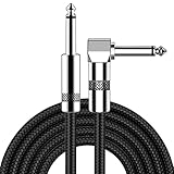
- [Low Noise High Fidelity] New bee guitar cord with 22AWG oxygen-free-copper center conductors provides enhanced signal transfer, the PVC insulation material and the high-density stranded copper double shield provide noise rejection for quiet operation
- [Ideal for Choice] New bee 1/4 straight and right angle metal connectors, ensures a secure connection in any instrument, pedal, or amp jack. L shape great fro on stage guitar stands
- [Wide Compatible] Suitable for mixer, power amplifier, microphone, effector, decoder, equalizer, electoronic organ, electric guitar, electric bass and other electronic equipments. Widely used in the installation of smart home, karaoke speaker, professional stage audio, etc
- [Easy Disassemble] Making incidental repairs quick and easy! Very nice, flexible cable
- [Dont Hesite to Order] 24 hours customer services and professional technology team are standing by
Adjust colors and contrast
The Display & Text Size area includes display-color adjustments. Options can include increased contrast, color filters, color inversion, and transparency changes, depending on the iOS version. Choose the option that addresses the actual barrier: a contrast increase for weak separation, a color filter for a color-perception issue, or reduced transparency when text is competing with a busy background. A dark theme is not universally easier to read; judge the result with the apps and lighting conditions you actually use.
Outdated Drivers Are Slowing You Down
One free scan finds every outdated or missing driver and matches the right update for your exact hardware.Free scan · exact hardware matchWindows Errors? Fix Them Before They Spread
Repair common Windows errors and clear accumulated junk for a smoother, more stable PC - no reinstall needed.Free scan · no reinstallWindows, browsers, and other screens
The available controls depend on the Windows release, monitor, graphics driver, browser, and app. The Windows guidance covered here is Microsoft’s developer guidance rather than a single consumer menu path that is identical on every release.
Use the controls your Windows version provides
Look in Windows accessibility or display settings for text-size and display-scaling controls, and use Magnifier when a temporary close-up is more useful than a permanent scale change. Microsoft advises validating Windows apps with Magnifier, global display scaling, and text-size settings. After changing scale, test the taskbar, window controls, dialog buttons, and notification text, not only a document.
Some desktop programs draw their own interface and may respond differently from modern Windows apps. If one program remains tiny, check its preferences for interface scale, font, or high-DPI behavior. A program that ignores both Windows scaling and its own controls may require magnification or replacement with an accessible alternative.
Zoom a web page
Browser zoom is the normal user-agent path for enlarging a web page. Use the browser’s zoom command or keyboard shortcut, then check headings, navigation, forms, tables, and dialogs. A well-built page should reflow instead of hiding content when enlarged.
Do these 3 things before closing this tab:
1Fix the driver behind crashes, sound loss and screen glitches2Repair Windows errors before they cause bigger problems3Scan for outdated or missing drivers - takes under a minuteRank #4

- Digital Family Calendar: BSIMB digital calendar wall touch screen puts an end to your chaotic life. Designed for busy families, the digital calendar keeps you organised and in step with your family. Assign different colours and tasks to each family member to make family scheduling easier and more intuitive.
- Easy Setup and Auto-Sync: Plug in, connect to WLAN and auto-syn your electric calendar in minutes. Digital wall calendar compatible with Google calendar, iCloud calendar, Outlook calendar, Cozi calendar and Yahoo calendar. Add events directly on the device or through the ecalendar app. Electronic calendar stays current whether you're at work or traveling—no manual updates needed.
- All-In-One Home Assistant: Smart calendar builds habits and encourage independence with personalised chores. Display daily meal plan to reduce the daily ‘What's for dinner?’ stress. To-do lists keep track of everything you want. Turning chores into valuable achievements with stars and rewards, making life easier and more enjoyable.
- Manage Anytime Anywhere: BSIMB electronic calendar for family stay connected with the powerful ecalendar app. Access and manage your digital wall calendar anytime, anywhere with free features like stars & rewards, photo screensaver, chore charts, meals plans, to-do lists etc. Electronic planner paid features like Magic Import tailor advanced tools for users with special needs.
- Stay in Touch with Loved Ones: Share photos or videos from your phone to electronic wall calendar with app, instantly update your life moment, and keep in touch with your family, especially those who are far away; you can also surprise your smart calendar digital wall by sending him a wish card; it's also great for keeping tech-illiterate elders in touch with the youngsters.
WCAG 2.1 Success Criterion 1.4.4 states: “Except for captions and images of text, text can be resized without assistive technology up to 200 percent without loss of content or functionality.” This is a web-content accessibility criterion, not a guarantee that every native application behaves the same way. Authors should not block effective resizing, and users should be able to reach 200% without losing essential content or controls.
Apply the same method to televisions, tablets, and e-readers
Look first for a text-size or accessibility menu, then for display zoom or magnification. On a television, the setting may be under accessibility rather than picture settings; on an e-reader, it may be inside the reading view. Because menus differ by model and firmware, search the device’s settings for text size, zoom, magnification, or high contrast. Test both the system menu and the apps you use: a device-level preference does not automatically control every app.
Fix contrast, color, and brightness separately
Larger type is not a substitute for adequate contrast. WCAG 2.2 Success Criterion 1.4.3 sets minimum contrast ratios of 4.5:1 for normal-size text and 3:1 for large text. In that criterion, large text is at least 18-point regular type or 14-point bold type. These are minimum accessibility thresholds, not a prescription for an individual’s preferred theme.
Thin or unusual font strokes can appear fainter than their measured ratio suggests. Stronger strokes or more contrast may therefore be useful even when a color pair technically meets the minimum. Microsoft also warns that contrast calculations do not account for hue perception: red text on a green background can remain difficult for some people even when the colors look distinct to others. Do not communicate status by hue alone; add a label, icon, pattern, or other cue.
A practical contrast check
- Identify the actual text and background colors, including gradients, images, hover states, disabled states, and focus indicators.
- Check normal and large text against the WCAG 2.2 minimums.
- Inspect the result at the font weight and size users will see; thin strokes often look weaker than a ratio suggests.
- Test in bright surroundings and at low screen brightness, where Google notes that weak contrast becomes harder to read.
- Verify focus outlines, links, error messages, and placeholder text, not only paragraph copy.
Preserve resizing when you design a website or app
Use real text instead of text in images
Real text can be resized, reflowed, restyled, selected, translated, and read by assistive technology. W3C notes that images of text pixelate when enlarged and make it harder for users to adjust foreground and background colors. Use an image for a logo or essential visual lettering only when there is a strong reason, and provide equivalent real text where it conveys information.
Test at 200% before release
Set browser or operating-system scaling to 200% and inspect every route. Text should not overlap, disappear behind a fixed header, truncate a button label, or push a required control off-screen. WCAG allows responsive breakpoints to change during zoom, but users must still be able to reach the content and functionality at that enlargement.
- Check headings, paragraphs, captions, tables, and code blocks for clipping.
- Open menus, dialogs, date pickers, and validation messages at enlarged size.
- Confirm that keyboard focus remains visible and moves into controls in a logical order.
- Ensure horizontal scrolling is not required for ordinary sentences unless the content itself is inherently two-dimensional, such as a wide data table.
- Check that fixed-position toolbars do not cover enlarged text or the control currently receiving focus.
Make controls large enough to locate and activate
Readable letters do not make a tiny button usable. Android’s developer accessibility guidance recommends a touch target of at least 48 by 48 dp for touch interfaces. This is a developer recommendation, not a user text-size setting. Keep the interactive area at least that large even when the visible icon is smaller, provide spacing between adjacent targets, and make the focus or pressed state obvious.
Do not rely on color alone
Pair color with words, icons, position, or shape for errors, required fields, selected states, and status indicators. A red border alone does not tell every user which field failed or what to do next. This also helps users in glare, low brightness, or grayscale viewing conditions.
When an app still looks too small
- Confirm the system setting changed elsewhere. Test a built-in app or browser first. If it enlarges, the original app may not support the preference.
- Look for an in-app setting. Search menus for text size, reading view, interface scale, high contrast, or accessibility.
- Try display zoom. This can enlarge controls that text-only settings leave unchanged.
- Use magnification for occasional work. It is a practical fallback for a legacy app, remote desktop, map, or image.
- Check for clipping after every increase. If labels overlap or buttons become unreachable, reduce the setting one step and use a different adjustment.
- Update the operating system and app. Support for larger text, outline text, or high-contrast modes can be version-dependent.
Build a personal readability setup
Start in the environment where reading is hardest, not in an ideal room. Set text size while holding the device at your normal distance, then check a message, a web page, a settings screen, and a form. Add bold text only if strokes look faint. Add display zoom if controls remain difficult to locate. Use magnification for brief close-ups rather than leaving the entire interface enlarged when that causes excessive panning.
Next, tune contrast and brightness for the lighting you actually use. A setting that works in a dim bedroom may be uncomfortable outdoors. Recheck color-dependent information, focus indicators, and error messages after applying color filters or inversion. If only one app remains unreadable, use its own accessibility controls or magnification instead of making every other app unnecessarily large.
Quick Recap
What the numbers mean
| Figure | What it describes | Scope and qualification |
|---|---|---|
| 200% | Text resizing without loss of content or functionality | WCAG 2.1 Success Criterion 1.4.4 for web content; it is not a universal native-app guarantee |
| 200% | Upper adjustment described for Android font size | Google Accessibility Help’s current Android guidance; device and app support vary |
| 4.5:1 | Minimum contrast for normal-size text | WCAG 2.2 Success Criterion 1.4.3 |
| 3:1 | Minimum contrast for large text | WCAG 2.2 Success Criterion 1.4.3; large text is at least 18-point regular or 14-point bold |
| 48 × 48 dp | Recommended minimum touch target | Android Developers guidance for touch interfaces; it concerns controls, not font size |
A quick checklist
- Increase text size before changing the whole display.
- Use bold text when thin strokes are the problem.
- Use display zoom when buttons and icons, not just letters, are too small.
- Use magnification for temporary close-ups or apps that ignore text preferences.
- Check contrast against 4.5:1 for normal text and 3:1 for large text.
- Do not assume a dark theme is better for everyone.
- Keep text as real, selectable content rather than pixels in an image.
- Test web content at 200% without clipping, overlap, or lost functionality.
- Give touch controls at least 48 × 48 dp on touch interfaces.
- Expect differences between Android devices, iPhone apps, Windows releases, browsers, and software versions.
Product prices and availability are accurate as of the date/time indicated and are subject to change. Any price and availability information displayed on Amazon at the time of purchase will apply.




