Outdated Drivers Are Slowing You Down
One free scan finds every outdated or missing driver and matches the right update for your exact hardware.Free scan · exact hardware matchWindows Errors? Fix Them Before They Spread
Repair common Windows errors and clear accumulated junk for a smoother, more stable PC - no reinstall needed.Free scan · no reinstallA font is readable on a small screen when its letters remain easy to distinguish at their actual rendered size, with enough contrast and spacing—and when the layout still works as readers enlarge text. No single typeface or font-size number guarantees that result on every device. Judge the whole text system in context, not the font name alone.
Readability comes from the whole text system
On a phone, type has less physical room, but the typeface is only one part of what readers see. Readability depends on the size at which the letters render, how clearly their shapes differ, the weight of their strokes, contrast with the background, spacing, and whether the surrounding layout can adapt. A typeface that looks clear in a desktop mockup can become cramped or indistinct when reduced; another may appear larger or heavier at the same nominal size.

As an Amazon Associate I earn from qualifying purchases.
That is why there is no universally ideal mobile font size or proven best category—such as serif or sans serif—for every small screen. The official guidance discussed here gives design and accessibility criteria, not a comparative ranking of fonts. The practical test is the rendered interface: inspect the actual text at the size and conditions people will use, then check that it remains usable when users change text settings.
Choose a size by inspecting the rendered result
Apple Developer advises that interface text should be at least 11 points to be legible at a typical viewing distance without zooming. That is Apple’s general UI design tip, not a guarantee that every 11-point font will be readable, and not a WCAG minimum font-size requirement. The apparent size and stroke weight vary by typeface, screen, and rendering, so treat 11 points as a starting reference for Apple interfaces rather than a universal rule. See Apple’s UI Design Dos and Don’ts.
#1 Best Overall

- [Ultra-Lightweight Ear Buds Designed for Small Ears] Each earbud weighs only 3.7g and features a compact, ergonomic in-ear design made especially for small ears. Secure, low-profile, and comfortable for workouts, all-day wear or overnight sleeping.The ultra-slim profile sits flush in your ear with no hard edges poking or rubbing, so you can even sleep on your side without discomfort.
- [Immersive Stereo Sound with TOZO OrigX Technology] TOZO OrigX tuning delivers clear vocals, balanced mids, and natural stereo sound for music, podcasts, and videos.
- [Long Battery Life for Daily Use] Get up to 7 hours of playtime on a single charge, with up to 32 hours total using the charging case—ideal for workdays, commuting, and extended listening sessions.
- [Bluetooth 5.3 & Stable Connection] Bluetooth 5.3 provides fast pairing, stable wireless performance, and reduced dropouts as you move around home or office.
- [Deep Bass with Clear Vocals] High-performance drivers produce punchy bass while keeping vocals clean and detailed for everyday listening.
Do not confuse that recommendation with WCAG’s use of text size to determine contrast thresholds. Under WCAG 2.2 Success Criterion 1.4.3, “large text” means at least 18 pt regular or 14 pt bold. Those sizes classify text for the contrast criterion; they do not prescribe a comfortable body-text size on a phone. The distinction matters: a text size that qualifies for the lower large-text contrast threshold does not automatically make that text easy to read.
Start with a body size appropriate to the platform and audience, then view it on a real or representative narrow screen. Check ordinary paragraphs, labels, buttons, and secondary information separately: a size that suits a short button label may be tiring for a long passage, while tiny supporting text can be overlooked even if it technically fits. If you compare candidate typefaces, render them at the same size in the same interface. Nominal size alone is not a fair comparison when one font’s lowercase letters look larger or its strokes appear heavier.
Look for clear letterforms and adequate stroke weight
At small sizes, readers need to distinguish similar shapes quickly. Inspect commonly confused characters in the language and script your interface uses—for example, pairs whose forms can become hard to tell apart when counters close up or strokes blur. Check lowercase text as well as capitals, numerals as well as letters, and punctuation as well as words. A sample made only of a headline or a few large letters will not reveal problems in dense copy.
Rank #2

- 【IP68 Waterproof Multifunctinal Smart Watch】Torjalph fitness activity tracker smart watch is IP68 waterproof technology ,you can wear it when swimming,handwashing,it's rain-proof which means that you perform multiple exercise modes outside without worrying about sweat or rain corroding your fitness smart watch,and this watch equipped with a 230 mAh large capacity battery magnetic charging ,and this sports activity tracker watch can be used 5-7 days If fully charged.
- 【Larger 1.83'' Full Screen Watch & Multi-dial Selection】1.83 inch full HD color touch screen smart watch for men / women provides excellent 240*284 resolution image quality ,This Bluetooth smart watch offers a better touch experience and remarkable immersion and ,more than 200 watch faces for you to choose from App"Da Fit ", you can change the dial style according to your mood to wear keeping the world on your wrist
- 【Accurate Activity Tracker Smart Watch 】sports watch activity tracker uses sweat and dust resistant breathable silicone strap, our Fitness Tracker Smart Watch for Android iOS Phones supports 12 sports modes,walking,running,bicycle,swimming,badminton,basketball,football,rope skipping. This bluetooth calls smart watch for men women is lightweight and stylish, bringing more convenient and relaxing sports experience while also providing more protection.
- 【Your 24 Hour Personal Daily Health Monitor】Fitness watch for women men full touch screen IP67 waterproof bluetooth smartwatch for Android iOS Phones with heart rate blood pressure monitor multifunction Andriod smart watch with steps counter sleep monitor sports fitness watch, monitoring blood oxygen saturation allows you to understand your physical condition in real time to track fitness progress ,to know your health status in time.
- 【More Functions Bluetooth Call Smart Watch】This fitness activity smart watch full screen for iPhone and Android phones includes a bunch of new features including:The bluetooth smart watch can hang up the phone, receive and display WhatsAPP /Text /Facebook /Twitter /Messenger reminder.Support sedentary reminder, alarm clock, stopwatch, timer,weather information,music control, remote camera control compatible with Android 5.0 and above or iOS 9.0 and above smartphones.
Pay attention to the font’s apparent size and stroke weight at the size actually displayed. Very fine strokes may lose definition in some rendering conditions, while overly heavy or tightly packed letters can close interior spaces and make a word look crowded. These are reasons to inspect a candidate, not proof that one font family or style is always superior. Confirm that the typeface supports the scripts, accents, and symbols your product needs, and check that fallback fonts do not create sudden changes in size or line wrapping.
Make text contrast measurable
Text must stand apart from its background through luminance contrast, not merely through a difference in hue. WCAG 2.2 Success Criterion 1.4.3 sets a minimum contrast ratio of 4.5:1 for ordinary text and 3:1 for large text, defined as at least 18 pt regular or 14 pt bold. These thresholds concern the contrast between text and its background; they do not prescribe a typeface. The W3C’s explanation of Contrast (Minimum) describes the criterion and its scope.
Check the actual foreground and background combination wherever text appears, including labels over images, disabled-looking controls, and text in cards or overlays. A colour pairing that looks distinct on one display may be less clear under different viewing conditions. Do not rely on colour alone to separate text from neighbouring content. Contrast is one measurable part of readability, not a substitute for sufficient size, clear shapes, or spacing.
Rank #3
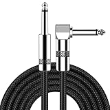
- [Low Noise High Fidelity] New bee guitar cord with 22AWG oxygen-free-copper center conductors provides enhanced signal transfer, the PVC insulation material and the high-density stranded copper double shield provide noise rejection for quiet operation
- [Ideal for Choice] New bee 1/4 straight and right angle metal connectors, ensures a secure connection in any instrument, pedal, or amp jack. L shape great fro on stage guitar stands
- [Wide Compatible] Suitable for mixer, power amplifier, microphone, effector, decoder, equalizer, electoronic organ, electric guitar, electric bass and other electronic equipments. Widely used in the installation of smart home, karaoke speaker, professional stage audio, etc
- [Easy Disassemble] Making incidental repairs quick and easy! Very nice, flexible cable
- [Dont Hesite to Order] 24 hours customer services and professional technology team are standing by
Give letters and lines room to breathe
When letters sit too close together, readers may have trouble separating them; when lines are too tight, it is harder to track from the end of one line to the start of the next. Apple specifically calls out line height and letter spacing as ways to improve legibility in its UI design guidance. Use spacing to make text comfortable without letting short labels become awkward or pushing important content out of view.
Quick wins for a faster PC:
Fix the driver behind crashes, sound loss and screen glitchesFind Drivers →Clear out junk files and repair common Windows errorsFree Scan →Also test whether the design survives user-adjusted spacing. WCAG 2.2 Success Criterion 1.4.12 checks that content and functionality remain available when users override line height, paragraph spacing, letter spacing, and word spacing to specified values. Those values are a resilience test—not a requirement that every page use them as its default styling. As the W3C explains, “Content is not required to use these text spacing values.” The requirement is about avoiding loss of content or function when the adjustments are applied. See the W3C explanation of Text Spacing.
In practice, look for clipped descenders, overlapping lines, hidden controls, and text that collides with nearby elements after spacing changes. Avoid fixed-height containers that assume every label will occupy one line. Let content wrap or grow where appropriate, and make sure spacing changes do not make an essential action unreachable.
Rank #4

- Digital Family Calendar: BSIMB digital calendar wall touch screen puts an end to your chaotic life. Designed for busy families, the digital calendar keeps you organised and in step with your family. Assign different colours and tasks to each family member to make family scheduling easier and more intuitive.
- Easy Setup and Auto-Sync: Plug in, connect to WLAN and auto-syn your electric calendar in minutes. Digital wall calendar compatible with Google calendar, iCloud calendar, Outlook calendar, Cozi calendar and Yahoo calendar. Add events directly on the device or through the ecalendar app. Electronic calendar stays current whether you're at work or traveling—no manual updates needed.
- All-In-One Home Assistant: Smart calendar builds habits and encourage independence with personalised chores. Display daily meal plan to reduce the daily ‘What's for dinner?’ stress. To-do lists keep track of everything you want. Turning chores into valuable achievements with stars and rewards, making life easier and more enjoyable.
- Manage Anytime Anywhere: BSIMB electronic calendar for family stay connected with the powerful ecalendar app. Access and manage your digital wall calendar anytime, anywhere with free features like stars & rewards, photo screensaver, chore charts, meals plans, to-do lists etc. Electronic planner paid features like Magic Import tailor advanced tools for users with special needs.
- Stay in Touch with Loved Ones: Share photos or videos from your phone to electronic wall calendar with app, instantly update your life moment, and keep in touch with your family, especially those who are far away; you can also surprise your smart calendar digital wall by sending him a wish card; it's also great for keeping tech-illiterate elders in touch with the youngsters.
Let readers enlarge text without breaking the layout
Text scaling is part of a usable small-screen design, not an optional polish step. Android recommends defining text sizes in scale-independent pixels (sp) rather than density-independent pixels (dp), pixels, or other units. Its guidance says: “Define text sizes in units of scale-independent pixels (sp), not dp, px, or others.” On Android, use sp for text and build layouts that can expand instead of cropping enlarged copy. Consult Android’s text scaling guidance for the platform-specific recommendations.
For a practical check, raise the device’s accessibility font setting to its largest value, then inspect the interface in portrait and landscape. Android’s guidance recommends this kind of test. Look beyond whether the letters themselves grow: confirm that headings wrap sensibly, buttons remain operable, paragraphs are not cut off, and content can still be reached. On Apple platforms, Apple’s UI tips advise fitting primary content to the screen without horizontal scrolling. That does not mean shrinking text until everything fits; prioritize adaptable layouts over a rigid design that forces users to read smaller copy.
Check both the usual size and enlarged settings. A layout that works only at maximum enlargement may be unnecessarily sparse at normal settings; one that looks elegant at the default size but hides content when enlarged is not resilient. Give containers room to grow, avoid fixed line counts where they would truncate meaningful copy, and verify navigation and controls after text wraps.
Use line length and alignment thoughtfully
On a narrow screen, a line can become so short that reading feels choppy, but widening a text block too far can make it difficult to find the next line. WCAG’s Level AAA visual-presentation criterion offers one user-adjustment model: it includes a mechanism for blocks no wider than 80 characters or glyphs (40 for Chinese, Japanese, and Korean), non-justified text, and at least 1.5 line spacing. The same criterion addresses resizing text to 200 percent. These figures belong to a Level AAA criterion and its adjustment mechanism; they are not a universal mobile breakpoint, nor a requirement that every mobile page use exactly those values by default. See the W3C explanation of Visual Presentation.
Use those values in their proper context: they describe a way users can adjust visual presentation, not a one-size-fits-all phone layout. Avoid forced justification if it creates uneven gaps, and judge line breaks in the language and script being displayed. Short lines may be appropriate for compact controls or narrow screens; the key is to avoid a layout that becomes difficult to scan or cannot accommodate user changes.
A practical review process for a small-screen interface
- Set up a realistic sample. Use representative paragraphs, headings, labels, numerals, punctuation, and the scripts your product supports. Review them in the actual interface, not only in a font specimen.
- Compare fonts fairly. Render each candidate at the same nominal size in the same layout. Check distinguishing letterforms, apparent size, stroke weight, script coverage, wrapping, and fit. Treat these as inspection axes, not as a published ranking of font families.
- Check contrast. Measure each relevant text/background pairing against WCAG 2.2’s 4.5:1 ordinary-text threshold or 3:1 large-text threshold, using its definition of large text. Recheck text that sits on changing or image backgrounds.
- Inspect spacing and wrapping. Look for cramped letters and lines, then apply user spacing changes to see whether content or controls overlap, disappear, or stop working.
- Increase text size to the largest accessibility setting. Verify portrait and landscape layouts. Check that primary content remains available, text wraps rather than clips, and controls stay usable.
- Review the rendered result at normal use. Confirm that readers can distinguish characters and follow lines without relying on enlargement. Adjust type size, weight, spacing, contrast, or layout as needed; changing the font alone may not fix the problem.
Common mistakes to avoid
- Treating a size number as a guarantee. Apple’s 11-point tip and WCAG’s large-text definition serve different purposes and do not prove that a particular interface is readable.
- Picking a font from its reputation. The guidance cited here does not establish a universally best serif, sans-serif, or other font family. Inspect the actual type at the actual size.
- Fixing fit by shrinking copy. If enlarged text gets cropped, make the layout more flexible rather than removing the reader’s ability to scale it.
- Using colour as the only distinction. Make sure text has sufficient luminance contrast with its background.
- Testing only at the default settings. Font scaling and spacing overrides can change wrapping and control placement, so test those states as well.
- Applying Level AAA figures as mandatory defaults. The 80-character or glyph, 40-CJK, 1.5-line-spacing, and 200-percent values belong to WCAG’s Level AAA visual-presentation criterion and its user-adjustment mechanism.
What the guidance can—and cannot—settle
The recommendations here come from Apple Developer, Android Accessibility, and W3C/WAI guidance reviewed on October 13, 2026; they are published platform and accessibility guidance, not a hands-on comparison of fonts or devices. They support concrete checks for size, contrast, spacing, scaling, and layout resilience. They do not establish a controlled winner among font families, a universally ideal mobile font size, or a special font or device that every reader needs.
What’s actually slowing this PC down?
Pick the symptom - the matching free tool is one click away.
That leaves a straightforward design principle: choose a typeface that is clear for your scripts and content, then evaluate it alongside size, weight, contrast, spacing, and responsive behaviour. A readable small-screen interface is the one that stays legible in its rendered form and remains usable when the reader changes how text is displayed.
Quick Recap
Product prices and availability are accurate as of the date/time indicated and are subject to change. Any price and availability information displayed on Amazon at the time of purchase will apply.




