Free tools Windows power users keep installed
One-click scans. No signup required.
Regular or moderately heavier text is usually more readable than a very thin (“slim”) weight at small sizes on phones and other compact displays. Thin strokes can fade through anti-aliasing, glare, scaling and low contrast. That is a practical default, not a universal law: typeface design, rendered size, contrast, spacing, display quality and the reader’s vision all affect the result.
The short answer
Choose a regular, book or medium weight for body copy, navigation labels, form instructions and other small-screen text. Reserve the thinnest weights for large display text that has generous contrast and space around it. If a brand typeface only looks right in a light weight, increase its rendered size and verify it on real devices before shipping.

As an Amazon Associate I earn from qualifying purchases.
Apple’s accessibility guidance states that “Thicker weights are easier to read for smaller font sizes.” The Web Content Accessibility Guidelines (WCAG) add an important reason: anti-aliasing can make unusually thin strokes appear fainter than the color specified in CSS. A font can therefore meet a nominal color contrast calculation and still look weak in practice.
Recommended Free Tools
No official guidance establishes one universally best font family or a single winning weight for every phone. The useful decision is whether the chosen weight remains legible under the conditions your readers actually encounter.
#1 Best Overall

- [Ultra-Lightweight Ear Buds Designed for Small Ears] Each earbud weighs only 3.7g and features a compact, ergonomic in-ear design made especially for small ears. Secure, low-profile, and comfortable for workouts, all-day wear or overnight sleeping.The ultra-slim profile sits flush in your ear with no hard edges poking or rubbing, so you can even sleep on your side without discomfort.
- [Immersive Stereo Sound with TOZO OrigX Technology] TOZO OrigX tuning delivers clear vocals, balanced mids, and natural stereo sound for music, podcasts, and videos.
- [Long Battery Life for Daily Use] Get up to 7 hours of playtime on a single charge, with up to 32 hours total using the charging case—ideal for workdays, commuting, and extended listening sessions.
- [Bluetooth 5.3 & Stable Connection] Bluetooth 5.3 provides fast pairing, stable wireless performance, and reduced dropouts as you move around home or office.
- [Deep Bass with Clear Vocals] High-performance drivers produce punchy bass while keeping vocals clean and detailed for everyday listening.
Why slim strokes become difficult to see
Anti-aliasing reduces apparent darkness
Small text rarely lands on whole physical pixels. The operating system smooths the edges of each glyph by blending edge pixels with the background. With a thin stroke, a larger share of the letter is made from partially blended pixels, so the stroke can look lighter than its CSS color suggests.
W3C describes this directly: “Due to anti-aliasing, particularly thin or unusual fonts may be rendered by user agents with a much fainter color than the actual text color defined in the underlying CSS.” Its recommended response is to select stronger or thicker lines, or to exceed the minimum contrast requirement. Google’s Android accessibility guidance similarly notes that smoothing can change the apparent color of low-stroke-width content.
Small displays magnify environmental problems
Reflections, outdoor light, a dim screen, viewing from an angle and display scaling can all reduce the difference between a thin stroke and its background. A regular weight has more ink-like area, so it generally retains its shape when conditions are less than ideal.
Not all “regular” and “light” cuts are equivalent
Weight names are relative to a family. One typeface’s light cut may have more visible stroke area than another family’s regular cut. Letter shapes, x-height, counters, aperture size, spacing and hinting also affect recognition. A well-designed light face at a generous size can outperform a poorly designed regular face at the same nominal size.
Weight is only one part of readable text
Contrast still has to be measured
WCAG 2.2’s contrast guidance uses a minimum ratio of 4.5:1 for ordinary text and 3:1 for large text, subject to the exceptions described by the standard. These are color-contrast requirements, not a guarantee that every font will look equally clear.
| Text category | WCAG 2.2 explanatory ratio | What the ratio does not tell you |
|---|---|---|
| Ordinary text | 4.5:1 minimum | Whether a very thin stroke survives anti-aliasing, glare or a low-quality display |
| Large text | 3:1 minimum | Whether the typeface’s shapes, spacing and line length are comfortable to scan |
Check the actual foreground and background colors, then inspect the result at the final size and weight. If a light cut looks faint, increasing contrast beyond the minimum or moving to a heavier cut is safer than relying on the ratio alone. See W3C’s Understanding Success Criterion 1.4.3 for the requirements and exceptions.
Rank #2

- 【IP68 Waterproof Multifunctinal Smart Watch】Torjalph fitness activity tracker smart watch is IP68 waterproof technology ,you can wear it when swimming,handwashing,it's rain-proof which means that you perform multiple exercise modes outside without worrying about sweat or rain corroding your fitness smart watch,and this watch equipped with a 230 mAh large capacity battery magnetic charging ,and this sports activity tracker watch can be used 5-7 days If fully charged.
- 【Larger 1.83'' Full Screen Watch & Multi-dial Selection】1.83 inch full HD color touch screen smart watch for men / women provides excellent 240*284 resolution image quality ,This Bluetooth smart watch offers a better touch experience and remarkable immersion and ,more than 200 watch faces for you to choose from App"Da Fit ", you can change the dial style according to your mood to wear keeping the world on your wrist
- 【Accurate Activity Tracker Smart Watch 】sports watch activity tracker uses sweat and dust resistant breathable silicone strap, our Fitness Tracker Smart Watch for Android iOS Phones supports 12 sports modes,walking,running,bicycle,swimming,badminton,basketball,football,rope skipping. This bluetooth calls smart watch for men women is lightweight and stylish, bringing more convenient and relaxing sports experience while also providing more protection.
- 【Your 24 Hour Personal Daily Health Monitor】Fitness watch for women men full touch screen IP67 waterproof bluetooth smartwatch for Android iOS Phones with heart rate blood pressure monitor multifunction Andriod smart watch with steps counter sleep monitor sports fitness watch, monitoring blood oxygen saturation allows you to understand your physical condition in real time to track fitness progress ,to know your health status in time.
- 【More Functions Bluetooth Call Smart Watch】This fitness activity smart watch full screen for iPhone and Android phones includes a bunch of new features including:The bluetooth smart watch can hang up the phone, receive and display WhatsAPP /Text /Facebook /Twitter /Messenger reminder.Support sedentary reminder, alarm clock, stopwatch, timer,weather information,music control, remote camera control compatible with Android 5.0 and above or iOS 9.0 and above smartphones.
Size changes the practical result
Digital.gov uses an effective 16px body-text size as guidance for visual designers, while noting that the appropriate size varies with the font’s design. Treat 16px as a starting point, not a promise that every family will read the same at that size. A low-x-height light face may need to be larger; a highly legible family may remain comfortable at a smaller setting for a particular interface.
Apple advises following each platform’s type-size recommendations and supporting enlargement. Its published values differ by operating system, so there is no single Apple-wide “correct” point size:
| Platform | Default custom type size listed by Apple | Minimum listed by Apple |
|---|---|---|
| iOS and iPadOS | 17 pt | 11 pt |
| macOS | 13 pt | 10 pt |
| tvOS | 29 pt | 23 pt |
| visionOS | 17 pt | 12 pt |
| watchOS | 16 pt | 12 pt |
These are the platform-specific values presented in Apple’s Accessibility guidance, not a universal rule for web pages or Android interfaces.
How to choose a weight for a phone interface
1. Classify the text before choosing a font cut
- Body paragraphs, help text and legal copy: start with regular or book. If the family’s regular cut is unusually delicate, try medium.
- Navigation, tabs and buttons: use regular to medium, depending on size and contrast. The label must remain identifiable when the control is scanned quickly.
- Form labels and error messages: avoid the thinnest cut; these strings are often read under stress and beside colored backgrounds.
- Large headings and hero text: a light weight can work when the text is large, the line length is short and contrast is strong. Test it rather than assuming the decorative treatment is safe.
2. Set a readable size before fine-tuning weight
Use the family’s metrics, not only the CSS number. Compare lowercase letters, numerals and punctuation at the rendered size. If a thin style is part of the visual identity, increase the size until counters stay open and adjacent strokes do not merge, then recheck the amount of content that fits on screen.
3. Verify contrast on the intended background
Measure the color pair used in the interface, including text placed over images, gradients, disabled-looking surfaces and tinted panels. A color that works on white may fail on a photograph or a dark-mode surface. When a light weight looks washed out, first test a darker color or heavier cut instead of adding a shadow that can blur the edges.
4. Inspect real rendering, not just a design file
Open the page on the operating systems and browsers your audience uses. Compare at normal brightness and at a dim setting, in light and dark themes, and with system text scaling enabled. Look at long words, mixed-case labels, numbers, punctuation and adjacent controls. Screenshots exported from a design tool cannot reproduce every device’s anti-aliasing and scaling behavior.
Rank #3
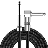
- [Low Noise High Fidelity] New bee guitar cord with 22AWG oxygen-free-copper center conductors provides enhanced signal transfer, the PVC insulation material and the high-density stranded copper double shield provide noise rejection for quiet operation
- [Ideal for Choice] New bee 1/4 straight and right angle metal connectors, ensures a secure connection in any instrument, pedal, or amp jack. L shape great fro on stage guitar stands
- [Wide Compatible] Suitable for mixer, power amplifier, microphone, effector, decoder, equalizer, electoronic organ, electric guitar, electric bass and other electronic equipments. Widely used in the installation of smart home, karaoke speaker, professional stage audio, etc
- [Easy Disassemble] Making incidental repairs quick and easy! Very nice, flexible cable
- [Dont Hesite to Order] 24 hours customer services and professional technology team are standing by
5. Check enlarged text and user spacing
Apple recommends Dynamic Type support and text enlargement. On the web, WCAG 1.4.12 requires content to remain usable when a user overrides line height, paragraph spacing, letter spacing and word spacing to the criterion’s specified values. A layout that only works at the designer’s default settings is not robust, even if the initial thin font appears attractive.
Increase text size through the platform setting or browser zoom, then check for clipped labels, overlapping buttons, hidden error messages and horizontal scrolling. If a heavier weight causes wrapping, adjust the component’s width or line height rather than disabling enlargement.
A repeatable comparison method for slim and regular weights
The available standards support a general preference for stronger strokes, but they do not provide a controlled, universal head-to-head ranking of font families. You can still make a disciplined product decision by holding the relevant variables constant.
The Tool Desk
Outbyte Driver Updater FREEFix the driver behind crashes, sound loss and screen glitchesFind Drivers →Outbyte PC Repair FREEClear out junk files and repair common Windows errorsFree Scan →- Choose the same content. Include a paragraph, a short navigation label, a form field, an error message, numerals and punctuation. Recognition problems often appear in labels before they appear in prose.
- Match the rendered size and line height. Compare the slim and regular cuts at the same CSS size first. Then test the slim cut at a larger size, because increasing size is Apple’s stated option when a custom thin font is used.
- Keep color and background identical. Evaluate each weight against the same foreground and background pair, then repeat on the actual light and dark surfaces.
- Use the same device conditions. Test at least one current iOS or iPadOS device and one Android device if both audiences matter. Include a small-screen viewport, system scaling, normal and low brightness, and indoor and bright-light viewing when possible.
- Check scanning and continuous reading separately. Ask whether a user can identify a label instantly and whether a paragraph can be followed for several lines without effort. These are different tasks.
- Record failures, not impressions alone. Note letters that close up, disappear or blend into neighboring strokes; controls that become ambiguous; and text that clips after enlargement. Fix the worst failure mode first.
Use these comparison axes for every candidate: stroke visibility at the final size, contrast against the intended background, anti-aliasing and scaling behavior, readability after user enlargement, and preservation of the layout when spacing overrides are applied.
Implementation guidance for web and app teams
Use a sensible weight fallback
Do not assume a device has the exact numeric weight you request. A variable font may interpolate smoothly, while a static family may substitute a nearby file. Define a fallback stack and test the actual files that load:
body {
  font-family: system-ui, -apple-system, "Segoe UI", sans-serif;
  font-size: 1rem;
  font-weight: 400;
  line-height: 1.5;
  color: #1f2933;
  background: #ffffff;
}

.small-label {
  font-weight: 500;
}
The values above are an implementation example, not a universal prescription. The important practice is to specify a deliberate body weight, provide enough line height for the selected family and verify the fallback that users actually receive.
Rank #4

- Digital Family Calendar: BSIMB digital calendar wall touch screen puts an end to your chaotic life. Designed for busy families, the digital calendar keeps you organised and in step with your family. Assign different colours and tasks to each family member to make family scheduling easier and more intuitive.
- Easy Setup and Auto-Sync: Plug in, connect to WLAN and auto-syn your electric calendar in minutes. Digital wall calendar compatible with Google calendar, iCloud calendar, Outlook calendar, Cozi calendar and Yahoo calendar. Add events directly on the device or through the ecalendar app. Electronic calendar stays current whether you're at work or traveling—no manual updates needed.
- All-In-One Home Assistant: Smart calendar builds habits and encourage independence with personalised chores. Display daily meal plan to reduce the daily ‘What's for dinner?’ stress. To-do lists keep track of everything you want. Turning chores into valuable achievements with stars and rewards, making life easier and more enjoyable.
- Manage Anytime Anywhere: BSIMB electronic calendar for family stay connected with the powerful ecalendar app. Access and manage your digital wall calendar anytime, anywhere with free features like stars & rewards, photo screensaver, chore charts, meals plans, to-do lists etc. Electronic planner paid features like Magic Import tailor advanced tools for users with special needs.
- Stay in Touch with Loved Ones: Share photos or videos from your phone to electronic wall calendar with app, instantly update your life moment, and keep in touch with your family, especially those who are far away; you can also surprise your smart calendar digital wall by sending him a wish card; it's also great for keeping tech-illiterate elders in touch with the youngsters.
Do not fake a heavier face with effects
Text shadows, strokes and aggressive font-smoothing overrides can soften edges or create halos. Prefer a real weight from the family, a darker text color, a larger size or a more suitable typeface. If a platform applies its own smoothing, let it do so and judge the rendered result.
Keep text selectable and scalable
Rasterized labels in images, canvases or fixed-height components cannot respond reliably to Dynamic Type, browser zoom or user spacing. Use live text, flexible containers and wrapping rules that allow a regular or medium weight to occupy the space it needs.
Independent reader supportYour contribution helps us test, update, and keep practical guides available for everyone.Common mistakes and their fixes
“The contrast checker passed, so the light font is accessible.”
Why it fails: the ratio evaluates colors, while anti-aliasing changes the apparent darkness of thin strokes.
Fix: inspect the rendered text and choose a stronger weight or higher-than-minimum contrast when the strokes look faint.
“Every mobile screen should use one fixed pixel size.”
Why it fails: font metrics, platform defaults, viewing distance and user settings differ.
Windows Errors? Fix Them Before They Spread
Repair common Windows errors and clear accumulated junk for a smoother, more stable PC - no reinstall needed.Free scan · no reinstallCrashes, No Sound, or Screen Glitches?
Random freezes, missing sound and display glitches usually trace back to one bad driver. Find and replace yours safely.Free scan · under a minuteFix: use platform guidance as a starting point, support enlargement and validate the effective size of the chosen family.
“Light text makes a dense interface look cleaner.”
Why it fails: reducing stroke area can make labels disappear in glare or at low brightness, increasing cognitive effort.
Fix: keep the visual hierarchy through size, spacing and color while using regular or medium weight for information users must read.
“If the default viewport works, accessibility is finished.”
Why it fails: enlarged text and user-controlled spacing can expose clipping, overlap and hidden content.
Do these 3 things before closing this tab:
1Scan for outdated or missing drivers - takes under a minute2Clear out junk files and repair common Windows errors3Fix the driver behind crashes, sound loss and screen glitchesFix: test the complete flow with text enlargement and spacing overrides before release.
“A single device proves the type choice.”
Why it fails: operating systems, browsers, pixel densities and smoothing algorithms render the same font differently.
Fix: repeat the check on the major platforms and browsers represented in your audience, using the same content and conditions.
Decision table: which weight is the safer starting point?
| Situation | Starting choice | Reason and next check |
|---|---|---|
| Body copy below a large display size | Regular or book | Provides more stroke area; verify line length, contrast and enlargement. |
| Compact navigation or tab labels | Regular to medium | Improves quick recognition; check wrapping and selected/unselected contrast. |
| Small helper text on a tinted surface | Medium or a darker color | Tinted backgrounds and anti-aliasing can make light strokes recede. |
| Large, short headline | Light may be acceptable | Confirm 3:1 large-text contrast, open counters and legibility in bright light. |
| Brand font available only in a thin cut | Increase size, then test | Apple advises considering a larger size for custom thin fonts; verify layout at enlarged settings. |
| Users with text enlargement enabled | Regular or medium | Leaves more resilience as scaling, wrapping and spacing change. |
What the evidence can—and cannot—tell you
Official accessibility guidance converges on a cautious rule: very thin strokes are riskier at small sizes, and thicker strokes are usually easier to read. It does not prove that every regular font beats every slim font, nor does it supply a universal device-by-device ranking. The final choice remains a design-system decision that must account for the actual typeface, color, size, layout, platform rendering and audience.
For that reason, document the conditions behind your choice: the font files and weights, rendered size, foreground and background colors, supported platforms, text-scaling behavior and the failures observed during review. Future changes to a font, browser, theme or component width can alter readability even when the CSS declarations look unchanged.
Bottom line for small-screen typography
Use regular or moderately heavier weights for text users must read at small sizes. Treat a slim weight as a display treatment that needs more size, stronger contrast and space. Validate the rendered interface on the target devices, support enlargement and spacing overrides, and never treat a contrast ratio as a substitute for looking at the actual letters.
Quick Recap
Sources and standards
- W3C: Understanding Success Criterion 1.4.3, Contrast (Minimum)
- Apple Developer: Accessibility | Apple Human Interface Guidelines
- W3C: Understanding Success Criterion 1.4.12, Text Spacing
- W3C: Understanding Success Criterion 1.4.8, Visual Presentation
- Digital.gov: Accessibility for Visual Designers
- Google Accessibility Help: Color contrast
Product prices and availability are accurate as of the date/time indicated and are subject to change. Any price and availability information displayed on Amazon at the time of purchase will apply.




