Recommended Free Tools
Reduce checkout friction by finding where shoppers hesitate, removing unnecessary decisions and fields, making errors easy to fix, and proving each change with behavioral data and usability observation. Start with the same cart-to-confirmation journey on desktop and mobile, then prioritize problems that block progress or create uncertainty about the order, total, payment, or next step.
Why checkout friction deserves a deliberate audit
Checkout is not one screen; it is a chain of decisions and system responses that begins at the cart and ends at confirmation. A shopper can abandon because an account is required, a field is ambiguous, an error wipes their data, a delivery charge appears late, or the payment step does not make the final action clear. The interface may be technically functional while still demanding more effort or confidence than the shopper is willing to supply.

As an Amazon Associate I earn from qualifying purchases.
Baymard Institute’s current benchmark, updated November 25, 2025, rates 64% of desktop sites and 63% of mobile sites as “mediocre” or worse in checkout UX; the corresponding figure for apps is 46% (Baymard Institute, 2025). The benchmark reports more than 41,000 manually reviewed checkout performance scores and 33,000-plus categorized examples. Those are observations across Baymard’s benchmark population, not a prediction for any individual store.
The Tool Desk
Outbyte PC Repair FREEClear out junk files and repair common Windows errorsFree Scan →Outbyte Driver Updater FREEFix the driver behind crashes, sound loss and screen glitchesFind Drivers →Baymard’s 2025 article also cites an estimate that 70% of ecommerce users abandon a purchase after adding items to a cart. That figure describes cart abandonment overall, not abandonment caused solely by checkout design. The same article estimates up to a 35% potential conversion-rate increase for an average large ecommerce site from checkout design changes; it is a research-based potential, not a guaranteed lift for your business (Baymard Institute, 2025).
#1 Best Overall

- [Ultra-Lightweight Ear Buds Designed for Small Ears] Each earbud weighs only 3.7g and features a compact, ergonomic in-ear design made especially for small ears. Secure, low-profile, and comfortable for workouts, all-day wear or overnight sleeping.The ultra-slim profile sits flush in your ear with no hard edges poking or rubbing, so you can even sleep on your side without discomfort.
- [Immersive Stereo Sound with TOZO OrigX Technology] TOZO OrigX tuning delivers clear vocals, balanced mids, and natural stereo sound for music, podcasts, and videos.
- [Long Battery Life for Daily Use] Get up to 7 hours of playtime on a single charge, with up to 32 hours total using the charging case—ideal for workdays, commuting, and extended listening sessions.
- [Bluetooth 5.3 & Stable Connection] Bluetooth 5.3 provides fast pairing, stable wireless performance, and reduced dropouts as you move around home or office.
- [Deep Bass with Clear Vocals] High-performance drivers produce punchy bass while keeping vocals clean and detailed for everyday listening.
The scale of the underlying usability work explains why small-looking details matter. In its 2024 expanded study, Baymard reports more than 200 qualitative user/site usability-test sessions, over 1,350 medium-to-severe checkout usability issues, 16 ecommerce sites, and more than 4,000 hours of research and testing (Baymard Institute, 2024). Treat these findings as a map of recurring opportunities, then verify which opportunities exist in your own flow.
Map the complete journey before changing the interface
Do not begin by choosing a fashionable checkout pattern. First document what a real shopper encounters, including redirects, validation states, shipping-rate calculations, authentication, payment authorization, and the confirmation page.
- Record every entry point. Start from product pages, saved carts, promotional links, and mobile deep links. Note whether the shopper arrives with an account, an empty address book, or a discount code.
- Capture the normal path. Walk from cart to confirmation on a current desktop browser and on actual phones. Record every page, modal, field, button label, loading state, and external payment hand-off.
- Test non-ideal paths. Use an invalid postal code, an expired card, a declined payment, a missing required value, a back-button action, and a network interruption. Check whether entered data survives and whether the shopper knows what to do next.
- Mark uncertainty and effort. For each step, ask: What decision is required? What information is missing? Is the cost already known? Can the shopper correct a mistake without starting over?
- Connect behavior to evidence. Use analytics to locate exits or unusually long pauses, then inspect session recordings, support contacts, usability sessions, and customer comments to understand the reason. A drop-off percentage alone cannot tell you whether the cause is confusion, price, eligibility, or a technical failure.
Audit and reduce friction step by step
1. Find the point of hesitation
Create a funnel with events such as cart view, checkout start, address submitted, shipping selected, payment submitted, and order confirmed. Segment it by device type, browser, new versus returning customer, traffic source, country, payment method, and logged-in state. A high-level funnel identifies where to look; it does not explain why the shopper left.
Pair the quantitative view with observation. Ask representative shoppers to complete a purchase while speaking aloud, or run moderated and unmoderated usability sessions. Review support tickets for phrases such as “where do I enter,” “why do you need,” “it keeps rejecting,” or “did my order go through?” The objective is to identify preventable effort and uncertainty, not to optimize a single metric in isolation.
2. Make the account choice explicit
Place guest checkout as a prominent, understandable option. Requiring account creation before purchase adds a task unrelated to the immediate goal and can make a shopper suspect that the business values data collection over completion.
If you offer an account, explain the concrete benefit at the moment of choice—for example, order tracking or saved addresses—and keep registration lightweight. Do not hide guest checkout as a low-contrast link beneath a dominant sign-in form. If a shopper begins as a guest, offer account creation after the order using information already entered, rather than interrupting payment with a new password requirement.
Rank #2

- 【IP68 Waterproof Multifunctinal Smart Watch】Torjalph fitness activity tracker smart watch is IP68 waterproof technology ,you can wear it when swimming,handwashing,it's rain-proof which means that you perform multiple exercise modes outside without worrying about sweat or rain corroding your fitness smart watch,and this watch equipped with a 230 mAh large capacity battery magnetic charging ,and this sports activity tracker watch can be used 5-7 days If fully charged.
- 【Larger 1.83'' Full Screen Watch & Multi-dial Selection】1.83 inch full HD color touch screen smart watch for men / women provides excellent 240*284 resolution image quality ,This Bluetooth smart watch offers a better touch experience and remarkable immersion and ,more than 200 watch faces for you to choose from App"Da Fit ", you can change the dial style according to your mood to wear keeping the world on your wrist
- 【Accurate Activity Tracker Smart Watch 】sports watch activity tracker uses sweat and dust resistant breathable silicone strap, our Fitness Tracker Smart Watch for Android iOS Phones supports 12 sports modes,walking,running,bicycle,swimming,badminton,basketball,football,rope skipping. This bluetooth calls smart watch for men women is lightweight and stylish, bringing more convenient and relaxing sports experience while also providing more protection.
- 【Your 24 Hour Personal Daily Health Monitor】Fitness watch for women men full touch screen IP67 waterproof bluetooth smartwatch for Android iOS Phones with heart rate blood pressure monitor multifunction Andriod smart watch with steps counter sleep monitor sports fitness watch, monitoring blood oxygen saturation allows you to understand your physical condition in real time to track fitness progress ,to know your health status in time.
- 【More Functions Bluetooth Call Smart Watch】This fitness activity smart watch full screen for iPhone and Android phones includes a bunch of new features including:The bluetooth smart watch can hang up the phone, receive and display WhatsAPP /Text /Facebook /Twitter /Messenger reminder.Support sedentary reminder, alarm clock, stopwatch, timer,weather information,music control, remote camera control compatible with Android 5.0 and above or iOS 9.0 and above smartphones.
3. Remove form ambiguity and unnecessary work
Inventory every field and identify the operational reason it exists. Remove fields that are not needed for fulfillment, tax, fraud prevention, payment, or legally required records. Distinguish required and optional fields next to each label; a form-wide note at the top is easy to miss, especially on a long mobile screen.
Quick wins for a faster PC:
Clear out junk files and repair common Windows errorsFree Scan →Fix the driver behind crashes, sound loss and screen glitchesFind Drivers →Use labels that describe the expected value, not internal terminology. Keep labels visible while typing, provide examples in supporting text, and use the input type that matches the data so the appropriate mobile keyboard appears. If you request a phone number or another sensitive value that a shopper may not expect, explain why it is needed and how it will be used. Do not make a shopper infer the reason from an error that appears only after submission.
Group fields in the order shoppers naturally know the information: contact, delivery address, shipping method, and payment. Avoid asking for the same value twice unless there is a demonstrated error risk. When billing and shipping addresses are usually identical, provide a clearly labeled option to reuse the shipping address while allowing a separate billing address when required.
4. Design errors for recovery, not blame
Validate at the earliest useful moment without interrupting typing. On blur or submission, identify the specific field and the specific correction in plain language. “Enter a five-digit postal code” is actionable; “Invalid information” is not.
Place the message beside the relevant control, associate it programmatically with that control, and move focus to the first blocking error when appropriate. Preserve every valid value when validation fails. A shopper should never have to reconstruct an address or re-enter a card number because one field was formatted incorrectly.
Do these 3 things before closing this tab:
1Fix the driver behind crashes, sound loss and screen glitches2Clear out junk files and repair common Windows errors3Scan for outdated or missing drivers - takes under a minuteHandle server-side failures separately from input mistakes. If an address service is unavailable, say that the service is temporarily unavailable and offer a manual path. If payment is declined, avoid implying that the cardholder is at fault; show the next safe action, such as checking details, trying another method, or contacting the issuer. Log the error code internally while presenting a useful customer-facing message.
Rank #3
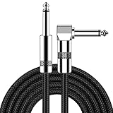
- [Low Noise High Fidelity] New bee guitar cord with 22AWG oxygen-free-copper center conductors provides enhanced signal transfer, the PVC insulation material and the high-density stranded copper double shield provide noise rejection for quiet operation
- [Ideal for Choice] New bee 1/4 straight and right angle metal connectors, ensures a secure connection in any instrument, pedal, or amp jack. L shape great fro on stage guitar stands
- [Wide Compatible] Suitable for mixer, power amplifier, microphone, effector, decoder, equalizer, electoronic organ, electric guitar, electric bass and other electronic equipments. Widely used in the installation of smart home, karaoke speaker, professional stage audio, etc
- [Easy Disassemble] Making incidental repairs quick and easy! Very nice, flexible cable
- [Dont Hesite to Order] 24 hours customer services and professional technology team are standing by
5. Make payment predictable
Keep the order summary visible or one tap away throughout payment. Show items, quantities, delivery charges, taxes where applicable, discounts, and the amount that will be charged. If the total can change after an address or shipping choice, explain when it recalculates and why.
Payment fields should correspond to what shoppers see on a physical card. Detect the card network when possible, format the number as it is entered, identify where the security code is located, and use an expiry format that is immediately understandable. Baymard’s payment guidance treats these details as distinct usability concerns (Baymard Institute, June 1, 2026).
Make the primary action unambiguous. “Place order” communicates a final commitment more clearly than a vague “Continue” at the last step. If a multi-step flow collects payment before the final review, state that entering payment does not silently submit the order, and show how to review or edit before the charge is made. Conversely, if the payment action submits immediately, label it accordingly and ensure the total is adjacent to the control.
Free tools Windows power users keep installed
One-click scans. No signup required.
Support the payment methods your customers actually use, but do not add a method merely to increase a list. Each method introduces its own redirect, authentication, failure, refund, and reconciliation states. Measure completion and error rates by method so a seemingly popular option does not conceal a high failure rate.
6. Treat mobile as a separate product surface
Desktop success does not establish mobile success. Test on actual devices with slow connections and small screens, not only in a responsive browser preview. Check that the correct keyboard opens, focus scrolls the active field into view, labels remain visible, and tap targets can be used accurately with one hand.
Keep the order total and the primary action discoverable without forcing the shopper to hunt through a long page. If the summary collapses, use a clear control that exposes the full breakdown without losing entered data. Verify that sticky headers, chat widgets, cookie notices, and virtual keyboards do not cover errors or the submit button.
Run the same recovery tests on mobile as on desktop: invalid fields, back navigation, declined payment, interrupted network, and a return from an external authentication screen. Check keyboard navigation, focus order, color contrast, and announced labels with assistive technology; an inaccessible control is friction even when it looks correct visually.
What’s actually slowing this PC down?
Pick the symptom - the matching free tool is one click away.
Rank #4

- Digital Family Calendar: BSIMB digital calendar wall touch screen puts an end to your chaotic life. Designed for busy families, the digital calendar keeps you organised and in step with your family. Assign different colours and tasks to each family member to make family scheduling easier and more intuitive.
- Easy Setup and Auto-Sync: Plug in, connect to WLAN and auto-syn your electric calendar in minutes. Digital wall calendar compatible with Google calendar, iCloud calendar, Outlook calendar, Cozi calendar and Yahoo calendar. Add events directly on the device or through the ecalendar app. Electronic calendar stays current whether you're at work or traveling—no manual updates needed.
- All-In-One Home Assistant: Smart calendar builds habits and encourage independence with personalised chores. Display daily meal plan to reduce the daily ‘What's for dinner?’ stress. To-do lists keep track of everything you want. Turning chores into valuable achievements with stars and rewards, making life easier and more enjoyable.
- Manage Anytime Anywhere: BSIMB electronic calendar for family stay connected with the powerful ecalendar app. Access and manage your digital wall calendar anytime, anywhere with free features like stars & rewards, photo screensaver, chore charts, meals plans, to-do lists etc. Electronic planner paid features like Magic Import tailor advanced tools for users with special needs.
- Stay in Touch with Loved Ones: Share photos or videos from your phone to electronic wall calendar with app, instantly update your life moment, and keep in touch with your family, especially those who are far away; you can also surprise your smart calendar digital wall by sending him a wish card; it's also great for keeping tech-illiterate elders in touch with the youngsters.
7. Close the loop with controlled verification
After implementing a change, repeat the original usability tasks and monitor step completion, time in step, validation-error frequency, payment failures, support contacts, and confirmed orders. Compare the new experience with the previous one using the same definitions and attribution windows.
Interpret movement cautiously. Traffic mix, seasonality, promotions, inventory, shipping prices, tax rules, outages, and changes in payment authorization can affect abandonment independently of the interface. Use an experiment when traffic and operational conditions permit; otherwise document the comparison period and confounding changes. A benchmark indicates an opportunity to investigate, not a promised conversion result.
Choosing a checkout structure
There is no source-backed universal winner between a one-page checkout, a multi-step flow, and an accordion that expands sections in place. Select the structure that makes your fulfillment, payment, compliance, and customer-support constraints easiest to understand and recover from, then test the candidate with representative shoppers. Use these criteria rather than a pattern label.
| Decision axis | Questions to answer |
|---|---|
| Entry effort | How many fields, decisions, redirects, and repeated values must a shopper handle? |
| Progress clarity | Can the shopper tell where they are, what remains, and whether the current action is reversible? |
| Total-cost confidence | Are shipping, tax, discounts, and the final charge visible before commitment? |
| Error recovery | Can a shopper return to an earlier section, fix one value, and keep all valid data? |
| Mobile and accessibility | Does the implementation work with small screens, touch, keyboards, and assistive technology? |
| Operational fit | Does it support address rules, fraud checks, payment authorization, inventory, and compliance without opaque interruptions? |
A one-page layout can make progress and review visible, but a very long form may overwhelm a phone user. A multi-step layout can reduce the apparent workload, but hidden steps create surprise if progress and totals are unclear. An accordion can combine review and editing, but collapsed errors are easy to miss. These are implementation trade-offs; measure them in your context.
Build a friction-prioritization system
Not every defect deserves the same release priority. Score each finding on four dimensions: how many shoppers encounter it, whether it blocks completion, how severe the resulting confusion or loss is, and how confidently the proposed fix addresses the observed cause.
- Blockers: payment submission failures, inaccessible controls, loops, and errors that erase the form. Fix these before cosmetic refinements.
- High-cost uncertainty: unclear totals, hidden shipping conditions, unexplained sensitive fields, or ambiguous final buttons. These undermine purchase confidence even when the system works.
- Repeated effort: duplicate data entry, forced account creation, unnecessary fields, and avoidable redirects.
- Polish: spacing, copy tone, and visual hierarchy issues that do not prevent progress but still affect comprehension.
Maintain a finding record with the step, device, observed behavior, evidence, affected segment, proposed change, owner, and verification metric. This keeps teams from treating a single anecdote as a universal problem while ensuring recurring support evidence is not ignored.
Instrumentation that reveals hidden friction
Track events that represent meaningful state changes rather than every click. Useful properties include checkout version, step name, field name (without storing sensitive values), validation result, payment method, error category, device class, and whether the shopper was authenticated. Never send full card numbers, security codes, passwords, or unnecessary personal data to analytics.
Review distributions, not only averages. A median completion time can look healthy while a small group experiences repeated retries. Examine:
- step-to-step completion and abandonment;
- time spent before the first interaction and before submission;
- client- and server-side validation errors by field;
- backtracking, repeated submissions, and reloads;
- payment authorization and redirect-return failures by method;
- orders completed after an error versus sessions that restart or exit;
- support contacts tagged to checkout, payment, address, or account issues.
Protect privacy and data quality. Exclude internal traffic, bots, duplicate retries, and test orders; define whether a session is counted once or multiple times; and annotate releases, promotions, outages, and shipping changes so later comparisons remain interpretable.
Common failure modes and practical fixes
| Observed symptom | Likely friction | Fix to test |
|---|---|---|
| Large exit at the first checkout screen | Guest path is hidden or account creation is mandatory | Give guest checkout equal prominence and defer optional registration until after purchase |
| Many submissions with the same field error | Label, format, or requirement is unclear | Use field-level guidance, examples, correct input types, and plain-language messages |
| Users repeatedly restart after an error | Valid values are cleared or the correction path is hard to find | Preserve data, focus the first blocking field, and explain the exact correction |
| Payment step has long pauses or backtracking | Total, security-code location, expiry format, or next action is uncertain | Keep the summary available, format card inputs, explain sensitive fields, and label the final action |
| Mobile completion trails desktop | Keyboard, focus, tap-target, viewport, or sticky-element problem | Test on physical devices and repair responsive, focus, and accessibility behavior |
| Conversion changes after a release but the cause is unclear | Promotions, traffic mix, shipping, seasonality, or payment operations changed too | Use annotated comparisons or controlled tests and segment by relevant conditions |
A release checklist for a lower-friction flow
Before implementation
- Map cart through confirmation on desktop and mobile, including external payment returns.
- Use analytics and qualitative evidence to identify the highest-impact hesitation.
- List every field, its business purpose, its required status, and its data-retention rule.
- Choose a checkout structure using effort, clarity, recovery, accessibility, and operational fit.
During implementation
- Make guest checkout prominent and explain any optional account benefit.
- Place required/optional indicators beside labels and explain unexpected sensitive fields.
- Use field-specific validation, preserve valid entries, and provide recovery for service failures.
- Keep totals and the order summary available; make the final action and its consequence explicit.
- Format card fields to match familiar card conventions and avoid storing sensitive analytics data.
- Verify keyboard, focus, tap-target, screen-reader, and responsive behavior.
Before and after release
- Run normal and failure-path tasks with representative users.
- Check completion, errors, retries, payment failures, and support contacts by device and method.
- Compare against a documented baseline while recording promotions, shipping, traffic, and outage changes.
- Keep unresolved findings visible so the next audit starts with evidence rather than assumptions.
What a successful audit should establish
At the end of the audit, your team should be able to point to the exact step where shoppers hesitate, explain the cause in observable terms, and show how the proposed change reduces effort or uncertainty. It should also be possible to tell whether the change helped mobile users, desktop users, and app users separately, because those experiences have different failure modes and benchmark contexts. Baymard’s checkout research overview provides additional topic areas for checkout, payment methods, form design, and order review (Baymard Institute, research overview).
The practical standard is not a particular number of pages or fields. It is a checkout that lets a shopper understand the order, enter only necessary information, recover from mistakes without losing work, and know exactly what will happen when the final button is pressed. Measure that standard in your own flow, then iterate on the largest verified obstacle.
Quick Recap
Product prices and availability are accurate as of the date/time indicated and are subject to change. Any price and availability information displayed on Amazon at the time of purchase will apply.




