A clear decision tree turns a user’s question into one understandable next step. Build it by defining the real outcomes first, asking only the shortest questions that distinguish those outcomes, labeling every option in the user’s language, and explaining important consequences before commitment. Then test the implemented flow with the people who will use it—including keyboard and assistive-technology users—and provide a human route when automation cannot resolve the issue.
The method below works for in-app setup and troubleshooting, eligibility checks, account journeys, and chatbot or webchat support. It treats the tree as a service, not merely a diagram: the wording, controls, accessibility, escalation path, analytics, and rule maintenance all affect whether someone reaches a useful result.

As an Amazon Associate I earn from qualifying purchases.
Define the decision before drawing branches
Start with the task a person is trying to complete, not with a preferred diagram or chatbot script. Write the user’s question in plain language, then list the valid end states. An end state should be an action or service outcome such as “reset access,” “show the correct form,” “connect to an adviser,” or “explain why the request is not eligible.” If two endings lead to the same action, combine them; every unnecessary branch adds reading, interaction, and maintenance cost.
List the minimum facts that separate outcomes
For each outcome, identify the smallest fact that distinguishes it from the others. A support flow might need to know whether the person can sign in, whether a charge is recognised, and whether a payment is still pending. It usually does not need a complete account history before offering the first useful step. A question belongs in the tree only when its answer changes the next action.
#1 Best Overall

- [Ultra-Lightweight Ear Buds Designed for Small Ears] Each earbud weighs only 3.7g and features a compact, ergonomic in-ear design made especially for small ears. Secure, low-profile, and comfortable for workouts, all-day wear or overnight sleeping.The ultra-slim profile sits flush in your ear with no hard edges poking or rubbing, so you can even sleep on your side without discomfort.
- [Immersive Stereo Sound with TOZO OrigX Technology] TOZO OrigX tuning delivers clear vocals, balanced mids, and natural stereo sound for music, podcasts, and videos.
- [Long Battery Life for Daily Use] Get up to 7 hours of playtime on a single charge, with up to 32 hours total using the charging case—ideal for workdays, commuting, and extended listening sessions.
- [Bluetooth 5.3 & Stable Connection] Bluetooth 5.3 provides fast pairing, stable wireless performance, and reduced dropouts as you move around home or office.
- [Deep Bass with Clear Vocals] High-performance drivers produce punchy bass while keeping vocals clean and detailed for everyday listening.
- Outcome: the concrete result the service can provide.
- Required fact: the smallest piece of information needed to route to that result.
- Next action: what the user can do immediately after answering.
- Exit or escalation: what happens when the tree cannot resolve the request.
Write these in a simple table before designing the interface. It exposes missing outcomes and “dead ends” early, when they are inexpensive to fix.
| Outcome | Fact needed | Next action | Fallback |
|---|---|---|---|
| Recover a locked account | User can receive the registered email or phone code | Start identity-verification recovery | Offer a staffed recovery route |
| Explain an unfamiliar charge | Charge date and payment method | Show matching transaction guidance | Route to a payment specialist |
| Report a safety concern | Whether anyone is at immediate risk | Show urgent safety instructions | Provide emergency contact guidance appropriate to the user’s location |
For a complex process, a flow chart can help people understand how steps relate. W3C describes flow charts as an aid for complex, multistep information, but neither W3C nor GOV.UK establishes one presentation as universally superior. Choose after observing how your users understand the task, rather than treating a diagram as the specification.
Phrase questions the way users speak
Put the decisive words first
Use one idea per question and place the condition that changes the route at the beginning. “Can you sign in?” is easier to scan than “When you try to access your account, are you currently able to sign in?” Use the same terms people use in support requests, interface labels, and error messages. GOV.UK’s Writing for user interfaces guidance advises minimising cognitive load by being clear and using the user’s language.
Prefer familiar words over internal labels. Ask “Is this payment yours?” rather than “Is the transaction attributable to you?” If research shows that a term is misunderstood, add a short explanation or example beside the question. If every user needs a long explanation, simplify the question or change the interaction instead of adding a paragraph of instructions.
Ask only what determines the next step
Order questions from broad, easy-to-answer distinctions to narrower checks. Begin with a question most users can answer without looking up information. Defer account numbers, dates, or documents until they are actually needed. This keeps the early path short and lets people leave with a useful action even if they cannot answer a later question.
- Identify the user’s goal in their own terms.
- Ask the highest-value yes/no or multiple-choice distinction.
- Show the next action or the next necessary question immediately.
- Request sensitive or effortful information only when a route requires it.
Use research to refine wording
Collect the phrases people use in search boxes, contact forms, call notes, and observed sessions. Treat the example “I want to know how to appeal a decision,” shown in GOV.UK’s chatbot guidance, as an illustration rather than evidence of search volume. Your audience may use different words; test those words with real users before locking labels.
Rank #2

- 【IP68 Waterproof Multifunctinal Smart Watch】Torjalph fitness activity tracker smart watch is IP68 waterproof technology ,you can wear it when swimming,handwashing,it's rain-proof which means that you perform multiple exercise modes outside without worrying about sweat or rain corroding your fitness smart watch,and this watch equipped with a 230 mAh large capacity battery magnetic charging ,and this sports activity tracker watch can be used 5-7 days If fully charged.
- 【Larger 1.83'' Full Screen Watch & Multi-dial Selection】1.83 inch full HD color touch screen smart watch for men / women provides excellent 240*284 resolution image quality ,This Bluetooth smart watch offers a better touch experience and remarkable immersion and ,more than 200 watch faces for you to choose from App"Da Fit ", you can change the dial style according to your mood to wear keeping the world on your wrist
- 【Accurate Activity Tracker Smart Watch 】sports watch activity tracker uses sweat and dust resistant breathable silicone strap, our Fitness Tracker Smart Watch for Android iOS Phones supports 12 sports modes,walking,running,bicycle,swimming,badminton,basketball,football,rope skipping. This bluetooth calls smart watch for men women is lightweight and stylish, bringing more convenient and relaxing sports experience while also providing more protection.
- 【Your 24 Hour Personal Daily Health Monitor】Fitness watch for women men full touch screen IP67 waterproof bluetooth smartwatch for Android iOS Phones with heart rate blood pressure monitor multifunction Andriod smart watch with steps counter sleep monitor sports fitness watch, monitoring blood oxygen saturation allows you to understand your physical condition in real time to track fitness progress ,to know your health status in time.
- 【More Functions Bluetooth Call Smart Watch】This fitness activity smart watch full screen for iPhone and Android phones includes a bunch of new features including:The bluetooth smart watch can hang up the phone, receive and display WhatsAPP /Text /Facebook /Twitter /Messenger reminder.Support sedentary reminder, alarm clock, stopwatch, timer,weather information,music control, remote camera control compatible with Android 5.0 and above or iOS 9.0 and above smartphones.
Make every option recognizable and operable
Label controls by their result
An option should tell users what selecting it will do. “Replace a lost card” is more informative than “Card issue.” Keep the grammatical pattern consistent across sibling options, and avoid options that overlap (“technical problem” and “something else”) unless the difference is explained. The W3C guidance on clearly identifying controls supports controls whose purpose is apparent from their text and context.
Recommended Free Tools
Do not distinguish branches by color, shape, sound, screen position, or an icon alone. A green button and a red button still need text labels; an arrow icon still needs an accessible name. Provide a real button, link, radio group, checkbox, or select control according to the action, rather than a clickable paragraph styled to look like one.
Show one question at a time when attention is the constraint
A step-by-step interaction can reduce the number of choices a person must hold in memory. Keep the current question, answer controls, and next action together. Preserve a visible progress cue when the journey is long, and provide a way to review or change earlier answers without restarting.
Explain consequences before commitment
When a choice affects money, privacy, safety, health, eligibility, or access, state the practical result before the user confirms. Explain what the service will do, what information it will use or share, and whether the choice can be reversed. W3C’s supplemental supported-choice pattern says: “When presenting users with actions and selections, clearly explain the benefits, risks and consequences of each option.” This is supplemental guidance, not a standalone WCAG conformance requirement; use it to make consequential decisions understandable.
For example, instead of a button labelled “Continue with verification,” write “Verify by text message — we’ll send a one-time code to the phone ending in 42.” If selecting an option starts a paid service, show the price, billing interval, and cancellation implication before the final control.
The Tool Desk
Outbyte PC Repair FREERepair Windows errors before they cause bigger problemsFix Now →Outbyte Driver Updater FREEFix the driver behind crashes, sound loss and screen glitchesFind Drivers →Choose a presentation that fits the task
Decide whether users need an overview of the whole process, focused attention on one question, or both. Compare the actual alternatives against the characteristics below; this is a design framework, not a validated scoring instrument.
Rank #3
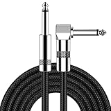
- [Low Noise High Fidelity] New bee guitar cord with 22AWG oxygen-free-copper center conductors provides enhanced signal transfer, the PVC insulation material and the high-density stranded copper double shield provide noise rejection for quiet operation
- [Ideal for Choice] New bee 1/4 straight and right angle metal connectors, ensures a secure connection in any instrument, pedal, or amp jack. L shape great fro on stage guitar stands
- [Wide Compatible] Suitable for mixer, power amplifier, microphone, effector, decoder, equalizer, electoronic organ, electric guitar, electric bass and other electronic equipments. Widely used in the installation of smart home, karaoke speaker, professional stage audio, etc
- [Easy Disassemble] Making incidental repairs quick and easy! Very nice, flexible cable
- [Dont Hesite to Order] 24 hours customer services and professional technology team are standing by
| Format | Useful when | Strengths | Risks to test |
|---|---|---|---|
| Visible flow chart | People must understand many relationships or hand-offs | Shows routes, loops, and destinations at once; useful as a reference | Small nodes, crossing lines, and dense text can be difficult to navigate with a keyboard or screen reader |
| Step-by-step interaction | Each answer determines one immediate next question | Focuses attention; limits simultaneous choices; works well on small screens | Users may lose the overall context or struggle to correct an early answer |
| Hybrid | The process is long but orientation matters | Combines one clear question with a progress or overview panel | Two representations can diverge unless generated from the same rules |
W3C’s supplemental material gives an always-visible flow chart as an example for a multistep process, while GOV.UK guidance recommends establishing eligibility through questions rather than presenting a long list of conditions. Treat both as patterns to validate for your service, not as a universal prescription.
Build a decision tree step by step
- State the user task. Write a sentence such as “I need to know whether I can appeal and what to do next.” Keep this statement visible during design reviews.
- Define all supported outcomes. Include successful completion, “not eligible” explanations, requests for more information, and human escalation. An outcome without an action is not a finished branch.
- Map the minimum facts. For every branch, record the exact answer that changes the route. Remove questions that merely satisfy internal curiosity.
- Order the questions. Put low-effort, high-discrimination questions first. Defer sensitive details until a route requires them.
- Draft user-language labels. Use the vocabulary found in user research. Keep options parallel and mutually understandable.
- Attach consequences. Add concise benefit, risk, cost, privacy, or reversibility information before consequential selections.
- Specify the control and state. Decide whether each answer uses radios, checkboxes, a select, text input, or a link. Define focus order, error text, disabled states, and what happens after submission.
- Provide navigation safety. Let people go back, edit an answer, pause, and resume where appropriate. Do not erase entered information when a validation error occurs.
- Design exits. If the tree cannot solve the problem, say so and offer the next-best route, its hours or response expectation, and the information the user should have ready.
- Test the implemented service. Observe likely users completing realistic tasks, then revise wording, branch order, controls, and content from the breakdowns you see.
Design support chat and webchat flows responsibly
Identify the system and set scope early
At the landing page or the start of a chat, tell people whether they are speaking with an automated system, a person, or a hand-off. State what the tool can and cannot do, which topics it covers, and what happens if it cannot help. GOV.UK’s Using chatbots and webchat tools guidance specifically recommends outlining capabilities and limits at the beginning of a session.
Use a short set of recognizable intents rather than forcing users through an exhaustive menu. A knowledge base can help categorize requests, but categories should mirror the language people use. Accept free-text descriptions where they are useful, then confirm the interpreted intent in plain words before routing.
Quick wins for a faster PC:
Scan for outdated or missing drivers - takes under a minuteDriver Scan →Repair Windows errors before they cause bigger problemsFix Now →Fix the driver behind crashes, sound loss and screen glitchesFind Drivers →Keep a human route visible
Automation should not become a wall. Offer a human or alternative channel when the request is outside scope, the user has tried and failed, or the issue involves vulnerability, safety, disputed money, or a complex exception. Explain the route’s availability, expected response time, and any information needed for hand-off. If no person is available, provide a concrete alternative such as a form, telephone route, or instructions for returning during staffed hours.
Preserve the conversation
Tell users before or during the conversation how they can retrieve a transcript, what it contains, and how long it remains available. Let them refer back to earlier answers when they are transferred so they do not have to repeat sensitive details. Provide a clear “start over” option without making it the only way to recover from a mistaken answer.
Place the tool where support is needed
Choose placement from observed contact behaviour, analytics, and the moments when users need help. Do not let a chat launcher obscure the main service, cover controls, or appear at times when no support route exists. Test the tool on the pages and devices where the underlying task actually occurs.
Rank #4

- Digital Family Calendar: BSIMB digital calendar wall touch screen puts an end to your chaotic life. Designed for busy families, the digital calendar keeps you organised and in step with your family. Assign different colours and tasks to each family member to make family scheduling easier and more intuitive.
- Easy Setup and Auto-Sync: Plug in, connect to WLAN and auto-syn your electric calendar in minutes. Digital wall calendar compatible with Google calendar, iCloud calendar, Outlook calendar, Cozi calendar and Yahoo calendar. Add events directly on the device or through the ecalendar app. Electronic calendar stays current whether you're at work or traveling—no manual updates needed.
- All-In-One Home Assistant: Smart calendar builds habits and encourage independence with personalised chores. Display daily meal plan to reduce the daily ‘What's for dinner?’ stress. To-do lists keep track of everything you want. Turning chores into valuable achievements with stars and rewards, making life easier and more enjoyable.
- Manage Anytime Anywhere: BSIMB electronic calendar for family stay connected with the powerful ecalendar app. Access and manage your digital wall calendar anytime, anywhere with free features like stars & rewards, photo screensaver, chore charts, meals plans, to-do lists etc. Electronic planner paid features like Magic Import tailor advanced tools for users with special needs.
- Stay in Touch with Loved Ones: Share photos or videos from your phone to electronic wall calendar with app, instantly update your life moment, and keep in touch with your family, especially those who are far away; you can also surprise your smart calendar digital wall by sending him a wish card; it's also great for keeping tech-illiterate elders in touch with the youngsters.
Make the actual implementation accessible
Use the four principles as a review lens
The GOV.UK Design System describes accessibility through four principles: perceivable, operable, understandable, and robust. Its accessibility strategy also cautions that adopting a design-system pattern does not prove that a service is accessible. Your content, code, data, integrations, and support process still require service-specific design, development, and testing.
- Perceivable: Provide text alternatives for icons, sufficient contrast, captions or transcripts where needed, and instructions that do not depend on color or sound.
- Operable: Make every branch reachable by keyboard, keep focus visible, use logical focus order, and give users enough time to read or respond.
- Understandable: Keep labels and error messages consistent, explain consequences, and identify the current step and how to go back.
- Robust: Use semantic controls and states that work with browsers, screen readers, magnification, voice input, and other assistive technology.
Test the service, not just the component
Run keyboard-only journeys, screen-reader passes, zoom and reflow checks, reduced-motion checks, and mobile tests on the complete flow. Include people with disabilities and assistive-technology users in research. A technically valid radio group can still be unusable if its question is ambiguous, its error appears far from focus, or the next branch changes without announcement.
GOV.UK’s Guidance and tools for digital accessibility provides a starting point for accessibility work; it does not replace testing your specific service. WCAG 3.0 remains a draft, and its supported-decision-making review for substantial decisions is marked “Developing,” so describe that material as draft guidance rather than a current conformance rule.
Independent reader supportYour contribution helps us test, update, and keep practical guides available for everyone.Use a concrete account-support example
Suppose an app receives the request, “I can’t get into my account.” A clear tree does not begin with a dozen account fields. It begins with the distinction that changes the recovery route:
- Question: “What is stopping you from signing in?” Options: “I forgot my password,” “I’m not receiving the code,” “My account is locked,” and “Something else.”
- Password route: Explain that a reset link will be sent to the registered address, show the masked destination, and provide a staffed route if the user no longer has access.
- Code route: Ask whether the phone number is still available. Offer resend and timing guidance; do not imply that repeated requests will speed delivery.
- Locked route: Explain the lockout duration or verification requirement, then provide the recovery action and a human route for urgent access needs.
- Something else: Ask for a short description, confirm the interpreted issue, and route to the relevant article or adviser.
Each option names a recognizable problem, each next step says what will happen, and every branch has an exit when the automated path does not fit. The same structure can be adapted to billing, eligibility, shipping, or setup without copying the wording.
PC Slower Than It Used to Be?
A free scan shows the junk files, broken settings and background clutter dragging Windows down - then fixes them in one click.Free scan · Windows 10 & 11Crashes, No Sound, or Screen Glitches?
Random freezes, missing sound and display glitches usually trace back to one bad driver. Find and replace yours safely.Free scan · under a minuteTest, instrument, and improve the tree
Observe realistic tasks
Recruit people who match the service audience, including disabled participants and people who use assistive technology. Give them a goal rather than instructions about which branch to choose. Watch for hesitation, misread labels, unexpected backtracking, abandoned forms, and requests for clarification. Ask what they expected to happen before revealing the intended route.
Check the failure cases deliberately
- The user selects the wrong answer and needs to change it.
- The user cannot provide a requested document or no longer controls a contact channel.
- The service has no matching article or the rule data is unavailable.
- The user is on a small screen, zoomed in, using a keyboard, or using a screen reader.
- A hand-off occurs outside staffed hours or after a conversation has timed out.
Record the exact point of failure and the consequence. “Users were confused” is less actionable than “six of eight participants interpreted ‘account issue’ as a password problem and never saw the billing route.” Revise the question, option label, order, or help text that caused the breakdown, then retest the changed path.
Measure service outcomes without inventing a success score
Track whether people reach a valid outcome, abandon at each question, repeat a question, request a human, reopen the same issue, or contact another channel shortly afterward. Segment findings by device, language, and accessibility needs where lawful and appropriate. These signals diagnose friction; they are not proof that one visual format is inherently better. Pair them with observed sessions and support feedback.
Keep rules and content maintainable
Separate decision logic from presentation
Store outcomes, conditions, labels, consequence text, and escalation rules in a versioned source that can feed the flow chart and the interactive interface. This reduces the chance that a diagram says one thing while a chatbot implements another. Give each rule an owner, an effective date, and a record of why it exists.
Review changes that affect people
When eligibility, pricing, privacy language, or support hours change, review every branch that mentions the old consequence. Check translated labels, error messages, transcript wording, analytics events, and hand-off instructions. Retest keyboard and assistive-technology paths after structural changes, not only after visual redesigns.
Provide a readable alternative
For a highly visual or complex process, offer an equivalent text explanation or step list. Keep the alternative synchronized with the interactive route and make the current position clear. An alternative is not a dump of internal rules; it is the same user-relevant decisions expressed in an accessible form.
Common failure modes and fixes
| Failure | What the user experiences | Repair |
|---|---|---|
| Starting with internal categories | Labels such as “Tier 2 incident” do not match the user’s problem | Rewrite options around the goal and words users supplied |
| Too many questions up front | The person abandons before seeing help | Remove facts that do not change the next action; defer sensitive details |
| Color-only instructions | A branch is indistinguishable for some users or in grayscale | Add explicit text labels and semantic controls |
| Hidden consequences | The user discovers a fee, disclosure, or irreversible action afterward | Explain benefit, risk, cost, privacy, and reversibility before confirmation |
| No correction path | One mistaken answer forces a restart | Add back, edit, review, and safe reset controls |
| Automation without an exit | The person repeats inputs in a loop | State the limit and offer a human or alternative channel with expectations |
| Diagram mistaken for accessibility | A polished flow fails with keyboard or assistive technology | Test the implemented service, including focus, announcements, semantics, and content |
| Rules copied into several interfaces | Chat, app, and help page give conflicting answers | Use a maintained source of truth and review dependent content together |
Decision-tree launch checklist
- The user task and every valid outcome are written in plain language.
- Each question changes the next action; unnecessary questions are removed.
- Options use familiar, parallel labels and recognizable controls.
- No branch relies on color, shape, sound, or position alone.
- Consequences involving money, privacy, safety, wellbeing, or eligibility appear before commitment.
- Users can go back, correct answers, pause where appropriate, and recover from errors.
- The service states what an automated tool can and cannot do.
- A human or alternative route is available when automation cannot resolve the issue.
- Transcript access and retrieval instructions are clear for chat support.
- The complete implementation has been tested with keyboard, screen reader, zoom, mobile, and representative users.
- Rules, labels, translations, analytics, and escalation details have owners and a review process.
A decision tree is successful when a person can recognize their situation, understand what each choice will cause, operate the interface with their preferred technology, and reach an appropriate next step without guessing. Keep the logic no larger than the decision requires, make exceptions visible, and treat every observed misunderstanding as evidence for a clearer question or route.
Quick Recap
Product prices and availability are accurate as of the date/time indicated and are subject to change. Any price and availability information displayed on Amazon at the time of purchase will apply.
What’s actually slowing this PC down?
Pick the symptom - the matching free tool is one click away.




