Do these 3 things before closing this tab:
1Clear out junk files and repair common Windows errors2Fix the driver behind crashes, sound loss and screen glitches3Repair Windows errors before they cause bigger problemsSVG line animation creates the familiar effect of an icon, logo, chart line, or illustration drawing itself onto the screen. The effect is not produced by progressively generating new geometry; it usually comes from changing how an existing SVG stroke is displayed over time.
The core technique relies on two stroke properties: stroke-dasharray, which defines the visible and hidden pattern along a path, and stroke-dashoffset, which shifts that pattern. By setting the dash length to match the path length and then animating the offset, the stroke appears to reveal itself from start to finish.
As an Amazon Associate I earn from qualifying purchases.
This approach works with CSS transitions and keyframes for simple animations, while JavaScript adds control for measuring path length, sequencing mulle paths, responding to user input, and fine-tuning timing. Understanding the SVG drawing model makes the effect predictable, easier to debug, and more reliable across different shapes and browsers.
SVG Paths, Strokes, and the Drawing Model
SVG line animation starts with understanding what the browser is actually drawing. An SVG shape can have a fill, a stroke, or both. The fill paints the inside of a closed shape, while the stroke paints along the shape’s outline or centerline. Line-drawing effects focus on the stroke, because a stroke can be revealed progressively along the length of a path without changing the underlying geometry.
#1 Best Overall
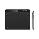
- Battery-Free Pen: StarG640 drawing tablet is the perfect replacement for a traditional mouse! The XPPen advanced Battery-free PN01 stylus does not require charging, allowing for constant uninterrupted Draw and Play, making lines flow quicker and smoother, enhancing overall performance
- Ideal for Online Education: XPPen G640 graphics tablet is designed for digital drawing, painting, sketching, E-signatures, online teaching, remote work, photo editing, it's compatible with Microsoft Office apps like Word, PowerPoint, OneNote, Zoom, Xsplit etc. Works perfect than a mouse, visually present your handwritten notes, signatures precisely
- Compact and Portable: The G640 art tablet is only 2 mm thick, it's as slim as all primary level graphic tablets, allowing you to carry it with you on the go
- Chromebook Supported: XPPen G640 digital drawing tablet is ready to work seamlessly with Chromebook devices now, so you can create information-rich content and collaborate with teachers and classmates on Google Jamboard’s whiteboard; Take notes quickly and conveniently with Google Keep, and effortlessly sketch diagrams with the Google Canvas
- Multipurpose Use: Designed for playing OSU! Game, digital drawing, painting, sketch, sign documents digitally, this writing tablet also compatible with Microsoft Office programs like Word, PowerPoint, OneNote and more. Create mind-maps, draw diagrams or take notes as replacement for mouse
The most flexible SVG element for this is <path>. A path describes a series of drawing commands in its d attribute, such as move commands, straight lines, curves, and arcs. For example, M moves the virtual pen, L draws a line, C draws a cubic Bézier curve, and Z closes the shape. Other elements such as <line>, <polyline>, <polygon>, <circle>, and <rect> can also be stroked and animated, but paths are commonly used because they can represent nearly any outline.
The stroke is drawn along the path, not inside it
When a browser renders a stroked SVG path, it follows the path’s mathematical centerline and paints outward on both sides based on stroke-width. This means a path with stroke-width="10" is not a 10-unit-wide object in the path data itself; it is a centerline with 5 units of paint on each side. This distinction matters when aligning animated lines to icons, maps, signatures, or charts, because the visual edge may extend beyond the coordinates in the d attribute.
Several stroke-related properties affect how the line appears while it is being drawn. stroke-linecap controls the ends of open strokes, with common values like butt, round, and square. A round line cap can make an animated stroke look smoother and more natural, especially for handwriting or route-tracing effects. stroke-linejoin controls corners where path segments meet, while stroke-miterlimit affects sharp joins. These properties do not create the animation by themselves, but they strongly influence the perceived quality of the reveal.
The Tool Desk
Outbyte PC Repair FREERepair Windows errors before they cause bigger problemsFix Now →Outbyte Driver Updater FREEFix the driver behind crashes, sound loss and screen glitchesFind Drivers →stroke: sets the color or paint used for the line.stroke-width: sets the thickness of the painted line.fill="none": prevents closed paths from being filled when only an outline is desired.stroke-linecap: controls the shape of the visible stroke ends.stroke-linejoin: controls how corners are rendered.
The drawing model also depends on the SVG coordinate system. The viewBox defines the internal coordinate space, while the rendered width and height determine how that space is scaled on screen. Stroke lengths are measured in SVG user units, not necessarily CSS pixels. If an SVG has viewBox="0 0 100 100" and is displayed at 500 pixels wide, a path length of 100 SVG units may appear as 500 screen pixels after scaling. This is normal, but it means path length calculations and visual size are related through the viewBox and layout.
For line animation, the browser treats the stroke as something that can be patterned along the path. A solid stroke is effectively an uninterrupted painted segment from start to end. By changing the stroke into a dash pattern and shifting that pattern along the path, you can hide and reveal different portions of the line. The geometry stays the same throughout the animation; only the way the stroke is painted along that geometry changes. That separation between path shape and stroke rendering is what makes SVG line animation efficient, precise, and easy to control.
How stroke-dasharray and stroke-dashoffset Create Line Animation
The classic “self-drawing” SVG effect is usually not drawing new geometry at all. The path already exists in the SVG; the animation simply changes how its stroke is displayed. Two stroke properties make this possible: stroke-dasharray, which defines the visible and hidden dash pattern along a stroke, and stroke-dashoffset, which shifts that pattern forward or backward along the path.
stroke-dasharray accepts one or more lengths. For example, a value of 10 5 means “paint 10 units of stroke, skip 5 units, then repeat.” If the path is 300 units long and you set stroke-dasharray: 300, the browser treats the dash as a painted segment 300 units long followed by a gap 300 units long. That gives you one dash large enough to cover the whole path, plus an equally large hidden section. The stroke can therefore be fully visible or fully hidden depending on where that dash pattern is positioned.
Quick wins for a faster PC:
Fix the driver behind crashes, sound loss and screen glitchesFind Drivers →Clear out junk files and repair common Windows errorsFree Scan →stroke-dashoffset controls that positioning. If the dash array is set to the full path length and the dash offset is also set to the full path length, the painted dash is pushed out of view, leaving the path hidden in the gap portion of the pattern. When the offset is animated down to 0, the painted dash slides back over the path, creating the illusion that the line is being drawn from start to finish.
The basic setup
- Measure the path length: find the total length of the path, often with JavaScript using
getTotalLength(). - Set the dash array: use that same length for
stroke-dasharrayso one dash can span the entire path. - Hide the stroke: set
stroke-dashoffsetto the path length so the visible dash is shifted away. - Animate the offset: transition or animate
stroke-dashoffsetfrom the path length to0.
For a path that is 742 units long, the initial stroke settings would typically be stroke-dasharray: 742; and stroke-dashoffset: 742;. During the animation, only stroke-dashoffset changes. At the beginning, the stroke appears invisible. Halfway through, about half of the stroke appears. At the end, the full stroke is visible because the dash starts at the beginning of the path again.
| State | stroke-dasharray | stroke-dashoffset | Visual result |
|---|---|---|---|
| Hidden | Path length | Path length | The visible dash is shifted off the path |
| Partially drawn | Path length | Half the path length | The stroke appears partway along the path |
| Fully drawn | Path length | 0 | The full stroke is visible |
The direction of the animation depends on the path’s own direction, which is determined by how the SVG path data was authored. A path may appear to draw left to right, right to left, clockwise, or counterclockwise. Reversing the path data reverses the visual drawing direction. Negative dash offsets can also shift the pattern in the opposite direction, but editing or regenerating the path is often cleaner when direction matters for icons, signatures, maps, or logo outlines.
This technique works best on stroked shapes with fill="none" or with the fill delayed until after the line animation finishes. If a filled shape is visible from the start, the viewer sees the completed silhouette immediately, which weakens the drawing illusion. Keeping the animation focused on the stroke first, then fading or enabling the fill afterward, produces a clearer and more polished result.
Rank #2

- Wacom Intuos Small Graphics Drawing Tablet: Enjoy industry leading tablet performance in superior control and precision with Wacom's EMR, battery free technology that feels like pen on paper
- Works With All Software: Wacom Intuos tablet can be used in any software program to explore new facets of digital creativity; draw, paint, edit photos/videos, create designs, and mark up documents
- What the Professionals Use: Wacom's industry leading pen technology and pen to paper feeling makes it the preferred drawing tablet of professional graphic designers
- Software and Training Included: Only Wacom gives you software with every purchase. Register your Intuos tablet and gain access to some of the best creative software and Wacom's online training
- Wacom is the Global Leader in Drawing Tablet and Displays: For over 40 years in pen display and tablet market, you can trust that Wacom to help you bring your vision, ideas and creativity to life
Animating SVG Lines with CSS
CSS is the simplest way to animate an SVG line when the effect can run automatically, such as on page load, hover, focus, or when a class is added by another part of the interface. The basic setup is to give the path a visible stroke, remove or neutralize the fill, set stroke-dasharray to the path length, and animate stroke-dashoffset from that same length down to 0. At the start, the dash is shifted completely out of view; by the end, the full stroke is visible, creating the appearance that the line has been drawn.
A typical SVG path prepared for CSS animation looks like this: the shape itself remains in the SVG markup, while presentation and motion live in CSS. This separation is useful because designers can edit stroke color, width, easing, duration, and repeat behavior without changing the geometry of the path. For icons, logos, signatures, route maps, and decorative dividers, CSS-only animation often provides enough control.
For example, if a path has a total length of 320, the CSS can use that value for both dash properties before animation begins:
.draw-path {

  fill: none;

  stroke: #2563eb;

  stroke-width: 4;

  stroke-linecap: round;

  stroke-linejoin: round;

  stroke-dasharray: 320;

  stroke-dashoffset: 320;

  animation: draw-line 1.6s ease-out forwards;

}
@keyframes draw-line {
to {
stroke-dashoffset: 0;
}
}
The forwards fill mode keeps the final state after the animation completes. Without it, the browser returns the path to its original dashed, hidden state when the animation ends. The easing function also changes the feel of the drawing: linear produces a constant drawing speed, ease-out starts quickly and settles into place, and a custom cubic-bezier() curve can make handwriting or logo reveals feel more natural.
Triggering the animation with states and classes
CSS animations can be attached directly to the path, but in production interfaces it is often cleaner to trigger them through a parent class or state selector. A path can remain hidden by default, then animate only when a component becomes active. This pattern works well for tab panels, scroll-triggered sections where JavaScript only adds a class, or interactive buttons.
.chart-line {

  fill: none;

  stroke: currentColor;

  stroke-width: 3;

  stroke-dasharray: 480;

  stroke-dashoffset: 480;

}
.is-visible .chart-line {
animation: draw-chart-line 1200ms ease-in-out forwards;
}
@keyframes draw-chart-line {
to {
stroke-dashoffset: 0;
}
}
Hover and focus states can also be used, especially for small icons. For accessible interactive elements, pair hover effects with :focus-visible so keyboard users receive the same visual feedback. If the animation should be reversible, use transition instead of animation: set the default stroke-dashoffset to the full length, then change it to 0 on hover, focus, or an active class.
- Use
animationfor one-way drawing effects that play from start to finish. - Use
transitionfor state-based effects that should draw and undraw smoothly. - Use
animation-delayto sequence multiple paths, such as drawing a logo letter by letter. - Use
currentColorwhen the SVG stroke should inherit the text color of its container.
When animating several paths, each path needs dash values that match its own length unless the SVG uses normalized path lengths. Different lengths animated over the same duration will appear to draw at different speeds. This can be desirable for a staggered logo reveal, but for diagrams and maps it is often better to adjust each duration so longer paths take more time and shorter paths finish sooner. CSS variables can make this easier by storing per-path length and duration values directly on each element.
Controlling Line Animation with JavaScript
CSS is ideal for simple “draw on load” effects, but JavaScript gives you control over when an SVG line animation starts, pauses, reverses, restarts, or responds to user input. The basic technique is the same: set the path’s stroke-dasharray and stroke-dashoffset to the path length, then animate stroke-dashoffset down to 0. JavaScript’s role is to measure the path, apply the starting values, and update the offset at the right moment.
Rank #3

- Word-first 16K Pressure Levels: The upgraded stylus features 16,384 levels of pressure sensitivity and supports up to 60 degrees of tilt, delivering smoother lines and shading for a natural drawing experience. With no battery or charging needed, it operates like a real pen, making it easy for beginners to create effortlessly. This functionality helps novice artists develop their skills and explore their creativity without the intimidation of complex tools
- Designed for Beginners: This drawing pad desinged with 8 customizable shortcuts for both right and left-hand users, express keys create a highly ergonomic and convenient work platform
- Perfectly Adapted for Android: The XPPen Deco 01 V3 art tablet supports connections with Android devices running version 10.0 and above. It is recommended to download the XPPen Tools Android application, which adapts to your smartphone's screen aspect ratio, ensuring accurate mapping. It also supports mapping on Android screens with different aspect ratios in portrait mode
- Large Drawing Space, Bigger Bold Inspiration: This expansive drawing pad has10 x 6.25-inch helps you break through the limit between shortcut keys and drawing area
- Easy Connectivity for Beginners: The Deco 01 V3 offers USB-C to USB-C connectivity, plus adapters for USB C. This ensures easy connection to various devices, allowing beginner artists to set up quickly and focus on their creativity without compatibility concerns. Whether using a laptop, tablet, or desktop, the Deco 01 V3 provides a seamless experience, making it an ideal choice for those just starting their digital art journey
A common setup uses getTotalLength(), which is available on SVG path-like elements such as <path>, <line>, <polyline>, and <polygon>. Once the length is known, the element can be hidden as a continuous dash pushed out of view. Triggering the animation can then be as simple as changing an inline style, adding a class, or using the Web Animations API.
Outdated Drivers Are Slowing You Down
One free scan finds every outdated or missing driver and matches the right update for your exact hardware.Free scan · exact hardware matchWindows Errors? Fix Them Before They Spread
Repair common Windows errors and clear accumulated junk for a smoother, more stable PC - no reinstall needed.Free scan · no reinstallBasic JavaScript pattern
For a single path, the workflow is straightforward: select the element, measure it, initialize the dash values, force the browser to apply those starting styles, then animate toward zero. This approach keeps the visual in SVG stroke properties while using JavaScript for control.
const path = document.querySelector('.draw-path');

const length = path.getTotalLength();
path.style.strokeDasharray = length;
path.style.strokeDashoffset = length;
path.getBoundingClientRect();
path.style.transition = 'stroke-dashoffset 1200ms ease';
path.style.strokeDashoffset = '0';
The getBoundingClientRect() call forces a layout read, ensuring the browser registers the initial hidden state before the transition begins. Without that step, some browsers may batch the style changes together and skip directly to the final state. An alternative is to set the initial state in CSS and only use JavaScript to add an active class.
Free tools Windows power users keep installed
One-click scans. No signup required.
Using the Web Animations API
The Web Animations API is useful when you need timeline control without manually managing CSS classes. It returns an animation object that can be paused, played, reversed, or connected to other interface events.
const path = document.querySelector('.draw-path');

const length = path.getTotalLength();
path.style.strokeDasharray = length;
path.style.strokeDashoffset = length;
const animation = path.animate(
[
{ strokeDashoffset: length },
{ strokeDashoffset: 0 }
],
{
duration: 1200,
easing: 'ease-in-out',
fill: 'forwards'
}
);
This method works well for interactive diagrams, onboarding illustrations, maps, signatures, and progress-style line drawings. For example, you can start the animation when an element enters the viewport with IntersectionObserver, replay it on a button click, or synchronize mulle paths by assigning different delays.
- Viewport trigger: start drawing only when the SVG scrolls into view.
- Sequential paths: animate one path after another using delays or animation promises.
- Scrubbed animation: map scroll progress to
stroke-dashoffsetfor a controlled reveal. - User interaction: play, pause, reverse, or reset the line on clicks, hovers, or form progress.
For mulle paths, measure each element independently instead of assuming they share the same length. Two paths may look similar on screen but have very different geometric lengths. A practical pattern is to loop over all drawable paths, store each length in a CSS custom property or dataset value, and then animate each one with its own duration or delay. This keeps timing predictable and avoids one short segment racing ahead while a longer segment lags behind.
JavaScript control also makes it easier to respect accessibility preferences. If prefers-reduced-motion is enabled, skip the drawing transition and set stroke-dashoffset directly to 0. That preserves the final artwork without forcing users to watch motion. For performance, measure paths once after the SVG has loaded, avoid repeatedly calling getTotalLength() during scrolling, and update only the stroke offset rather than altering complex path data frame by frame.
Rank #4

- Large Active Drawing Space: UGEE M708 V3 graphic drawing tablet features 10 x 6 inch large active drawing space with papery texture surface, provides enormous and smooth drawing for your digital artwork creation, offers no-lag sketch and painting experience
- 16384 Passive Stylus Technology: A more affordable passive stylus technology offers 16384 levels of pressure sensitivity allows you to draw accurate lines of any weight and opacity according to the pressure you apply to the pen, sharper line with light pressure and thick line with hard pressure for artistry design or unique brush effect for photo retouching
- Compatible with Multiple System and Softwares: Powerful compatibility, tablet for drawing computer, perform well with Windows 11/10/8/7, Mac OS X 10.10 or later, Android 10.0 or later, mac OS 10.12 or later, Chrome OS 88 or later and Linux; Driver program works with creative software such as Photoshop, Illustrator, Macromedia Flash, Comic Studio, SAI, Infinite Stratos, 3D MAX, Autodesk MAYA, Pixologic ZBrush and more
- Ergonomically Designed Shortcuts: 8 customizable express keys on the side for short cuts like eraser, zoom in and out, scrolling and undo, provide a lot more for convenience and helps to improve the productivity and efficiency when creating with the drawing tablet
- Easy Connectivity for Beginners: The UGEE M708 V3 offers USB to USB-C connectivity, plus adapters for USB C, ensuring easy connection to various devices and allowing beginner artists to set up quickly and focus on their creativity without compatibility concerns; Whether using a laptop, desktop, chromebook, or tablet, the UGEE M708 V3 provides a seamless experience for those just starting their digital art journey
Measuring Path Length and Timing the Effect
Accurate SVG line animation usually starts with knowing the length of the path being animated. The common pattern is to set stroke-dasharray and stroke-dashoffset to the full path length, then animate stroke-dashoffset down to 0. When those values match the real length of the path, the stroke appears to draw from start to finish cleanly, without an early reveal, a visible gap, or a sudden jump at the end.
In JavaScript, SVG path-like elements expose a built-in measurement method: getTotalLength(). It works on elements such as <path>, <line>, <polyline>, <polygon>, <circle>, <ellipse>, and <rect> in modern browsers. For a path, you can measure it once after the SVG is in the document, apply the dash values, then trigger the transition or animation.
Recommended Free Tools
const path = document.querySelector('svg path');

const length = path.getTotalLength();
path.style.strokeDasharray = length;
path.style.strokeDashoffset = length;
requestAnimationFrame(() => {
path.style.transition = 'stroke-dashoffset 1.6s ease-in-out';
path.style.strokeDashoffset = '0';
});
Timing should match both the visual length and the role of the animation in the interface. A short icon checkmark may feel responsive at 300ms to 600ms, while a detailed illustration path may need 1500ms to 3000ms. If mulle paths are involved, avoid giving every path the same duration blindly. A 40-pixel segment and an 800-pixel curve will appear to draw at very different speeds if they share the same duration.
Keeping drawing speed consistent
For multi-path artwork, a practical approach is to calculate duration from path length. This keeps the apparent drawing speed similar across strokes. For example, choose a drawing speed such as 500 SVG units per second, then divide each path’s length by that speed to get its duration. You can still clamp the result so tiny details do not flash too quickly and long paths do not drag on.
What’s actually slowing this PC down?
Pick the symptom - the matching free tool is one click away.
- Measure each path: use
getTotalLength()for every animated stroke. - Set dash values from that length: assign the measured length to both
stroke-dasharrayand the initialstroke-dashoffset. - Calculate duration: use a consistent units-per-second value for similar drawing speed.
- Add delays intentionally: stagger paths when you want the viewer to follow the drawing sequence.
const speed = 500; // SVG units per second
document.querySelectorAll('.draw-path').forEach((path, index) => {
const length = path.getTotalLength();
const duration = Math.min(Math.max(length / speed, 0.4), 3);
path.style.strokeDasharray = length;
path.style.strokeDashoffset = length;
path.style.transition =
`stroke-dashoffset ${duration}s ease ${index * 0.15}s`;
});
CSS variables are useful when combining JavaScript measurement with CSS animation rules. JavaScript can calculate the path length and store it in a custom property, while CSS remains responsible for the animation style. This keeps the animation easier to adjust and avoids scattering timing details across many inline declarations.
.draw-path {

  stroke-dasharray: var(--path-length);

  stroke-dashoffset: var(--path-length);

  animation: draw var(--draw-duration, 1.2s) ease forwards;

}
@keyframes draw {
to {
stroke-dashoffset: 0;
}
}
When timing the effect, also consider the easing curve. linear produces a mechanical, constant drawing speed, which works well for technical diagrams and loaders. ease or ease-in-out feels more polished for logos and decorative illustrations, but it means the stroke slows down or speeds up during the reveal. For sequential animations, delays should account for the easing so the next path does not begin too early or leave an awkward pause.
Measurements should run after the SVG exists in the DOM and after any path data has been finalized. If you modify the d attribute, scale paths through generated markup, or swap symbols with <use>, remeasure before starting the animation. For responsive SVGs using viewBox, path length is measured in SVG user units, not screen pixels, so resizing the SVG usually does not require recalculating lengths unless the geometry itself changes.
Best Value

- Advanced PenTech 3.0: Upgraded from PenTech 2.0 to PenTech 3.0, Inspiroy 2 drawing pad offers amazing precision & control over every line with no noticeable lag & wobble, just like a standard pen
- Ergonomics Pen Design: The new digital stylus PW110 is improved designed with slimmer body, soft silicone grip & accessible side buttons for better ergonomics & comfort
- Programmable Scroll & 3-Set Shortcut Keys: The digital art tablet with unique scroll wheel & 3-Set 8-press keys can be customized to your favorite shortcut so that your creative work becomes smoother and more efficient. You also can change the settings for different apps
- Mobile Friendly: Enjoy creating on your Inspiroy 2 drawing tablet for pc and see your drawings and paintings come to life on your Android smartphone or tablet (OS version 6.0 or later)
- Multi-OS Compatibility: Inspiroy 2 digital drawing pad is compatible with Mac (MacOS 10.12 or later), PC (Windows 7 or later), Linux(Ubuntu), and certain Android devices (OS version 6.0 or later)
Common Pitfalls and Performance Tips
SVG line animation is usually lightweight, but small setup mistakes can make the effect look broken or feel inconsistent. The most common issue is a mismatch between the actual path length and the values used for stroke-dasharray and stroke-dashoffset. If the dash values are too short, part of the line may remain visible before the animation starts. If they are too long, the drawing may appear delayed because the visible stroke does not enter the path immediately.
Another frequent problem is animating shapes that are not paths without considering how their stroke length is calculated. Elements such as <circle>, <rect>, <line>, and <polyline> can be animated with the same stroke properties, but their lengths may need to be measured differently or converted to paths for predictable control. Browser support for getTotalLength() is strongest and most familiar on path-like geometry, so converting complex artwork into clean <path> elements often makes animation easier to manage.
Common issues to check
- Visible stroke at the start: Set both
stroke-dasharrayand the initialstroke-dashoffsetto the full path length. - Animation runs backward: Reverse the path direction in your vector editor, or animate the dash offset in the opposite direction.
- Line appears clipped: Check the SVG
viewBox, parent container overflow, and whether thick strokes extend beyond the visible bounds. - Uneven speed: A single duration across paths of very different lengths can make short paths draw slowly and long paths draw too quickly.
- Jagged curves: Simplify excessive anchor points and avoid exporting overly complex paths from design tools.
For performance, prefer animating stroke properties rather than repeatedly changing path geometry. Updating the d attribute every frame is usually more expensive because the browser must recalculate the shape. A dash-offset animation lets the browser keep the path geometry stable while only changing how the stroke is rendered. CSS transitions and keyframes are often enough for simple effects, while JavaScript is better reserved for sequencing, scroll-driven progress, interaction, or dynamic duration calculation.
The Tool Desk
Outbyte PC Repair FREEClear out junk files and repair common Windows errorsFree Scan →Outbyte Driver Updater FREEScan for outdated or missing drivers - takes under a minuteDriver Scan →When animating many paths at once, avoid measuring every path repeatedly during scroll or resize events. Cache each result from getTotalLength() after the SVG loads, then reuse it. If the SVG is responsive and its coordinate system is stable through a proper viewBox, the path length usually remains usable across layout sizes. For scroll-linked animation, throttle updates with requestAnimationFrame so style changes are grouped with the browser’s paint cycle.
Practical performance guidelines
- Keep exported SVGs clean by removing hidden layers, unused groups, and unnecessary metadata.
- Use
vector-effect="non-scaling-stroke"when responsive scaling should not change perceived stroke thickness. - Limit simultaneous animations in large illustrations; stagger paths for a smoother visual rhythm and less rendering pressure.
- Test on mobile devices, especially when using filters, masks, gradients, or very thick strokes.
- Add a reduced-motion alternative with
@media (prefers-reduced-motion: reduce)so users can see the final artwork without motion.
Finally, make sure the animated state and final state are both intentional. A line animation should usually end with stroke-dashoffset at 0, leaving the complete stroke visible. If the SVG is decorative, it can be hidden from assistive technologies with aria-hidden="true". If it communicates information, provide an accessible label or nearby text so the meaning does not depend on animation alone.
Frequently Asked Questions
Do I need to know the exact length of an SVG path before animating it?
You usually need the path length so you can set stroke-dasharray and stroke-dashoffset to values that fully hide and then reveal the stroke. In JavaScript, you can get it with getTotalLength() on a path element. A common workflow is to measure the path, set both dash values to that length, then animate stroke-dashoffset back to 0.
Can I animate SVG lines using only CSS?
Yes, CSS is enough for many line-drawing effects. You can define stroke-dasharray and stroke-dashoffset on the SVG path, then use a keyframes animation to change stroke-dashoffset over time. JavaScript becomes useful when path lengths vary, animations need to respond to scrolling, or timing must be calculated dynamically.
What’s actually slowing this PC down?
Pick the symptom - the matching free tool is one click away.
Does this technique work on shapes like circles, rectangles, and polygons?
Yes, the same stroke-dasharray and stroke-dashoffset technique works on most stroked SVG shapes, including circles, rectangles, lines, polylines, and polygons. For consistent control, many developers convert shapes to paths or measure each element with JavaScript. The animation only affects the stroke, so the element needs a visible stroke and usually no fill for a clean drawn-line effect.
How do I make multiple SVG paths draw in sequence?
You can stagger the animation-delay for each path in CSS, or use JavaScript to start each animation after the previous one finishes. If the paths have different lengths, calculate each duration based on its length so short and long paths draw at a similar visual speed. This prevents small details from dragging on while longer outlines finish too quickly.
What should I check if my SVG line animation is not visible?
First confirm the element has a stroke color, a stroke width, and that the stroke is not hidden by fill or clipping. Then check that stroke-dasharray and stroke-dashoffset are large enough to cover the full path length at the start of the animation. Also make sure the CSS selector targets the actual path or shape element, not only the parent svg.
Bottom Line
SVG line animation works by turning a path’s stroke into a controllable dash pattern, then shifting that pattern with stroke-dashoffset so the line appears to draw itself over time. Once you understand path length, dash values, timing, and easing, the effect becomes predictable rather than mysterious.
Start with a simple path, measure its length, set matching stroke-dasharray and stroke-dashoffset values, then animate the offset with CSS or JavaScript. From there, refine the speed, sequencing, and performance details to make the animation feel intentional and polished.
Quick Recap
Product prices and availability are accurate as of the date/time indicated and are subject to change. Any price and availability information displayed on Amazon at the time of purchase will apply.




