The Tool Desk
Outbyte PC Repair FREEClear out junk files and repair common Windows errorsFree Scan →Outbyte Driver Updater FREEScan for outdated or missing drivers - takes under a minuteDriver Scan →Images can make up a substantial share of a page’s transferred bytes, but fixing image-related slowdowns is not as simple as converting every file or lazy-loading every image. Serve an image sized for its actual layout and device, choose a format and quality that suit its content, reserve space for it, and make important above-the-fold images discoverable early.
1. Uploading images much larger than their display slot
A source image that is far wider or taller than its rendered space can send unnecessary bytes to a visitor’s browser. But the CSS width alone does not determine the right source: a high-density display may need more image pixels to look sharp. The browser’s choice should account for both the layout slot and device pixel ratio (DPR). web.dev’s responsive images guidance explains how srcset and sizes let the browser select an appropriate candidate.
As an Amazon Associate I earn from qualifying purchases.
Generate a reasonable set of image widths for the places an image appears, then provide them as width-descriptor candidates. Set sizes to describe how wide the image is expected to render at relevant viewport widths; it is a description of the layout, not a command to resize the image.
<img
  src="/images/article-800.jpg"
  srcset="/images/article-400.jpg 400w,
          /images/article-800.jpg 800w,
          /images/article-1200.jpg 1200w"
  sizes="(max-width: 700px) 100vw, 700px"
  width="1200"
  height="800"
  alt="A sample image">
Here, the image is expected to use the full viewport width up to 700 CSS pixels and a 700-pixel slot on wider screens. Change that description to match your actual columns, gutters, and breakpoints. If it overstates the slot, the browser may choose a larger file than needed; if it understates it, the chosen image may look soft.
#1 Best Overall

- USB-C 2-in-1 storage OTG: The Lexar JumpDrive Dual Drive D40E features USB Type-A and Type-C connectors in a slim, portable form factor for easy device compatibility
- Transfer speeds up to 100MB/s: Based on internal testing, performance may vary depending upon the host device, interface, and usage conditions. 1MB=1,000,000 bytes
- Plug and Play: Widely compatible with USB Type-C smartphones, tablets, laptops, Macs, and traditional Type-A devices, no software installation required. The 360° swivel design allows for easy switching between connectors without the hassle of losing a cap
- Durable & Compact: The Lexar D40E USB memory stick features a metal enclosure, withstands temperatures from 0° to 50° C (32°F to 122°F), and is lightweight at 26g with dimensions of 70.4 x 16.9 x 11.7mm
- Security & Warranty: Securely protects files using an advanced security software solution with 256-bit AES encryption. Backed by a Lexar 3-year limited warranty
Check the result at more than one size
- Inspect representative narrow and wide viewport widths.
- Check a standard-density display and a high-DPR device or emulation.
- Confirm the selected candidate is appropriate for the rendered slot and remains acceptably sharp.
Do not make every source file the same dimensions, and do not assume a small CSS-rendered image can always use the smallest source candidate.
2. Treating modern formats as automatic wins
WebP and AVIF can produce smaller files than older formats, but no format wins for every image. Results depend on image content, resolution, quality settings, transparency or animation needs, and browser support. A setting that saves bytes on a photograph may not preserve the detail needed in a diagram or text-heavy graphic. web.dev’s image guidance covers format and delivery trade-offs.
Compare representative assets at a visual quality you consider acceptable. Check the encoded byte size as well as the rendered result, and preserve the required behavior for transparency or animation. If you serve a newer format, make sure your delivery approach accounts for the browsers your audience uses; do not assume every visitor can use every format.
Do these 3 things before closing this tab:
1Clear out junk files and repair common Windows errors2Scan for outdated or missing drivers - takes under a minute3Repair Windows errors before they cause bigger problemsRank #2
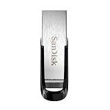
- High-speed USB 3.0 performance of up to 150MB/s(1) [(1) Write to drive up to 15x faster than standard USB 2.0 drives (4MB/s); varies by drive capacity. Up to 150MB/s read speed. USB 3.0 port required. Based on internal testing; performance may be lower depending on host device, usage conditions, and other factors; 1MB=1,000,000 bytes]
- Transfer a full-length movie in less than 30 seconds(2) [(2) Based on 1.2GB MPEG-4 video transfer with USB 3.0 host device. Results may vary based on host device, file attributes and other factors]
- Transfer to drive up to 15 times faster than standard USB 2.0 drives(1)
- Sleek, durable metal casing
- Easy-to-use password protection for your private files(3) [(3)Password protection uses 128-bit AES encryption and is supported by Windows 7, Windows 8, Windows 10, and Mac OS X v10.9 plus; Software download required for Mac, visit the SanDisk SecureAccess support page]
Avoid converting an entire library without checking the result. There is no guaranteed percentage reduction that applies to every site or image.
3. Leaving out intrinsic image dimensions
If the browser does not know an image’s proportions before it loads, it may not reserve enough space for it. When the image arrives, surrounding text and elements can move. That visible movement can be avoided by specifying its intrinsic width and height. As the web.dev Responsive images page puts it: “If you know an image’s dimensions, always include width and height attributes.”
<img src="/images/article.jpg" width="1200" height="800" alt="A sample image">Those attributes communicate the image’s proportions so the browser can reserve aspect-ratio space; they do not prevent responsive CSS from scaling it. For example:
Rank #3

- What You Get - 2 pack 64GB genuine USB 2.0 flash drives, 12-month warranty and lifetime friendly customer service
- Great for All Ages and Purposes – the thumb drives are suitable for storing digital data for school, business or daily usage. Apply to data storage of music, photos, movies and other files
- Easy to Use - Plug and play USB memory stick, no need to install any software. Support Windows 7 / 8 / 10 / Vista / XP / Unix / 2000 / ME / NT Linux and Mac OS, compatible with USB 2.0 and 1.1 ports
- Convenient Design - 360°metal swivel cap with matt surface and ring designed zip drive can protect USB connector, avoid to leave your fingerprint and easily attach to your key chain to avoid from losing and for easy carrying
- Brand Yourself - Brand the flash drive with your company's name and provide company's overview, policies, etc. to the newly joined employees or your customers
img {
  max-width: 100%;
  height: auto;
}
Keep the HTML dimensions consistent with the source image’s intrinsic ratio. If the displayed image is cropped, use the appropriate layout and cropping rules rather than declaring a misleading ratio.
4. Lazy-loading every image, including the hero
Lazy loading can avoid fetching images far down a page before a visitor needs them. Applying it indiscriminately to the hero or another image visible immediately can delay the image most important to the initial view and to Largest Contentful Paint (LCP). web.dev’s LCP guidance and its responsive image guidance explain why the likely LCP image should not be delayed by lazy-loading.
Use loading="lazy" for appropriate below-the-fold images. Leave the hero image eager by default, or override a site-wide rule that would otherwise lazy-load it:
Rank #4

- GOOD VALUE PACKAGE - 1 Pack 32GB Memory Stick USB 2.0 Flash Drives with great cost performance and high quality.
- BIG CAPACITY - The available capacity: 29.10GB-29.8GB, You can save the data of movies, music, photos, designs, programs, manuals, handouts in a high speed.Good performance in digital data storing, transferring and sharing with families, friends, workmates, clients and machines.
- EASY TO USE & PLUG AND WORK - Support windows 7 / 8 / 10 / Vista / XP / 2000 / ME / NT Linux and Mac OS, Compatible with USB2.0 and below.
- TWISTTURN DESIGN & EASY CARRY - The metal clip rotates 360° round the ABS plastic body which with rubber oil skin feeling finish. The capless design can avoid lossing of cap, and providing efficient protection to the USB port.
- WARRANTY & SUPPORT - SIMMAX logo is laser printed on the USB connector surface, our products are of good quality and we promise that any problem about the product within one year since you buy.
<!-- Important image near the top of the page -->
<img src="/images/hero.jpg" width="1600" height="900" alt="...">

<!-- Image farther down the page -->
<img src="/images/lower-section.jpg" width="1200" height="800" loading="lazy" alt="...">
Do not add fetchpriority="high" to every image. Reserve it for an image that is genuinely important to early rendering, and confirm its loading behavior in a waterfall rather than adding priority hints by default.
5. Making the important image hard for the browser to discover
An image referenced in the initial HTML through src or srcset can generally be discovered earlier than one that is added only after JavaScript runs or referenced only as a CSS background. Late discovery can delay the request for an important image.
Quick wins for a faster PC:
Clear out junk files and repair common Windows errorsFree Scan →Fix the driver behind crashes, sound loss and screen glitchesFind Drivers →Repair Windows errors before they cause bigger problemsFix Now →When the important visual is a CSS background and cannot reasonably be moved into the markup, preloading may help the browser discover it earlier. But preload and high-priority hints are not universal fixes: they can compete with other resources. Check the page’s request waterfall and priority information before adding them. The web.dev LCP article discusses discovery and prioritization of the LCP resource.
Best Value

- 【16GB Flash Drive】USB flash drives with 16GB capacity, meet your needs of daily use on work, school, home and travelling for photos, music, videos, files storage and transfer. IMEASON thumb drives can be used to store different files, easy to data backup.
- 【Metal Swivel Cap Design】USB thumb drive is metal swivel cover provides extra protection for the usb thumbdrive connector, no usb drive cap to lose; keychain design makes it easier to carry without worrying lose it.
- 【Wide Compatibility】USB drive supports Windows 7/8/10/11 / Vista / XP / Unix / 2000 / ME / NT Linux and Mac OS, also Supports USB 2.0 and 1.1 ports. USB Stick support TV, desktop, notebook computer, car, audio and other device. The USB Memory Stick is your great data storage and transfer companion with traveling and working.
- 【Easy to use】usb memory stick is plug and play without any software installation. Just simply plug the Flashdrive into the port of your USB-compatible devices such as computer, laptop to start data storage or transmission.
- 【What You Get】16 GB USB Flash Drive Thumb Drive, The default format of the usb storage flash drive is FAT32.
6. Giving srcset an inaccurate sizes value
A width-descriptor srcset tells the browser which intrinsic image widths are available. The accompanying sizes attribute describes the expected rendered width. If the description does not match the real layout, the browser may download a candidate that is unnecessarily large or one that looks too soft.
Base sizes on actual breakpoints and column widths. For a two-column desktop layout, for example, the image slot may be substantially narrower than the viewport; using 100vw at every width would overstate the slot. Conversely, describing a slot as narrower than it is can lead to an undersized candidate. Verify the selected resource at representative viewport sizes and DPRs rather than assuming the browser will compensate for an inaccurate layout description.
7. Checking bytes, quality, layout, and loading together
Image optimization is a set of interacting decisions, not a single switch. The best candidate depends on the rendered slot and device density; the best format and quality depend on the content; and the loading strategy depends on whether the image is needed early or farther down the page. The operational cost matters too: generating many size and format variants can add pipeline, caching, and maintenance work. The web.dev guidance discusses these responsive sizing and delivery trade-offs in its responsive images material and image learning resources.
Recommended Free Tools
Use a repeatable review for representative pages:
- Identify the image’s role. Determine whether it is likely to be visible immediately, part of the LCP element, or below the fold.
- Measure its actual slot. Check the rendered width at the page’s real breakpoints and account for high-DPR displays.
- Compare candidates. Inspect encoded bytes and visual quality for representative image types, including transparency or animation where relevant.
- Check discovery and priority. Review whether the important image is available in initial HTML and whether the browser requests it promptly.
- Check layout movement. Confirm dimensions reserve the correct proportions before images load.
- Recheck the page after changes. Use browser developer tools and lab and field performance tools where available; one screenshot or one lab run does not establish how all users experience the page.
The reviewed web.dev material recommends checking resource priority and using lab and field tools, but it does not establish a universal speed gain or a current named statistic for the impact of image optimization. Google’s separate image optimization page identifies itself as written for the deprecated PageSpeed Insights API v4, so its historical figures should not be treated as current measurements.
Troubleshooting common image-related problems
| Symptom | Likely cause | What to check or change |
|---|---|---|
| The image looks soft on a high-density display. | The browser may be receiving a candidate that is too small for the rendered slot and DPR, or sizes may understate the slot. |
Check the selected srcset candidate, rendered width, DPR, and sizes description. Provide appropriate larger variants where needed. |
| A small card image transfers a large file. | The source candidate may be much larger than its layout slot, or sizes may overstate the expected width. |
Inspect the selected resource and align sizes with the card’s actual width at each breakpoint. |
| Text shifts when an image appears. | The browser may not have enough information to reserve the image’s aspect-ratio space. | Supply correct intrinsic width and height values and check that the layout preserves the intended ratio. |
| The hero image appears late. | It may be lazy-loaded, discovered only after JavaScript runs, or referenced only through CSS. | Make it discoverable early in HTML where practical, avoid lazy-loading it, and inspect request priority. Consider preload for a CSS background only if the waterfall supports that choice. |
| A newer image format is smaller but looks worse or fails for some visitors. | The quality setting or format may not suit the content, or delivery may not account for browser support. | Compare visual quality and bytes across representative assets; preserve transparency or animation needs and provide an appropriate browser-compatible delivery strategy. |
Or skip the browser setup
If you need a clean capture to inspect how a page looks after image changes, ScreenshotNeo can return a screenshot from one GET request. A screenshot can help you check visual output, but it does not measure page speed or replace performance tools.
Install no browser automation for this call; create an API key and replace YOUR_API_KEY:
Quick Recap
curl -G "https://api.screenshotneo.com/v1/shot" -d access_key=YOUR_API_KEY --data-urlencode url=https://stripe.com -o shot.webpSee the ScreenshotNeo documentation for request options. Cookie banners, popups, and chat widgets are removed before the shot; bot checks, blank pages, and failed loads are never billed. Its MCP server lets AI agents take screenshots. The free plan includes 1,000 screenshots a month with no card, and paid plans start at $5 for 3,000. Sign up for 1,000 free screenshots a month, with no card required.
Free tools Windows power users keep installed
One-click scans. No signup required.
Product prices and availability are accurate as of the date/time indicated and are subject to change. Any price and availability information displayed on Amazon at the time of purchase will apply.




