Quick wins for a faster PC:
Clear out junk files and repair common Windows errorsFree Scan →Fix the driver behind crashes, sound loss and screen glitchesFind Drivers →Repair Windows errors before they cause bigger problemsFix Now →If Puppeteer produces a phone-shaped layout when you expected desktop, the screenshot settings are usually not the problem. The page was rendered with a mobile viewport, device emulation, a mobile user agent, or a connection-level default that survived from earlier code. Inspect those values, set the intended desktop viewport and user agent before navigation, then capture the page. Options such as fullPage and clip change how much you capture, not whether the site uses its mobile layout.
What makes a Puppeteer screenshot look mobile?
Responsive sites choose their layout from the browser conditions they see. In Puppeteer, the conditions most likely to select the phone layout are:
- A narrow width or height in
page.setViewport(). isMobile: true, which makes the document’s<meta name="viewport">tag take effect.hasTouch: true, which can make a site treat the browser as touch-capable.page.emulate(device), which applies a device’s viewport and user-agent together.- A mobile user-agent string set separately with
page.setUserAgent(). - A
defaultViewportsupplied when connecting to an existing browser.
The viewport API uses CSS pixels. Its documented defaults include deviceScaleFactor: 1 and isMobile: false. A screenshot can therefore be high resolution and still have a mobile layout if its CSS viewport is narrow or mobile emulation is enabled.
Diagnose the active configuration before changing code
Print Puppeteer’s viewport settings
Run this immediately before navigation. It reports Puppeteer’s configured viewport, not an independent measurement taken from the rendered page.
#1 Best Overall
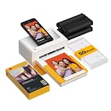
- Dock Photo Printer: The KODAK Dock Plus is a home photo printer that produces high-quality 4x6” prints directly from compatible smartphones. Featuring an integrated docking station, users can place their phone on the printer for better connection while simultaneously charging the device during printing.
- Genuine 4PASS dye sublimation printing: Each photo is produced in three color layers and finished with a clear protective lamination layer. In approximately 55 seconds, you receive a smooth, detailed print designed to resist fingerprints, water, and fading for long-lasting quality.
- Easy to Use: Print photos quickly without complicated setup or technical steps. Simply power on, connect wireless bluetooth, and start printing within seconds. The Dock Plus is built for straightforward operation, making it ideal for first time users and everyday photo printing.
- Home Printing Station: Designed for stable desktop use, this dock photo printer connects to a power outlet for consistent performance and larger 4x6” prints. Ideal for home printing, photo albums, framing, family events, and everyday picture printing.
- KODAK Photo Printer APP: Featuring integrated Bluetooth connectivity, this portable printer connects to compatible iOS and Android devices through the KODAK Photo Printer app. Edit, crop, and customize your photos before printing for creative results.
const viewport = page.viewport();
console.log(viewport);

// Typical fields:
// { width, height, deviceScaleFactor, isMobile, hasTouch, isLandscape }
Look for a width intended for a phone, isMobile: true, or hasTouch: true. A viewport of 800 by 600 is the documented default when a browser connection’s defaultViewport is not overridden, but your launch or connection code may replace it.
Inspect every place that can set a viewport
puppeteer.launch({ defaultViewport: ... })or equivalent launch configuration.puppeteer.connect({ defaultViewport: ... }). The connection option applies that viewport to each page.- Every
page.setViewport()call, including helpers imported from another module. - Every
page.emulate(...)call. It changes both viewport metrics and user agent. - Test fixtures or shared setup that runs before your test.
Do not assume the last line you remember is the last line that ran. Log the viewport after all setup helpers have completed and before page.goto().
Check for device presets and user-agent overrides
A device preset is convenient for intentional mobile testing but easy to leave enabled accidentally:
const iPhone = puppeteer.KnownDevices['iPhone 13'];
await page.emulate(iPhone);
That shortcut applies the preset’s viewport and user agent. A separate page.setUserAgent() call can also make server-side code return mobile markup even when the width appears desktop. Compare the user agent, viewport width and height, isMobile, and hasTouch as one set of values.
Recommended Free Tools
Fix an unintended mobile layout
Set a desktop viewport explicitly
Use CSS-pixel dimensions that match the desktop scenario you are testing, and explicitly disable mobile behavior:
import puppeteer from 'puppeteer';

const browser = await puppeteer.launch();
const page = await browser.newPage();

await page.setViewport({
  width: 1440,
  height: 900,
  deviceScaleFactor: 1,
  isMobile: false,
  hasTouch: false,
  isLandscape: true
});

await page.goto('https://example.com', { waitUntil: 'networkidle2' });
await page.screenshot({ path: 'desktop.png', fullPage: true });
await browser.close();
The important sequence is configuration first, navigation second, capture third. Many sites do not expect a phone to change size after loading. Puppeteer’s Page API therefore advises applying emulation before navigation; changing isMobile or hasTouch can also cause a reload in some circumstances.
Rank #2
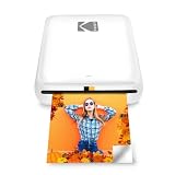
- STEP UP YOUR PRINTING GAME. KODAK Step Printer Connects to Any iOS or Android Device [Via Bluetooth or NFC] Turn Your Selfies, Portraits, Social Media Posts Into Physical Photos.Package Includes : KODAK STEP Instant Mobile Photo Printer, Micro USB Charging Cable, Starter Pack of KODAK ZINK Photo Paper, Quick Start Guide, Limited Warranty
- AMAZING ZERO-INK TECHNOLOGY. ZINK 2” x 3” Sticky-Back Paper with Embedded Dye Crystals Delivers High-Quality, Durable, Affordable, Beautifully Detailed Prints That are Resistant to Moisture, Rips, Tears & Smudges.
- FULL EDITING SUITE VIA APP. Download the KODAK App to Create Collages & Customize Your Snaps with Stunning Filters, Interesting Borders, Cool Stickers, Funny Text & Other Personalized Flair.
- TAKE YOUR PROJECTS TO GO. Our Palm-Sized Printer Weighs Less Than a Pound, Sets Up Fast & Delivers Gorgeous Prints You Can Peel & Stick Everywhere.
- CUTE, COMPACT & COLORFUL. Step Printer is Designed for Photo-Loving Influencers & Crafters of All Ages & Skill Levels! Portable, Lightweight Device Features Built-In Lithium-Ion Rechargeable Battery [Prints 25 Photo on a Full Charge]
Remove an accidental custom viewport
If you do not need a specific viewport, reset it:
await page.setViewport(null);That returns the page to Puppeteer’s default viewport behavior. For reproducible screenshots, an explicit width and height are safer than relying on a default that may differ between launch and connection code.
Undo a device emulation call
Delete or conditionally bypass page.emulate(device) in desktop runs. If the same test supports both modes, keep the branches explicit:
Do these 3 things before closing this tab:
1Repair Windows errors before they cause bigger problems2Fix the driver behind crashes, sound loss and screen glitches3Clear out junk files and repair common Windows errorsif (mobile) {
await page.emulate(puppeteer.KnownDevices['Pixel 7']);
} else {
await page.setViewport({
width: 1440,
height: 900,
deviceScaleFactor: 1,
isMobile: false,
hasTouch: false,
isLandscape: true
});
}
await page.goto(url, { waitUntil: 'networkidle2' });Do not emulate a device and then attempt to correct only the width. The emulation may have also changed the user agent, touch capability, orientation, and mobile viewport behavior.
Separate layout settings from screenshot extent
These capture options are often blamed for a mobile-looking result, but they control the region captured:
| Option | Documented behavior | What it does not do |
|---|---|---|
fullPage |
Defaults to false; captures the full scrollable page when set to true. |
It does not switch desktop and mobile CSS. |
clip |
Captures a specified rectangle. | It does not make a narrow viewport behave like a phone by itself. |
captureBeyondViewport |
Defaults to false when there is no clip and true when a clip is supplied. |
It changes capture extent, not responsive breakpoints. |
A desktop page can be clipped to a small rectangle, and a mobile page can be captured full-page. Compare the viewport and emulation values first; inspect extent options only after the layout is correct.
Use a repeatable desktop capture script
This complete example logs the effective configuration, sets it before navigation, waits for the page, and captures a full page:
What’s actually slowing this PC down?
Pick the symptom - the matching free tool is one click away.
Rank #3

- User-Friendly Portable Photo Printer for iPhone, Android & PC - Get beautiful and colourful memories with Liene 4x6 photo printer! After opening the entire package, you can find one cartridge + 20 sheets of photo paper (placed inside the machine packaging), as well as an additional box containing 80 sheets of photo paper (which includes two cartridges + 80 sheets of photo paper). Full package includes smartphone photo printer, Liene 4x6 photo printer papers (100 sheets), 3 colour cartridges, and fully sealed cassette to prevent dust. Minimalist and magnetic design for compact storage.
- Superior Quality 4x6 Photo Printer - Print photos like no other thanks to the thermal-dye sublimation tech adopted by the picture printer for iphone. The dyes deeply penetrate the paper for vibrant photo printing, and the laminated surface is resistant to water, scratches, fingerprints and fading. Clean the print head promptly if smudges are observed on printed photos during operation. Get Liene photo printers now for yourself and your loved ones, print your happy moments together and keep your love forever!
- Wi-Fi Photo Printer for Smartphone - The built-in hotspot of the photo printer makes it easy to print pictures from your phone, avoiding outside interference with a fast and stable connection. No other networks required! Simply connect your device to the independent instant photo printer 4x6 hotspot.
- Multiple Device Compatibility - Liene phone printer provides instant photo printing for up to 5 simultaneous connections. Share with family and friends or print from your different devices. No additional cables or Bluetooth required when printing photos with this picture printer. Note: Ensure the ink cartridge clicks into place before printing.
- Customize your Printing with the Liene App - Customize your photos with our specialized App! You can add a Square border, insert filters, enhance the contrast and brightness, check printing status, and more. You can even print your ID and Visa photos from home with this photo printer for iphone 4x6 prints.
import puppeteer from 'puppeteer';

const url = process.argv[2] ?? 'https://example.com';
const browser = await puppeteer.launch();
try {
  const page = await browser.newPage();
  await page.setViewport({
    width: 1440,
    height: 900,
    deviceScaleFactor: 1,
    isMobile: false,
    hasTouch: false,
    isLandscape: true
  });

  console.log('viewport before navigation:', page.viewport());
  await page.goto(url, { waitUntil: 'networkidle2', timeout: 90_000 });
  await page.screenshot({
    path: 'desktop.webp',
    type: 'webp',
    fullPage: true
  });
} finally {
  await browser.close();
}
If your application needs a particular desktop user agent, set it before goto as well. Keep that choice intentional: user-agent selection can alter server responses independently of viewport CSS.
Troubleshoot the cases that look like mobile capture
The logged viewport is desktop, but the page is still mobile
- Search for a later
page.emulate()orpage.setViewport()call. - Check whether
puppeteer.connect()applies a connection-leveldefaultViewportafter your page is created. - Print
await page.evaluate(() => navigator.userAgent)and compare it with the intended desktop user agent. - Inspect the page’s responsive breakpoints in DevTools or CSS. A desktop breakpoint may require a wider CSS viewport than expected.
The layout changes after setting the viewport
Set the viewport before page.goto(). Changing isMobile or hasTouch after navigation can trigger a reload, and scripts that already ran may not reinitialize in the way your page expects.
Only the screenshot appears narrow
Check the screenshot’s clip rectangle, image resizing performed after capture, and the display element that presents the file. fullPage, clip, and captureBeyondViewport affect the captured area; they do not select responsive CSS.
A device preset keeps returning in a test suite
Shared fixtures commonly create a page, emulate a device, and hand that page to multiple tests. Create a fresh page for desktop tests or reset the viewport and user agent in the test’s setup hook. Log the values in the failing test rather than relying on a global configuration file.
Free tools Windows power users keep installed
One-click scans. No signup required.
The page has a mobile-looking result at the documented default
A default of 800 by 600 is not a promise of a particular desktop design. Sites can choose mobile styling at that width, and server-side user-agent detection can override what CSS would otherwise do. Select the width required by your test and use a desktop user agent when that is part of the scenario.
Performance and reliability considerations
Choose dimensions deliberately
Larger widths and full-page captures require more pixels and memory. Use the smallest viewport that represents the desktop behavior you need, and avoid fullPage: true when a fixed region answers the test. Keep deviceScaleFactor at the documented default of 1 unless you specifically need a denser image.
Rank #4

- Easy to Set Up: RONGTA F11A portable thermal printer for travel go by bluetooth.Download "RONGTA" APP from Google Play or APP store for iOS and Android Phone or tablet.Connect the printer via bluetooth in the App, choose the F11A and make a Bluetooth connection in the APP, then it can easily print from your iPhone, iPad, or Android mobile, tablet.The inkless portable printer supports USB cable connection for Laptops,compatible with Windows 7-11 and MacOs for PC.
- RONGTA portable printer, 203DPI resolution, large to 8.5" design, easy to use and maintain. Print forms, letters, assignments, study materials, and travel documents hassle-free with advanced thermal technology. Ideal for printing outdoor, meeting office, or at home.
- Stylish Thermal Printer:Rongta bluetooth wireless printer, It is compatible with your go-to paper sizes—including US Letter, Legal, A4 thermal papers. What’s more, it requires no ribbons or ink cartridges at all. Designed for hassle-free home and travel use, it combines portability, versatility, and ultra-low operating costs in one sleek device.
- Portable and Compact: When traveling you can take Rongta portable printer wireless in your backpack or tote bag wherever you need. It is compact and portable whether in office home or on business trips,or any outdoor occations. Print contracts,office documents,inventory lists,or study materials for school.
- Warm Tips: Do Not Support Chrome. Rongta portable printers wireless for travel can't support pair bluetooth via Phone or tablet directly, must be pair on the"RONGTA" APP. Download APP, then turn on app make a Bluetooth connection. Please use thermal paper, do not support normal paper.
Wait for the page state you actually need
networkidle2 can be useful for pages that finish loading after several requests, but applications with analytics, polling, or streaming connections may never become truly idle. In those cases, wait for a meaningful selector or a bounded delay after navigation, then capture. A deterministic wait prevents a late responsive component from making two captures look different.
Keep mobile and desktop jobs isolated
Do not reuse a page whose emulation state is implicit. Give each job an explicit viewport, user agent, touch setting, and navigation order. This removes state leakage and makes failures reproducible in local runs and CI.
Or skip the browser setup
ScreenshotNeo returns a website screenshot or PDF from one GET request, so you do not need to manage Chromium, viewport state, or navigation timing yourself. You can still choose a viewport, device preset, full-page capture, element selector, dark mode, retina scale, custom CSS or JavaScript, waits, headers, cookies, user agent, timezone, geolocation, blocking rules, image format, resizing, caching TTL, signed links, asynchronous webhooks, bulk capture, and PDF settings.
For a desktop capture, set the viewport options required by your request and call the API. The parameter names used by other screenshot APIs also work, which can simplify a migration.
curl -G "https://api.screenshotneo.com/v1/shot" -d access_key=YOUR_API_KEY --data-urlencode url=https://stripe.com -o shot.webpSee the ScreenshotNeo documentation for the complete option list and response headers. The same request in Python is:
import requests

r = requests.get(
    "https://api.screenshotneo.com/v1/shot",
    params={"access_key": "YOUR_API_KEY", "url": "https://stripe.com"},
    timeout=90,
)
r.raise_for_status()
open("shot.webp", "wb").write(r.content)
Node.js:
const q = new URLSearchParams({ access_key: 'YOUR_API_KEY', url: 'https://stripe.com' });
const res = await fetch(`https://api.screenshotneo.com/v1/shot?${q}`);
if (!res.ok) throw new Error(`Screenshot failed: ${res.status}`);
const fs = await import('node:fs/promises');
await fs.writeFile('shot.webp', Buffer.from(await res.arrayBuffer()));
ScreenshotNeo accepts consent banners like a visitor and removes more than 60 known consent platforms, newsletter popups, and chat widgets before capture; each cleanup step can be disabled. Bot checks or CAPTCHAs, blank pages, timeouts, failed loads, and cache hits are not billed as clean shots, and the response identifies the result with X-Page-Verdict and X-Billed headers. Its MCP server provides take_screenshot, get_page_info, and capture_pdf tools to Claude, Cursor, and other MCP clients.
| Plan | Included shots per month | Price |
|---|---|---|
| Free | 1,000 | $0, no card |
| Starter | 3,000 | $5 |
| Growth | 15,000 | $15 |
| Pro | 60,000 | $39 |
| Scale | 250,000 | $99 |
| Business | 1,000,000 | $249 |
Yearly billing provides two months free, and every feature is available on every plan. Create a free ScreenshotNeo account to start with 1,000 screenshots per month and no card.
Best Value

- 2x3" Portable Photo Printer: The upgraded PP01 photo printer uses advanced inkjet technology. This portable photo printer produces vivid, full-color prints on premium sticky-backed photo paper that is smudge-proof, water-resistant, and tear-resistant. The Nelko mini photo printer is pocket-sized and weighs only 308g, making it ultra-portable for school, travel, and field trips. Each ink cartridge prints up to 80 full-color 2x3 photos on sticky-backed paper
- Easy Printing via Bluetooth: The PP01 mini photo printer is compatible with iOS and Android phones via Bluetooth. Simply download the Nelko app from Google Play or the App Store. Load the 2x3 photo paper with the smooth side facing down. Install the ink cartridge, connect via Bluetooth, and print directly using the Nelko app. A USB charging cable is included; the adapter is not included
- High Photo Quality: This mini photo printer uses advanced inkjet technology for clear, vibrant prints. This portable photo printer produces 600 DPI high-resolution images with precise colors, capturing fine details and realistic tones. Each photo comes with adhesive backing, perfect for scrapbooks and preserving your memories. Personalize every photo for holidays, birthdays, or daily events
- Powerful App: The Nelko 2x3" PP01 photo printer app lets you edit photos and offers a variety of frame designs, making it perfect for personalizing your photos for projects like scrapbooking or journaling. Download the Nelko app to create collages and customize photos with filters, graffiti, borders, stickers, text, AI image editing, and many other features. Edit photos on your phone, then send them to the Nelko app for instant printing in under 90 seconds
- Versatile Usage Scenarios: This portable photo printer is ideal for travel journals, party favors, and family gatherings. Students use it for planners and photo printing. Crafters use it for DIY projects, custom labels, and scrapbooking. It's a practical tool for bloggers, small businesses, and event photographers to create instant giveaways. Perfect for Mother's Day surprises and heartfelt moments with loved ones using Nelko sticky-backed photo paper.
FAQ
Does deviceScaleFactor make Puppeteer use a mobile layout?
No. It changes pixel density. Responsive layout is primarily determined by CSS viewport dimensions, mobile emulation, touch capability, and user-agent behavior.
Why does page.viewport() not match the image dimensions?
The method reports configured CSS-pixel settings. Output dimensions can also be affected by device scale, clipping, full-page extent, image processing, or the viewer displaying the file.
Should I use fullPage to fix a mobile screenshot?
No. Use it when you need the entire scrollable document. Correct the viewport and emulation settings to change the responsive layout.
Can I change from mobile to desktop after goto()?
You can, but it is less reliable: Puppeteer notes that changing viewport properties can reload the page, and sites may not handle a phone changing size after load. Configure the desktop state before navigation instead.
Frequently Asked Questions
Does deviceScaleFactor make Puppeteer use a mobile layout?
No. It changes pixel density; viewport dimensions, emulation, touch capability and user-agent behavior determine responsive layout.
Why does page.viewport() not match the image dimensions?
It reports CSS-pixel settings. Device scale, clipping, full-page extent, post-processing and the image viewer can change output dimensions.
Should fullPage fix a mobile screenshot?
No. It controls document extent. Change viewport and emulation settings for responsive layout.
Outdated Drivers Are Slowing You Down
One free scan finds every outdated or missing driver and matches the right update for your exact hardware.Free scan · exact hardware matchWindows Errors? Fix Them Before They Spread
Repair common Windows errors and clear accumulated junk for a smoother, more stable PC - no reinstall needed.Free scan · no reinstallCan I switch from mobile to desktop after navigation?
It is less reliable because changing viewport properties can reload the page and sites may not handle a phone changing size after load. Configure desktop before goto().
Quick Recap
Product prices and availability are accurate as of the date/time indicated and are subject to change. Any price and availability information displayed on Amazon at the time of purchase will apply.




