Free tools Windows power users keep installed
One-click scans. No signup required.
There is no universal website slider-banner size. As practical 2026 starting points, use 1200 × 400 pixels (3:1) on desktop and 360 × 120 pixels on mobile for a standard landscape banner. For a taller, hero-style composition, Shopify suggests 1600 × 500 pixels on desktop and 800 × 1200 pixels on mobile. Treat these as starting recommendations, not a cross-platform standard: your theme or page builder’s section ratio, height and crop mode determine the final export.
Recommended slider sizes at a glance
| Use case | Desktop starting point | Mobile starting point | How to interpret it |
|---|---|---|---|
| Standard website banner | 1200 × 400 px | 360 × 120 px | 3:1 landscape ratio; Shopify’s general 2026 guidance |
| Hero-style composition | 1600 × 500 px | 800 × 1200 px | Separate portrait mobile framing may be needed |
| Broad background guidance | 1,920–2,560 px wide | Not stated | General banner/background range, not a slider requirement |
| Hero or main-content image | 1,200–1,280 px wide | Not stated | General image guidance, not a mandatory slider width |
The 1200 × 400 and 360 × 120 figures are useful when you need a conventional, shallow carousel. The 1600 × 500 and 800 × 1200 figures describe a different design problem: a prominent hero whose mobile version becomes much taller. Do not combine the rows into one universal specification.
Start with the slider section, not a magic number
Open your theme or page builder and inspect the slider’s image area before exporting artwork. Record the desktop and mobile section heights, maximum content width, breakpoint behavior and object-fit or crop setting. A source image is cropped whenever its aspect ratio differs from the box in which it is displayed.


Check the rendered box
- Measure the actual CSS width and height at common breakpoints, including the widest desktop layout and a narrow phone.
- Identify whether the slider uses
cover(fills the box and crops),contain(shows the whole image but may leave space), or a fixed background position. - Set a focal point in the theme when available. Keeping the focal subject off the crop edge is more important than matching a generic pixel recommendation.
- Reserve the intended height so the page does not jump while images load.
Why cropping happens
A 3:1 source placed in a tall mobile box cannot remain fully visible without empty space or a crop. Conversely, a portrait source in a shallow desktop strip loses its top and bottom. Cropping is therefore usually an aspect-ratio mismatch, not a defective image file.
PC Slower Than It Used to Be?
A free scan shows the junk files, broken settings and background clutter dragging Windows down - then fixes them in one click.Free scan · Windows 10 & 11Outdated Drivers Are Slowing You Down
One free scan finds every outdated or missing driver and matches the right update for your exact hardware.Free scan · exact hardware matchDecide whether mobile needs a separate image
Use one source when the subject remains recognizable after the mobile crop and all overlaid text and calls to action stay readable. Create a mobile-specific crop when the desktop composition depends on wide negative space, a person or product sits near an edge, or the mobile section is substantially taller or narrower.
#1 Best Overall
Composition checklist
- Keep faces, products, logos and other essential details inside the safe area that survives every crop.
- Do not bake long text into the bitmap unless you can provide a legible mobile version; HTML text is easier to reflow and localize.
- Check contrast behind buttons and headings at every slide position.
- Compare the first and last slide: a focal point that works on one may fail on another.
Shopify’s hero guidance explicitly illustrates that landscape desktop and portrait mobile compositions can be different. A separate asset is not automatically required; it is justified when the framing or information hierarchy genuinely changes.
Implement responsive images without distortion
Preserve the aspect ratio
For a normal responsive image, let the browser scale proportionally:
img {
  max-inline-size: 100%;
  block-size: auto;
  display: block;
}
For a deliberately cropped slider, define the box and make the crop intentional:
Recommended Free Tools
.slider img {
  width: 100%;
  aspect-ratio: 3 / 1;
  object-fit: cover;
  object-position: 50% 50%;
}

@media (max-width: 767px) {
  .slider img {
    aspect-ratio: 3 / 1;
  }
}
Change the mobile ratio only when the section itself changes shape. Never force width and height independently in a way that stretches the subject.
Rank #2

- 【Complete Book Club Banner Set】You will receive 1 book banner with letters spelling 'BOOK CLUB', 1 plastic needle and a 5m rope. The book club decor creates a peaceful and beautiful atmosphere for reading and studying.
- 【Reliable Material】The book club decorations is made of premium cardboard, which is lightweight and sturdy, ensuring that it retains its luxurious look and shape throughout the party.
- 【Easy to Install】Designed with user convenience in mind, the book themed party decorations require minimal setup time. The included plastic needle easily threads through pre-punched holes on each card, while the 5m rope accommodates various hanging spaces.
- 【Vintage Design】The distressed typography and classic book stack graphics evoke a cozy, old-library feel. The eye catching graphics add a fun and festive touch to your reading events, making your event stand out from ordinary party decor.
- 【Wide Application】Book club banner can be widely used to decorate book themed party, book lover party, newspaper birthday party, library themed party, girls night party, book reading theme party and so on.
Use srcset and sizes
srcset supplies width candidates; sizes tells the browser how much layout width the image occupies. For a full-viewport slider:
<img
  src="banner-1200.webp"
  srcset="banner-768.webp 768w,
          banner-1200.webp 1200w,
          banner-1600.webp 1600w,
          banner-2400.webp 2400w"
  sizes="100vw"
  width="1200"
  height="400"
  alt="Spring collection"
>
For a slider constrained to a centered container, make sizes reflect that container and its breakpoints instead of claiming the full viewport. Include width and height (or an equivalent CSS aspect ratio) to reserve space before the request finishes.
Use picture for art direction
When desktop and mobile require genuinely different crops, use responsive source selection rather than downloading both files and hiding one with CSS:
<picture>
  <source media="(max-width: 767px)"
          srcset="hero-mobile-800x1200.webp"
          width="800" height="1200">
  <source media="(min-width: 768px)"
          srcset="hero-desktop-1600x500.webp"
          width="1600" height="500">
  <img src="hero-desktop-1600x500.webp"
       width="1600" height="500"
       alt="Featured product collection"
       loading="eager"
       fetchpriority="high"
       decoding="async">
</picture>
The browser chooses the matching source, so the unused crop need not be fetched. Use lazy loading for slides that are below the fold; keep the initially visible slide eager so it does not delay the first view.
Rank #3

- Book Party Decorations: Package include 1 x vintage book club banner. The book club banner comes pre-assembled for quick and easy hanging, effortlessly decorating your reading-themed event or party.
- Durable Material: Book themed party decorations bunting is made of high quality burlap material, which is thick, not easy to tear, and durable.
- Widely Use: Book club banner is suitable for hanging on desks, walls, windows, and other indoor or outdoor surfaces, adding a decorative highlight to your book themed party.
- Book Themed Party Decorations: Perfect for decorating book themed party, book lover party, book themed birthday party, library themed party, book reading theme party, school reading event and so on.
- If there are any questions about our book themed banner, please contact us and we will get back to you within 24 hours.
Format, quality and loading performance
- Export a modern format such as WebP when your platform supports it, with a fallback if older clients matter.
- Choose compression by visual inspection of gradients, text edges and fine product detail rather than promising one universal kilobyte target.
- Do not upload a 2,560-pixel background when the rendered box never exceeds 1,200 pixels unless high-density displays or a full-bleed layout justify it.
- Generate only the width candidates you actually reference; excessive variants increase storage and build work.
- Use a CDN or image pipeline when available, but do not assume one platform’s automatic optimization applies to every website.
Shopify states that its storefront images are optimized through its CDN. That is platform behavior, not a guarantee for a custom site, another commerce system or a self-hosted slider.
Build and test a slider step by step
- Inspect the component: note section dimensions, breakpoints, crop mode and focal-point controls.
- Choose the composition: begin with 1200 × 400 and 360 × 120 for a shallow banner, or the hero dimensions when the design calls for a tall mobile frame.
- Prepare crops: keep one shared source if it survives; otherwise create explicit desktop and mobile art direction.
- Export candidates: produce a small, medium and large width for each crop and retain the correct aspect ratio.
- Wire responsive markup: use
srcset/sizesfor scaling orpicturefor different crops. - Test real viewports: check narrow phones, tablets, desktop widths, browser zoom and high-density screens.
- Test every state: rotate through slides, keyboard controls, autoplay pauses, translated text and slow network conditions.
Troubleshooting common slider problems
The subject is cut off
Compare the source and rendered aspect ratios. Move the focal point, adjust object-position, reduce the section height, or supply a mobile crop. Do not merely add pixels to the original if the box remains unchanged.
The image looks stretched
Find CSS that sets both width and height without preserving ratio. Use height: auto for uncropped images or object-fit: cover inside a deliberately sized box.
What’s actually slowing this PC down?
Pick the symptom - the matching free tool is one click away.
Text is unreadable
Move text into HTML, add a contrast overlay, or create a crop with quieter background space. Verify the smallest viewport and translated copy, not just the desktop screenshot.
The page shifts while loading
Add intrinsic dimensions or an aspect-ratio to the image wrapper. Reserve the slide’s height before the bitmap arrives.
Mobile downloads the desktop file
Check that the media condition in picture matches the breakpoint and that your CDN is not rewriting sources. Avoid CSS-hiding two independently loaded images.
The slider is slow
Reduce oversized candidates, defer non-visible slides, preload only the first visible image, and inspect the network panel to confirm that the selected width matches the layout.
Do these 3 things before closing this tab:
1Clear out junk files and repair common Windows errors2Scan for outdated or missing drivers - takes under a minute3Repair Windows errors before they cause bigger problemsOr skip the browser setup
If you need rendered screenshots of your finished slider for QA, documentation or social previews, ScreenshotNeo can capture the URL without building your own browser automation. It accepts consent banners before capture and removes more than 60 known consent platforms, newsletter popups and chat widgets. Bot checks, blank pages, timeouts, failed loads and cache hits are not billed, and response headers identify the page verdict and billing status.
One GET request returns PNG, JPEG, WebP or PDF. The service also supports full-page and selector captures, device presets, retina scale, custom CSS and JavaScript, waits, request blocking, cookies, headers, timezone, geolocation, caching, signed links, asynchronous webhooks and bulk capture. Its MCP server exposes take_screenshot, get_page_info and capture_pdf to Claude, Cursor and other MCP clients.
Best Value
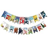
- Colorful and Engaging Design: This classic children's book banner features bright illustrations and storybook themes that add fun and charm to any space
- Perfect for Any Occasion: Great for classrooms, birthday parties, reading corners, and fiesta party decorations—creates a cheerful and inviting atmosphere
- Inspires a Love of Reading: Ideal for teachers and parents who want to encourage imagination and promote reading through creative and fun classroom decor
- Easy to Hang and Display: This lightweight banner decoration is simple to hang on walls, bulletin boards, or doorways—perfect as part of your school supplies setup
- Versatile Use for All Spaces: Use it for reading events, learning themes, libraries, or at home—this banner brings joy and literary flair to any setting
cURL (see the ScreenshotNeo documentation):
curl -G "https://api.screenshotneo.com/v1/shot" -d access_key=YOUR_API_KEY --data-urlencode url=https://stripe.com -o shot.webpPython:
import requests
r = requests.get("https://api.screenshotneo.com/v1/shot", params={"access_key": "YOUR_API_KEY", "url": "https://stripe.com"}, timeout=90)
open("shot.webp", "wb").write(r.content)Node.js:
const q = new URLSearchParams({ access_key: 'YOUR_API_KEY', url: 'https://stripe.com' });
const res = await fetch(`https://api.screenshotneo.com/v1/shot?${q}`);
The Free plan includes 1,000 screenshots per month with no card; paid plans start at $5 for 3,000 shots. Create a free ScreenshotNeo account.
FAQ
Is 1920 × 1080 the correct slider size?
Not by default. A 16:9 file may be cropped heavily by a shallow slider. Match the section’s ratio first.
The Tool Desk
Outbyte Driver Updater FREEFix the driver behind crashes, sound loss and screen glitchesFind Drivers →Outbyte PC Repair FREERepair Windows errors before they cause bigger problemsFix Now →Should every slide have identical dimensions?
Yes, within a carousel, unless the component explicitly supports variable-height slides. Consistent dimensions prevent layout jumps.
Can I use the same image on desktop and mobile?
Yes, when the focal subject and text remain visible after responsive cropping. Otherwise use art-directed sources.
Which ratio is best for accessibility?
No ratio is inherently accessible. Prioritize readable HTML text, sufficient contrast, keyboard controls, pause mechanisms and meaningful alternative text.
Quick Recap
The Bottom Line
Use the slider’s real display box as the specification. Start with 1200 × 400 desktop and 360 × 120 mobile for a conventional banner, or use separate 1600 × 500 desktop and 800 × 1200 mobile hero crops when the composition demands it. Preserve proportions, select responsive sources, and test every breakpoint before publishing.
Quick wins for a faster PC:
Clear out junk files and repair common Windows errorsFree Scan →Fix the driver behind crashes, sound loss and screen glitchesFind Drivers →Repair Windows errors before they cause bigger problemsFix Now →Product prices and availability are accurate as of the date/time indicated and are subject to change. Any price and availability information displayed on Amazon at the time of purchase will apply.




