Use img srcset when the image content stays the same and the browser should choose an appropriate file for the available slot width or pixel density. Use <picture> when the source itself may change—such as a different crop, a media-specific composition, or an alternative format. A <picture> element still ends with a normal <img>, and its srcset candidates can be used inside each <source> when you need both art direction and responsive renditions.
What is the difference between srcset and <picture>?
srcset is an attribute that gives one image element a set of candidate files. The browser chooses one candidate using the image’s intrinsic dimensions, the rendered slot, device pixel ratio, and other loading conditions. The pixels depict the same subject; only the file rendition normally changes.

As an Amazon Associate I earn from qualifying purchases.
<picture> is a container for alternative image sources. Each <source> can be filtered by a media condition or supported format, and the browser selects the first usable source. A child <img> remains mandatory: it is the fallback and the image element that is ultimately displayed. MDN documents the selection model and fallback behavior in its responsive-images guide and <picture> reference.
The practical test is whether the visual content changes. If a narrow layout needs the same photograph at a smaller width, use srcset. If it needs a tighter crop, a different composition, or a different file format, use <picture>. These are complementary features rather than mutually exclusive alternatives.
#1 Best Overall

- [Ultra-Lightweight Ear Buds Designed for Small Ears] Each earbud weighs only 3.7g and features a compact, ergonomic in-ear design made especially for small ears. Secure, low-profile, and comfortable for workouts, all-day wear or overnight sleeping.The ultra-slim profile sits flush in your ear with no hard edges poking or rubbing, so you can even sleep on your side without discomfort.
- [Immersive Stereo Sound with TOZO OrigX Technology] TOZO OrigX tuning delivers clear vocals, balanced mids, and natural stereo sound for music, podcasts, and videos.
- [Long Battery Life for Daily Use] Get up to 7 hours of playtime on a single charge, with up to 32 hours total using the charging case—ideal for workdays, commuting, and extended listening sessions.
- [Bluetooth 5.3 & Stable Connection] Bluetooth 5.3 provides fast pairing, stable wireless performance, and reduced dropouts as you move around home or office.
- [Deep Bass with Clear Vocals] High-performance drivers produce punchy bass while keeping vocals clean and detailed for everyday listening.
Choose by the job the browser must perform
| Requirement | Preferred markup | Why | Is sizes needed? |
|---|---|---|---|
| Same image, several intrinsic widths | <img srcset> with w descriptors |
The browser matches candidate widths to the expected layout slot. | Yes, describe the slot with sizes. |
| Same displayed dimensions, standard and high-density files | <img srcset> with x descriptors |
Selection follows display pixel density. | No; this pattern does not use a slot-width list. |
| Different crop or composition at a breakpoint | <picture> with source media |
This is art direction: the image framing changes. | Only if a source also offers width candidates. |
| AVIF or WebP with a fallback format | <picture> with source type, then <img> |
The browser skips formats it does not support. | Not for format choice alone. |
| Art direction plus several sizes of each crop | <picture> whose <source> elements have srcset and sizes |
Media conditions choose the crop; srcset chooses its rendition. |
Yes for width-descriptor candidates. |
Use srcset for the same content at different widths
When the subject and framing are unchanged, supply files with different intrinsic widths. Width descriptors such as 480w and 800w tell the browser the actual pixel width of each file; they are not labels for CSS breakpoints.
<img
  src="large.jpg"
  srcset="small.jpg 480w, large.jpg 800w"
  sizes="(width <= 600px) 480px, 800px"
  width="800"
  height="533"
  alt="A cyclist riding beside a lake">
In this example, sizes says that the image occupies a 480-pixel slot when the viewport is 600 pixels wide or narrower; otherwise the expected slot is 800 pixels. The browser compares that slot estimate with the available candidates and may choose either file, also considering device pixel density and network conditions. The src value is a fallback for user agents that do not use srcset. The <img> reference describes these attributes and intrinsic dimensions.
The media condition in sizes is evaluated from left to right. The first matching condition supplies the slot length; the final length is the default. A length can be a fixed CSS length, a percentage-like viewport expression such as 50vw, or another valid image-slot length supported by the browser. Describe the slot created by your layout, not the file you hope will be downloaded.
Free tools Windows power users keep installed
One-click scans. No signup required.
When width descriptors are the right fit
- The image can be cropped or scaled without changing what information the viewer should see.
- Your image pipeline produces several intrinsic widths, for example 480, 800 and 1,200 pixels.
- The displayed width varies with the layout, so a media-query-style slot description helps the browser avoid an unnecessarily large download.
Every w value must correspond to the candidate file’s intrinsic width. If a file is actually 760 pixels wide, do not advertise it as 800w; an inaccurate descriptor can lead to a poor choice. Do not mix width and density descriptors in a single candidate list.
Use density descriptors when the slot size is fixed
For an image that always occupies approximately the same CSS dimensions—such as a 200 by 120 pixel logo slot—provide files for normal and high-density displays. The x descriptor expresses a device-pixel-ratio multiplier.
Rank #2

- 【IP68 Waterproof Multifunctinal Smart Watch】Torjalph fitness activity tracker smart watch is IP68 waterproof technology ,you can wear it when swimming,handwashing,it's rain-proof which means that you perform multiple exercise modes outside without worrying about sweat or rain corroding your fitness smart watch,and this watch equipped with a 230 mAh large capacity battery magnetic charging ,and this sports activity tracker watch can be used 5-7 days If fully charged.
- 【Larger 1.83'' Full Screen Watch & Multi-dial Selection】1.83 inch full HD color touch screen smart watch for men / women provides excellent 240*284 resolution image quality ,This Bluetooth smart watch offers a better touch experience and remarkable immersion and ,more than 200 watch faces for you to choose from App"Da Fit ", you can change the dial style according to your mood to wear keeping the world on your wrist
- 【Accurate Activity Tracker Smart Watch 】sports watch activity tracker uses sweat and dust resistant breathable silicone strap, our Fitness Tracker Smart Watch for Android iOS Phones supports 12 sports modes,walking,running,bicycle,swimming,badminton,basketball,football,rope skipping. This bluetooth calls smart watch for men women is lightweight and stylish, bringing more convenient and relaxing sports experience while also providing more protection.
- 【Your 24 Hour Personal Daily Health Monitor】Fitness watch for women men full touch screen IP67 waterproof bluetooth smartwatch for Android iOS Phones with heart rate blood pressure monitor multifunction Andriod smart watch with steps counter sleep monitor sports fitness watch, monitoring blood oxygen saturation allows you to understand your physical condition in real time to track fitness progress ,to know your health status in time.
- 【More Functions Bluetooth Call Smart Watch】This fitness activity smart watch full screen for iPhone and Android phones includes a bunch of new features including:The bluetooth smart watch can hang up the phone, receive and display WhatsAPP /Text /Facebook /Twitter /Messenger reminder.Support sedentary reminder, alarm clock, stopwatch, timer,weather information,music control, remote camera control compatible with Android 5.0 and above or iOS 9.0 and above smartphones.
<img
  src="logo.png"
  srcset="logo.png 1x, [email protected] 2x"
  width="200"
  height="120"
  alt="Northwind community logo">
A display with a device pixel ratio near 2 can use [email protected] to preserve detail while the rendered CSS size remains 200 by 120 pixels. This pattern does not need sizes, because the candidates are described by density rather than by varying layout width. Width and density descriptors solve different selection problems; choose one model for each srcset list.
Density descriptors are not a substitute for responsive widths. If the image grows from a one-column card to a wide desktop banner, describe those possible slot widths with w candidates and sizes instead of assuming that a 2x file covers every layout.
Outdated Drivers Are Slowing You Down
One free scan finds every outdated or missing driver and matches the right update for your exact hardware.Free scan · exact hardware matchWindows Errors? Fix Them Before They Spread
Repair common Windows errors and clear accumulated junk for a smoother, more stable PC - no reinstall needed.Free scan · no reinstallUse <picture> for art direction
Art direction means changing the framing or composition, not merely serving a smaller copy. A portrait crop can keep a person’s face visible on a phone, while a wide crop can show the surrounding scene on a desktop. Put the narrow-screen source first, then broader conditions, and finish with the fallback <img>.
<picture>
  <source
    media="(width <= 600px)"
    srcset="lake-portrait.jpg"
    width="600"
    height="900">
  <source
    media="(width > 600px)"
    srcset="lake-landscape.jpg"
    width="1200"
    height="675">
  <img
    src="lake-landscape.jpg"
    width="1200"
    height="675"
    alt="A cyclist riding beside a lake">
</picture>
The browser checks the <source> elements in order. When a condition matches and the source is usable, that resource is selected. If no source matches or a user agent does not implement <picture>, the child <img> supplies the image. Keep the <img> even when modern browsers are your target; it carries the fallback URL, alternative text, and image semantics.
Use media on a source when the source represents a deliberate art-directed condition. Avoid copying every layout breakpoint into both media and sizes without a separate purpose. MDN’s responsive-image guidance recommends reserving media for art direction rather than using it as a second, redundant layout system.
Use <picture> to offer modern formats
Format negotiation changes the encoding, not necessarily the composition. A type attribute lets the browser skip a source format it does not support and continue to the next source or the fallback image.
Quick wins for a faster PC:
Repair Windows errors before they cause bigger problemsFix Now →Fix the driver behind crashes, sound loss and screen glitchesFind Drivers →Clear out junk files and repair common Windows errorsFree Scan →Rank #3
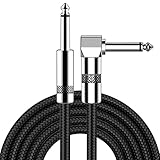
- [Low Noise High Fidelity] New bee guitar cord with 22AWG oxygen-free-copper center conductors provides enhanced signal transfer, the PVC insulation material and the high-density stranded copper double shield provide noise rejection for quiet operation
- [Ideal for Choice] New bee 1/4 straight and right angle metal connectors, ensures a secure connection in any instrument, pedal, or amp jack. L shape great fro on stage guitar stands
- [Wide Compatible] Suitable for mixer, power amplifier, microphone, effector, decoder, equalizer, electoronic organ, electric guitar, electric bass and other electronic equipments. Widely used in the installation of smart home, karaoke speaker, professional stage audio, etc
- [Easy Disassemble] Making incidental repairs quick and easy! Very nice, flexible cable
- [Dont Hesite to Order] 24 hours customer services and professional technology team are standing by
<picture>
  <source type="image/avif" srcset="hero.avif">
  <source type="image/webp" srcset="hero.webp">
  <img
    src="hero.jpg"
    width="1600"
    height="900"
    alt="A red train crossing a mountain bridge">
</picture>
The order matters: place the preferred supported format before its fallback. The fallback <img> should use a broadly supported format and remain a complete image element. Format sources can also carry media, but add conditions only when the visual choice really depends on the condition.
Combine art direction with responsive renditions
A source can have its own srcset and sizes. This lets you choose a crop with media, then choose the most suitable width of that crop.
<picture>
  <source
    media="(width <= 600px)"
    srcset="portrait-480.jpg 480w, portrait-800.jpg 800w"
    sizes="100vw"
    width="800"
    height="1200">
  <source
    media="(width > 600px)"
    srcset="landscape-800.jpg 800w, landscape-1400.jpg 1400w"
    sizes="(width <= 1200px) 80vw, 960px"
    width="1400"
    height="788">
  <img
    src="landscape-1400.jpg"
    width="1400"
    height="788"
    alt="A chef preparing vegetables in a bright kitchen">
</picture>
Here, media selects portrait or landscape art direction. Within the selected source, the width descriptors and sizes describe the available renditions and expected slot. The fallback <img> should represent the default composition and include its own dimensions.
This combined pattern is useful when a mobile crop and a desktop crop are each generated at several widths. It is unnecessary when there is only one composition and the only variation is file size; in that simpler case, a single <img srcset> is easier to maintain.
Understand sizes before using width candidates
sizes is a hint about rendered slot width. It does not resize the image, replace CSS, or declare the intrinsic width of a file. CSS still controls the final layout. The browser uses the hint early enough to select a candidate before downloading it.
Rank #4

- Digital Family Calendar: BSIMB digital calendar wall touch screen puts an end to your chaotic life. Designed for busy families, the digital calendar keeps you organised and in step with your family. Assign different colours and tasks to each family member to make family scheduling easier and more intuitive.
- Easy Setup and Auto-Sync: Plug in, connect to WLAN and auto-syn your electric calendar in minutes. Digital wall calendar compatible with Google calendar, iCloud calendar, Outlook calendar, Cozi calendar and Yahoo calendar. Add events directly on the device or through the ecalendar app. Electronic calendar stays current whether you're at work or traveling—no manual updates needed.
- All-In-One Home Assistant: Smart calendar builds habits and encourage independence with personalised chores. Display daily meal plan to reduce the daily ‘What's for dinner?’ stress. To-do lists keep track of everything you want. Turning chores into valuable achievements with stars and rewards, making life easier and more enjoyable.
- Manage Anytime Anywhere: BSIMB electronic calendar for family stay connected with the powerful ecalendar app. Access and manage your digital wall calendar anytime, anywhere with free features like stars & rewards, photo screensaver, chore charts, meals plans, to-do lists etc. Electronic planner paid features like Magic Import tailor advanced tools for users with special needs.
- Stay in Touch with Loved Ones: Share photos or videos from your phone to electronic wall calendar with app, instantly update your life moment, and keep in touch with your family, especially those who are far away; you can also surprise your smart calendar digital wall by sending him a wish card; it's also great for keeping tech-illiterate elders in touch with the youngsters.
For example, if a card occupies the full viewport below 700 pixels, half the viewport from 700 through 1,199 pixels, and 400 pixels on wider screens, the markup can describe those slots as:
<img
  src="card-800.jpg"
  srcset="card-400.jpg 400w, card-800.jpg 800w, card-1200.jpg 1200w"
  sizes="(width < 700px) 100vw, (width < 1200px) 50vw, 400px"
  width="800"
  height="600"
  alt="A bowl of seasonal fruit">
The values must match the actual CSS layout. If the card has 24 pixels of horizontal padding, a slot of 50vw may be an overestimate; if a sidebar constrains the card, 100vw may be an underestimate. Keep sizes synchronized with layout changes so candidate selection remains useful.
Do not add sizes to a density-only list merely because the image is responsive in some other sense. The attribute is relevant to width-descriptor selection; density descriptors already state the intended relationship to the CSS size.
What’s actually slowing this PC down?
Pick the symptom - the matching free tool is one click away.
Fallbacks, accessibility and layout stability
Keep the fallback image inside <picture>
The child <img> is required for fallback behavior and is the element that exposes normal image attributes. Put it after all <source> elements. A standalone <source> is not a displayed image.
Write alternative text for the information conveyed
Use meaningful alt text when the image communicates content, as in “A cyclist riding beside a lake.” If the image is purely decorative and nearby text already conveys its purpose, use alt="". The alt belongs on the fallback <img>, not on <source>.
Declare intrinsic dimensions
Set appropriate width and height attributes on the displayed image and, where useful, on corresponding sources. These values express the file’s intrinsic aspect ratio and let the browser reserve space while the resource loads, reducing unexpected layout movement. They do not prevent CSS from making the image fluid; a rule such as img { max-width: 100%; height: auto; } can still scale it.
Match aspect ratios across art-directed sources when possible
If portrait and landscape sources intentionally have different ratios, reserve the correct ratio for each layout condition in CSS so the change does not create a sudden shift. If they share a ratio, consistent dimensions simplify layout calculations.
Why a JavaScript image swap is usually the wrong foundation
Do not solve the basic responsive-image problem by loading one image and replacing its URL after page load. Browsers can discover and preload images before CSS and JavaScript finish executing. A late swap may therefore download the original and then the replacement, wasting bandwidth and delaying the useful image. Native srcset, sizes, and <picture> let the browser make its choice during resource discovery, as explained in MDN’s responsive-images guide.
JavaScript can still be appropriate for an application-specific interaction—such as changing an image after a user selects a product variant—but it should not replace native source selection for ordinary viewport and format decisions.
Common mistakes and how to correct them
- Using
<picture>for simple resizing: If every file shows the same framing, remove unnecessary sources and use one<img>with width candidates and an accuratesizesvalue. - Omitting
sizeswithwdescriptors: Add a slot description that reflects the real CSS layout. Without it, the browser cannot reliably estimate how wide the image will render. - Mixing
wandxin one list: Separate the strategies. Use intrinsic widths plussizes, or use density multipliers for a fixed CSS slot. - Advertising the wrong intrinsic width: Verify every descriptor against the generated file. A mislabeled candidate can cause blurry output or an unnecessarily large request.
- Putting the fallback outside
<picture>: Move the normal<img>inside the element after all sources. - Adding duplicate breakpoint logic: Decide whether a condition selects art direction (
media) or describes the selected source’s slot (sizes); use both only when each has a distinct job. - Leaving out dimensions: Add intrinsic
widthandheightvalues to help reserve the correct space during loading. - Using nonempty alternative text for decoration: Set
alt=""when the image adds no information beyond nearby content.
A practical implementation workflow
- Classify the visual change. Decide whether all candidates show the same content and crop. If yes, start with
<img srcset>; if the crop, composition, or format can change, plan for<picture>. - Choose the descriptor model. Use
wdescriptors for varying intrinsic widths. Usexdescriptors for a stable CSS slot with density variants. - Generate and verify files. Record each file’s actual intrinsic width and aspect ratio, then write matching descriptors and dimensions.
- Describe the slot. For width candidates, map each layout range to the image’s expected rendered width in
sizes. Keep the final, condition-free value as the default. - Add art direction or format sources only when needed. Order
<source>elements from the most specific preferred option to broader alternatives, and usemediaortypefor their respective decisions. - Finish with a complete fallback. Put
src, usefulalttext, and intrinsic dimensions on the child<img>. - Test selection scenarios. Check narrow and wide layouts, a high-density display, a browser that lacks a newer image format, slow connections, and an image-disabled or assistive-technology context. Confirm that the selected crop is intentional and that no source is downloaded unnecessarily.
Browser support and standards status
MDN describes <picture> as widely available across browsers and lists support dating from March 2016. That is a documentation support statement, not a claim about a measured global usage percentage. For a specific legacy browser or embedded webview, verify its version separately and rely on the child <img> fallback where required. See the current MDN <picture> reference and <img> reference for syntax details.
Quick Recap
Decision checklist
- Same subject and crop, variable slot width: one
<img>withsrcsetusingwdescriptors and an accuratesizeshint. - Same slot, standard and high-density files: one
<img>with1x,2xor other density descriptors. - Different crop or composition:
<picture>with ordered<source media>elements and a fallback<img>. - Alternative encodings:
<picture>with<source type>elements and a broadly supported fallback. - Different crops that each need multiple widths: combine
mediaon<source>with that source’s ownsrcsetandsizes.
Product prices and availability are accurate as of the date/time indicated and are subject to change. Any price and availability information displayed on Amazon at the time of purchase will apply.
Do these 3 things before closing this tab:
1Repair Windows errors before they cause bigger problems2Fix the driver behind crashes, sound loss and screen glitches3Clear out junk files and repair common Windows errors



