What’s actually slowing this PC down?
Pick the symptom - the matching free tool is one click away.
A game feature that players cannot read may not work for them. Treat readability as an acceptance criterion for menus, HUDs, objectives, subtitles, chat, alerts and every other place the game communicates—not as a final polish pass.
What counts as readable in a game?
Readability is whether players can perceive and interpret information where and when they need it. A clear menu label can become hard to read over moving scenery; a subtitle may be too small at a distance; an alert may disappear before someone can process it. The question is not only “Can the player read this screen?” but “Can the player read this information in the conditions where the feature is used?”
| # | Preview | Product | Price | |
|---|---|---|---|---|
| 1 |
|
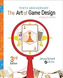
The Art of Game Design: A Book of Lenses, Third Edition | $54.66 | Buy on Amazon |
| 2 |

|
Designing Games: A Guide to Engineering Experiences | $34.99 | Buy on Amazon |
| 3 |

|
Theory of Fun for Game Design | $25.11 | Buy on Amazon |
| 4 |

|
Level Up! The Guide to Great Video Game Design | $32.24 | Buy on Amazon |
| 5 |
|
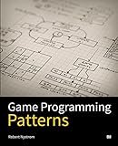
Game Programming Patterns | $24.95 | Buy on Amazon |
As an Amazon Associate I earn from qualifying purchases.
Microsoft’s Xbox Accessibility Guideline 101 asks, “Is the ability to read text a requirement in your game?” Its scope includes navigable menus, HUD text, objectives, instructions, waypoints, NPC communications, player chat, subtitles and captions. That list is a useful reminder to review the whole experience, including loading screens and notifications, rather than limiting checks to settings menus. Microsoft Xbox Accessibility Guideline 101
Quick wins for a faster PC:
Scan for outdated or missing drivers - takes under a minuteDriver Scan →Repair Windows errors before they cause bigger problemsFix Now →Set readable defaults before adding options
Start with text sizes and spacing that are comfortable to read at the game’s default settings. Then provide controls for players to adjust presentation where practical: size, style or font, spacing, and color. Microsoft’s guidance puts the choice plainly: “The best approach to ensuring that text is accessible for as many players as possible is by providing players with choices to configure the UI to best address their needs.” Xbox Accessibility Guideline 101
#1 Best Overall
Make these controls easy to find and apply consistently. If text scaling only affects dialogue but leaves objective markers, chat or menus unchanged, players still encounter parts of the game they cannot comfortably read. A readable default matters because not every player will discover or use an option; configurability matters because no single presentation works equally well for everyone.
Check contrast in the contexts where text appears
Text and visual markers must remain distinguishable from their backgrounds during play, not only in a static mock-up. Check representative scenes, interface states and gameplay effects: a label that reads well on a plain menu may blend into a bright sky, dark environment, busy texture or changing action behind it. Microsoft’s Xbox Accessibility Guideline 102 recommends strong contrast for visibility while also recognizing that some players with cognitive disabilities or reading difficulties may find high-contrast interfaces harder to perceive. Microsoft Xbox Accessibility Guideline 102
Rank #2
Offer color or contrast choices where feasible instead of assuming one palette is universally best. The Game Accessibility Guidelines note that color needs differ, and that very high contrast may create difficulty for some people with certain forms of dyslexia. Their recommendation is to allow foreground and background color choices when practical, or at least offer a contrast choice. Game Accessibility Guidelines: text color choice
Do not make essential information depend on one channel
Text is not the only way to communicate an important event, and sound is not always available or perceptible. Reinforce essential information with another suitable channel: pair an objective update with a visual marker or speech, and provide text or visual cues for sound-dependent information. The Game Accessibility Guidelines recommend avoiding text-only communication for essential information and replicating essential sound information in text or visuals. Game Accessibility Guidelines full list
Rank #3
Redundancy here means giving players another way to receive the same information, not adding decorative noise. A visual indicator should be understandable without relying on a color distinction alone, and a spoken cue should not be the sole notice of a critical change.
Validate readability under real viewing conditions
Review the feature on the displays and in the situations players are likely to encounter. Microsoft notes that readability can be affected by a distant screen, a small mobile screen, or muted or noisy play environments. That means checks should include more than a developer’s close-up view of a monitor: test small displays, viewing distance, changing gameplay backgrounds, and different interface states. Microsoft Xbox Accessibility Guideline 101
Rank #4
Roblox Creator Hub likewise recommends enlarging small labels and ensuring sufficient contrast between text and its background; it also notes that player preference settings include text size. These are practical reminders to assess both the default experience and the controls players can use to adapt it. Roblox Creator Hub accessibility guidelines
Recommended Free Tools
Use a feature-level readability checklist
- Coverage: Check menus, HUD, instructions, objectives, subtitles, captions, chat, loading screens and notifications—not just the main screen.
- Default settings: Confirm that text size and spacing are comfortable without requiring a settings change.
- Player control: Where feasible, let players adjust text size, style, spacing and color or contrast.
- Context: Check text and visual elements against changing backgrounds, interface states, small screens and viewing distance.
- Alternative channels: Ensure essential information is not available only as text or only as sound.
- Player variation: Avoid treating one font, color pairing or contrast level as best for everyone.
A feature is ready when its important information remains perceivable in the conditions where players encounter it, and players have useful ways to adapt presentation to their needs.
Quick Recap
Best Value
Product prices and availability are accurate as of the date/time indicated and are subject to change. Any price and availability information displayed on Amazon at the time of purchase will apply.




