Do these 3 things before closing this tab:
1Clear out junk files and repair common Windows errors2Fix the driver behind crashes, sound loss and screen glitches3Repair Windows errors before they cause bigger problemsIf an app looks wrong on a wide-screen or foldable phone, first identify the symptom: unused bars around an otherwise complete app, controls cut off at an edge, or content that looks stretched. Those are different problems, and there is no single phone setting that reliably fixes all of them. Check the affected app’s display options and updates; if its layout is incompatible with the screen, the app developer may need to correct it.
The goal is not simply to make the app occupy every pixel. A good fit also keeps text and artwork in proportion, makes controls reachable, and continues to work when the device rotates, folds, unfolds, or changes window size.

As an Amazon Associate I earn from qualifying purchases.
Identify what is happening on screen
People sometimes describe an app on a foldable’s inner display as “cropped” or “zoomed in,” but those descriptions do not establish the technical cause. Look closely at what is actually visible before changing settings. The distinction matters because the remedy for empty space around an app is not necessarily the remedy for a button that has disappeared beyond the edge.
- Bars around a complete app: The app may be letterboxed or pillarboxed. The unused display area is filled with bars, a solid matte, or sometimes blurred wallpaper, while the app keeps its proportions. If all the app’s content is visible and the interface is not distorted, the bars may be compatibility behavior rather than a malfunction.
- Controls or content cut off: A button, field, menu, or other interface element is outside the usable area or hidden. This points to a layout or window-size handling problem, rather than simply unused screen space. Check whether scrolling reveals the missing content and whether the problem appears only in a particular view or device state.
- Distorted or unusually enlarged content: Text, artwork, or controls may look stretched. Filling more of the display this way does not necessarily make the app’s layout responsive. The app may occupy more screen area while proportions are wrong or controls remain difficult to use.
One app can behave differently from another on the same phone. The visual symptom is a useful starting point, not proof that a particular system setting or cause is responsible. Even similar-looking symptoms can result from different app or compatibility behavior, so avoid assuming that changing one setting will resolve every case.
#1 Best Overall

- [Ultra-Lightweight Ear Buds Designed for Small Ears] Each earbud weighs only 3.7g and features a compact, ergonomic in-ear design made especially for small ears. Secure, low-profile, and comfortable for workouts, all-day wear or overnight sleeping.The ultra-slim profile sits flush in your ear with no hard edges poking or rubbing, so you can even sleep on your side without discomfort.
- [Immersive Stereo Sound with TOZO OrigX Technology] TOZO OrigX tuning delivers clear vocals, balanced mids, and natural stereo sound for music, podcasts, and videos.
- [Long Battery Life for Daily Use] Get up to 7 hours of playtime on a single charge, with up to 32 hours total using the charging case—ideal for workdays, commuting, and extended listening sessions.
- [Bluetooth 5.3 & Stable Connection] Bluetooth 5.3 provides fast pairing, stable wireless performance, and reduced dropouts as you move around home or office.
- [Deep Bass with Clear Vocals] High-performance drivers produce punchy bass while keeping vocals clean and detailed for everyday listening.
Take note of when the symptom appears. Does it happen only on the foldable’s inner display, after rotation, or when the app is shown in a resized window? Does it affect one screen within the app or every screen? These observations help you describe the issue accurately to the developer and avoid confusing a layout failure with intentional empty space.
Why an app may not use the whole display
Android’s device compatibility mode can place an app within the display and fill the remaining area with mattes. This can happen when the screen’s dimensions or aspect ratio differ from those the app was designed to support. Fixed orientation, a fixed aspect ratio, or an app that is not resizable can contribute.
In practical terms, the phone has a display shape or available window that does not match the assumptions the app makes about its usable area. The system can preserve the app’s supported shape and place the app inside the larger display area, rather than forcing the content to cover the entire screen. The bands around the app may be solid or may use blurred wallpaper, depending on the compatibility treatment. Their presence alone does not show that the app’s controls are clipped.
Preserving an app’s aspect ratio can keep its interface from being simply stretched across a mismatched screen, though the app may use less of the physical display. In some size-compatibility cases, Android can rescale an app to fill at least one dimension. The exact result depends on the app and the compatibility behavior in effect. It is therefore useful to separate two questions: how much of the display the app uses, and whether the content remains complete and proportionate.
A complete letterboxed view may be less immersive, but if controls remain visible and artwork retains its proportions it can be a more usable result than a full-screen view that distorts everything. Conversely, bars are not proof that the app is otherwise well adapted: they do not tell you whether it will handle rotation, resizing, or a different fold state correctly.
Apple’s Human Interface Guidelines for layout also note that viewing an app in a different context or on a screen with a different aspect ratio can make artwork appear cropped, letterboxed, or pillarboxed. That is a general design consideration, not a universal iPhone troubleshooting recipe. The useful takeaway is that a changed aspect ratio can affect what artwork looks like; it does not establish that a single setting on every iPhone will correct a particular app.
Rank #2

- 【IP68 Waterproof Multifunctinal Smart Watch】Torjalph fitness activity tracker smart watch is IP68 waterproof technology ,you can wear it when swimming,handwashing,it's rain-proof which means that you perform multiple exercise modes outside without worrying about sweat or rain corroding your fitness smart watch,and this watch equipped with a 230 mAh large capacity battery magnetic charging ,and this sports activity tracker watch can be used 5-7 days If fully charged.
- 【Larger 1.83'' Full Screen Watch & Multi-dial Selection】1.83 inch full HD color touch screen smart watch for men / women provides excellent 240*284 resolution image quality ,This Bluetooth smart watch offers a better touch experience and remarkable immersion and ,more than 200 watch faces for you to choose from App"Da Fit ", you can change the dial style according to your mood to wear keeping the world on your wrist
- 【Accurate Activity Tracker Smart Watch 】sports watch activity tracker uses sweat and dust resistant breathable silicone strap, our Fitness Tracker Smart Watch for Android iOS Phones supports 12 sports modes,walking,running,bicycle,swimming,badminton,basketball,football,rope skipping. This bluetooth calls smart watch for men women is lightweight and stylish, bringing more convenient and relaxing sports experience while also providing more protection.
- 【Your 24 Hour Personal Daily Health Monitor】Fitness watch for women men full touch screen IP67 waterproof bluetooth smartwatch for Android iOS Phones with heart rate blood pressure monitor multifunction Andriod smart watch with steps counter sleep monitor sports fitness watch, monitoring blood oxygen saturation allows you to understand your physical condition in real time to track fitness progress ,to know your health status in time.
- 【More Functions Bluetooth Call Smart Watch】This fitness activity smart watch full screen for iPhone and Android phones includes a bunch of new features including:The bluetooth smart watch can hang up the phone, receive and display WhatsAPP /Text /Facebook /Twitter /Messenger reminder.Support sedentary reminder, alarm clock, stopwatch, timer,weather information,music control, remote camera control compatible with Android 5.0 and above or iOS 9.0 and above smartphones.
What Android 16 changes on large screens
For apps targeting Android 16 (API level 36), Android changes how certain restrictions are handled on qualifying large displays. On displays with a smallest width of at least 600 dp, the platform overrides restrictions involving screen orientation, app resizability, and minimum or maximum aspect ratio. Examples of qualifying contexts include tablets, large foldable inner displays, and desktop windowing. See the current Android guidance on app orientation, aspect ratio, and resizability for the applicable rules.
What’s actually slowing this PC down?
Pick the symptom - the matching free tool is one click away.
The 600 dp figure is a platform threshold measured in density-independent pixels (dp), not a promise that every device described informally as “wide” will qualify. The rule is tied to the display’s smallest width and the app’s target API level. A device’s marketing description or the fact that it is a foldable is not enough on its own to conclude that the override applies.
This does not mean every app on every wide phone will automatically fit well. The behavior applies to apps targeting API level 36 and has exceptions. These include displays below the 600 dp threshold, games identified through the app-category flag, and cases where the user opts in to an app’s default behavior in aspect-ratio settings. Android also warns that an app designed only for a standard portrait phone may show overlapping layouts when exposed to other sizes.
That warning is important for users and app teams alike. Allowing an app to run in a larger or differently shaped area removes some restrictions, but it does not by itself redesign the app’s screens. If the interface assumes a narrow portrait window, controls or content can overlap when that assumption no longer holds. The platform behavior and the quality of the app’s adaptive layout are separate issues.
As of the Android guidance updated October 1, 2026, Google says Google Play will require apps to target API level 36 as of August 2026. This is a platform policy with a stated date, not a guarantee that every app’s layout will be well adapted; consult the official page for current requirements. A target-level requirement should not be confused with an assurance that every screen has been tested and adjusted for every large display or window configuration.
Free tools Windows power users keep installed
One-click scans. No signup required.
What you can try as a phone user
Work through these checks in order. Menu names and available controls vary by phone, operating-system version, and app, so do not assume a setting documented for one model exists on another. There is no substantiated universal phone-side switch that fixes all letterboxing, clipping, or stretching.
Rank #3
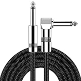
- [Low Noise High Fidelity] New bee guitar cord with 22AWG oxygen-free-copper center conductors provides enhanced signal transfer, the PVC insulation material and the high-density stranded copper double shield provide noise rejection for quiet operation
- [Ideal for Choice] New bee 1/4 straight and right angle metal connectors, ensures a secure connection in any instrument, pedal, or amp jack. L shape great fro on stage guitar stands
- [Wide Compatible] Suitable for mixer, power amplifier, microphone, effector, decoder, equalizer, electoronic organ, electric guitar, electric bass and other electronic equipments. Widely used in the installation of smart home, karaoke speaker, professional stage audio, etc
- [Easy Disassemble] Making incidental repairs quick and easy! Very nice, flexible cable
- [Dont Hesite to Order] 24 hours customer services and professional technology team are standing by
- Classify the symptom. Decide whether the app has unused bars, visibly clipped controls, or distorted content. Note whether the problem occurs on the inner display, after rotation, or only in one particular view. If the interface is complete and undistorted, the bars may simply be preserving the app’s proportions. If a control is missing or overlapped, record exactly what is inaccessible.
- Check the app itself. Look in the affected app for display, layout, or full-screen options. Install an available update from the app’s normal update channel. An option may not exist, and an update may not change the layout. If the app offers a full-screen choice, assess the result rather than assuming that using more of the display is automatically better: stretching can distort elements without fixing the underlying layout.
- Check for a phone-specific control only with model-specific instructions. Do not change font size, display zoom, resolution, aspect ratio, or developer options on the assumption that one will fix the app. The available guidance does not establish a universal control across Android manufacturers or iPhone models. Confirm the phone model, OS version, and documented effect of a setting before using it.
- Compare with another display state if available. On a foldable, note whether the problem changes between the folded and unfolded states. If it occurs after rotation or resizing, include that detail too. The purpose is not to assume that another state will fix the app, but to make the failure repeatable and describe which window conditions trigger it.
- Report a reproducible problem. If the issue is limited to one app, contact its developer with the phone model, OS version, app version, a screenshot, and the steps that reproduce the problem. Those details help distinguish a particular screen or window-size failure from general display behavior. Mention whether controls are clipped, overlapping, or merely surrounded by bars.
When checking an app, compare the same screen before and after any change and make sure essential controls remain reachable. Avoid judging the result only by whether the app fills the glass. A stretched view can look more expansive while still being less legible or less usable than the original letterboxed view.
How a properly adapted app should behave
A responsive app adjusts to the window it actually receives instead of assuming every screen is a fixed portrait rectangle. Android’s adaptive-app guidance recommends using window size classes and responsive layouts, keeping content usable as the window changes, and preserving state through orientation and window-size changes. This is relevant not only to phones: large foldable inner screens, tablets, and desktop windowing can all expose layouts to different available dimensions.
- Keep controls reachable: Content should be able to scroll when it does not fit, rather than leaving important controls stranded beyond the visible area. A user should be able to reach off-screen content instead of finding that a fixed screen arrangement cuts it off.
- Avoid stretching components: Android Developers’ instruction is: “Add a maximum width to components to avoid stretching.” A component can remain legible and proportionate instead of expanding without limit across a wide window. A responsive layout does not have to make every individual field, button, or content block as wide as the available display.
- Handle size changes: The app should preserve relevant state when the device rotates or its window changes size, rather than losing the user’s place or showing a broken layout. A change in orientation or window dimensions should not force the app to behave as though the user opened an unrelated screen.
- Check specialized views: Android recommends verifying camera previews in both portrait and landscape, where orientation and aspect ratio can affect what the user sees. The preview is a reminder that not every part of an app is ordinary text and controls; views tied to a particular orientation need checking in more than one configuration.
Window size classes and responsive layouts give developers a way to make layout decisions based on the space available rather than the device label alone. The important user-facing outcomes are straightforward: content should stay visible or scroll into reach, components should not expand until they look unnaturally stretched, and the app should retain its state as the window changes.
These behaviors matter on foldables as a device moves between folded and unfolded states, as well as on tablets or in desktop windowing. A layout that merely occupies more pixels is not necessarily a better fit if controls become unreachable or proportions are distorted. A well-adapted app balances available space with control placement and appropriate component widths.
Choosing between bars, stretching, and responsive layout
There is a real trade-off when an app was designed for a different shape of screen. Compare the outcome by whether controls remain visible and reachable, whether text and artwork keep their proportions, how much of the physical display the app uses, and whether the behavior survives rotation, folding, unfolding, and resizing. These axes are more useful than treating “full screen” as the only measure of success.
| Outcome | Display use | Proportions | Controls and resizing |
|---|---|---|---|
| Letterboxed or pillarboxed | Uses less of the display, leaving bars or other matte areas | Can preserve the app’s proportions | Does not by itself show that the app adapts to rotation or window resizing |
| Stretched to fill | May occupy more of the display | Can distort text, artwork, or interface elements | Does not necessarily fix clipped controls or make the layout responsive |
| Responsive layout | Uses available space according to the app’s design | Aims to retain appropriate proportions | Aims to keep controls reachable as the window, orientation, or device state changes |
The best result is generally a layout that uses the available space without sacrificing reachability or proportions. A letterboxed but complete interface can be more usable than a full-screen view with distorted content; an app developer’s responsive layout is the route that can address both screen use and usability.
Rank #4

- Digital Family Calendar: BSIMB digital calendar wall touch screen puts an end to your chaotic life. Designed for busy families, the digital calendar keeps you organised and in step with your family. Assign different colours and tasks to each family member to make family scheduling easier and more intuitive.
- Easy Setup and Auto-Sync: Plug in, connect to WLAN and auto-syn your electric calendar in minutes. Digital wall calendar compatible with Google calendar, iCloud calendar, Outlook calendar, Cozi calendar and Yahoo calendar. Add events directly on the device or through the ecalendar app. Electronic calendar stays current whether you're at work or traveling—no manual updates needed.
- All-In-One Home Assistant: Smart calendar builds habits and encourage independence with personalised chores. Display daily meal plan to reduce the daily ‘What's for dinner?’ stress. To-do lists keep track of everything you want. Turning chores into valuable achievements with stars and rewards, making life easier and more enjoyable.
- Manage Anytime Anywhere: BSIMB electronic calendar for family stay connected with the powerful ecalendar app. Access and manage your digital wall calendar anytime, anywhere with free features like stars & rewards, photo screensaver, chore charts, meals plans, to-do lists etc. Electronic planner paid features like Magic Import tailor advanced tools for users with special needs.
- Stay in Touch with Loved Ones: Share photos or videos from your phone to electronic wall calendar with app, instantly update your life moment, and keep in touch with your family, especially those who are far away; you can also surprise your smart calendar digital wall by sending him a wish card; it's also great for keeping tech-illiterate elders in touch with the youngsters.
In other words, judge the three outcomes separately. Letterboxing can preserve proportions but leave some display area unused. Stretching can increase display coverage but distort content and still leave a poor layout. Responsive design aims to use the available space appropriately while keeping controls accessible and preserving suitable proportions. It is the combination of these qualities—not screen coverage alone—that makes an app fit well.
Outdated Drivers Are Slowing You Down
One free scan finds every outdated or missing driver and matches the right update for your exact hardware.Free scan · exact hardware matchPC Slower Than It Used to Be?
A free scan shows the junk files, broken settings and background clutter dragging Windows down - then fixes them in one click.Free scan · Windows 10 & 11When the app developer needs to make the fix
If controls are clipped, overlap, or become unusable only at a particular window size, the app may need changes to its layout or resizing behavior. Android’s large-screen compatibility changes can expose phone-only assumptions in an app; they do not guarantee that those assumptions have been replaced by a good adaptive design. A practical bug report should identify the exact screen and steps involved, include a screenshot, and state the device, OS, and app versions.
For a useful report, describe the condition that makes the problem appear: for example, the display state, orientation, or window size change that preceded it. State what is missing or distorted rather than only saying that the app looks “zoomed.” A report with a screenshot and repeatable steps gives the developer a clearer starting point for checking the affected layout. The research supports sending those details as a practical troubleshooting step, not as a promise that the developer will make a particular change or that every case has the same cause.
There is no substantiated universal phone-side remedy for one incompatible app, and buying a different phone is not a dependable way to correct that app’s layout. The available official guidance explains compatibility and design practices, but does not establish one setting that fixes every Android manufacturer or iPhone model. There is also no named, dated prevalence figure that supports claims about how often wide-screen apps are cropped or stretched. Treat individual reports of cropping or zooming as descriptions of what users see, not as a measured trend or proof of a specific technical fault.
Common questions
Are black bars around an app a sign that it is broken?
Not necessarily. Android can use bars or other mattes to fill unused display area when an app’s supported dimensions or aspect ratio differ from the screen. If the app remains complete and undistorted, the bars may be preserving its proportions. They do not, by themselves, show whether the app handles rotation or resizing well.
Recommended Free Tools
Will Android 16 make every app fill my foldable’s inner screen?
No. The behavior described applies to apps targeting API level 36 on displays with a smallest width of at least 600 dp, with exceptions including smaller displays, games identified through the app-category flag, and user opt-in to an app’s default behavior in aspect-ratio settings. Even when a restriction is overridden, an app designed only for a standard portrait phone may show overlapping layouts.
Should I stretch the app to fill the screen?
Only treat it as an optional display behavior if your specific app or phone provides it, and check the result. Stretching can make content look distorted and does not necessarily fix clipped controls or create a responsive layout. More display coverage is not automatically better usability.
What information should I give the app developer?
Include the phone model, operating-system version, app version, a screenshot, and steps that reproduce the issue. Note whether the symptom is bars, clipped or overlapping controls, or distorted content, and whether it occurs after rotation, folding or unfolding, or resizing.
Is there one setting that fixes cropped apps on every phone?
The reviewed official guidance does not establish a universal setting across Android manufacturers or iPhone models. App options and phone controls vary. Check the affected app’s own options and updates, and use only device-specific instructions that match your exact model and software version.
Frequently Asked Questions
Are black bars around an app a sign that it is broken?
Not necessarily. Android can use bars or other mattes to fill unused display area when an app’s supported dimensions or aspect ratio differ from the screen. If the app is complete and undistorted, the bars may preserve its proportions.
Will Android 16 make every app fill my foldable’s inner screen?
No. The behavior applies to apps targeting API level 36 on displays with a smallest width of at least 600 dp, with exceptions. Even when restrictions are overridden, a phone-only layout may overlap or otherwise fail to adapt.
Should I stretch an app to fill the screen?
Stretching may use more of the display, but it can distort text, artwork, or controls and does not necessarily make the layout responsive. Check the result rather than assuming full-screen coverage is better.
What should I include when reporting a display problem to an app developer?
Provide the phone model, OS version, app version, screenshot, and steps to reproduce the issue. Describe whether content is letterboxed, clipped, overlapping, or distorted, and note any rotation, folding, unfolding, or resizing involved.
Is there one setting that fixes cropped apps on every phone?
No universal fix is established by the reviewed guidance. Options vary by app, phone model, and OS version, so use only controls documented for your specific device.
The Bottom Line
First distinguish unused bars from clipped controls and distorted content. Letterboxing can preserve an app’s proportions, while stretching can distort content without fixing its layout. Check the affected app’s options and updates, use only verified device-specific settings, and report reproducible problems to the developer. A genuinely responsive app should keep controls reachable and preserve appropriate proportions as the window changes.
Quick Recap
Product prices and availability are accurate as of the date/time indicated and are subject to change. Any price and availability information displayed on Amazon at the time of purchase will apply.




