Hover-over help gives users quick, contextual guidance without sending them to separate documentation or cluttering a form with long s. In a JSP application, this pattern is especially useful for field labels, settings screens, admin tools, and any page where a short hint can reduce confusion at the point of interaction.
JSP custom tags make this feature reusable and clean by moving the toolmarkup, escaping, IDs, and optional behavior into a tag handler instead of repeating the same HTML across every page. With a small tag library, developers can add inline help with a simple tag call while keeping JSP files easier to read and maintain.


As an Amazon Associate I earn from qualifying purchases.
A complete implementation typically includes a tag handler class, a TLD entry that exposes the tag to JSP pages, simple usage examples in the view layer, and supporting CSS or JavaScript for the actual hover or focus behavior. Together, these pieces create a consistent help experience that can be applied across the application with minimal duplication.
How Hover-Over Help Works in JSP Applications
Hover-over help in a JSP application is typically a small toolor popover that appears when a user places the mouse pointer over a help icon, label, or highlighted field. In a form-heavy application, this allows extra guidance to sit close to the related input without filling the page with long instructions. For example, a “?” icon beside a Tax ID field can reveal formatting rules, accepted values, or a short example only when the user needs it.
#1 Best Overall
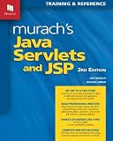
- Series: Murach: Training & Reference
- Paperback: 758 pages
- Language: English
- ISBN-10: 1890774782, ISBN-13: 978-1890774783
- Product Dimensions: 8 x 1.7 x 10 inches, Shipping Weight: 3.4 pounds
At runtime, the feature is a combination of server-side markup generation and client-side presentation. JSP runs on the server and produces HTML for the browser. CSS controls how the help text is positioned, hidden, and displayed, while JavaScript can add richer behavior such as delayed opening, keyboard support, click-to-pin behavior, or automatic repositioning near the edge of the viewport. The browser does not know that a JSP custom tag was used; it only receives ordinary HTML elements, classes, attributes, and optional script hooks.
A simple toolcan be built directly in each JSP page, but that approach becomes repetitive very quickly. Every page would need to repeat the same wrapper elements, icon markup, ARIA attributes, CSS class names, and escaping rules. Small inconsistencies then appear: one tooltip uses a different class, another omits accessibility attributes, and another hard-codes unsafe text. A JSP custom tag avoids that drift by moving the tooltip structure into one reusable server-side component.
Conceptually, a custom help tag acts as a small rendering shortcut. The JSP author supplies only the changing values, such as the help text, icon label, title, or placement. The tag handler then writes a consistent block of HTML. A typical output might include an inline container, a focusable trigger, and a hidden help panel:
What’s actually slowing this PC down?
Pick the symptom - the matching free tool is one click away.
- Trigger element: an icon, button, or text span that the user hovers over or focuses with the keyboard.
- Help content: the short explanatory message associated with the field or control.
- CSS classes: stable class names used by the application stylesheet to display and position the tooltip.
- Accessibility attributes: identifiers and relationships such as aria-describedby so assistive technologies can associate the help text with its trigger.
- Optional data attributes: values used by JavaScript, such as placement, delay, or behavior mode.
The interaction can be implemented with CSS alone when the requirement is simple. For instance, the toolpanel can remain hidden until the parent container matches :hover or :focus-within. This keeps the feature lightweight and avoids unnecessary scripting. For more advanced interfaces, JavaScript can listen for mouse, focus, blur, and escape-key events, then toggle a class or ARIA state. The custom tag remains useful in either case because it centralizes the HTML contract that CSS and JavaScript rely on.
In a JSP application, the overall flow is straightforward: the developer places the custom tag beside a field, the JSP engine invokes the tag handler during page rendering, the handler emits standardized toolmarkup, and the browser applies the shared stylesheet and script behavior. This makes inline help easy to add across many forms while keeping each JSP page focused on its own business content rather than repeated tooltip plumbing.
Designing a Reusable JSP Custom Tag
A hover-over-help feature becomes much easier to maintain when the repeated toolmarkup is moved into a JSP custom tag. Instead of copying the same span, icon, ARIA attributes, and hidden help text across many forms, each page can call a compact tag such as <ui:help text="Enter the customer’s legal name" />. The tag handler then generates the consistent HTML structure required by the CSS and JavaScript layer.
The custom tag should be designed around the information that changes from field to field, while keeping presentation details centralized. At a minimum, the tag usually needs a help message. In a real application, it is also useful to support an optional title, icon label, CSS class, placement, and a unique identifier for accessibility. These attributes let developers adapt the toolto different screens without rewriting the underlying HTML pattern.
The Tool Desk
Outbyte Driver Updater FREEScan for outdated or missing drivers - takes under a minuteDriver Scan →Outbyte PC Repair FREEClear out junk files and repair common Windows errorsFree Scan →Common tag attributes
| Attribute | Purpose | Example |
|---|---|---|
text |
The help content displayed in the tooltip. | text="Use MM/DD/YYYY format." |
title |
An optional heading inside the tooltip. | title="Date of Birth" |
placement |
Controls where the tooltip appears relative to the icon. | placement="right" |
styleClass |
Adds a project-specific CSS class to the rendered wrapper. | styleClass="form-help" |
The rendered markup should be predictable and safe. A typical structure is a wrapper element containing a focusable help trigger and a toolpanel. The trigger may be a small question-mark icon, but it should still be keyboard accessible by using a button or an element with proper focus behavior. The tooltip panel can be connected to the trigger with aria-describedby, allowing assistive technologies to associate the inline control with the explanatory text.
When planning the tag, decide whether the help content will come from an attribute, the tag body, or both. Attribute-based text is concise for short messages, while body content is better when the toolneeds simple formatting such as links, emphasis, or multiple sentences. For example, a body-based tag could allow <ui:help>Password must be at least 12 characters.</ui:help>, keeping longer help copy readable in the JSP.
Design guidelines
- Keep JSP usage short: the page author should not need to know the internal tooltip markup.
- Escape dynamic content: help text from attributes or databases should be HTML-escaped unless trusted rich content is explicitly supported.
- Generate stable IDs: each tooltip needs a unique ID so ARIA attributes and JavaScript hooks do not collide.
- Separate behavior from rendering: the tag should output semantic HTML, while CSS handles appearance and JavaScript handles interaction enhancements.
- Support defaults: placement, icon text, and CSS class should have sensible default values so most calls remain minimal.
This design makes the custom tag a small reusable component rather than a simple text substitution. JSP pages stay clean, form fields remain easy to scan, and future changes to toolmarkup or accessibility behavior can be made in one tag implementation instead of across every page in the application.
Creating the Tag Handler Class
The tag handler class is the Java component that turns a compact JSP tag into the HTML needed for inline hover help. For a simple hover-over-help feature, the handler can extend javax.servlet.jsp.tagext.SimpleTagSupport and expose JavaBean-style properties such as text, title, cssClass, and icon. The JSP container sets these properties from the attributes used on the custom tag, then calls doTag() to write the final markup to the page.
Recommended Free Tools
A practical handler should keep the output predictable and safe. The help text may come from JSP attributes, resource bundles, or database-backed configuration, so it should be HTML-escaped before rendering unless the application explicitly supports trusted rich content. The handler can also generate consistent wrapper elements and ARIA attributes so every toolbehaves the same way across the application.
package com.example.tags;
import java.io.IOException;
import javax.servlet.jsp.JspException;
import javax.servlet.jsp.JspWriter;
import javax.servlet.jsp.tagext.SimpleTagSupport;
import org.apache.commons.text.StringEscapeUtils;
public class HelpTag extends SimpleTagSupport {
private String text;
private String title;
private String cssClass = "help-tool";
private String icon = "?";
public void setText(String text) {
this.text = text;
}
public void setTitle(String title) {
this.title = title;
}
public void setCssClass(String cssClass) {
this.cssClass = cssClass;
}
public void setIcon(String icon) {
this.icon = icon;
}
@Override
public void doTag() throws JspException, IOException {
if (text == null || text.trim().isEmpty()) {
return;
}
Quick wins for a faster PC:
Clear out junk files and repair common Windows errorsFree Scan →Scan for outdated or missing drivers - takes under a minuteDriver Scan →Repair Windows errors before they cause bigger problemsFix Now →JspWriter out = getJspContext().getOut();
String safeText = StringEscapeUtils.escapeHtml4(text);
String safeTitle = title == null ? "" : StringEscapeUtils.escapeHtml4(title);
String safeClass = StringEscapeUtils.escapeHtml4(cssClass);
String safeIcon = StringEscapeUtils.escapeHtml4(icon);
Rank #3
out.write("<span class=\"" + safeClass + "\" tabindex=\"0\" role=\"button\"");
if (!safeTitle.isEmpty()) {
out.write(" aria-label=\"" + safeTitle + ": " + safeText + "\"");
} else {
out.write(" aria-label=\"" + safeText + "\"");
}
out.write(">");
out.write("<span class=\"help-tooltip__icon\" aria-hidden=\"true\">");
out.write(safeIcon);
out.write("</span>");
out.write("<span class=\"help-tooltip__content\" role=\"tooltip\">");
if (!safeTitle.isEmpty()) {
out.write("<strong class=\"help-tooltip__title\">");
out.write(safeTitle);
out.write("</strong>");
}
out.write("<span class=\"help-tooltip__text\">");
out.write(safeText);
out.write("</span>");
out.write("</span>");
out.write("</span>");
}
}
This implementation produces a small, consistent HTML fragment: an outer focusable wrapper, a visible icon, and a hidden tooltip body that CSS can reveal on hover or keyboard focus. The tabindex="0" attribute allows keyboard users to focus the help icon, while role="tooltip" identifies the supporting text for assistive technologies. The generated classes use a predictable naming pattern, making the tooltip easy to style without changing JSP pages.
The handler should avoid storing request-specific state in static fields because tag instances may be reused by the container. Attribute values should be instance fields with setter methods, and all rendering should happen inside doTag(). If the application uses Jakarta EE 9 or later, the imports change from javax.servlet.jsp.* to jakarta.servlet.jsp.*, but the structure of the handler remains the same.
text: the main help message shown in the tooltip.title: an optional short heading inside the tooltip.cssClass: an optional class hook for alternate styling.icon: the visible marker users hover over or focus.
Defining the Tag in the TLD File
After the tag handler class is created, the next step is to expose it to JSP pages through a Tag Library Descriptor, usually stored as a .tld file. The TLD acts as the contract between the JSP container and your custom tag: it names the tag, points to the Java handler class, declares which attributes are allowed, and defines how the tag may be used. For a hover-over-help tag, this is where you make attributes such as label, text, cssClass, or icon available to page authors.
A common location for an application-specific descriptor is /WEB-INF/tlds/help.tld. Files under WEB-INF cannot be requested directly by browsers, but they remain available to the JSP engine. The descriptor should include a stable URI that JSP pages can reference with the taglib directive. The URI does not need to be a real web address; it only needs to uniquely identify the library within the application.
Do these 3 things before closing this tab:
1Repair Windows errors before they cause bigger problems2Scan for outdated or missing drivers - takes under a minute3Clear out junk files and repair common Windows errors<?xml version="1.0" encoding="UTF-8"?>
<taglib xmlns="http://java.sun.com/xml/ns/javaee"
xmlns:xsi="http://www.w3.org/2001/XMLSchema-instance"
xsi:schemaLocation="http://java.sun.com/xml/ns/javaee
http://java.sun.com/xml/ns/javaee/web-jsptaglibrary_2_1.xsd"
version="2.1">
<tlib-version>1.0</tlib-version>
<short-name>help</short-name>
<uri>http://example.com/tags/help</uri>
<tag>
<name>hoverHelp</name>
<tag-class>com.example.web.tags.HoverHelpTag</tag-class>
<body-content>empty</body-content>
<attribute>
<name>label</name>
<required>true</required>
<rtexprvalue>true</rtexprvalue>
</attribute>
<attribute>
<name>text</name>
<required>true</required>
<rtexprvalue>true</rtexprvalue>
</attribute>
<attribute>
<name>cssClass</name>
<required>false</required>
<rtexprvalue>true</rtexprvalue>
</attribute>
</tag>
</taglib>
The <name> element controls the tag name used in JSP, such as <help:hoverHelp ... />. The <tag-class> value must match the fully qualified class name of the handler created earlier. The <body-content>empty</body-content> setting is appropriate when the tag renders everything from attributes and does not wrap any nested JSP content. If you later want a version that accepts body content, such as a longer formatted description, this value can be changed to JSP and the handler design adjusted accordingly.
Each <attribute> entry should mirror a writable property on the tag handler. For example, a label attribute expects a corresponding setLabel(String label) method, and text expects setText(String text). Setting <required>true</required> is useful for values the tag cannot render without, while optional attributes allow page-specific customization without forcing repeated boilerplate. Enabling <rtexprvalue>true</rtexprvalue> lets developers pass JSP Expression Language values, so help text can come from a resource bundle, database-backed model, or request attribute.
For deployment, most modern JSP containers automatically discover TLD files placed under WEB-INF or packaged in a JAR under META-INF. If the application uses an older configuration style, the TLD can also be mapped explicitly in web.xml with a <taglib> entry. Once the descriptor is available, JSP pages can import it with the declared URI and use the short prefix of their choice, keeping inline help consistent across forms, settings screens, and admin pages.
Using the Custom Help Tag in JSP Pages
After the tag handler and TLD entry are in place, JSP authors can add hover-over help with a small, readable tag instead of repeating toolmarkup across every page. The page only needs to import the tag library once with a JSP taglib directive, then the custom tag can be placed beside labels, form fields, table headings, or action buttons wherever contextual help is needed.
A typical JSP page starts by declaring the tag library URI defined in the TLD file and assigning it a short prefix. The prefix should be descriptive but compact, such as ui, help, or app. Once declared, the custom help tag behaves like any other JSP tag on the page:
<%@ taglib prefix="help" uri="/WEB-INF/tlds/help-tags.tld" %>
<label for="email">Email address</label>
<input type="email" id="email" name="email" />
<help:hover text="We use this address for password resets and account alerts." />
This keeps the JSP focused on page structure rather than toolimplementation details. The tag handler can generate the icon, accessible text, ARIA attributes, wrapper element, and data attributes internally. If the visual treatment changes later, the update happens in the tag handler, CSS, or JavaScript rather than in dozens of JSP files.
Passing Help Content Through Attributes
For short messages, an attribute such as text is usually enough. This works well for inline s, validation guidance, and field descriptions. Additional attributes can make the tag more flexible without forcing page authors to write tooltip markup manually:
Outdated Drivers Are Slowing You Down
One free scan finds every outdated or missing driver and matches the right update for your exact hardware.Free scan · exact hardware matchPC Slower Than It Used to Be?
A free scan shows the junk files, broken settings and background clutter dragging Windows down - then fixes them in one click.Free scan · Windows 10 & 11- text: the help message displayed in the tooltip.
- title: an optional heading inside the tooltip.
- position: a preferred placement such as top, right, bottom, or left.
- icon: an optional icon style, for example question, info, or warning.
- cssClass: an extra class for page-specific styling.
<help:hover

    title="Username rules"

    text="Use 6 to 20 characters. Letters, numbers, dots, and underscores are allowed."

    position="right"

    icon="info" />
For longer help content, the custom tag can also be designed with a body so that JSP authors can include formatted content between the opening and closing tags. This is useful when the toolneeds multiple sentences, a link to documentation, or a compact list of rules:
<help:hover title="Password requirements" position="bottom">

    Use at least 12 characters, including one uppercase letter,

    one number, and one special character.

</help:hover>
Using the Tag in Forms and Data Tables
Hover help is especially useful in forms because it gives guidance at the exact point where users need it. A clean pattern is to place the help tag immediately after the label text or after the field, depending on the layout. For table columns, the tag can sit inside the header cell so every user sees the same for abbreviations, calculated values, or business-specific terms.
<th>

    Risk score

    <help:hover

        text="A calculated value from 1 to 100 based on account activity, payment history, and profile completeness."

        position="top" />

</th>
When the same message appears on many pages, consider storing the help text in a resource bundle and passing a key to the tag, such as key=”help.account.riskScore”. The tag handler can resolve the localized message, allowing toolcontent to be translated without changing JSP templates. This approach keeps pages clean, supports internationalization, and makes inline help easier to audit across the application.
With this pattern, JSP developers use a compact declarative syntax while the custom tag owns the generated HTML contract. The result is reusable inline assistance that is consistent across screens, easier to maintain, and simple enough for page authors to apply without knowing the tool’s internal markup or scripting details.
Free tools Windows power users keep installed
One-click scans. No signup required.
Styling and Enhancing the Help Tooltip
Once the custom tag is rendering a consistent help trigger and toolcontainer, the final layer is presentation and interaction. Keeping the visual behavior in CSS and JavaScript prevents the tag handler from becoming responsible for layout details. The JSP tag should output predictable class names, such as help-trigger, help-icon, and help-tooltip, while the stylesheet controls positioning, colors, spacing, animation, and responsive behavior.
A simple toolcan be handled mostly with CSS. The wrapper can use position: relative, while the tooltip panel uses position: absolute so it appears near the icon or label. By default, the panel is hidden with opacity: 0, visibility: hidden, and a slight transform. On hover or keyboard focus, those values are changed to make the tooltip visible. This approach keeps the generated JSP markup compact while still allowing designers to change the look without editing Java classes or JSP pages.
Best Value
Example CSS for the generated help markup
.help-trigger {

  position: relative;

  display: inline-flex;

  align-items: center;

  margin-left: .35rem;

  cursor: help;

}
.help-icon {
display: inline-flex;
justify-content: center;
align-items: center;
width: 1.1rem;
height: 1.1rem;
border-radius: 50%;
background: #2563eb;
color: #fff;
font-size: .75rem;
font-weight: 700;
}
Do these 3 things before closing this tab:
1Fix the driver behind crashes, sound loss and screen glitches2Repair Windows errors before they cause bigger problems3Scan for outdated or missing drivers - takes under a minute.help-tool{
position: absolute;
z-index: 1000;
left: 50%;
bottom: calc(100% + .5rem);
width: max-content;
max-width: 18rem;
padding: .6rem .75rem;
border-radius: .4rem;
background: #111827;
color: #fff;
font-size: .875rem;
line-height: 1.4;
box-shadow: 0 .5rem 1.25rem rgba(0, 0, 0, .2);
transform: translateX(-50%) translateY(.25rem);
opacity: 0;
visibility: hidden;
transition: opacity .15s ease, transform .15s ease, visibility .15s ease;
}
.help-trigger:hover .help-tooltip,
.help-trigger:focus-within .help-tooltip {
opacity: 1;
visibility: visible;
transform: translateX(-50%) translateY(0);
}
For production use, accessibility should be built into both the tag output and the styling. If the tag renders a focusable button or link-style element, users can open the help text with the keyboard as well as the mouse. The trigger should reference the tooltip with aria-describedby, and the tooltip should have a stable id. If the tooltip contains only supporting text, role=”tooltip” is usually appropriate. The tag handler can generate unique identifiers when one is not supplied, which avoids duplicate IDs when the same help tag appears several times on a page.
Optional JavaScript enhancements
CSS hover behavior is often enough, but JavaScript can improve placement and mobile behavior. A small script can detect whether the toolwould overflow the viewport and then apply a class such as help-tooltip–right, help-tooltip–left, or help-tooltip–bottom. On touch devices, JavaScript can toggle the tooltip when the user taps the help icon and close it when the user taps outside or presses Escape. This keeps the custom tag reusable while allowing richer behavior where the interface needs it.
- Use shared class names emitted by the custom tag instead of inline styles.
- Support both :hover and :focus-within so mouse and keyboard users get the same help content.
- Generate or accept a unique tooltip ID for reliable aria-describedby wiring.
- Keep JavaScript optional and limited to behavior such as viewport-aware placement, touch toggling, and Escape-key closing.
- Centralize colors, spacing, and transitions in one stylesheet so all JSP pages inherit the same help style.
This separation is what makes the custom tag valuable across a JSP application. Page authors add a short tag where help is needed, the tag handler emits the agreed markup, and the shared CSS and JavaScript provide a polished tool. As the design evolves, the application can update one stylesheet or script rather than editing every form, table, and settings page that uses inline help.
Frequently Asked Questions
Should I implement the hover help tag with SimpleTagSupport or the classic TagSupport API?
For most modern JSP applications, use SimpleTagSupport because it is easier to write, test, and maintain. It works well when the tag outputs a toolbased on attributes such as text, label, or key. Use the classic TagSupport API only if you are maintaining an older JSP codebase that already depends on it.
Where should the tooltip text be stored?
For small applications, tooltext can be passed directly as a custom tag attribute. In larger applications, store the text in resource bundles or a database and pass a message key to the tag instead. This keeps JSP pages cleaner and makes localization or content updates much easier.
How do I prevent tooltip content from causing XSS issues?
Escape any tooltext before writing it to the response, especially if it comes from users, a CMS, or a database. In the tag handler, use a safe escaping utility or JSTL functions rather than writing raw strings directly. If you need limited HTML inside tooltips, allow only a strict whitelist of tags and attributes.
Can the same custom tag support both mouse hover and keyboard focus?
Yes, the generated markup should include focusable elements and accessible attributes such as aria-describedby. The CSS can display the toolon both :hover and :focus, while JavaScript can handle richer interactions if needed. This makes the help feature usable for keyboard users and improves accessibility.
Crashes, No Sound, or Screen Glitches?
Random freezes, missing sound and display glitches usually trace back to one bad driver. Find and replace yours safely.Free scan · under a minutePC Slower Than It Used to Be?
A free scan shows the junk files, broken settings and background clutter dragging Windows down - then fixes them in one click.Free scan · Windows 10 & 11Do I need JavaScript for a JSP hover-over-help tooltip?
You can build a basic toolwith only HTML and CSS using generated markup from the custom tag. JavaScript is useful when you need delayed display, positioning near screen edges, click-to-open behavior, or dynamic loading of help text. A good approach is to make the CSS version work first, then add JavaScript enhancement where the interface requires it.
Bottom Line
JSP custom tags are a clean way to add reusable hover-over help without scattering repetitive markup, scripts, and styling across every page. By keeping the tag handler, TLD, JSP usage, and supporting CSS/JavaScript clearly separated, the feature becomes easier to maintain and extend.
The next step is to package the tag into a shared tag library, document the expected attributes, and apply it consistently wherever users need quick inline guidance. This gives your application a polished help experience while keeping JSP pages readable and developer-friendly.
Quick Recap
Product prices and availability are accurate as of the date/time indicated and are subject to change. Any price and availability information displayed on Amazon at the time of purchase will apply.




