The Tool Desk
Outbyte Driver Updater FREEFix the driver behind crashes, sound loss and screen glitchesFind Drivers →Outbyte PC Repair FREERepair Windows errors before they cause bigger problemsFix Now →Responsive design is shaped not only by screen size, but also by the browser rendering engine, device pixel ratio, input method, font handling, viewport behavior, and support for modern CSS features. A layout that feels polished in one browser can reveal spacing issues, scroll quirks, media query surprises, or performance bottlenecks in another.
Chrome, Firefox, Safari, and Edge each bring useful developer tools for testing responsive interfaces, from device emulation and CSS inspection to remote debugging and engine-specific checks. Choosing the right mix helps teams catch issues earlier, refine layouts more confidently, and avoid relying on a single browser’s interpretation of how the web should behave.
As an Amazon Associate I earn from qualifying purchases.
Why Browser Choice Matters for Responsive Design
Responsive design is not only about making a layout fit different screen widths. A page can appear correct in one browser’s device emulator and still break in another because browsers use different rendering engines, ship features on different timelines, and handle form controls, scrolling, media, fonts, and viewport units in subtly different ways. Choosing the right browser mix helps you catch these issues before users do, especially on layouts that rely on modern CSS such as Grid, Flexbox, container queries, dynamic viewport units, sticky positioning, and responsive images.
The biggest practical difference is the rendering engine. Chrome and Edge use Chromium’s Blink engine, Firefox uses Gecko, and Safari uses WebKit. These engines usually follow the same web standards, but they do not always produce identical results. A navigation bar that wraps cleanly in Chrome may have a one-pixel overflow in Safari. A custom select field may look different in Firefox. A mobile layout that uses 100vh may behave unexpectedly on iOS because the browser chrome expands and collapses as the user scrolls. These differences matter most when a design is dense, interactive, or highly polished.
Browser choice also affects the quality of your debugging workflow. Chrome DevTools is often the fastest environment for inspecting layout, network behavior, performance, and JavaScript-driven UI changes. Firefox is especially strong for CSS inspection, grid and flex visualization, and understanding how styles cascade. Safari is essential when testing iPhones and iPads because iOS browsers are WebKit-based, even when the app is branded as Chrome or Firefox. Edge is useful for validating Chromium behavior in a Windows-focused environment, including enterprise settings and compatibility with Microsoft features.
#1 Best Overall

- Extensive Compatibility - Forhelp portable monitor features 2 full-featured Type-C ports and 1 MINI HDMI port. You can easily access your favorite devices with just one USB Type-C or MINI HDMI cable. NOTE: Your device should support Thunderbolt 3.0/4.0 or USB 3.1 Type C DP ALT-MODE. It is compatible with all devices equipped with HDMI and USB Type-C ports like laptops, PS, XBOX, SWITCH game consoles.
- Full HD Portable Monitor - 15.6inch portable laptop monitor with 1920*1080 resolution, advanced IPS Matte screen support 178° full viewing angle, it renders accurate and bright color, draws you into the video or game with lifelike colors and amazing detail. It can effectively reduce blue light radiation damage, no flickering, eye-care, and make it easier to watch for a long time.
- Ultra-slim Portable Monitor - As a portable external monitor, Forhelp portable laptop monitor's body is made of aluminum alloy, the weight of the whole machine is 1.52lb, 0.3" ultra-thin profile, can easily fit into your bag, so you can carry it with you. With our magnetic smart holster, you can use and store it anytime.
- Able to Balance Work and Play - With multiple display modes [copy mode/extension mode/second screen mode]. During meetings,it can copy your laptop's content as a second screen to share with others. At work, it can be used as a second extended screen to increase productivity. In life, adjusting to HDR mode can upgrade the image to a new level, providing you with brighter highlights, more realistic colors and images. Two built-in speakers provide an amazing viewing and gaming experience.
- DURABLE SMART COVER - Comes with a scratch-proof smart cover made of durable PU leather exterior, doubles as a stand, provides comprehensive protection for this portable computer monitor. There are two grooves in the cover base to give at least some choice of viewing angle for your comfort.
A balanced testing strategy should account for both market share and technical risk. If most of your audience uses Chrome on Android and Safari on iPhone, those browsers deserve direct testing, not just simulation. If your product is used in corporate environments, Edge on Windows may be more relevant than Firefox. If you ship complex CSS, Firefox can reveal issues that Chromium-based testing may hide. The goal is not to test every possible combination every time, but to choose browsers that represent distinct engines, common devices, and the highest-risk parts of your interface.
- Use Chromium browsers for broad baseline testing, device emulation, performance profiling, and everyday debugging.
- Use Firefox to validate CSS behavior, inspect layout systems, and catch engine-specific rendering differences.
- Use Safari for iOS, iPadOS, macOS, WebKit behavior, touch interactions, and mobile viewport quirks.
- Use Edge when Windows users, enterprise environments, or Chromium consistency across platforms are part of your support target.
Responsive design testing is strongest when browsers are treated as complementary tools rather than interchangeable windows. Emulation can speed up early layout work, but real browsers on real operating systems reveal the details that affect usability: font rendering, tap targets, scroll behavior, input controls, zooming, and performance under device constraints. Selecting the right browser mix gives teams a more reliable view of how the design actually behaves across the devices people use.
Do these 3 things before closing this tab:
1Repair Windows errors before they cause bigger problems2Fix the driver behind crashes, sound loss and screen glitches3Clear out junk files and repair common Windows errorsChrome DevTools for Device Emulation and Debugging
Chrome DevTools is often the first stop for responsive design testing because it combines fast viewport resizing, device presets, CSS inspection, performance profiling, and network throttling in one workflow. The Device Toolbar lets you switch from a desktop layout to common mobile and tablet dimensions, rotate orientation, set a custom viewport, and adjust device pixel ratio. This makes it useful for catching layout problems such as overflowing cards, cramped navigation, images that do not scale correctly, and breakpoints that trigger too early or too late.
Its biggest practical strength is speed. A designer or developer can edit CSS live in the Elements panel, test media queries, change flexbox and grid properties, and immediately see how the page reacts at different widths. The Styles and Computed panes are especially helpful when a responsive rule is being overridden by a more specific selector or loaded later in the cascade. Chrome also highlights active media queries above the viewport, making it easier to jump between breakpoints and refine spacing, typography, and component behavior without repeatedly resizing the window by hand.
Where Chrome DevTools is especially useful
- Device presets: Quickly preview layouts for popular phones, tablets, and custom screen sizes.
- CSS debugging: Inspect applied media queries, container behavior, grid overlays, flex alignment, and computed sizes.
- Network throttling: Simulate slower connections to test responsive images, lazy loading, and critical CSS behavior.
- Performance tools: Measure layout shifts, scripting cost, rendering work, and mobile-oriented performance issues.
- Touch simulation: Check tap targets, hover-dependent UI, and pointer interactions in a mobile-like context.
Chrome’s emulation is not the same as testing on a physical device. It can approximate screen size, pixel density, touch input, user agent, and network speed, but it still runs inside desktop Chrome’s rendering environment unless remote debugging is used with an actual Android device. This means it may not expose every issue related to mobile GPU behavior, browser UI chrome, address bar resizing, virtual keyboards, font rendering, battery constraints, or device-specific scrolling behavior. It also does not represent Safari on iOS, which uses WebKit and has its own viewport and form-control quirks.
A productive workflow is to use Chrome DevTools early and often while building components, then validate the same layouts in other engines and on real hardware. Start by checking flexible breakpoints rather than only named device presets, since responsive design should work across the full range between common widths. Test narrow widths around 320px, mid-range mobile widths around 375px to 430px, tablet ranges around 768px to 1024px, and large desktop sizes above 1280px. Pair this with Lighthouse or the Performance panel to catch mobile loading and layout stability issues before moving to Firefox, Safari, Edge, and physical-device testing.
Free tools Windows power users keep installed
One-click scans. No signup required.
Rank #2
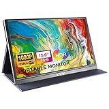
- [ FHD 1080P PORTABLE MONITOR ]: KYY using a 15.6''(8.8"x14.2") advanced IPS screen with 178° wide viewing angle, Delivers 1920*1080 breathtaking viewing quality and HDR technology, KYY portable gaming monitor has excellent color rendering ability, provide you the clearer, smooth, excellent performance in gaming/multimedia. It can effectively reduce blue light radiation damage, no flickering, eye-care, and make it easier to watch for a long time
- [ WIDE COMPATIBILITY ]: KYY portable monitor for laptop equipped with 2 Full Function Type-C ports and Mini-HDMI port, easy access to your favorite devices with 1 cable solution as long as your device support Thunderbolt 3 or 3.1 USB-Type-C, compatible with most laptop, smartphone, PC, PS4, XBOX and more.
- [ ULTRA-SLIM PORTABLE DISPLAY ]: KYY USB C portable monitor features a 0.3inch ultra-slim profile(1.7lb), it is easy to slides into your bag, allows you to carry it everywhere, ideal for a simple on-the-go dual-monitor setup or extend your phone screen for movies or games. No driver needed and equipped with 3.5mm audio inputs and 2 built-in stereo speakers to enhance entertainment experience
- [ DURABLE SMART COVER ]: Comes with a scratch-proof smart cover made of durable PU leather exterior, doubles as a stand, provides comprehensive protection and frameless magnetic design for this portable computer monitor. There are two grooves in the cover base to give at least some choice of viewing angle for your comfort for less cumbersome installation
- [ LIGHTWEIGHT BUT POWERFUL ]: KYY portable external monitor can work in both landscape and portrait mode, can be used as a gaming monitor, screen extender for laptop or phone. It has a unique designed Premium gray metal appearance, 2 built-in speakers to play audio, a friendly menu control wheel for setting, and 24/7 professional support team
Firefox Responsive Design Mode and CSS Inspection
Firefox is especially useful in a responsive design workflow because it combines viewport testing with some of the strongest CSS inspection tools available in any browser. Its Responsive Design Mode lets you resize pages, choose common device dimensions, rotate orientation, adjust device pixel ratio, and simulate touch input without leaving the tab. For teams building complex layouts with CSS Grid, Flexbox, container queries, or advanced typography, Firefox often reveals layout behavior more clearly than a simple viewport emulator.
Responsive Design Mode can be opened from the developer tools or with the keyboard shortcut Ctrl+Shift+M on Windows and Linux, or Cmd+Opt+M on macOS. Once active, you can drag the viewport to custom widths, select saved presets, throttle network speed, and capture screenshots at specific breakpoints. This makes it practical for checking common responsive states such as a 320px mobile layout, a 768px tablet layout, and wider desktop breakpoints in quick succession. Unlike testing only by dragging the main browser window, Responsive Design Mode keeps the browser chrome out of the equation, giving you a cleaner view of the page area you are actually designing for.
Where Firefox stands out
- Grid inspection: Firefox provides detailed overlays for CSS Grid, including line numbers, area names, gaps, and track sizes. This is valuable when debugging dense editorial layouts, dashboards, product cards, or any design where content changes across breakpoints.
- Flexbox tools: The Flexbox inspector highlights flex containers and items, helping you understand spacing, wrapping, alignment, and shrinking behavior when the viewport becomes narrow.
- Computed CSS clarity: The Rules and Computed panels make it easy to see which media query or selector is controlling a property. This helps identify unexpected overrides between mobile, tablet, and desktop styles.
- Font and accessibility inspection: Firefox includes helpful font details and accessibility panels, which are useful when responsive changes affect readability, contrast, focus order, or text scaling.
Firefox is also a strong check against Chromium-only assumptions. Since Chrome, Edge, Brave, and many other browsers share the Blink rendering engine, it is easy to test in several browsers and still miss issues that appear in Gecko, Firefox’s engine. Differences may show up in form controls, subpixel rounding, line wrapping, SVG rendering, scroll behavior, sticky positioning, or newer CSS features. Testing in Firefox gives you a more meaningful cross-engine comparison than testing only across Chromium-based browsers.
There are some limitations. Firefox Responsive Design Mode is still an emulator, not a substitute for real phones and tablets. It cannot perfectly reproduce mobile browser UI behavior, hardware performance, touch ergonomics, operating-system font rendering, or mobile Safari quirks. Its device presets are useful for sizing, but they should not be treated as exact replicas of physical devices. For JavaScript-heavy interfaces, animations, and performance-sensitive pages, it is still worth validating on actual hardware or through a remote device testing service.
A practical workflow is to use Firefox after an initial pass in Chrome DevTools. First, confirm that the layout responds correctly at your main breakpoints. Then open the same page in Firefox and inspect the Grid, Flexbox, and computed styles at the breakpoints where the design changes most. Pay close attention to navigation wrapping, card alignment, form spacing, modal behavior, sticky headers, and any layout that depends on precise measurements. If Firefox and Chrome agree, you have stronger evidence that the responsive implementation is robust across rendering engines.
Safari for iOS and WebKit-Specific Testing
Safari deserves a dedicated place in a responsive design testing workflow because it is the browser engine behind iOS browsing. On iPhone and iPad, Safari, Chrome, Firefox, and most in-app browsers all rely on WebKit, so a layout that works well in desktop Chrome is not enough to prove that it will behave correctly on mobile Apple devices. Testing in Safari helps catch issues with viewport sizing, touch interaction, fixed positioning, form controls, media playback, and WebKit-specific CSS behavior before users encounter them.
For responsive layout checks, Safari on macOS includes Web Inspector and a Responsive Design Mode that can preview common iPhone and iPad dimensions. It is useful for quick validation of breakpoints, typography scaling, navigation changes, and orientation behavior. The most valuable setup, however, is pairing a real iPhone or iPad with Safari’s remote debugging tools on a Mac. After enabling Web Inspector on the iOS device, Safari on macOS can inspect the live page, review DOM changes, edit CSS, monitor console output, and debug JavaScript while the page runs on actual hardware.
Where Safari testing is especially valuable
- Viewport units: Mobile Safari has historically handled vh, browser chrome, and dynamic viewport changes differently from desktop browsers, which can affect full-height hero sections, drawers, and sticky footers.
- Touch and scrolling: Momentum scrolling, overscroll behavior, nested scroll containers, and fixed elements can behave differently on iOS than in Chromium-based desktop emulation.
- Form controls: Date inputs, select menus, input zooming, keyboard overlays, and autofill styling often need real-device review.
- Safe areas: Devices with notches or rounded corners require checks for
env(safe-area-inset-*), especially for fixed headers, bottom navigation, and full-screen web apps. - Media and permissions: Autoplay, inline video, camera access, and audio behavior should be validated in Safari because platform rules can differ from Chrome and Firefox.
Safari’s limitation is that its emulation is not a complete substitute for physical devices. Responsive Design Mode can approximate screen sizes and user agents, but it cannot perfectly reproduce device performance, touch latency, keyboard behavior, network variability, or GPU rendering on older iPhones. It also requires access to macOS for the strongest debugging workflow, which can be a constraint for teams working primarily on Windows or Linux. Browser testing services can fill part of that gap, but critical flows such as checkout, login, onboarding, and media capture are still best checked on at least one recent iPhone and, when possible, one older supported model.
Quick wins for a faster PC:
Fix the driver behind crashes, sound loss and screen glitchesFind Drivers →Repair Windows errors before they cause bigger problemsFix Now →Rank #3

- Full HD Portable Monitor - MNN 15.6inch portable laptop monitor with 1920*1080 resolution, advanced IPS glossy screen support 178° full viewing angle, it renders accurate and bright color, draws you into the video or game with lifelike colors and amazing detail.It can effectively reduce blue light radiation damage, no flickering, eye-care, and make it easier to watch for a long time.A second monitor for working from home.
- Double Type-C Port -For Plug & Play, the MNN monitor provides 2 Full Feature Type-C ports. Only One USB Type-C Cable is required to connect to the power supply & display signal transmission. NOTE: Your device should support thunderbolt 3.0 or USB 3.1 Type C DP ALT-MODE.which supports multiple connect ways to your laptops, PC, Phones, Macbooks, PS5/PS4, Xbox, and Switch.
- Lightweight Ultra Slim for Travel - As a portable external monitor,MNN portable laptop monitor easily accommodate to every suitcase and backpack and stress-free when you are holding it for a long time. They are truly portable computer monitors for travelers, students, gamers,engineers, and everyone.
- Give consideration to work and games - through multiple display modes [Copy Mode/Extended Mode/Second Screen Mode/Portrait Mode], we can bring you a clear second screen in the meeting, and expand the screen anytime and anywhere to improve work efficiency and improve the quality of life. Adjusting to HDR mode can upgrade the image to a new level, providing you with brighter highlights,deeper and more realistic colors, more realistic images, and amazing viewing/gaming experience.
- Powerful Smart Cover - MNN portable external monitor can work in both landscape and portrait mode, can be used as a gaming monitor, screen extender for laptop or phone. Comes with a scratch-proof smart cover made of durable PU leather exterior, doubles as a stand, provides comprehensive protection for this portable computer monitor.
A practical approach is to use Safari after the main responsive structure has already been refined in Chrome or Firefox. Start by opening the site in Safari Responsive Design Mode to scan core breakpoints, then test on a connected iOS device for real scrolling, tapping, form entry, and orientation changes. Pay close attention to sticky headers, bottom bars, modals, off-canvas menus, and any layout using viewport-height calculations. If analytics show a large iOS audience, include Safari checks before each release rather than treating them as final-stage cleanup.
Edge and Chromium-Based Cross-Browser Checks
Microsoft Edge is built on Chromium, so its responsive design behavior is often close to Chrome’s, especially for layout, modern CSS support, JavaScript execution, and DevTools workflows. That makes Edge useful as a second Chromium-based checkpoint: if a design works in Chrome but breaks in Edge, the issue may involve browser defaults, user settings, extensions, enterprise policies, font rendering, media handling, or platform integration rather than the core rendering engine alone.
Edge DevTools will feel familiar to anyone using Chrome DevTools. It includes device emulation, viewport resizing, network throttling, performance profiling, accessibility inspection, CSS debugging, and responsive screenshots. For responsive testing, the main value is not relearning a new toolset but confirming that common Chromium assumptions hold across another widely used browser. This is especially relevant for Windows-heavy audiences, corporate environments, internal apps, and sites where Edge may be the managed default browser.
Where Edge adds practical coverage
- Windows font and UI differences: Text metrics, fallback fonts, scrollbar behavior, and form controls can affect wrapping, spacing, and component height at narrow widths.
- Enterprise environments: Managed Edge installations may run with stricter security settings, disabled features, proxy configurations, or compatibility policies that influence app behavior.
- Progressive web apps: Edge has strong PWA integration on Windows, making it useful for checking installed app windows, standalone display modes, icons, and responsive layouts outside a normal tab.
- Accessibility tooling: Edge includes accessibility inspection features that help verify whether responsive changes preserve labels, focus order, contrast, and usable touch targets.
Testing in Edge should not be treated as a substitute for Safari, Firefox, or real mobile devices. Because Edge and Chrome share the Chromium engine, they may both pass the same layout while Safari exposes a WebKit-specific issue or Firefox reveals a different interpretation of sizing, scrolling, or CSS behavior. Edge is most valuable when paired with those engines rather than used as evidence that a design is broadly compatible.
A practical workflow is to use Chrome or Edge as the primary debugging browser during development, then run a quick comparison in the other Chromium browser before moving on to Firefox and Safari. Check the same breakpoints, navigation states, form flows, modals, sticky elements, and media-heavy sections. If the site targets business users, also test Edge on Windows at common laptop widths such as 1366px, 1440px, and 1920px, plus narrower snapped-window sizes where responsive layouts often expose hidden overflow or cramped controls.
| Check | What to verify in Edge |
|---|---|
| Viewport resizing | Breakpoints, overflow, sticky headers, and navigation collapse behavior. |
| Typography | Line wrapping, fallback fonts, button height, and readable spacing on Windows. |
| Forms | Native controls, validation messages, keyboard focus, and autofill layout shifts. |
| PWA mode | Standalone window sizing, app chrome, icons, splash screens, and responsive shell layout. |
For Chromium-based cross-browser checks beyond Edge, consider Brave, Opera, Samsung Internet, and Android WebView when they match your audience. They may share Chromium foundations, but release cadence, feature flags, privacy protections, built-in UI, and mobile browser chrome can change the effective viewport and behavior. Use analytics to decide which Chromium variants deserve routine testing, and reserve deeper investigation for browsers that represent meaningful traffic or revenue.
Key Differences in Rendering, Performance, and Compatibility
Responsive design bugs often come from small differences in how browsers interpret layout, paint UI elements, schedule rendering work, or expose device capabilities. Chrome and Edge share the Blink rendering engine, Safari uses WebKit, and Firefox uses Gecko. Modern standards support is strong across all three engine families, but the details still matter when a design depends on fluid grids, sticky positioning, viewport units, form controls, video behavior, touch input, or advanced CSS features.
Layout is usually the first area where differences appear. Flexbox and Grid are broadly reliable, but edge cases involving intrinsic sizing, overflow, percentage gaps, subgrid, aspect-ratio, and min-width behavior can vary enough to affect a mobile layout. Safari has historically required closer attention for viewport-related behavior, especially on iOS where browser chrome expands and collapses as the user scrolls. Units such as vh, dvh, svh, and lvh should be tested on real mobile Safari rather than trusted only in desktop emulation.
Outdated Drivers Are Slowing You Down
One free scan finds every outdated or missing driver and matches the right update for your exact hardware.Free scan · exact hardware matchPC Slower Than It Used to Be?
A free scan shows the junk files, broken settings and background clutter dragging Windows down - then fixes them in one click.Free scan · Windows 10 & 11Visual rendering also differs in ways that affect polish. Font smoothing, default form styling, line-height calculation, emoji rendering, focus outlines, scrollbars, and color management can make the same component feel slightly different across browsers. Native controls such as selects, date inputs, range sliders, file uploads, and checkboxes are especially browser-specific. If a design system relies on heavily customized controls, test keyboard focus, pointer interaction, disabled states, validation messages, and high-contrast or forced-color modes in more than one browser.
Rank #4

- 15.6" FHD Portable Monitor - Featuring a 1920*1080P resolution, 178°FULL viewing angle, HDR, and Low Blue Light Super Clear IPS A-grade screen, this Anyuse portable screen for laptop enhanced visual experience, reduces eye strain and fatigue.
- Double Type-C Port -For Plug & Play - Anyuse portable monitor features 2 full-featured Type-C ports and 1 MINI HDMI port. You can easily access your favorite devices with just one USB Type-C or MINI HDMI cable. NOTE: Your device should support Thunderbolt 3.0/4.0 or USB 3.1 Type C DP ALT-MODE.
- Portable & Light Weight - At just 1.37lbs and 0.04 inch thin, this portable laptop monitor is ultra-portable and perfect for on-the-go productivity or gaming. flexible to use anywhere you need a second screen for laptop. bringing you efficiency for meetings, work from home, and presentations.
- Able to Balance Work and Play - With multiple display modes [copy mode/extension mode/second screen mode]. During meetings,it can copy your laptop's content as a second screen to share with others.At work, it can be used as a second extended screen to increase productivity. In life, adjusting to HDR mode can upgrade the image to a new level, providing you with brighter highlights, more realistic colors and images.Two built-in speakers provide an amazing viewing and gaming experience.
- Wide Compatibility - Enjoy hassle-free plug-and-play functionality with the portable monitor. it is compatible with all devices equipped with HDMI and USB Type-C ports like laptops, PS, XBOX, SWITCH game consoles, No app or driver installation required.
Common areas where browser behavior diverges
- Viewport units: Mobile browser toolbars can change the visible viewport during scroll, affecting full-height panels and sticky footers.
- Touch and pointer events: Hover states, tap delays, passive listeners, and gesture handling can behave differently on touch-first devices.
- CSS feature support: Container queries, cascade layers, subgrid, scroll-driven animations, and newer color functions may not have identical support across engines.
- Media performance: Autoplay rules, codec support, poster rendering, and video inline playback vary, particularly between iOS Safari and Chromium browsers.
- Forms and inputs: Date pickers, autofill styling, validation bubbles, virtual keyboards, and input zooming are strongly affected by browser and operating system.
Performance testing should also use a browser mix because each engine has different strengths in JavaScript execution, layout calculation, painting, compositing, and memory management. A page that feels smooth in Chrome DevTools with CPU throttling may still stutter in Safari on an older iPhone if it uses large fixed backgrounds, expensive blur filters, heavy box shadows, or JavaScript-driven scroll effects. Firefox can reveal different paint and layout bottlenecks, while Edge is useful for confirming that Windows-specific input methods, display scaling, and font rendering do not introduce usability problems.
| Browser | Rendering Engine | Responsive Testing Focus |
|---|---|---|
| Chrome | Blink | Baseline debugging, Android emulation, performance profiling, broad extension support |
| Firefox | Gecko | CSS inspection, Grid and Flexbox debugging, standards comparison |
| Safari | WebKit | iOS behavior, WebKit-specific layout issues, touch and viewport validation |
| Edge | Blink | Windows testing, enterprise environments, Chromium comparison outside Chrome |
Compatibility decisions should be based on audience data, not only personal preference. Analytics can show whether users rely on iOS Safari, Chrome on Android, desktop Firefox, Edge on Windows, embedded webviews, or older browser versions. For most teams, a practical minimum is Chrome for daily development, Firefox for independent engine comparison, Safari for WebKit and iOS validation, and Edge for Windows-specific checks. This combination catches the most common responsive failures before they reach users.
Independent reader supportYour contribution helps us test, update, and keep practical guides available for everyone.Recommended Browser Testing Workflow
A practical responsive testing workflow should combine fast iteration in one primary browser with targeted checks in other engines and real-device validation before release. Chrome or Edge is often the fastest place to begin because their DevTools provide strong device emulation, performance profiling, network throttling, and layout debugging. Firefox should be added early for CSS inspection and independent Gecko rendering checks, while Safari is essential for WebKit behavior, especially when the site must work well on iPhone and iPad.
What’s actually slowing this PC down?
Pick the symptom - the matching free tool is one click away.
1. Start with layout foundations in a primary browser
Begin development in the browser where your team is most productive, usually Chrome, Edge, or Firefox. Use responsive viewport resizing rather than testing only preset device names. Drag from very narrow widths through tablet, laptop, and wide desktop sizes to find breakpoints where navigation, grids, forms, media, and typography begin to fail. Inspect flexbox and grid overlays, verify spacing tokens, and check whether content wraps naturally instead of relying on device-specific fixes.
2. Test core breakpoints across multiple engines
After the layout works in your primary browser, repeat the same flows in Chrome or Edge, Firefox, and Safari where available. Focus on the pages and components users interact with most: headers, menus, product cards, checkout steps, dashboards, modals, embedded media, and long forms. Chromium-based browsers share a rendering engine, so testing both Chrome and Edge is useful for browser features, extensions, enterprise environments, and PDF or form behavior, but it does not replace Firefox or Safari checks.
- Chrome or Edge: use for rapid debugging, Lighthouse audits, viewport emulation, network throttling, and JavaScript performance analysis.
- Firefox: use for CSS grid, flexbox, font rendering, scroll behavior, and catching differences in Gecko’s interpretation of standards.
- Safari: use for iOS viewport behavior, touch interactions, WebKit-specific CSS issues, video playback, form controls, and safe-area handling.
3. Validate on real devices for touch and viewport behavior
Emulation is useful, but it cannot fully reproduce mobile hardware, operating system UI, browser chrome, input latency, pixel density, virtual keyboards, or real scrolling. Before launch, test at least one iPhone in Safari, one Android device in Chrome, and any device class that matters to your audience, such as tablets or high-DPI laptops. Pay close attention to sticky headers, fixed-position elements, off-canvas menus, tap targets, focus states, orientation changes, and forms that trigger the on-screen keyboard.
4. Use a repeatable checklist before release
Create a small browser matrix based on analytics, customer requirements, and known risk areas rather than trying to test every possible device. For most teams, a balanced mix includes latest Chrome, latest Firefox, latest Safari on macOS or iOS, latest Edge, and at least one real Android and iOS phone. Older browser versions should be added only when analytics or contractual support requires them.
Best Value

- Clear visuals. Fluid motion: A 144Hz refresh rate and 1ms MPRT deliver smooth, tear‑free motion across work, gaming, and streaming for clearer, more fluid viewing.
- Eye comfort: TÜV Rheinland 3‑star* certification reduces harmful blue light while preserving stunning color quality without compromise. *TÜV Rheinland 3-star eye comfort certification.
- Wide viewing angle: Get consistent views across a wide 178° /178° viewing angle.
- In-Plane Switching (IPS): See excellent color accuracy and consistency across wide viewing angles with In-plane Switching (IPS) technology.
- Ultra-thin bezels: Maximize your viewing experience with thin bezels.
| Stage | Best browser mix | Main focus |
|---|---|---|
| Build | Chrome, Edge, or Firefox | Fast layout iteration, CSS inspection, component behavior |
| Cross-engine review | Chromium, Firefox, Safari | Rendering differences, CSS support, form controls, scrolling |
| Device validation | Real iOS and Android devices | Touch input, viewport changes, keyboard behavior, performance |
| Pre-release | Analytics-based browser matrix | Critical user journeys, regressions, accessibility, network conditions |
For ongoing projects, combine manual browser checks with automated visual regression tests and end-to-end tests for critical flows. Automation can catch broken layouts after code changes, but manual review remains valuable for judging readability, touch comfort, animation smoothness, and real-world usability. The strongest workflow is not tied to a single browser: it uses each browser where it is strongest and reserves real devices for the issues emulators are most likely to miss.
Frequently Asked Questions
Which browser should I use first when testing responsive design?
Start with the browser your audience uses most, usually Chrome or Safari depending on your traffic. Chrome DevTools is excellent for fast viewport testing, layout debugging, and performance checks, while Safari is essential if a large share of users are on iPhone or iPad. Use analytics data rather than personal preference to decide your primary testing browser.
Is Chrome device emulation enough to test mobile layouts?
Chrome device emulation is useful for checking breakpoints, touch targets, network throttling, and basic responsive behavior. It does not perfectly reproduce every mobile browser issue, especially iOS Safari rendering, browser UI effects, scrolling behavior, and hardware-specific quirks. Treat emulation as an early testing step, then verify key pages on real devices or cloud device labs.
Do I really need to test in Safari if my site works in Chrome?
Yes, especially for iOS users, because every browser on iPhone and iPad uses WebKit under the hood. Safari can differ from Chrome in viewport height handling, form controls, fixed positioning, font rendering, media playback, and newer CSS support. Testing in Safari helps catch issues that Chromium-based browsers will not reveal.
What does Firefox catch that Chrome DevTools might miss?
Firefox is especially helpful for inspecting CSS Grid, Flexbox, container queries, fonts, and accessibility-related layout behavior. Its Responsive Design Mode also makes it easy to test viewport sizes, device pixel ratios, touch simulation, and reduced motion settings. Running a layout through Firefox can reveal standards-based differences that are hidden when you only test in Chromium browsers.
What is a practical browser testing workflow for responsive design?
Build and debug primarily in Chrome or Firefox, then test the same pages in Safari and Edge before release. Check common breakpoints, awkward in-between viewport widths, portrait and landscape orientations, zoom levels, and real touch interaction. For high-value pages, add real-device testing on at least one iPhone, one Android phone, and one tablet-sized viewport.
Bottom Line
No single browser gives you a complete picture of responsive behavior, so the strongest workflow combines Chrome or Edge for everyday debugging, Firefox for layout and CSS inspection, and Safari for WebKit/iOS validation. This mix helps catch viewport, rendering, touch, and performance issues before users do.
Use device emulation for fast iteration, then confirm breakpoints and interactions on real devices when possible. Start with the browsers your audience actually uses, document the quirks you find, and make cross-browser responsive checks a regular part of your release process.
Recommended Free Tools
Quick Recap
Product prices and availability are accurate as of the date/time indicated and are subject to change. Any price and availability information displayed on Amazon at the time of purchase will apply.




