
GitHub Primer
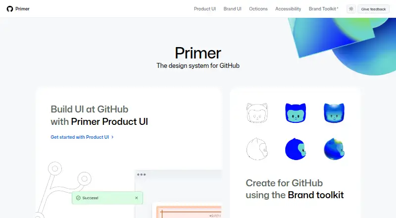
What GitHub Primer is
GitHub Primer is a free, open-source design system for creating and building user interfaces. Primer Product UI documents components, patterns, and design tokens for color, spacing, and typography, while Primer Brand addresses marketing websites and digital experiences. React guidance covers theming, recommended practices, and extending components. Primer also provides accessibility resources and tools, along with Octicons, a scalable icon set made by GitHub.
Components are labeled experimental, ready, or deprecated; GitHub describes ready components as mature, with long-term support expected. Primer Web and Primer Primitives are available through the Primer Figma Community page, but GitHub’s Figma organization is limited to GitHub team members. The Primer Mobile Figma library is internal only, and contributions to Primer Web are limited to GitHub employees because of how Figma handles open-source files. Product UI documentation includes an MCP server page. GitHub’s Design Infrastructure and Design Engineering teams maintain the system, including its CSS framework, documentation, tools, and libraries. Primer is available for web and API use, with no paid plans listed.
Who it suits
Primer suits teams building product interfaces or marketing experiences who want documented patterns, React guidance, design tokens, and accessibility resources. Its Figma availability and contribution rules may matter to teams working outside GitHub.
What it does well
- Free and open source
- Includes React component and theming guidance
- Provides accessibility resources and tools
- Documents component status and support expectations
- Primer Web and Primitives are available in Figma Community
What to know first
- Mobile Figma library is internal only
- Only GitHub employees can contribute to Primer Web
- GitHub Figma organization access is limited to team members
Plans
| Plan | Billed and limits | Price |
|---|---|---|
| Primer | Design system for GitHub; no paid plans listed | Free |
As primer.style lists them, read 9 Oct 2026. The maker's own page has the final word.
Getting started
- Visit primer.style for Primer documentation.
- Use the Product UI or Brand guidance for the interface work you are designing.
- For React, consult Primer’s component and theming guidance.
- Find Primer Web and Primer Primitives through the Primer Figma Community page.
- Use Primer’s accessibility resources and Octicons as relevant to your work.
Verdict
Primer provides product and brand design guidance, React documentation, accessibility resources, and icons without a listed paid plan. Figma access and contribution restrictions limit some collaboration options.
Questions
How much does Primer cost?
The Primer plan is free. Primer is open source, and no paid plans are listed.
Which platforms are listed for Primer?
Primer is listed for API and web.
Can I access Primer Figma libraries?
Primer Web and Primer Primitives are available through the Primer Figma Community page. Access to GitHub’s Figma organization is limited to GitHub team members, and the Primer Mobile Figma library is internal only.
Can anyone contribute to Primer Web?
No. Contributions to Primer Web are limited to GitHub employees because of how Figma handles open-source files.
What does Primer’s React documentation cover?
It provides React component documentation and guidance for theming, recommended practices, and extending components.
Who maintains Primer?
GitHub’s Design Infrastructure and Design Engineering teams build and maintain Primer, including its CSS framework, documentation, Octicons, tools, libraries, and component libraries.
Facts from GitHub Primer's own pages
- Accessibility
- Primer includes accessibility foundations, policies, principles and frameworks for accessible experiences. · primer.style, 14 Oct 2026
- Brand release
- The Primer Brand site lists version 0.79.0 as its latest release. · primer.style, 14 Oct 2026
- Brand UI
- Primer Brand UI is GitHub’s system for marketing websites and digital experiences. · primer.style, 14 Oct 2026
- Component lifecycle
- Primer marks components as experimental, ready, or deprecated, and says ready components are mature with long-term support expected. · primer.style, 9 Oct 2026
- Components
- The Product UI documentation catalogs dozens of components including buttons, dialogs, forms, navigation, tables and overlays. · primer.style, 14 Oct 2026
- Contribution limits
- Only GitHub employees can contribute to Primer Web because of how Figma handles open source files. · primer.style, 9 Oct 2026
- Contributions
- Primer publishes contribution guidance for adding components, documentation, Figma work and other changes. · primer.style, 14 Oct 2026
- CSS changelog
- The Primer CSS repository lists v22.3.0 as its latest release and describes a class-name export and pagination selector changes. · github.com, 14 Oct 2026
- CSS utilities
- Primer documents CSS utilities for animation, borders, box shadows, flexbox, grid, layout, spacing and typography. · primer.style, 14 Oct 2026
- Design tokens
- Primer Primitives provide design tokens for color, spacing and typography. · primer.style, 14 Oct 2026
- Figma
- Primer Web and Primer Primitives are available through the Primer Figma Community page, while access to GitHub’s Figma organization is limited to GitHub team members. · primer.style, 9 Oct 2026
- Icons
- Octicons is a scalable set of icons handcrafted by GitHub. · primer.style, 9 Oct 2026
- Independent adoption
- OpenProject says it began adopting Primer in 2023 and planned to use it for new features while gradually revising existing ones. · openproject.org, 14 Oct 2026
- Independent feature use
- OpenProject 16.2 applied Primer to project creation and project-copy forms to improve consistency and accessibility. · openproject.org, 14 Oct 2026
- Independent limit: gradual migration
- OpenProject reports that its existing interface is being migrated to Primer gradually rather than all at once. · openproject.org, 14 Oct 2026
- Independent limit: unresolved accessibility issues
- The 2026 Primer Docs conformance report records several WCAG 2.2 AA criteria as only partially supported, with low-priority exceptions. · accessibility.github.com, 14 Oct 2026
- Independent roadmap
- OpenProject’s design-system roadmap includes Primer work for page headers, popovers, tables, color-blind mode, account screens and accessibility improvements. · community.openproject.org, 14 Oct 2026
- Licence
- The Primer design repository is released under the MIT license. · github.com, 14 Oct 2026
- Limit: accessibility context still required
- GitHub’s Primer annotation guidance says accessible components alone do not guarantee correct heading hierarchy, focus order, reflow or other page-level outcomes. · github.com, 14 Oct 2026
- Limit: component complexity
- GitHub says design systems with more than 60 components can make annotation prioritization difficult and that mapping properties can take substantial time. · github.blog, 14 Oct 2026
- Limit: maintenance overhead
- GitHub’s annotation article warns that mature Primer components change frequently and annotations can fall out of sync without monitoring, creating confusion and rework. · github.blog, 14 Oct 2026
- Maker investors
- Crunchbase lists seven GitHub investors, including Sequoia Capital and Andreessen Horowitz. · crunchbase.com, 14 Oct 2026
- Maker ownership
- Crunchbase records GitHub as acquired by Microsoft and lists GitHub’s headquarters in San Francisco, California. · crunchbase.com, 14 Oct 2026
- Maker team
- GitHub’s Design Infrastructure and Design Engineering teams build and maintain Primer, including its CSS framework, documentation, Octicons, tools, libraries, and component libraries. · primer.style, 9 Oct 2026
Where GitHub Primer stands on Freedom251
- UI Kit Libraries#1 of 26