A production-ready React color picker should be more than a draggable visual control: keep its value synchronized with application state, provide a labeled text-based way to inspect or enter colors, and treat image and screen sampling as optional enhancements. If users edit gradients or modern color spaces such as OKLCH, represent that information explicitly rather than silently reducing it to a hex value.
How do I add a color picker to a React form?
Use a controlled-value design: the picker reports changes to its parent, and the parent owns the value used for validation, reset, persistence, and previews. PrimeReact’s documented basic ColorPicker pattern uses value and onChange. React Aria’s ColorPicker documentation likewise shows color state shared among its color components. These are useful integration patterns, not proof that every picker handles every form requirement.

As an Amazon Associate I earn from qualifying purchases.
Decide what your application will store before choosing the visual control. For a simple solid-color field, that may be a CSS color string or a normalized color object. If the product edits gradients, store structured gradient data and serialize it to CSS at a boundary; a single string may be convenient for display or export, but is harder to edit safely as separate stops and parameters.
Free tools Windows power users keep installed
One-click scans. No signup required.
Keep editing, validation and persistence distinct
- Give the control a programmatically associated label and expose a text field that can show or accept the value.
- Keep incomplete text entry as an editable draft. Do not replace it with an older value or clear it simply because the user has not finished typing.
- Validate the draft, present errors in text associated with the field, and update the canonical application value according to an explicit rule.
- Let the parent own reset, persistence and any preview so those behaviors remain consistent with the rest of the form.
- Test round trips for alpha, modern space-separated syntax, missing components if supported, and out-of-gamut values if your product accepts them. A component accepting a string does not establish that it preserves every CSS color feature.
For a form that needs only a solid color, a compact picker may be enough. A design tool that edits gradients, channels and modern color spaces needs a richer data model and a more deliberate editing interface.
#1 Best Overall

- 【Broad Compatibility】XOPPOX upgraded drawing tablet is compatible with Windows XP/7/8/10/11, Android 4.4 and above, and macOS 11 or later (not compatible with iPhone, iPad, or Chromebook). Note: For Mac users, permissions for Accessibility, Input Monitoring, and Full Disk Access are required in Security & Privacy after installation
- 【No-Battery Pen】The digital drawing tablet comes with a battery-free pen featuring 8192 levels of pressure sensitivity, making lines smoother and more natural. This pen does not need to be charged, so you don’t have to worry about battery power. The package includes 20 replacement nibs
- 【Convenient Shortcut Keys】Designed with 12 customizable shortcut keys and 10 multimedia keys (only compatible with Windows), this drawing pad for pc provides greater convenience and helps improve productivity and efficiency by allowing you to set shortcuts for many different software in the driver settings
- 【Easy to Install】When connecting the graphics tablet to the computer, you can find the installation driver on the removable disk of your computer and install it. Note: After installation, you need to perform some settings and restart your computer before use. If you have any questions about the drawing tablet for pc, please reach out to us directly via "Get Product Support" on the Amazon order page or after-sales email
- 【Wide Range of Use】XOPPOX drawing tablet is compatible with office software such as Microsoft Word, Excel, PowerPoint. It is ideal for online teaching, online classes, remote work, web conferences, presentations, and so on. The art tablet is also compatible with most major software, including Photoshop, SAI, FlipaClip, MediBang, Adobe Illustrator, Lightroom, and more
Which React color-picker approach fits the job?
Compare candidates against the actual interaction and data requirements, not a feature checklist alone. The documented features below describe what the projects say their components provide; they are not an independent audit of accessibility, performance, maintenance or suitability for a particular application.
| Approach | What the documentation describes | Important qualification |
|---|---|---|
| PrimeReact ColorPicker | Controlled value/onChange, popup or inline presentation, and hex, RGB and HSB value formats. |
Its ColorPicker documentation currently says the component is not compatible with screen readers and describes text fields as a plan. Do not treat the visual component alone as an accessible form control. |
| PrimeReact InputColor | An unstyled compound component with an area, channel sliders, swatches, inputs, a transparency grid, formats including HSBA, HSLA, RGBA and OKLCHA, and native EyeDropper integration. | Those are documented features, not an independent accessibility or performance audit. Verify the current API and behavior in your application. |
| React Aria ColorPicker | Shared color state across color components; its example checks for EyeDropper availability before invoking it from a button action. | The example is an integration pattern, not a guarantee of current browser coverage or a complete browser-support matrix. |
| Colorshot | Its project page advertises React 18+ support, solid colors, linear, radial, conic and repeating gradients, CSS color strings, OKLCH and other formats, and accessibility claims. | These are maintainer statements. Verify the current release, API, bundle impact, license and accessibility behavior independently before selecting it. |
Before adopting any candidate, check whether it supports your form-library integration, invalid and manually entered values, output formats, keyboard interaction, screen-reader use, image sampling, eyedropper cancellation, gradient types and stops, interpolation, and the package constraints of your application. The available evidence does not establish a head-to-head performance or accessibility winner.
Rank #2
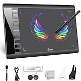
- Large 10x6 Inch Active Drawing Space: The UGEE M708 V3 drawing tablet offers a spacious 10x6 inch active area with a papery texture surface, providing a smooth, lag-free drawing experience for digital art creation, sketching, and photo editing. This mature and well-crafted product ensures exceptional quality and durability for long-term use.
- 8192 Levels Pressure Sensitivity: Equipped with a battery-free stylus featuring 8192 levels of pressure sensitivity, this digital drawing tablet delivers precise control over line thickness and opacity, perfect for professional artists and hobbyists alike. Its proven design guarantees consistent performance and reliability.
- Universal Compatibility: Compatible with Windows 11/10/8/7, Mac OS X 10.10 or above, and Chrome OS 88 (or later), Linux. Works seamlessly with popular creative software like Photoshop, Illustrator, Corel Painter, Autodesk MAYA, and more, making it an ideal graphics tablet for PC. Its mature technology ensures seamless integration with your workflow.
- 8 Customizable Shortcut Keys: The Ugee M708 drawing tablet is designed with 8 ergonomic shortcut keys for quick access to functions like undo, zoom, brush size adjustment, and eraser, enhancing productivity and workflow efficiency. Its refined design makes it a trusted tool for creators.
- Paper-Like Drawing Experience: The UGEE M708 tablet’s papery texture surface and tilt-supporting stylus provide a natural, realistic drawing experience, mimicking the feel of traditional paper and pen. This well-established product offers a premium drawing experience for all skill levels.
How do I pick a color from an image in React?
Image sampling is a separate workflow from opening a browser eyedropper. A typical experience lets a user preview an uploaded or available image and choose a point on it. The value to store must come from the corresponding source-image pixel, not simply the pointer’s displayed position.
Quick wins for a faster PC:
Repair Windows errors before they cause bigger problemsFix Now →Scan for outdated or missing drivers - takes under a minuteDriver Scan →Clear out junk files and repair common Windows errorsFree Scan →Plan for the mapping between the rendered preview and source pixels to account for scaling, letterboxing, cropping and device pixel ratio. If the image is remote, browser origin and security rules can affect pixel reads. These details depend on the implementation and browser environment; verify them against current browser documentation before shipping canvas or file-processing code. Do not assume a library’s image-sampling feature resolves those constraints for every source image.
Rank #3
- Mens Womens Kids Related To RGB And Cyan, Magenta, Yellow and Black Colours
- Great For Choosing Complimentary Colors Model Related To Coloration Colorist Pigment Coloristic Hue Technicolor Inkjet Printer
- PopGrip with swappable top; switch out your PopTop for another design or remove it completely for wireless charging capabilities. (Not compatible with Apple MagSafe wireless charger or MagSafe wallet.)
- Expandable stand to watch videos, take group photos, FaceTime, and Skype handsfree.
- Advanced adhesive allows you to remove and reposition on most devices and cases.
- Make the image preview’s sampling affordance clear and provide a non-image route, such as text entry, to specify a color.
- Decide how the interface communicates the sampled value and any failure to read a pixel.
- Test images with the scaling and cropping behavior your product actually uses, including remote images if they are in scope.
Can a React color picker use the browser eyedropper?
Yes, where the browser exposes the EyeDropper API. Treat it as a feature-detected convenience, not the sole way to choose a color. React Aria’s example checks whether EyeDropper exists before calling open() from a button action; an application should preserve its visual picker and manual input as alternatives.
Give screen sampling its own labeled button and handle both unavailability and a user abandoning the operation with a useful result in the interface. The reviewed material does not establish a complete 2026 browser-support matrix or every API security and user-activation rule, so check current browser documentation for the browsers your application supports before promising compatibility.
Do not promise that screen sampling recovers a display’s full wide-gamut color. Chrome DevTools documents that its eyedropper samples in sRGB and clips values outside sRGB to the nearest value. That statement applies to the DevTools picker; it is not a claim that every browser API implementation behaves identically.
The Tool Desk
Outbyte Driver Updater FREEFix the driver behind crashes, sound loss and screen glitchesFind Drivers →Outbyte PC Repair FREERepair Windows errors before they cause bigger problemsFix Now →How do I support OKLCH and gradients in a React color picker?
Keep color format and gradient structure visible in the data model. For a gradient editor, define at least the gradient type, direction or geometry, ordered stops, stop positions and—where supported—the interpolation choice. Serialize that structure to CSS at a deliberate boundary, and test parse, edit and serialize round trips. Avoid converting to hex automatically if that would discard authored color-space or gradient information.
Best Value

- Mens Womens Kids Related To RGB
- Great For Choosing Complimentary Colors Model Related To Coloration Colorist Pigment Coloristic Hue Technicolor Inkjet Printer
- PopGrip with swappable top; switch out your PopTop for another design or remove it completely for wireless charging capabilities. (Not compatible with Apple MagSafe wireless charger or MagSafe wallet.)
- Expandable stand to watch videos, take group photos, FaceTime, and Skype handsfree.
- Advanced adhesive allows you to remove and reposition on most devices and cases.
Choose and test interpolation deliberately
The W3C CSS Images Level 4 specification documents gradient interpolation color-space choices, including Oklch. The interpolation space affects the path between stops and therefore the colors visible between them. Oklch can be useful when a more chroma-preserving transition is desired, but it does not guarantee that every resulting color fits a target display’s gamut.
The W3C CSS Color Module Level 4 Candidate Recommendation Draft dated 26 September 2026 covers CSS color values, interpolation and gamut mapping. A standards draft is not proof that every feature has shipped in every browser. Test the actual serialized gradient in your target browsers and decide how your application handles colors that must be mapped into a display gamut.
What accessibility checks should a color picker pass?
The label “color picker” does not establish that a component is accessible. The W3C CSS Color Module Level 4, §3.1, dated 26 September 2026, states: “Although colors can add significant information to documents and make them more readable, color by itself should not be the sole means to convey important information.”
- Associate a programmatic label with the control and provide a text route to enter or inspect the current color.
- Make sliders, swatches, text entry and popovers operable by keyboard, with visible focus.
- Ensure assistive technology can announce relevant control names and current values.
- Do not use color alone to communicate an error, selection or instruction; provide meaningful textual feedback.
- Check contrast in the picker and surrounding interface, then test keyboard-only use and screen-reader combinations in the application’s target environment.
PrimeReact’s disclosure about its ColorPicker’s screen-reader compatibility is a concrete reminder to assess the behavior of the exact component you plan to ship rather than infer accessibility from a library name or feature claim.
Quick Recap
What should I verify before release?
- State: changes reach the parent, while reset, validation and persistence behave predictably.
- Text entry: incomplete drafts remain editable, invalid values receive textual feedback, and supported values survive round trips.
- Sampling: image-point selection maps correctly for the preview behavior you use; screen sampling has a manual fallback and a clear unavailable or canceled state.
- Color fidelity: alpha, OKLCH and other required formats are preserved, and gradient stops and interpolation survive editing and serialization.
- Accessibility: labels, keyboard operation, focus indication, announced values and non-color feedback work in the target environment.
- Dependency fit: verify current release, React compatibility, API, license and bundle impact. Feature descriptions alone do not establish maintenance quality or performance.
Product prices and availability are accurate as of the date/time indicated and are subject to change. Any price and availability information displayed on Amazon at the time of purchase will apply.

