Free tools Windows power users keep installed
One-click scans. No signup required.
If an iOS page looks zoomed in after an interaction, don’t start by changing CSS at random. First check what Safari reports about the page’s layout viewport and the portion of it currently visible. Those are different measurements, and inspecting both can help narrow down whether the apparent zoom involves layout, user zoom, oversized content, an embedded web view, or another runtime change. The title’s incident has no device, iOS version, app code, or reproducible trigger attached, so there is no established root cause; the steps below are a way to investigate it.
Why a page can look zoomed without its layout changing
Safari on iOS distinguishes the layout viewport, which affects page layout and text wrapping, from the visual viewport, the portion of the page currently visible on screen. A gesture can change the scale of the visible area without changing the layout viewport’s dimensions. That means a screenshot that looks enlarged does not, by itself, show whether the page reflowed, the user zoomed, or the visible region changed for another reason.
As an Amazon Associate I earn from qualifying purchases.
Apple’s archived Configuring the Viewport guide says iOS used a default viewport width of 980 pixels when a page did not configure one, and recommends width=device-width for iOS-targeted web apps. Treat the 980-pixel figure as historical documentation, not a guarantee about every current browser configuration. Apple’s recommendation is to set the width to device-width so portrait scale is 1.0 and the viewport is not resized when the user changes to landscape orientation.
What’s actually slowing this PC down?
Pick the symptom - the matching free tool is one click away.
That setting is not a cure for every apparent zoom. WebKit notes that a page can specify width=device-width and still have content so wide that Safari automatically scales it to fit. Also, WebKit says that iOS 10 allows pinch zoom on every page and ignores user-scalable, min-scale, and max-scale restrictions. That is a version-specific statement, but it is a reason not to treat disabling zoom as a routine fix: it restricts an important user interaction and may not work as intended.
#1 Best Overall
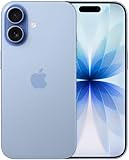
- This phone is unlocked and compatible with any carrier of choice on GSM and CDMA networks (e.g. AT&T, T-Mobile, Sprint, Verizon, US Cellular, Cricket, Metro, Tracfone, Mint Mobile, etc.).
- Please check with your carrier to verify compatibility.
- When you receive the phone, insert a SIM card from a compatible carrier. Then, turn it on, connect to Wi-Fi, and follow the on screen prompts to activate service.
- The device does not come with headphones or a SIM card. It does include a generic (Mfi certified) charger and charging cable.
- Tested for battery health and guaranteed to have a minimum battery capacity of 80%.
Investigate the reproduced interaction, not just the appearance
1. Record the conditions
Before editing the page, write down the device, iOS version, browser or app shell, orientation, and exact action immediately before the apparent scale change. Note whether it follows a tap, keyboard appearance or dismissal, pinch gesture, or rotation. Without a repeatable trigger and platform details, the appearance alone cannot identify a cause.
2. Check the viewport declaration
Inspect the document’s viewport meta tag. For an iOS-specific web app, Apple’s archived guide recommends width=device-width. Check what is actually present in the page rather than assuming a framework inserted the intended declaration. Do not add scale restrictions as a first response: WebKit’s account of iOS 10 user zoom shows why such restrictions are not a dependable general solution.
Rank #2
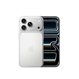
- This phone is unlocked and compatible with any carrier of choice on GSM and CDMA networks (e.g. AT&T, T-Mobile, Sprint, Verizon, US Cellular, Cricket, Metro, Tracfone, Mint Mobile, etc.).
- Please check with your carrier to verify compatibility.
- When you receive the phone, insert a SIM card from a compatible carrier. Then, turn it on, connect to Wi-Fi, and follow the on screen prompts to activate service.
- The device does not come with headphones or a SIM card. It does include a generic (Mfi certified) charger and charging cable.
3. Find content that exceeds the intended width
Check for fixed-width containers, oversized images or other media, wide tables, long unbroken strings, and responsive breakpoints that fail at the width where the issue occurs. A device-width viewport can coexist with layout wider than the device, and WebKit identifies that as a situation where automatic fit scaling may occur. Test the actual content and reproduced width; the viewport tag alone does not establish that the layout fits.
Do these 3 things before closing this tab:
1Clear out junk files and repair common Windows errors2Fix the driver behind crashes, sound loss and screen glitches3Repair Windows errors before they cause bigger problems4. Compare browser inspection with iOS rendering
In Safari on macOS, use Develop > Enter Responsive Design Mode to inspect the layout at device dimensions and while changing viewport dimensions. Web Inspector can help examine the page as you reproduce the interaction. Apple cautions that iOS-family rendering differs from macOS and recommends testing in an iOS simulator for platform-specific behavior; confirm on the affected device as well when the problem is device-specific.
Rank #3

- This phone is unlocked and compatible with any carrier of choice on GSM and CDMA networks (e.g. AT&T, T-Mobile, Sprint, Verizon, US Cellular, Cricket, Metro, Tracfone, Mint Mobile, etc.).
- Please check with your carrier to verify compatibility.
- When you receive the phone, insert a SIM card from a compatible carrier. Then, turn it on, connect to Wi-Fi, and follow the on screen prompts to activate service.
- The device does not come with headphones or a SIM card. It does include a generic (Mfi certified) charger and charging cable.
- Tested for battery health and guaranteed to have a minimum battery capacity of 80%.
These environments answer related but different questions:
- Responsive Design Mode and Web Inspector: useful for changing viewport dimensions and inspecting layout.
- iOS simulator or affected device: useful for confirming iOS rendering and reproducing the actual focus, keyboard, gesture, or orientation sequence.
5. Observe the visual viewport during the interaction
If a change in visible area or scale is suspected, instrument the Visual Viewport API. WebKit describes it as a way for pages to detect the part of the page visible to the user while accounting for zoom and the onscreen keyboard. Compare visual viewport dimensions and scale before and after the trigger, and during keyboard appearance or dismissal and orientation changes. This can show whether the visible region changed; it does not by itself prove why it changed.
Rank #4

- This phone is unlocked and compatible with any carrier of choice on GSM and CDMA networks (e.g. AT&T, T-Mobile, Sprint, Verizon, US Cellular, Cricket, Metro, Tracfone, Mint Mobile, etc.).
- Please check with your carrier to verify compatibility.
- When you receive the phone, insert a SIM card from a compatible carrier. Then, turn it on, connect to Wi-Fi, and follow the on screen prompts to activate service.
- The device does not come with headphones or a SIM card. It does include a generic (Mfi certified) charger and charging cable.
- Tested for battery health and guaranteed to have a minimum battery capacity of 80%.
6. Separate page zoom from magnification in a WKWebView
If the page is inside an embedded WKWebView, inspect the host app’s configuration as well as the web page. Apple documents pageZoom as scaling all content relative to the view’s bounds, with a default of 1.0, and lists magnification controls separately. A web-page viewport investigation will not account for every change introduced by the containing app.
What the evidence can—and cannot—identify
The viewport model, Apple’s historical default-width explanation, WebKit’s description of user zoom on iOS 10, and the available inspection methods support a browser-first investigation. They do not identify the cause of this particular incident. Focus-triggered text zoom, a CSS transform, page zoom in an embedded web view, a keyboard or visual-viewport transition, an accessibility setting, or an iOS regression are possibilities only if the reproduced evidence points to them. Do not label any one of them the cause based only on a page that looks enlarged.
Quick Recap
Best Value

- This phone is unlocked and compatible with any carrier of choice on GSM and CDMA networks (e.g. AT&T, T-Mobile, Sprint, Verizon, US Cellular, Cricket, Metro, Tracfone, Mint Mobile, etc.).
- Please check with your carrier to verify compatibility.
- When you receive the phone, insert a SIM card from a compatible carrier. Then, turn it on, connect to Wi-Fi, and follow the on screen prompts to activate service.
- The device does not come with headphones or a SIM card. It does include a generic (Mfi certified) charger and charging cable.
Sources
- Apple Developer: Configuring the Viewport (archived documentation).
- WebKit: New Interaction Behaviors in iOS 10.
- WebKit: New WebKit Features in Safari 13.
- Apple Developer: Responsive Design Mode.
- Apple Developer: WKWebView.pageZoom.
Product prices and availability are accurate as of the date/time indicated and are subject to change. Any price and availability information displayed on Amazon at the time of purchase will apply.

