Quick wins for a faster PC:
Repair Windows errors before they cause bigger problemsFix Now →Fix the driver behind crashes, sound loss and screen glitchesFind Drivers →The most reliable Figma prompts read like a short product-and-design brief, not a wish for “a modern screen.” State the user’s goal, the exact surface and states, realistic content, the design-system resources the agent must reuse, responsive rules, accessibility requirements, and a concrete acceptance checklist. Then treat the generated screen as a first pass: inspect it in the real file, correct small issues on canvas, and issue a new, more specific prompt for structural changes.
Figma describes the principle this way: “A prompt gets you a decent first draft, but what makes that draft usable is what your design tool does next.” Your prompt supplies the decisions the agent cannot safely guess; your review loop turns its draft into a coherent, buildable interface.

As an Amazon Associate I earn from qualifying purchases.
What a usable Figma-agent result actually includes
A usable result is more than a visually pleasant frame. It lets the intended person complete the primary task, uses the team’s existing components and tokens, behaves predictably at the target sizes, and gives designers and developers enough information to continue without reverse-engineering the agent’s choices.
The Tool Desk
Outbyte PC Repair FREERepair Windows errors before they cause bigger problemsFix Now →Outbyte Driver Updater FREEFix the driver behind crashes, sound loss and screen glitchesFind Drivers →- Task clarity: The primary action is obvious, and navigation and secondary actions do not compete with it.
- Flow completeness: Relevant empty, loading, error, success, disabled, and focus states exist rather than only the happy path.
- System fidelity: Components, properties, variants, styles, and variables come from the published library instead of being visually similar inventions.
- Responsive structure: Auto-layout, wrapping, stacking, and breakpoint behavior preserve hierarchy when the viewport changes.
- Accessible communication: Labels, keyboard focus, contrast, target sizes, and error messages are considered in the design itself.
- Content fit and handoff: Realistic copy fits, layers have meaningful names, and implementation decisions are clear enough for code.
Generic prompts fail because they leave all of these decisions implicit. The agent fills the gaps with defaults that may look reasonable but do not match your product, library, content, or constraints.
#1 Best Overall

- [Ultra-Lightweight Ear Buds Designed for Small Ears] Each earbud weighs only 3.7g and features a compact, ergonomic in-ear design made especially for small ears. Secure, low-profile, and comfortable for workouts, all-day wear or overnight sleeping.The ultra-slim profile sits flush in your ear with no hard edges poking or rubbing, so you can even sleep on your side without discomfort.
- [Immersive Stereo Sound with TOZO OrigX Technology] TOZO OrigX tuning delivers clear vocals, balanced mids, and natural stereo sound for music, podcasts, and videos.
- [Long Battery Life for Daily Use] Get up to 7 hours of playtime on a single charge, with up to 32 hours total using the charging case—ideal for workdays, commuting, and extended listening sessions.
- [Bluetooth 5.3 & Stable Connection] Bluetooth 5.3 provides fast pairing, stable wireless performance, and reduced dropouts as you move around home or office.
- [Deep Bass with Clear Vocals] High-performance drivers produce punchy bass while keeping vocals clean and detailed for everyday listening.
Build the prompt in an order the agent can resolve
Use the following sequence. Each part removes a different kind of ambiguity, so the agent can make a decision without inventing product rules.
1. Define the outcome and the user
Start with the job to be done, not a visual adjective. Identify who is acting, what they are trying to accomplish, and the important context. “Design a checkout flow for a returning mobile shopper who needs to edit an address before payment” gives the agent a task, audience, and circumstance. “Make a modern checkout” gives it none of those.
If there are multiple roles, name the one whose task controls the screen. Add a measurable outcome when useful, such as submitting an address, comparing two plans, or recovering from a failed payment. This keeps decorative ideas from displacing the action that matters.
2. Bound the surface and scope
Name the product surface, target device, viewport, and exact screens or states. Ask for one bounded flow or section first. A request for “the whole app” encourages inconsistent assumptions and makes review difficult; a request for “the address-edit step at 390 px, plus its validation and success states” creates a unit you can evaluate.
Specify whether the result belongs in an existing file, a new page, a component set, or an interactive prototype. State the desktop and mobile widths you need, rather than saying only “responsive.” If the agent should modify an existing frame, identify it and say what must remain unchanged.
3. Supply realistic content
Give the labels, sample data, helper text, error copy, empty-state message, and loading treatment that matter to the decision. Do not ask the agent to invent critical terminology such as legal disclosures, status names, plan names, or button labels. Content length changes hierarchy and wrapping; placeholder text hides those problems until late in the process.
Include representative extremes: a long customer name, a multi-line address, a product with a long title, an unusually high count, or a translated-length string when those cases are plausible. Tell the agent where truncation is allowed and where text must wrap.
Do these 3 things before closing this tab:
1Scan for outdated or missing drivers - takes under a minute2Repair Windows errors before they cause bigger problems3Fix the driver behind crashes, sound loss and screen glitches4. Describe the information hierarchy
Explain the primary task, secondary actions, navigation, and information that must remain visible. State what should be visually dominant and what can be collapsed, deferred, or removed on small screens. If a summary, warning, or progress indicator must remain in view, say so explicitly.
Rank #2

- 【IP68 Waterproof Multifunctinal Smart Watch】Torjalph fitness activity tracker smart watch is IP68 waterproof technology ,you can wear it when swimming,handwashing,it's rain-proof which means that you perform multiple exercise modes outside without worrying about sweat or rain corroding your fitness smart watch,and this watch equipped with a 230 mAh large capacity battery magnetic charging ,and this sports activity tracker watch can be used 5-7 days If fully charged.
- 【Larger 1.83'' Full Screen Watch & Multi-dial Selection】1.83 inch full HD color touch screen smart watch for men / women provides excellent 240*284 resolution image quality ,This Bluetooth smart watch offers a better touch experience and remarkable immersion and ,more than 200 watch faces for you to choose from App"Da Fit ", you can change the dial style according to your mood to wear keeping the world on your wrist
- 【Accurate Activity Tracker Smart Watch 】sports watch activity tracker uses sweat and dust resistant breathable silicone strap, our Fitness Tracker Smart Watch for Android iOS Phones supports 12 sports modes,walking,running,bicycle,swimming,badminton,basketball,football,rope skipping. This bluetooth calls smart watch for men women is lightweight and stylish, bringing more convenient and relaxing sports experience while also providing more protection.
- 【Your 24 Hour Personal Daily Health Monitor】Fitness watch for women men full touch screen IP67 waterproof bluetooth smartwatch for Android iOS Phones with heart rate blood pressure monitor multifunction Andriod smart watch with steps counter sleep monitor sports fitness watch, monitoring blood oxygen saturation allows you to understand your physical condition in real time to track fitness progress ,to know your health status in time.
- 【More Functions Bluetooth Call Smart Watch】This fitness activity smart watch full screen for iPhone and Android phones includes a bunch of new features including:The bluetooth smart watch can hang up the phone, receive and display WhatsAPP /Text /Facebook /Twitter /Messenger reminder.Support sedentary reminder, alarm clock, stopwatch, timer,weather information,music control, remote camera control compatible with Android 5.0 and above or iOS 9.0 and above smartphones.
This instruction is more useful than asking for “clean hierarchy.” For example: “Keep Save address primary; keep the order summary visible on desktop; put help and cancellation below the form; do not hide validation messages behind a tooltip.”
5. Name the design-system resources
Connect the published library and identify exact components, styles, variables, and reusable blocks. Use @ references where the product supports them. Tell the agent to search the library before creating anything new, and state what to do if an exact component is missing.
Specify higher-order blocks as well as atoms. A card, header, feature row, carousel, or form section can encode spacing, color, and layout logic that the agent would otherwise reconstruct inconsistently. Ask for instances of the existing block, not a visually similar recreation.
Recommended Free Tools
6. Specify layout and responsive behavior
Describe the grid or flex approach, auto-layout expectations, spacing variables, breakpoints, stacking order, and minimum touch-target assumptions. Figma’s auto-layout model is a useful signal for responsive structure: tell the agent which containers should grow, wrap, hug, or fill, and which elements must stay aligned.
Define behavior at each important breakpoint. “On narrow screens, stack the address fields, move the summary below the form, and keep the primary button full width” is actionable; “make it mobile-friendly” is not. Mention minimum and maximum widths for fields, whether columns can shrink, and how long labels should wrap.
7. Require states and accessibility
List the states that apply: default, hover, focus, disabled, loading, empty, success, and error. Ask for visible keyboard focus, readable contrast, persistent labels, clear error association, and an accessibility review. The agent can provide accessibility feedback, but it needs to know that accessibility is an acceptance condition rather than an optional polish pass.
Describe behavior as well as appearance. For an invalid field, specify whether the error appears on blur or submit, where the message sits, and how the field is announced. For loading, say which controls are disabled and whether existing content remains visible. For success, state what confirmation and next action the user receives.
8. End with acceptance checks
Finish with a short, testable checklist. Good checks include:
Rank #3
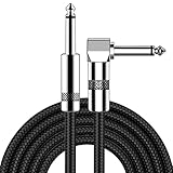
- [Low Noise High Fidelity] New bee guitar cord with 22AWG oxygen-free-copper center conductors provides enhanced signal transfer, the PVC insulation material and the high-density stranded copper double shield provide noise rejection for quiet operation
- [Ideal for Choice] New bee 1/4 straight and right angle metal connectors, ensures a secure connection in any instrument, pedal, or amp jack. L shape great fro on stage guitar stands
- [Wide Compatible] Suitable for mixer, power amplifier, microphone, effector, decoder, equalizer, electoronic organ, electric guitar, electric bass and other electronic equipments. Widely used in the installation of smart home, karaoke speaker, professional stage audio, etc
- [Easy Disassemble] Making incidental repairs quick and easy! Very nice, flexible cable
- [Dont Hesite to Order] 24 hours customer services and professional technology team are standing by
- Every control is an instance of a published library component or is explicitly marked as a new component.
- No detached components or invented color, spacing, typography, or elevation tokens are used.
- Text wraps without overlap, clipping, or accidental changes in hierarchy.
- Mobile and desktop variants preserve the same primary task and correct stacking order.
- Important states are represented and connected to the right components or variants.
- Keyboard focus, labels, contrast, and error communication have been reviewed.
- Layer names, variables, and component mappings are understandable for handoff.
Ask for two or three alternatives only where a genuine design decision exists, then require a recommendation and a reason. Unlimited options create noise instead of helping you choose.
A reusable prompt template
Replace the bracketed terms with project-specific information. Keep the structure, but remove sections that truly do not apply instead of leaving vague filler.
Create [screen or bounded flow] for [audience and user goal] in [product or context]. Target [device, viewport, and responsive behavior]. Include [screens, states, realistic content, and edge cases]. Connect [published library name] and use [@component names, @variables, @styles, and reusable blocks]; search the library before creating new UI. Use [grid, flex, or auto-layout rule], preserve [spacing and typography rules], and meet [accessibility requirements]. Keep [primary action] visually dominant. Deliver [number] alternatives for [one specific decision], then recommend one and explain the trade-off. Before finishing, verify [component reuse, token use, state coverage, responsive behavior, copy fit, and accessibility].The template works because it separates product intent from implementation constraints. You can reuse it for a single screen, a multi-state component, or a short flow without asking the agent to infer your team’s conventions.
Worked example: a mobile checkout address flow
This prompt is specific enough to generate a reviewable first pass while still leaving one design decision open:
Create a mobile checkout flow for a returning shopper editing a shipping address before payment. Use the published Acme DS library. Target a 390 px mobile frame and then show the responsive desktop adaptation. Search first for the FormField, Button, InlineAlert, Stepper, and OrderSummary components, and use the existing color.*, space.*, and type.* variables. Produce address-edit, validation-error, loading, and success states. Use auto layout; stack fields without overlap; allow address lines and long names to wrap; keep Save address as the primary action. On desktop, preserve a visible order summary beside the form; on mobile, place it below the form. Include visible keyboard-focus treatment, persistent labels, readable contrast, and inline error messaging tied to the affected field. Generate two layout options for the placement of the stepper, explain the trade-off, recommend one, and finish by confirming that every control is a library instance and every color, spacing, and text style is token-backed.Notice what the example does not do: it does not ask for a generic “beautiful” checkout, leave copy to the model, or assume that a desktop composition will automatically collapse correctly on mobile. It names the components and variables, supplies the viewport, defines state coverage, and makes the desktop-versus-mobile difference explicit.
Make your design system legible to the agent
Prompt quality cannot compensate for an opaque library. Agents reuse what they can identify and understand, so the file itself needs clear signals.
Use meaningful names and descriptions
Name components, variants, properties, variables, and layers according to their function. A property such as size=large or state=error communicates more than a layer named Frame 243. Add descriptions that explain when a component is appropriate, what content it expects, and which variables control it.
Free tools Windows power users keep installed
One-click scans. No signup required.
Publish the current library
After changing components, variables, or styles, publish the library so the agent can see the latest version. A local edit that has not been published can lead to an apparently inexplicable result: the prompt names a component, but the agent only has access to an older definition.
Rank #4

- Digital Family Calendar: BSIMB digital calendar wall touch screen puts an end to your chaotic life. Designed for busy families, the digital calendar keeps you organised and in step with your family. Assign different colours and tasks to each family member to make family scheduling easier and more intuitive.
- Easy Setup and Auto-Sync: Plug in, connect to WLAN and auto-syn your electric calendar in minutes. Digital wall calendar compatible with Google calendar, iCloud calendar, Outlook calendar, Cozi calendar and Yahoo calendar. Add events directly on the device or through the ecalendar app. Electronic calendar stays current whether you're at work or traveling—no manual updates needed.
- All-In-One Home Assistant: Smart calendar builds habits and encourage independence with personalised chores. Display daily meal plan to reduce the daily ‘What's for dinner?’ stress. To-do lists keep track of everything you want. Turning chores into valuable achievements with stars and rewards, making life easier and more enjoyable.
- Manage Anytime Anywhere: BSIMB electronic calendar for family stay connected with the powerful ecalendar app. Access and manage your digital wall calendar anytime, anywhere with free features like stars & rewards, photo screensaver, chore charts, meals plans, to-do lists etc. Electronic planner paid features like Magic Import tailor advanced tools for users with special needs.
- Stay in Touch with Loved Ones: Share photos or videos from your phone to electronic wall calendar with app, instantly update your life moment, and keep in touch with your family, especially those who are far away; you can also surprise your smart calendar digital wall by sending him a wish card; it's also great for keeping tech-illiterate elders in touch with the youngsters.
Prefer reusable blocks over isolated atoms
Higher-order blocks encode the relationships that make a section coherent: internal spacing, alignment, typography, color, and responsive behavior. Cards, headers, feature rows, carousels, form sections, and order summaries are more useful references than a pile of unrelated rectangles and text layers.
Expose variants and variables
Use component properties and variants for state, size, and content differences, and use variables for shared color, spacing, typography, and other tokens. Tell the agent which properties it should change. This makes a state change explicit and reduces the chance that the agent detaches an instance and edits raw layers.
Generate in a controlled iteration loop
Generation and review are separate activities. A disciplined loop keeps each prompt answerable and makes defects easy to trace.
PC Slower Than It Used to Be?
A free scan shows the junk files, broken settings and background clutter dragging Windows down - then fixes them in one click.Free scan · Windows 10 & 11Outdated Drivers Are Slowing You Down
One free scan finds every outdated or missing driver and matches the right update for your exact hardware.Free scan · exact hardware match- Attach context. Attach a representative frame, file, template, or screenshot, and connect the published library before asking for a design.
- Generate one bounded screen or flow. Start with the smallest unit that demonstrates the primary task and its key states.
- Inspect the first pass. Check hierarchy, task completion, content realism, state coverage, responsive structure, and fidelity to the system before requesting polish.
- Explore only real alternatives. Ask for two or three options when a decision such as navigation placement or summary location is unresolved. Require the agent to state the trade-off.
- Choose and refine on canvas. Make small spacing, copy, alignment, and instance-property fixes directly in the file. Use a new prompt for a structural change that affects the flow or component architecture.
- Run accessibility and responsive checks. Review focus visibility, contrast, labels, error communication, wrapping, stacking, and breakpoint behavior.
- Inspect the implementation signals. Confirm instances, variants, variables, naming, and component mappings before handing the file to engineering.
Small canvas edits are faster and safer for local corrections. A fresh prompt is appropriate when the information hierarchy, layout model, or state architecture needs to change; include the original context again so the agent does not solve the new problem in isolation.
Independent reader supportYour contribution helps us test, update, and keep practical guides available for everyone.How to compare multiple generated outputs
Visual preference is a useful input, but it should not be the only deciding factor. Score alternatives against the same criteria:
| Criterion | Questions to ask | Evidence in the file |
|---|---|---|
| Task clarity | Can the intended user complete the primary action without explanation? | Clear hierarchy, action labels, and an unobstructed path to completion. |
| Flow completeness | Are empty, loading, error, success, disabled, and focus states covered where relevant? | State frames or component variants connected to the flow. |
| Design-system fidelity | Did the agent use existing components, properties, variants, styles, and variables? | Library instances, token references, and no unexplained detached elements. |
| Responsive structure | Do auto-layout rules, wrapping, stacking, and breakpoints preserve hierarchy? | Frames at target widths with stable alignment and no overlap. |
| Accessibility | Are labels, focus, contrast, target sizes, and error communication addressed? | Visible focus states, readable text, and explicit error relationships. |
| Content fit | Does realistic copy fit without truncation or accidental hierarchy changes? | Representative long and short values tested in the actual components. |
| Handoff readiness | Could another designer or developer understand the structure and decisions? | Meaningful names, token mappings, component guidance, and implementation notes. |
When two options score similarly, choose the one that uses more of the existing system and requires fewer one-off exceptions. That choice lowers maintenance cost even if both compositions look acceptable in a static frame.
Prompting for responsive, accessible UI instead of a desktop picture
Describe the rules between breakpoints
Give the agent a behavior model, not a second screenshot. State which containers fill available width, which elements hug content, when columns stack, how gaps change, and whether actions become full-width. Identify minimum field widths and the order in which content should move. Ask the agent to demonstrate the result at the exact mobile and desktop widths you support.
Design states as part of the component
A default-only design hides the decisions that cause implementation bugs. Request state variants for controls, fields, alerts, progress indicators, and asynchronous content. Include realistic loading and error copy so the component is tested under the same text pressure it will face in production.
Make accessibility review explicit
Ask for visible keyboard focus, sufficient contrast, persistent labels, descriptive names, and error messages that are adjacent to and associated with the affected control. Request an accessibility review as a deliverable, then inspect the result yourself; a generated note is not proof that every interaction is accessible.
When the next step is code
Design prompts and implementation prompts should carry the same context. Figma’s MCP guidance recommends writing the implementation request like a teammate brief. Name the framework, styling system, codebase conventions, file location, existing-file behavior, and layout system.
Useful language is concrete: “Generate this using components from src/components/ui,” “Implement this using our Stack layout component,” or “Modify the existing checkout route rather than creating a new page.” State whether the agent may add a component, which tokens must remain references, and how responsive behavior maps to the codebase’s breakpoints. If the design uses a library component, provide its implementation name or mapping so engineering does not recreate it under a different name.
What’s actually slowing this PC down?
Pick the symptom - the matching free tool is one click away.
Common failure modes and precise fixes
| Symptom | Likely prompt gap | Fix in the next request |
|---|---|---|
| Generic cards, buttons, and colors appear. | No library, component names, or token references were supplied. | Connect the published library, name the exact components and variables, and require a library search before new UI. |
| The screen looks polished but the primary task is unclear. | The prompt asked for a style, not an outcome and hierarchy. | Name the user, task, primary action, secondary actions, and information that must remain visible. |
| Only the happy path exists. | States and edge cases were omitted. | List default, hover, focus, disabled, loading, empty, success, and error states that apply. |
| Mobile layout overlaps or loses important content. | “Responsive” was not defined as behavior. | Specify viewport widths, auto-layout rules, stacking order, wrapping, breakpoints, and mobile action treatment. |
| Text is clipped or changes hierarchy. | Placeholder copy hid real content pressure. | Provide realistic labels, long values, error text, and explicit wrap or truncation rules. |
| Instances are detached or tokens are invented. | The prompt did not make reuse an acceptance condition. | Require instances, variants, and variables, then ask for a final reuse-and-token checklist. |
| Repeated prompting produces unrelated designs. | Each request lacks the original frame, file, or system context. | Attach the same representative context and restate the constraints when making a structural change. |
| The generated accessibility note is vague. | Accessibility was requested as a general aspiration. | Name focus visibility, labels, contrast, target sizes, and error communication as checks to show in the design. |
Figma agent, Design agent, and Figma Make: choose the right request
The current Figma agent can connect libraries, reference components and variables with @, generate screens, edit layouts and component instances, apply styles and variables, generate or replace content in bulk, and provide design feedback including accessibility review. Use those capabilities in the prompt rather than treating the agent as a one-shot image generator.
Figma Make is oriented toward interactive apps and prototypes, while the Design agent works directly in design files. If your goal is a production-oriented design-system composition, ask for library instances, variables, variants, and named frames in the design file. If your goal is an interactive prototype, state the interactions, data behavior, and prototype scope separately. Do not assume that a visually complete prototype automatically contains a clean component architecture.
A final pre-handoff checklist
Before accepting the result, verify each item in the file rather than relying on the prompt’s wording:
- The user, primary task, surface, viewport, and scope are still evident.
- The main action is visually dominant and the information hierarchy survives at every target width.
- Realistic content, long values, empty states, loading, success, error, disabled, hover, and focus states are represented where applicable.
- Published components, properties, variants, styles, variables, and higher-order blocks are used instead of detached or invented equivalents.
- Auto-layout, grid or flex rules, wrapping, stacking, and breakpoints produce stable frames without overlap.
- Labels, focus treatment, contrast, touch-target assumptions, and error relationships are explicit.
- Layer and component names, token references, and implementation mappings are clear to the next person.
- Any alternatives have been reduced to one chosen direction with the trade-off recorded.
The prompt’s job is to make the first draft answerable. The file review’s job is to prove that the draft is usable. When both are treated as part of one workflow, Figma agents are far more likely to produce interfaces that respect your system, survive responsive layouts, communicate states clearly, and move cleanly toward implementation.
Quick Recap
Product prices and availability are accurate as of the date/time indicated and are subject to change. Any price and availability information displayed on Amazon at the time of purchase will apply.

