Free tools Windows power users keep installed
One-click scans. No signup required.
Test wide and unusual phones by sweeping custom CSS viewport widths and heights in browser DevTools, not by checking one named handset. Cover narrow and regular portrait, short-wide landscape, 21:9, and near-square foldable layouts. At each size, inspect breakpoint changes, overflow, fixed-position UI, safe areas, and resolution-dependent assets. Then repeat the critical cases on at least one real iOS phone and one real Android phone: desktop emulation cannot reproduce every mobile CPU, touch, keyboard, browser-chrome, or hardware behavior.
The procedure below gives you a repeatable matrix, exact DevTools steps, CSS checks, real-device validation, troubleshooting, and an API option when you need repeatable screenshots in a build or review workflow.

As an Amazon Associate I earn from qualifying purchases.
What you are actually testing
A phone’s physical screen dimensions are not the values that CSS media queries receive. Layout is driven primarily by the logical viewport width and height, measured in CSS pixels. Device pixel ratio (DPR) is a separate setting that maps CSS pixels to physical pixels. A high-DPR phone can therefore have a modest CSS width while still needing denser image assets.
Wide-phone testing is not only a width exercise. In landscape, a phone becomes short as well as wide. That short height exposes clipped dialogs, headers that consume too much space, bottom sheets that cover fields, sticky controls that hide content, and forms that become inaccessible when the virtual keyboard opens. Unusual ratios also include very tall 21:9 views and near-square foldable layouts, so a single portrait preset is not representative.
Build a viewport test matrix
Use custom width and height pairs rather than relying only on named device presets. The values below are practical starting points; add your product’s documented breakpoints and any dimensions reported by your users.
#1 Best Overall

- [Ultra-Lightweight Ear Buds Designed for Small Ears] Each earbud weighs only 3.7g and features a compact, ergonomic in-ear design made especially for small ears. Secure, low-profile, and comfortable for workouts, all-day wear or overnight sleeping.The ultra-slim profile sits flush in your ear with no hard edges poking or rubbing, so you can even sleep on your side without discomfort.
- [Immersive Stereo Sound with TOZO OrigX Technology] TOZO OrigX tuning delivers clear vocals, balanced mids, and natural stereo sound for music, podcasts, and videos.
- [Long Battery Life for Daily Use] Get up to 7 hours of playtime on a single charge, with up to 32 hours total using the charging case—ideal for workdays, commuting, and extended listening sessions.
- [Bluetooth 5.3 & Stable Connection] Bluetooth 5.3 provides fast pairing, stable wireless performance, and reduced dropouts as you move around home or office.
- [Deep Bass with Clear Vocals] High-performance drivers produce punchy bass while keeping vocals clean and detailed for everyday listening.
| Case | Example CSS viewport | What it exposes |
|---|---|---|
| Narrow portrait | 320 × 568 | Minimum-width assumptions, wrapped labels, cramped form controls, and horizontal overflow. |
| Regular portrait | 390 × 844 | Baseline mobile layout, common navigation and card behavior. |
| Large portrait | 430 × 932 | Extra line length, max-width rules, image cropping, and spacing that changes at an upper breakpoint. |
| Short-wide landscape | 844 × 390 | Fixed headers, dialogs, bottom sheets, sticky actions, and keyboard-adjacent fields that no longer fit vertically. |
| 21:9 portrait | 360 × 840 (approximately 21:9) | Very tall scrolling, background positioning, and components that assume a shorter page. |
| 21:9 landscape | 840 × 360 (approximately 21:9) | Wide content combined with very little vertical room. |
| Near-square foldable | 700 × 700 (approximately 1:1) | Two-column assumptions, image aspect-ratio rules, and breakpoint gaps around square layouts. |
The 21:9 and 1:1 examples represent the aspect-ratio ranges described in Android’s adaptive-design guidance, not market-share statistics. You should also test immediately below and above every breakpoint in your CSS; a one-pixel difference can reveal an incorrect media-query boundary.
Run the first pass in Chrome or Edge
1. Open responsive emulation
- Open the page in Chrome, then open DevTools with
F12orCtrl+Shift+I(Windows/Linux) orCmd+Option+I(macOS). - Activate the device toolbar with
Ctrl+Shift+Mor the phone/tablet icon. - Choose Responsive from the device selector. In Edge, open Device Emulation and choose its equivalent responsive mode.
- Enter a custom width and height in CSS pixels. Do not infer the CSS width from a phone’s advertised physical resolution.
2. Sweep, do not sample one size
Drag the responsive viewport through the full range, or enter a sequence of widths around each breakpoint. Record the exact width at which navigation, grids, cards, typography, forms, overlays, and visibility rules change. Use DevTools’ media-query display or breakpoint inspector to jump to active ranges, then test one or two pixels on either side of each transition.
Recommended Free Tools
Keep a simple table in your issue or test log with viewport width, viewport height, DPR, browser engine, orientation, and the observed result. A screenshot without those values is difficult to reproduce.
3. Exercise the short dimension
For each wide landscape case, inspect every control that is fixed or sticky. Open menus, confirmation dialogs, date pickers, cookie notices, bottom sheets, and chat-like panels. Scroll the page while each overlay is open. Confirm that the last actionable button can be reached without relying on a hidden scrollbar or an impossible gesture.
Test unusual aspect ratios and foldable ranges
Android’s responsive guidance recommends testing many screen sizes and aspect ratios. Its foldable examples span a tall 21:9 state when folded to approximately 1:1 when unfolded. You do not need a preset for every device: enter representative custom pairs and test both orientations.
Look for ratio-dependent failures
- Hero sections whose fixed height leaves a large blank area on tall screens or cuts off content on short screens.
- Two-column layouts that fit at a wide width but become unusable near square because each column is too narrow.
- Images forced into a desktop ratio, producing distortion or unexpected letterboxing.
- Dialogs positioned with a fixed top offset instead of being centered within the visible viewport.
- Navigation that changes at a width breakpoint but ignores the available height in landscape.
Prefer layout rules based on the available viewport and feature queries rather than device-name assumptions. The older device-aspect-ratio, device-height, and device-width descriptors are deprecated in Media Queries Level 4; use current viewport and feature-query patterns instead.
The Tool Desk
Outbyte Driver Updater FREEFix the driver behind crashes, sound loss and screen glitchesFind Drivers →Outbyte PC Repair FREEClear out junk files and repair common Windows errorsFree Scan →Rank #2

- 【IP68 Waterproof Multifunctinal Smart Watch】Torjalph fitness activity tracker smart watch is IP68 waterproof technology ,you can wear it when swimming,handwashing,it's rain-proof which means that you perform multiple exercise modes outside without worrying about sweat or rain corroding your fitness smart watch,and this watch equipped with a 230 mAh large capacity battery magnetic charging ,and this sports activity tracker watch can be used 5-7 days If fully charged.
- 【Larger 1.83'' Full Screen Watch & Multi-dial Selection】1.83 inch full HD color touch screen smart watch for men / women provides excellent 240*284 resolution image quality ,This Bluetooth smart watch offers a better touch experience and remarkable immersion and ,more than 200 watch faces for you to choose from App"Da Fit ", you can change the dial style according to your mood to wear keeping the world on your wrist
- 【Accurate Activity Tracker Smart Watch 】sports watch activity tracker uses sweat and dust resistant breathable silicone strap, our Fitness Tracker Smart Watch for Android iOS Phones supports 12 sports modes,walking,running,bicycle,swimming,badminton,basketball,football,rope skipping. This bluetooth calls smart watch for men women is lightweight and stylish, bringing more convenient and relaxing sports experience while also providing more protection.
- 【Your 24 Hour Personal Daily Health Monitor】Fitness watch for women men full touch screen IP67 waterproof bluetooth smartwatch for Android iOS Phones with heart rate blood pressure monitor multifunction Andriod smart watch with steps counter sleep monitor sports fitness watch, monitoring blood oxygen saturation allows you to understand your physical condition in real time to track fitness progress ,to know your health status in time.
- 【More Functions Bluetooth Call Smart Watch】This fitness activity smart watch full screen for iPhone and Android phones includes a bunch of new features including:The bluetooth smart watch can hang up the phone, receive and display WhatsAPP /Text /Facebook /Twitter /Messenger reminder.Support sedentary reminder, alarm clock, stopwatch, timer,weather information,music control, remote camera control compatible with Android 5.0 and above or iOS 9.0 and above smartphones.
Separate viewport size from DPR
In the device toolbar, set a CSS width and height first, then test more than one DPR when the page uses srcset, CSS image-set(), resolution media queries, canvas output, or other pixel-density-specific assets. Changing DPR should not silently change the logical CSS width; it changes how many physical pixels represent that layout.
What to verify at multiple DPR values
- The selected
srcsetcandidate has the intended dimensions and does not become blurry or needlessly huge. - Icons and canvas drawings remain sharp without overflowing their CSS boxes.
- Resolution media queries do not accidentally alter spacing or typography intended to depend on viewport width.
- Screenshot comparisons use the same DPR when you are judging pixel-level differences.
Verify the mobile viewport configuration
Inspect the document head for a mobile viewport declaration so mobile browsers lay out the page at the device CSS width. A typical declaration is:
<meta name="viewport" content="width=device-width, initial-scale=1">Then check the rendered page at every matrix size for horizontal scrolling, clipped content, unexpected wrapping, distorted images, and controls that become unreachable at short heights. A page can appear correct at one width while a missing or incorrect viewport policy causes a different layout on an actual phone.
Account for notches and safe areas
Fixed headers, footers, floating buttons, and full-screen sheets must leave room for notches, camera housings, and Dynamic Island regions. Apple describes safe areas as the boundary that helps keep content away from device interactive and display features.
For edge-to-edge layouts, combine your normal spacing with the environment insets and test both inset and non-inset devices:
Rank #3
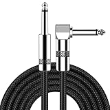
- [Low Noise High Fidelity] New bee guitar cord with 22AWG oxygen-free-copper center conductors provides enhanced signal transfer, the PVC insulation material and the high-density stranded copper double shield provide noise rejection for quiet operation
- [Ideal for Choice] New bee 1/4 straight and right angle metal connectors, ensures a secure connection in any instrument, pedal, or amp jack. L shape great fro on stage guitar stands
- [Wide Compatible] Suitable for mixer, power amplifier, microphone, effector, decoder, equalizer, electoronic organ, electric guitar, electric bass and other electronic equipments. Widely used in the installation of smart home, karaoke speaker, professional stage audio, etc
- [Easy Disassemble] Making incidental repairs quick and easy! Very nice, flexible cable
- [Dont Hesite to Order] 24 hours customer services and professional technology team are standing by
.fixed-action {
  bottom: calc(16px + env(safe-area-inset-bottom));
  padding-left: calc(16px + env(safe-area-inset-left));
  padding-right: calc(16px + env(safe-area-inset-right));
}

.page-shell {
  padding-top: env(safe-area-inset-top);
}
Do not assume the inset is present on every phone. The important check is that an action remains tappable when an inset exists and is not pushed off-screen when it does not.
Repeat critical cases in Safari and Chromium
Chrome and Edge provide responsive emulation and breakpoint inspection. Safari’s Responsive Design Mode previews viewport presets and dynamic media-query styles. Run the same matrix in the browser engines your audience uses, especially when your CSS depends on viewport units, scrolling behavior, form controls, or safe-area handling.
Record the engine and version with each result. A layout that matches in Chromium can still differ in WebKit because of text metrics, form controls, viewport-unit behavior, or keyboard and browser-chrome handling.
What’s actually slowing this PC down?
Pick the symptom - the matching free tool is one click away.
What emulation cannot prove
DevTools is a fast first pass, not a hardware substitute. Chrome’s documentation cautions that some mobile aspects can never be simulated in DevTools, including the very different architecture of mobile CPUs. Emulation also does not fully reproduce touch hit testing, virtual-keyboard resizing, browser chrome appearing and disappearing, orientation rotation, sensor behavior, thermal throttling, or device-specific safe areas.
Minimum real-device pass
- Use at least one current iOS phone and one current Android phone.
- Open the page in the audience’s actual browsers, not only an in-app web view.
- Rotate portrait to landscape while a menu, dialog, form, and bottom sheet are open.
- Tap and swipe every primary interaction; do not rely on mouse hover or precise pointer placement.
- Focus an input, invoke the virtual keyboard, and confirm that the focused field and submit action remain visible.
- Scroll long pages while browser chrome changes size, then return to the top and verify sticky elements.
- Check notched and non-notched safe-area behavior where available.
- Observe loading and scrolling performance on the real CPU and network conditions you support.
Choose the right test method
| Method | Viewport control | Engine and hardware coverage | Best use | Limit |
|---|---|---|---|---|
| Chrome or Edge DevTools | Custom width, height, DPR, and orientation | Chromium emulation; no physical hardware | Fast local breakpoint and overflow work | Cannot reproduce every mobile CPU or hardware behavior. |
| Safari Responsive Design Mode | Viewport presets and responsive inspection | WebKit preview; no physical hardware | WebKit-specific layout checks | Still an emulation environment for touch, keyboard, and device behavior. |
| Real iOS and Android phones | Actual viewport, DPR, safe areas, and orientation | Real hardware and browser engines | Release confidence for touch, keyboard, scrolling, and performance | Slower to set up and harder to cover every dimension. |
| Automated screenshot or device service | Repeatable scripted dimensions; service-dependent device options | Depends on the service | Regression evidence, pull-request review, and scheduled coverage | Must be paired with real-device checks for hardware-dependent behavior. |
For local development, start with DevTools, then use real phones for the failure modes emulation cannot establish. For a team, keep the custom matrix in source control and run consistent screenshots at each breakpoint so a change is comparable over time.
Rank #4

- Digital Family Calendar: BSIMB digital calendar wall touch screen puts an end to your chaotic life. Designed for busy families, the digital calendar keeps you organised and in step with your family. Assign different colours and tasks to each family member to make family scheduling easier and more intuitive.
- Easy Setup and Auto-Sync: Plug in, connect to WLAN and auto-syn your electric calendar in minutes. Digital wall calendar compatible with Google calendar, iCloud calendar, Outlook calendar, Cozi calendar and Yahoo calendar. Add events directly on the device or through the ecalendar app. Electronic calendar stays current whether you're at work or traveling—no manual updates needed.
- All-In-One Home Assistant: Smart calendar builds habits and encourage independence with personalised chores. Display daily meal plan to reduce the daily ‘What's for dinner?’ stress. To-do lists keep track of everything you want. Turning chores into valuable achievements with stars and rewards, making life easier and more enjoyable.
- Manage Anytime Anywhere: BSIMB electronic calendar for family stay connected with the powerful ecalendar app. Access and manage your digital wall calendar anytime, anywhere with free features like stars & rewards, photo screensaver, chore charts, meals plans, to-do lists etc. Electronic planner paid features like Magic Import tailor advanced tools for users with special needs.
- Stay in Touch with Loved Ones: Share photos or videos from your phone to electronic wall calendar with app, instantly update your life moment, and keep in touch with your family, especially those who are far away; you can also surprise your smart calendar digital wall by sending him a wish card; it's also great for keeping tech-illiterate elders in touch with the youngsters.
Make the test repeatable
Capture the inputs
- URL and build or commit identifier.
- CSS viewport width and height.
- DPR and orientation.
- Browser engine and version.
- Whether the page was cold-loaded, reloaded, or restored from cache.
- Any cookies, authentication state, feature flags, locale, timezone, or geolocation that affect layout.
Define pass criteria
- No horizontal overflow unless it is an intentional, discoverable carousel or table.
- All navigation, form fields, dialogs, and primary actions are reachable by touch and keyboard.
- Text remains readable without relying on a hover state.
- Images preserve their intended crop and density.
- Fixed and sticky elements do not cover content or safe areas.
- Orientation changes do not leave stale dimensions or an unscrollable overlay.
Compare screenshots carefully
Keep viewport, DPR, browser engine, font availability, and content state constant when comparing images. A change in any of those inputs can look like a CSS regression. For dynamic pages, wait for the same application state before capture and mask intentionally changing regions in your review process.
Independent reader supportYour contribution helps us test, update, and keep practical guides available for everyone.Troubleshooting common failures
The layout is wider than the device
Symptoms: horizontal scrolling, clipped right edges, or a desktop layout inside a phone viewport. Likely causes: a missing or incorrect viewport declaration, a fixed-width element, an unbreakable string, or a transformed child extending beyond its container. Fix: verify the viewport meta tag, inspect the widest element in DevTools, replace fixed widths with responsive constraints, and test the narrowest matrix case again.
A dialog or bottom sheet is clipped in landscape
Symptoms: the action row is below the visible area or the sheet cannot be dismissed after rotation. Likely causes: a height assumption, a fixed pixel offset, or keyboard resizing. Fix: constrain the overlay to the visual viewport, allow internal scrolling, keep the close and primary actions reachable, and retest with the virtual keyboard open on a real phone.
Images are blurry or unexpectedly large
Symptoms: a high-DPR device receives a low-resolution image, or a screenshot and network transfer become unnecessarily heavy. Likely causes: incorrect srcset descriptors, missing DPR variants, or a resolution media query that does not match the CSS width. Fix: inspect the selected resource, test at multiple DPR values, and make the CSS and image candidates agree.
A breakpoint fires at the wrong width
Symptoms: navigation changes one or two pixels earlier or later than expected. Likely causes: overlapping media queries, scrollbar effects, or testing a physical-pixel number instead of a CSS-pixel width. Fix: use the media-query inspector, test immediately on both sides of the rule, and document the intended range.
Safe-area padding works on one phone but not another
Symptoms: a button is too close to a notch on one device or has excessive blank space on another. Likely causes: hard-coded inset values or padding added without the environment variable. Fix: use env(safe-area-inset-*) with a normal fallback spacing, and validate on both inset and non-inset hardware.
Quick wins for a faster PC:
Repair Windows errors before they cause bigger problemsFix Now →Fix the driver behind crashes, sound loss and screen glitchesFind Drivers →The emulated page passes but the phone fails
Symptoms: touch targets, scrolling, keyboard behavior, performance, or browser chrome differ on hardware. Cause: emulation does not reproduce every mobile CPU and device behavior. Fix: reproduce the same URL and state on a real iOS and Android phone, capture a screen recording, and log orientation, keyboard state, browser version, and viewport dimensions.
Or skip the browser setup
ScreenshotNeo provides a website screenshot API and MCP server when you need repeatable captures across custom viewports. It can load lazy images for full-page captures, select a device preset or any viewport, set retina scale, emulate dark mode, inject CSS or JavaScript, click an element, wait for a selector, delay, or network idle, and hide selectors. You can also set custom headers, cookies, user agents, authorization, timezone, and geolocation; block ads, trackers, requests, or resource types; resize images; choose transparent backgrounds; cache with a TTL; create signed links; run asynchronous jobs with signed webhooks; capture up to 100 URLs per bulk call; and query usage through its API. Those captures are useful for documenting your width-and-height matrix, but real phones are still required for hardware behavior.
Before each capture, ScreenshotNeo accepts cookie or consent banners like a visitor and removes more than 60 known consent platforms, newsletter popups, and chat widgets. You can turn each cleanup step off. Bot checks or CAPTCHAs, blank pages, timeouts, failed loads, and cache hits are not billed; the response identifies the result with X-Page-Verdict and X-Billed headers. Its MCP server exposes take_screenshot, get_page_info, and capture_pdf for Claude, Cursor, and other MCP clients.
Use the API documentation at https://screenshotneo.com/docs/ for authentication and options. The following calls use https://example.com as the target; replace it with your page.
cURL
curl -G "https://api.screenshotneo.com/v1/shot" -d access_key=YOUR_API_KEY --data-urlencode url=https://example.com -o shot.webpPython
import requests
r = requests.get("https://api.screenshotneo.com/v1/shot", params={"access_key": "YOUR_API_KEY", "url": "https://example.com"}, timeout=90)
open("shot.webp", "wb").write(r.content)
Node.js
const q = new URLSearchParams({ access_key: 'YOUR_API_KEY', url: 'https://example.com' }); const res = await fetch(`https://api.screenshotneo.com/v1/shot?${q}`);The Free plan includes 1,000 shots per month with no card. Paid plans are Starter ($5 for 3,000), Growth ($15 for 15,000), Pro ($39 for 60,000), Scale ($99 for 250,000), and Business ($249 for 1,000,000); yearly billing gives two months free, and every feature is on every plan. Sign up for the free plan to run the matrix without a card.
FAQ
Should I use aspect-ratio media queries for every phone shape?
No. Treat aspect ratio as a test dimension, not a device identity. Base layout decisions on available viewport space and feature queries, and use ratio cases to expose components that fail when height and width change together.
How many widths are enough for a release?
There is no universal count. Cover the narrowest supported width, the normal mobile width, every breakpoint boundary, both orientations, at least one 21:9 case, and a near-square case if your product may run on foldables. Add any dimensions tied to an existing bug or customer report.
Can a screenshot prove that a mobile layout is accessible?
No. A screenshot can show clipping, overlap, and visual wrapping, but it cannot prove touch target behavior, keyboard navigation, focus order, screen-reader output, performance, or interaction with browser chrome. Pair visual captures with interactive checks on emulation and real hardware.
Crashes, No Sound, or Screen Glitches?
Random freezes, missing sound and display glitches usually trace back to one bad driver. Find and replace yours safely.Free scan · under a minuteWindows Errors? Fix Them Before They Spread
Repair common Windows errors and clear accumulated junk for a smoother, more stable PC - no reinstall needed.Free scan · no reinstallQuick Recap
Product prices and availability are accurate as of the date/time indicated and are subject to change. Any price and availability information displayed on Amazon at the time of purchase will apply.

