Make a WordPress theme faster on phones by measuring a representative page first, then shortening its critical path: ship less render-blocking CSS, defer nonessential JavaScript, deliver images at the mobile display size, and reserve space for every visual element. Recheck both lab and real-user data against Google’s mobile Core Web Vitals targets rather than treating one PageSpeed score as proof of success.
Antihost offers managed WordPress hosting with free migration, one-click staging and a 14-day free trial.
What mobile theme optimization actually changes
A theme controls much of the work that happens before a visitor can read or interact with a page. Its templates determine which styles, scripts, fonts, images, widgets and markup are requested. On a phone, a page can be delayed by a modest number of bytes because the connection may have higher latency and the device may parse and execute JavaScript more slowly than a desktop computer.

As an Amazon Associate I earn from qualifying purchases.
Optimization is therefore not just image compression or a better hosting plan. It is a template-level exercise in deciding what the first viewport needs, when each asset becomes necessary, and how much work the browser must perform on the main thread. A home page, article, archive, product page and checkout can use the same theme but have very different performance profiles, so each representative template needs its own baseline.
Measure a mobile baseline before changing code
Use Google PageSpeed Insights for repeatable lab diagnostics and its available real-user data, then use Google Search Console’s Core Web Vitals report to see how groups of URLs perform in the field. Field data is evaluated at the 75th percentile for mobile: a page is considered to meet a metric when at least three quarters of measured visits are within the good range.
#1 Best Overall

- [Ultra-Lightweight Ear Buds Designed for Small Ears] Each earbud weighs only 3.7g and features a compact, ergonomic in-ear design made especially for small ears. Secure, low-profile, and comfortable for workouts, all-day wear or overnight sleeping.The ultra-slim profile sits flush in your ear with no hard edges poking or rubbing, so you can even sleep on your side without discomfort.
- [Immersive Stereo Sound with TOZO OrigX Technology] TOZO OrigX tuning delivers clear vocals, balanced mids, and natural stereo sound for music, podcasts, and videos.
- [Long Battery Life for Daily Use] Get up to 7 hours of playtime on a single charge, with up to 32 hours total using the charging case—ideal for workdays, commuting, and extended listening sessions.
- [Bluetooth 5.3 & Stable Connection] Bluetooth 5.3 provides fast pairing, stable wireless performance, and reduced dropouts as you move around home or office.
- [Deep Bass with Clear Vocals] High-performance drivers produce punchy bass while keeping vocals clean and detailed for everyday listening.
- Choose representative URLs. Record one home page, one article, one archive or listing, and any product or checkout templates that matter to the site. Keep the URL set stable while comparing fixes.
- Run PageSpeed Insights in mobile mode. Save the results, the identified Largest Contentful Paint element, render-blocking resources, long tasks, layout-shift sources and oversized images.
- Check Search Console. Review the mobile URL groups and note whether the problem is widespread or limited to a template family.
- Record the page state. Note consent banners, logged-in versus logged-out behavior, personalization, ads and third-party widgets. These can change the critical path.
- Rank the causes. Compare candidate fixes by their expected change to LCP, INP and CLS, transferred bytes, main-thread JavaScript time, render-blocking request count, visual fidelity, accessibility and regression risk.
Google’s published good ranges are the decision guardrails for mobile measurements:
| Metric | Good mobile target | What it represents |
|---|---|---|
| First Contentful Paint (FCP) | ≤ 1,800 ms | When the first text or image is painted |
| Largest Contentful Paint (LCP) | ≤ 2,500 ms | When the main content element becomes visible |
| Interaction to Next Paint (INP) | < 200 ms | Responsiveness across user interactions |
| Cumulative Layout Shift (CLS) | < 0.1 | Unexpected movement of visible content |
| Time to First Byte (TTFB) | ≤ 800 ms, an experimental PageSpeed Insights target | How quickly the first response byte arrives |
These are thresholds, not guarantees. A passing lab run on one URL does not establish that every mobile visitor has a fast experience, and a field report can take time to reflect a code change.
What’s actually slowing this PC down?
Pick the symptom - the matching free tool is one click away.
Find the theme’s critical rendering path
The critical path consists of the requests and browser work required to display and use the first viewport. Start with the HTML document, the CSS needed to style visible content, the LCP image or text, fonts that affect initial rendering, and JavaScript required for an immediately visible control. Everything else should be questioned.
Remove unnecessary render-blocking CSS
Keep the base stylesheet usable at every width, but remove declarations that the page never uses. Desktop-only shadows, animations, large background images and component rules do not belong in the first mobile payload when the component is absent or below the fold. Keep selectors and DOM depth reasonable; deeply nested selectors and excessive wrapper elements increase style calculation and layout work.
Critical CSS should contain only the rules needed to paint the initial viewport. The remainder can load after the first paint through the site’s normal stylesheet strategy, provided the page remains usable and does not flash unstyled content. Test keyboard focus, contrast and reduced-motion behavior after trimming rules.
Enqueue assets through WordPress APIs
WordPress recommends registering and enqueueing styles and scripts rather than hard-coding tags in templates. Enqueueing gives the platform control over dependencies, versions and loading strategies. A modern script enqueue can place a noncritical file in the footer and request deferred execution:
Rank #2

- 【IP68 Waterproof Multifunctinal Smart Watch】Torjalph fitness activity tracker smart watch is IP68 waterproof technology ,you can wear it when swimming,handwashing,it's rain-proof which means that you perform multiple exercise modes outside without worrying about sweat or rain corroding your fitness smart watch,and this watch equipped with a 230 mAh large capacity battery magnetic charging ,and this sports activity tracker watch can be used 5-7 days If fully charged.
- 【Larger 1.83'' Full Screen Watch & Multi-dial Selection】1.83 inch full HD color touch screen smart watch for men / women provides excellent 240*284 resolution image quality ,This Bluetooth smart watch offers a better touch experience and remarkable immersion and ,more than 200 watch faces for you to choose from App"Da Fit ", you can change the dial style according to your mood to wear keeping the world on your wrist
- 【Accurate Activity Tracker Smart Watch 】sports watch activity tracker uses sweat and dust resistant breathable silicone strap, our Fitness Tracker Smart Watch for Android iOS Phones supports 12 sports modes,walking,running,bicycle,swimming,badminton,basketball,football,rope skipping. This bluetooth calls smart watch for men women is lightweight and stylish, bringing more convenient and relaxing sports experience while also providing more protection.
- 【Your 24 Hour Personal Daily Health Monitor】Fitness watch for women men full touch screen IP67 waterproof bluetooth smartwatch for Android iOS Phones with heart rate blood pressure monitor multifunction Andriod smart watch with steps counter sleep monitor sports fitness watch, monitoring blood oxygen saturation allows you to understand your physical condition in real time to track fitness progress ,to know your health status in time.
- 【More Functions Bluetooth Call Smart Watch】This fitness activity smart watch full screen for iPhone and Android phones includes a bunch of new features including:The bluetooth smart watch can hang up the phone, receive and display WhatsAPP /Text /Facebook /Twitter /Messenger reminder.Support sedentary reminder, alarm clock, stopwatch, timer,weather information,music control, remote camera control compatible with Android 5.0 and above or iOS 9.0 and above smartphones.
<?php function site_assets() { wp_enqueue_style( 'site-style', get_stylesheet_uri(), array(), '1.0' ); wp_enqueue_script( 'site-menu', get_theme_file_uri( '/assets/menu.js' ), array(), '1.0', array( 'in_footer' => true, 'strategy' => 'defer' ) ); } add_action( 'wp_enqueue_scripts', 'site_assets' ); ?>Use dependencies when order matters. Do not defer a script that must run before an inline configuration or an immediately usable control unless that dependency has been tested.
Load assets conditionally
A contact form, gallery, slider or commerce interaction should not force its JavaScript and CSS onto every page. Register the asset once, then enqueue it only when the current template needs it. For example:
<?php function site_conditional_assets() { if ( is_page_template( 'templates/contact.php' ) ) { wp_enqueue_script( 'contact-form', get_theme_file_uri( '/assets/contact.js' ), array(), '1.0', array( 'in_footer' => true, 'strategy' => 'defer' ) ); } if ( is_singular( 'product' ) ) { wp_enqueue_style( 'product-gallery', get_theme_file_uri( '/assets/gallery.css' ), array(), '1.0' ); } } add_action( 'wp_enqueue_scripts', 'site_conditional_assets' ); ?>Audit third-party widgets, sliders, icon libraries, analytics and page-builder bundles with the same rule. Delay code that is not needed for the first viewport, but retest menus, search, forms, carts, consent controls and account flows after every change. A smaller payload that leaves an interaction unresponsive is a regression, not an optimization.
Build a responsive CSS architecture that starts with mobile
WordPress documentation describes a default responsive classification of mobile at 480 pixels wide and narrower, and tablet as wider than 480 through 782 pixels. A theme may customize those breakpoints, so inspect the theme’s actual media queries instead of assuming the defaults.
The Tool Desk
Outbyte PC Repair FREERepair Windows errors before they cause bigger problemsFix Now →Outbyte Driver Updater FREEScan for outdated or missing drivers - takes under a minuteDriver Scan →Keep the base style functional at every width, then add only the overrides required for larger screens or narrow exceptions. This prevents a desktop-first bundle from carrying effects that phones immediately override. Use the theme’s style.css, theme.json, templates and component styles as deliberate surfaces:
- Set readable line lengths and tap targets in the base rules.
- Use fluid sizing where it avoids several near-duplicate breakpoint rules.
- Remove unused declarations and old component variants from the production bundle.
- Avoid shipping desktop background videos, hover-only effects and large decorative assets to narrow screens.
- Keep component markup shallow enough that style and layout calculations remain inexpensive.
After changing a breakpoint, inspect intermediate widths, not only a 360-pixel phone and a desktop monitor. Navigation wrapping, tables, forms and embedded media often fail between common device presets.
Rank #3
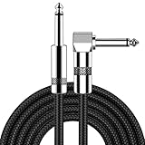
- [Low Noise High Fidelity] New bee guitar cord with 22AWG oxygen-free-copper center conductors provides enhanced signal transfer, the PVC insulation material and the high-density stranded copper double shield provide noise rejection for quiet operation
- [Ideal for Choice] New bee 1/4 straight and right angle metal connectors, ensures a secure connection in any instrument, pedal, or amp jack. L shape great fro on stage guitar stands
- [Wide Compatible] Suitable for mixer, power amplifier, microphone, effector, decoder, equalizer, electoronic organ, electric guitar, electric bass and other electronic equipments. Widely used in the installation of smart home, karaoke speaker, professional stage audio, etc
- [Easy Disassemble] Making incidental repairs quick and easy! Very nice, flexible cable
- [Dont Hesite to Order] 24 hours customer services and professional technology team are standing by
Deliver images at the size the phone actually displays
WordPress has generated responsive image markup since version 4.4. Its srcset and sizes attributes allow the browser to select an appropriate candidate instead of downloading the largest desktop file for a narrow slot. The markup is useful only when the source set contains sensible dimensions and the sizes value describes the layout.
Match candidates to the rendered slot
Measure the image slot in the mobile layout, then create or retain an image candidate close to that rendered width. A multi-thousand-pixel hero image is wasteful when the phone displays it at a fraction of that width. Compress the source while preserving the detail the design needs, and use a modern format where browser support and the project’s delivery pipeline make it appropriate.
Recommended Free Tools
When outputting an attachment, let WordPress generate responsive attributes instead of replacing them with a single hard-coded URL:
<?php echo wp_get_attachment_image( $image_id, 'large', false, array( 'class' => 'hero-image' ) ); ?>Review the resulting HTML in the browser. Confirm that the selected candidate changes at narrow widths and that a CSS background image has not bypassed the responsive image markup.
Reserve space to prevent layout shifts
Give every image an intrinsic width and height or a CSS aspect ratio that matches the eventual media. The browser can then allocate space before the bytes arrive, keeping headlines and buttons from jumping. Apply the same discipline to video posters, embeds, advertisements and asynchronously inserted cards.
Protect the LCP element from careless lazy loading
Lazy loading is appropriate for media that begins below the fold. It is not a universal setting for every image and iframe. The first viewport must be inspected manually because the browser may identify the hero image or an embedded frame as the LCP element.
Do these 3 things before closing this tab:
1Repair Windows errors before they cause bigger problems2Scan for outdated or missing drivers - takes under a minute3Clear out junk files and repair common Windows errorsRank #4

- Digital Family Calendar: BSIMB digital calendar wall touch screen puts an end to your chaotic life. Designed for busy families, the digital calendar keeps you organised and in step with your family. Assign different colours and tasks to each family member to make family scheduling easier and more intuitive.
- Easy Setup and Auto-Sync: Plug in, connect to WLAN and auto-syn your electric calendar in minutes. Digital wall calendar compatible with Google calendar, iCloud calendar, Outlook calendar, Cozi calendar and Yahoo calendar. Add events directly on the device or through the ecalendar app. Electronic calendar stays current whether you're at work or traveling—no manual updates needed.
- All-In-One Home Assistant: Smart calendar builds habits and encourage independence with personalised chores. Display daily meal plan to reduce the daily ‘What's for dinner?’ stress. To-do lists keep track of everything you want. Turning chores into valuable achievements with stars and rewards, making life easier and more enjoyable.
- Manage Anytime Anywhere: BSIMB electronic calendar for family stay connected with the powerful ecalendar app. Access and manage your digital wall calendar anytime, anywhere with free features like stars & rewards, photo screensaver, chore charts, meals plans, to-do lists etc. Electronic planner paid features like Magic Import tailor advanced tools for users with special needs.
- Stay in Touch with Loved Ones: Share photos or videos from your phone to electronic wall calendar with app, instantly update your life moment, and keep in touch with your family, especially those who are far away; you can also surprise your smart calendar digital wall by sending him a wish card; it's also great for keeping tech-illiterate elders in touch with the youngsters.
- Keep the LCP image discoverable in the initial document and do not add an automatic lazy-loading attribute merely because it is an image.
- Lazy-load article images, related-content thumbnails and embeds that are clearly below the initial viewport.
- Check long pages at several phone widths; a responsive layout can move an image into the first viewport at one width and below it at another.
- After changing loading attributes, verify both the LCP element in PageSpeed Insights and the visual result on a real or emulated narrow screen.
Do not infer the correct loading mode from the asset’s filename or its position in a template loop. The rendered position and the browser’s LCP choice are what matter.
Reduce JavaScript work that harms INP
JavaScript affects mobile performance in two ways: its bytes must be downloaded and parsed, and its tasks can block input handling and painting. Begin with a coverage and waterfall audit of the theme bundle and third-party files. Identify scripts that are unused on the current template, scripts that can be deferred until after first paint, and long tasks triggered when a user opens a menu, submits a form or searches.
Use WordPress’s enqueue dependencies and loading strategies to preserve order while deferring noncritical files. Delay third-party widgets that do not contribute to the first interaction, but keep consent controls and essential navigation available. Test an actual tap sequence after each delay: open the menu, focus fields, submit a form, use search, add an item to a cart where applicable, and dismiss consent controls. Watch for duplicate initialization when a delayed script finally runs.
Do not judge JavaScript solely by transferred kilobytes. A small file that performs expensive work on every input can damage INP more than a larger file that runs once. PageSpeed Insights’ long-task diagnostics and a field report’s interaction data together show whether the cost is startup, interaction handling or both.
Crashes, No Sound, or Screen Glitches?
Random freezes, missing sound and display glitches usually trace back to one bad driver. Find and replace yours safely.Free scan · under a minutePC Slower Than It Used to Be?
A free scan shows the junk files, broken settings and background clutter dragging Windows down - then fixes them in one click.Free scan · Windows 10 & 11Control fonts, caching and static delivery
Load only the font variants the design uses
Every additional family, weight and style creates more bytes and more font-selection work. Remove variants that never appear in the rendered templates. Prefer locally hosted or otherwise predictable delivery when it fits the project, and check the first viewport for flashes or invisible text after any font change. A fallback stack should remain readable while the chosen face loads.
Serve static resources as static resources
CSS, JavaScript, fonts and images should be cacheable files. The WordPress hosting handbook notes that these resources do not need PHP or database generation on every request and can be cached by the operating system and browser. Use stable versioning when a file changes so returning visitors do not receive stale CSS or JavaScript, while allowing unchanged assets to remain cached.
Caching cannot repair an oversized or render-blocking asset, but it reduces repeat-visit transfer and server work. Confirm cache behavior in the response headers and make sure a cache rule does not serve a personalized or private response as a shared static file.
Use a repeatable validation loop
- Capture the baseline. Save the mobile PageSpeed Insights result and the available Search Console field status for each representative template.
- Locate the dominant cause. Identify the LCP element, blocking styles, long JavaScript tasks, layout-shift sources, oversized images and slow initial response.
- Change one theme-level cause first. For example, conditionally remove a gallery bundle from article pages before changing several unrelated settings.
- Re-run the same URLs. Keep the device setting and page state consistent so the comparison is meaningful.
- Exercise real interactions. Test navigation, search, forms, consent, media controls and commerce flows on a narrow viewport.
- Monitor field data over time. Lab scores are useful for diagnosis, while field measurements reveal how the change behaves across actual devices and connections.
Keep a small change log with the URL, template, asset changed, expected metric effect and any visual or interaction risk. If a score improves but a menu fails or content shifts, roll back that change and isolate the specific dependency before trying again.
Free tools Windows power users keep installed
One-click scans. No signup required.
Troubleshoot by the metric that is failing
| Observed problem | Theme-level checks | Typical corrective action |
|---|---|---|
| LCP is slow | Identify whether the LCP is a hero image, heading or iframe; inspect blocking CSS and image candidate size | Reduce critical CSS, make the LCP resource discoverable early, deliver a correctly sized candidate and remove lazy loading from that first-viewport element |
| INP is slow | Look for long tasks during menu, search, form or cart interactions; inspect third-party scripts | Defer or conditionally enqueue nonessential code, reduce startup work and retest the interaction sequence |
| CLS is high | Find images, embeds, ads, fonts or injected components that change dimensions after paint | Provide width and height or an aspect ratio, reserve component space and stabilize font and widget insertion |
| FCP is slow | Count render-blocking styles, inspect font loading and check response time | Trim first-paint CSS, remove unused font variants and serve cacheable static files |
| Mobile score is low but desktop is acceptable | Compare transferred bytes, CPU tasks and breakpoint-specific rules on the same template | Prioritize mobile image candidates, conditional assets and narrow-screen CSS rather than optimizing desktop alone |
Audit each template instead of trusting the home page
The home page often receives the most attention, but a theme can be fast there and slow on an article or commerce template. Use the following checklist when selecting URLs:
- Home: inspect hero media, sliders, navigation, promotional blocks and any personalization that changes the first viewport.
- Article: check the featured image, author or sharing widgets, related-content scripts and long-form image loading.
- Archive: examine thumbnail dimensions, pagination, filters and whether every card loads a script it does not use.
- Product: test galleries, variation controls, reviews and add-to-cart interactions without delaying essential controls.
- Checkout: preserve form validation, payment controls and consent behavior while removing assets unrelated to the transaction.
Compare templates using the same axes: mobile LCP, INP and CLS; bytes transferred; main-thread JavaScript time; render-blocking request count; visual fidelity; accessibility; and regression risk. This prevents a technically faster but unusable template from being counted as a win.
A practical implementation order
- Inventory the first viewport. Write down the visible heading, image or iframe, navigation control, fonts and interactive elements for each template.
- Measure and save evidence. Use PageSpeed Insights and Search Console before touching the theme.
- Fix the LCP path. Remove unnecessary blocking CSS, size the LCP media correctly and ensure it is not lazily loaded.
- Split the asset graph. Enqueue styles and scripts through WordPress, add dependencies, and conditionally load component assets.
- Trim mobile CSS and markup. Keep base rules usable at all widths and remove desktop-only work that phones immediately override.
- Reduce interaction cost. Defer nonessential JavaScript and verify every user flow affected by the delay.
- Stabilize layout and fonts. Reserve media space, limit font variants and confirm predictable fallback behavior.
- Validate visually and with data. Re-run the same URLs, test a narrow viewport, then watch field results for sustained change.
Keep accessibility and visual fidelity in the acceptance criteria
Performance work is complete only when the page remains understandable and operable. A CSS trim must not remove visible focus styles, readable contrast or usable tap targets. A deferred script must not hide a menu or prevent keyboard operation. An image-size change must preserve meaningful detail and alternative text. A lazy-loaded embed must still expose an understandable loading state. Include these checks beside metric values in the change log; otherwise a green lab result can conceal a real usability regression.
The standard for a successful mobile theme
A successful optimization makes the first viewport arrive with less blocking work, gives the browser the right image and dimensions, and leaves interaction code available when the visitor needs it. It is measured on representative templates, judged at the mobile 75th percentile in field data, and confirmed with repeatable lab runs and hands-on interaction tests. Treat Google’s thresholds as targets, not promises, and keep monitoring after deployment because new content, widgets and template changes can move the critical path again.
Quick wins for a faster PC:
Repair Windows errors before they cause bigger problemsFix Now →Scan for outdated or missing drivers - takes under a minuteDriver Scan →Quick Recap
Product prices and availability are accurate as of the date/time indicated and are subject to change. Any price and availability information displayed on Amazon at the time of purchase will apply.

