Quick wins for a faster PC:
Fix the driver behind crashes, sound loss and screen glitchesFind Drivers →Clear out junk files and repair common Windows errorsFree Scan →Make the app adapt to the window, not to a foldable model. On a wide inner display, measure the space currently allocated to your activity, map that width to an Android window size class, and choose a layout that uses the extra room without stretching every control. This is becoming a compatibility requirement: for apps targeting Android 16 (API level 36), Android can ignore orientation, aspect-ratio, and non-resizability restrictions on displays whose smallest width is at least 600 dp, with documented exceptions.
A phone layout that merely fills the unfolded display may technically run while leaving text too wide, navigation inefficient, dialogs unreachable, or a camera preview distorted. The implementation work is therefore both platform compatibility and user-interface redesign. Android describes the principle directly: “Adaptive apps change layouts based on changes in the app display, primarily the size of the app window.” Android’s adaptive-app guidance provides the foundation for the steps below.

As an Amazon Associate I earn from qualifying purchases.
What “fit” means on a wide foldable
There are two separate questions when a user unfolds a phone:
What’s actually slowing this PC down?
Pick the symptom - the matching free tool is one click away.
- Can the app occupy the available display? Android’s large-screen compatibility rules increasingly answer this for the system, even when an older manifest tried to force portrait, a fixed aspect ratio, or a non-resizable activity.
- Is the app useful in that space? Only an adaptive layout answers this. A narrow column expanded across a broad window can make reading tiring, place controls far apart, or expose empty space without showing more useful content.
Do not identify the layout by a handset name, hinge position, or the physical panel’s advertised size. The same unfolded device can show your app full screen, in split screen, in a desktop-style window, or in a user-resized region. Those states provide different widths. Your code should respond to the current app window.
#1 Best Overall

- [Ultra-Lightweight Ear Buds Designed for Small Ears] Each earbud weighs only 3.7g and features a compact, ergonomic in-ear design made especially for small ears. Secure, low-profile, and comfortable for workouts, all-day wear or overnight sleeping.The ultra-slim profile sits flush in your ear with no hard edges poking or rubbing, so you can even sleep on your side without discomfort.
- [Immersive Stereo Sound with TOZO OrigX Technology] TOZO OrigX tuning delivers clear vocals, balanced mids, and natural stereo sound for music, podcasts, and videos.
- [Long Battery Life for Daily Use] Get up to 7 hours of playtime on a single charge, with up to 32 hours total using the charging case—ideal for workdays, commuting, and extended listening sessions.
- [Bluetooth 5.3 & Stable Connection] Bluetooth 5.3 provides fast pairing, stable wireless performance, and reduced dropouts as you move around home or office.
- [Deep Bass with Clear Vocals] High-performance drivers produce punchy bass while keeping vocals clean and detailed for everyday listening.
The practical goal is to spend additional width on one of three improvements: more task-relevant content, a second pane such as list-and-detail, or more efficient navigation. At the same time, preserve readable line lengths and comfortable touch targets by constraining components that should not grow indefinitely.
Android 16 and Android 17 behavior you must account for
Target-SDK behavior changed with Android 16. Read the current orientation, aspect-ratio, and resizability documentation before shipping because the rules depend on both the target API and the display’s smallest width.
| Target and display condition | What the system does | Engineering implication |
|---|---|---|
| App targets Android 16 (API 36); display smallest width is at least 600 dp | The system ignores listed values for screenOrientation, resizeableActivity, minAspectRatio, and maxAspectRatio, along with corresponding requested-orientation API calls. |
Do not depend on a portrait lock, fixed aspect ratio, or a non-resizable activity to keep a phone-shaped UI. The activity must tolerate a wide, changing window. |
| Display smallest width is below 600 dp | The large-screen rule does not apply solely because the device is foldable. | Keep testing narrow windows; a folded outer display and other compact surfaces can still follow different behavior. |
Game app using the android:appCategory game flag |
The documented Android 16 group has an exception for games. | Verify the current game-specific compatibility guidance instead of assuming ordinary adaptive-app behavior. |
| User opts into the app’s default behavior in aspect-ratio settings | The user setting is another documented exception. | Test the user-visible result when that setting is changed; do not treat one emulator default as universal. |
| Android 16, target API 36 or higher, using the temporary compatibility opt-out | PROPERTY_COMPAT_ALLOW_RESTRICTED_RESIZABILITY can be declared at activity or application scope. The opt-out does not lock orientation or prevent rotation on large displays. |
Use it only as a transition measure while fixing the UI. It is not a way to preserve a permanent portrait presentation. |
| Android 17 guidance, target API 37 or higher; display smallest width greater than 600 dp | Orientation, resizability, and aspect-ratio restrictions no longer apply on those displays. The Android 16 opt-out is removed for apps targeting API 37 or higher. | Plan for the stricter adaptive baseline and recheck release documentation when setting your target SDK. |
These rules cover tablets, inner displays of large-screen foldables, and desktop windowing where the smallest-width condition is met. They do not guarantee a good composition. Android’s device compatibility mode and related compatibility behavior can make an app launch or fill a surface, but compatibility is not the same as a usable design.
The Tool Desk
Outbyte PC Repair FREERepair Windows errors before they cause bigger problemsFix Now →Outbyte Driver Updater FREEScan for outdated or missing drivers - takes under a minuteDriver Scan →Step 1: Measure the app window, not the phone
A foldable can be open while your activity occupies only half the display in multi-window mode. A user can also resize a desktop-style window without changing the device. Physical screen dimensions therefore cannot tell you how much horizontal space your composables or views have at this instant.
Use current window metrics
Use Jetpack WindowManager or the current recommended Android window APIs to obtain the bounds of the area allocated to your activity. Recalculate when that area changes. Treat the resulting width and height as inputs to layout, not as device metadata.
Rank #2

- 【IP68 Waterproof Multifunctinal Smart Watch】Torjalph fitness activity tracker smart watch is IP68 waterproof technology ,you can wear it when swimming,handwashing,it's rain-proof which means that you perform multiple exercise modes outside without worrying about sweat or rain corroding your fitness smart watch,and this watch equipped with a 230 mAh large capacity battery magnetic charging ,and this sports activity tracker watch can be used 5-7 days If fully charged.
- 【Larger 1.83'' Full Screen Watch & Multi-dial Selection】1.83 inch full HD color touch screen smart watch for men / women provides excellent 240*284 resolution image quality ,This Bluetooth smart watch offers a better touch experience and remarkable immersion and ,more than 200 watch faces for you to choose from App"Da Fit ", you can change the dial style according to your mood to wear keeping the world on your wrist
- 【Accurate Activity Tracker Smart Watch 】sports watch activity tracker uses sweat and dust resistant breathable silicone strap, our Fitness Tracker Smart Watch for Android iOS Phones supports 12 sports modes,walking,running,bicycle,swimming,badminton,basketball,football,rope skipping. This bluetooth calls smart watch for men women is lightweight and stylish, bringing more convenient and relaxing sports experience while also providing more protection.
- 【Your 24 Hour Personal Daily Health Monitor】Fitness watch for women men full touch screen IP67 waterproof bluetooth smartwatch for Android iOS Phones with heart rate blood pressure monitor multifunction Andriod smart watch with steps counter sleep monitor sports fitness watch, monitoring blood oxygen saturation allows you to understand your physical condition in real time to track fitness progress ,to know your health status in time.
- 【More Functions Bluetooth Call Smart Watch】This fitness activity smart watch full screen for iPhone and Android phones includes a bunch of new features including:The bluetooth smart watch can hang up the phone, receive and display WhatsAPP /Text /Facebook /Twitter /Messenger reminder.Support sedentary reminder, alarm clock, stopwatch, timer,weather information,music control, remote camera control compatible with Android 5.0 and above or iOS 9.0 and above smartphones.
For a Compose application, current Android guidance demonstrates currentWindowAdaptiveInfoV2() with the Material 3 adaptive library. The exact package and dependency version should match the library release you ship, but the decision pattern looks like this:
@Composable
fun AppRoot() {
    val adaptiveInfo = currentWindowAdaptiveInfoV2()
    val widthClass =
        adaptiveInfo.windowSizeClass.windowWidthSizeClass

    when (widthClass) {
        WindowWidthSizeClass.COMPACT -> CompactLayout()
        WindowWidthSizeClass.MEDIUM -> MediumLayout()
        WindowWidthSizeClass.EXPANDED -> ExpandedLayout()
    }
}
For a Views-based app, feed the current window metrics into the same kind of width-class decision and update constraints or fragments when the metrics change. Do not branch on a model string such as a particular foldable name. The width class describes the space your task actually receives and remains meaningful in split screen, rotation, and desktop windowing.
Free tools Windows power users keep installed
One-click scans. No signup required.
Keep width-class decisions centralized
Make one adaptive information object available to the screen or navigation layer instead of letting every child inspect raw pixels independently. A centralized decision prevents contradictory behavior, such as a navigation rail appearing while a detail pane still assumes a compact form.
- Use the width class for the overall arrangement: one pane, a supporting pane, or list-and-detail.
- Use available height for reachability decisions, especially in landscape or a short split-screen window.
- Let individual components apply their own sensible maximum widths after the overall structure is selected.
- Re-evaluate on every metrics change, including repeated resize events.
Step 2: Recompose the layout for expanded space
Do not solve a foldable by applying a scale factor to the phone UI. Decide what the user can accomplish more efficiently when a second column is available.
| Window width class | Typical composition | Questions to answer |
|---|---|---|
| Compact | Single-column content with compact navigation, often a bottom navigation bar or a back-driven hierarchy. | Can the primary action and essential fields remain visible without horizontal scrolling? Does the screen still work when height is short? |
| Medium | A wider single pane, a navigation rail, or a selectively revealed supporting region. | Would a rail reduce navigation steps? Is there enough room for a second region without making either region cramped? |
| Expanded | List-detail, two-pane, or multi-column content when the task benefits from simultaneous context. | Which extra content improves the task, and what maximum width keeps text and controls readable? |
The class names are a decision vocabulary; the current adaptive library defines the breakpoints. Avoid hard-coding a device’s physical dimensions or copying a breakpoint from an older library version without checking the release you use.
Rank #3
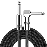
- [Low Noise High Fidelity] New bee guitar cord with 22AWG oxygen-free-copper center conductors provides enhanced signal transfer, the PVC insulation material and the high-density stranded copper double shield provide noise rejection for quiet operation
- [Ideal for Choice] New bee 1/4 straight and right angle metal connectors, ensures a secure connection in any instrument, pedal, or amp jack. L shape great fro on stage guitar stands
- [Wide Compatible] Suitable for mixer, power amplifier, microphone, effector, decoder, equalizer, electoronic organ, electric guitar, electric bass and other electronic equipments. Widely used in the installation of smart home, karaoke speaker, professional stage audio, etc
- [Easy Disassemble] Making incidental repairs quick and easy! Very nice, flexible cable
- [Dont Hesite to Order] 24 hours customer services and professional technology team are standing by
Change navigation deliberately
A bottom navigation bar can be efficient on a compact window but consume valuable vertical space on a broad, persistent layout. On larger classes, a navigation rail or another side-by-side navigation treatment can keep destinations visible while leaving the content area taller. This is not an automatic “rail on every foldable” rule: choose the pattern that reduces steps in your app’s primary task.
When navigation changes form, preserve the selected destination and its scroll position. A user who rotates or unfolds the device should not be sent to the first tab or lose the detail item they were reading.
Use list-detail when simultaneous context helps
Messaging, mail, file browsing, settings categories, and similar tasks often benefit from a list on the left and the selected item on the right. In a compact window, show one at a time. In an expanded window, retain the list while displaying the detail pane.
- Keep selection state in the screen’s state model, not only in a transient view instance.
- Give the list and detail panes independent scrolling where the task requires it.
- Define what happens when no item is selected: show a useful empty state rather than a blank panel.
- When the window narrows, collapse predictably to the single-pane route without discarding the selected item.
Constrain controls and reading width
Extra width should reveal useful information, not produce comically long text fields or buttons stretched from hinge to edge. Apply maximum widths to forms, articles, cards, and dialog content where long lines reduce comprehension. Center or align the constrained region according to the visual language of the screen, while allowing the surrounding layout to use the remaining space for navigation or supporting content.
For forms, group related fields in a column with a readable maximum width and use a second column only when the fields are logically independent. Keep labels close to their controls. For tables or dashboards, add columns that answer real user questions instead of widening existing columns until values become hard to scan.
Rank #4

- Digital Family Calendar: BSIMB digital calendar wall touch screen puts an end to your chaotic life. Designed for busy families, the digital calendar keeps you organised and in step with your family. Assign different colours and tasks to each family member to make family scheduling easier and more intuitive.
- Easy Setup and Auto-Sync: Plug in, connect to WLAN and auto-syn your electric calendar in minutes. Digital wall calendar compatible with Google calendar, iCloud calendar, Outlook calendar, Cozi calendar and Yahoo calendar. Add events directly on the device or through the ecalendar app. Electronic calendar stays current whether you're at work or traveling—no manual updates needed.
- All-In-One Home Assistant: Smart calendar builds habits and encourage independence with personalised chores. Display daily meal plan to reduce the daily ‘What's for dinner?’ stress. To-do lists keep track of everything you want. Turning chores into valuable achievements with stars and rewards, making life easier and more enjoyable.
- Manage Anytime Anywhere: BSIMB electronic calendar for family stay connected with the powerful ecalendar app. Access and manage your digital wall calendar anytime, anywhere with free features like stars & rewards, photo screensaver, chore charts, meals plans, to-do lists etc. Electronic planner paid features like Magic Import tailor advanced tools for users with special needs.
- Stay in Touch with Loved Ones: Share photos or videos from your phone to electronic wall calendar with app, instantly update your life moment, and keep in touch with your family, especially those who are far away; you can also surprise your smart calendar digital wall by sending him a wish card; it's also great for keeping tech-illiterate elders in touch with the youngsters.
Make every action reachable
A wide landscape or a short split-screen window can reduce vertical space even as it increases width. Put the primary action where it remains visible or make the content scroll. Verify that the keyboard, error messages, confirmation buttons, and secondary actions do not end up below an unscrollable container.
Dialogs deserve special attention. A dialog designed for a phone may become excessively wide or place its buttons beyond the visible region when the window is resized. Give dialog content a sensible maximum width, allow internal scrolling for long forms, and test both a broad full-screen window and a narrow split-screen window.
Step 3: Preserve state through unfolding, rotation, and resizing
Folding, unfolding, rotating, entering multi-window, and resizing can change configuration. By default, Android may recreate an activity for such changes. Treat recreation as normal rather than as an exceptional failure.
Identify state the user would consider work
- Text entered into every form field, including unsaved drafts.
- The current navigation destination and selected list item.
- Scroll positions, expanded sections, filters, sort order, and pagination position.
- Transient but important context, such as an in-progress checkout step or an attachment being composed.
- Whether a pane is open or collapsed when that choice affects the user’s next action.
Keep durable screen state in an appropriate state holder and restore it after recreation. In Compose, small form values can use saveable state; larger workflows should use a state holder or ViewModel with saved-state support. In Views, save instance state for transient UI values and keep business data outside the activity instance. The exact mechanism is less important than verifying that a user can unfold the device without losing entered work.
Do these 3 things before closing this tab:
1Repair Windows errors before they cause bigger problems2Fix the driver behind crashes, sound loss and screen glitches3Clear out junk files and repair common Windows errors@Composable
fun SearchForm() {
var query by rememberSaveable { mutableStateOf("") }
TextField(
value = query,
onValueChange = { query = it },
label = { Text("Search") }
)
}This small example covers a field value; it does not replace a state model for a multi-screen workflow. Test restoration after the activity is actually recreated, not only after a recomposition.
Handle navigation state when panes merge or split
When the window changes from compact to expanded, the detail destination may become a pane beside the list. When it changes back, the same detail should become the active screen or remain available through the back stack. Model the selected item and navigation route independently from the chosen arrangement so the layout can change without changing the user’s place.
Check content reachability after every change
Use scrolling containers where content can exceed the available height. Recheck focus order and keyboard behavior after a resize. A control that was visible in portrait may be below the fold in landscape; a two-column form may need to return to one column when width decreases. Automated state restoration is valuable, but manually exercise the transitions because clipping and focus problems are often visual.
Camera preview: separate sensor geometry from UI geometry
If the app includes a camera viewfinder, verify preview rotation and aspect-ratio behavior in portrait and landscape. The camera sensor’s aspect ratio can differ from the view’s aspect ratio, so the preview cannot always fill the available region without cropping, letterboxing, or a deliberate scale choice. Check that the capture button, overlays, focus indicators, and permission messages remain reachable in both orientations and in a resized window. Android’s orientation and resizability guidance includes camera behavior among the cases that need explicit validation: see the official guidance.
Recommended Free Tools
Step 4: Test more than one unfolded device
Use the adaptive app quality guidelines as a test matrix. A single physical foldable cannot represent every width, posture, split-screen allocation, or desktop window.
| Configuration named in the guidance | Reference dimensions or density | What it helps expose |
|---|---|---|
| Googlebook | 160 ppi | Desktop-style density and a broad keyboard-oriented surface. |
| Foldable | 841 × 701 dp | Wide foldable composition and the transition from a phone-sized outer display. |
| 8-inch tablet | 1024 × 640 dp | Landscape tablet proportions and short vertical space. |
| 10.5-inch tablet | 1280 × 800 dp | A broader two-pane candidate with more horizontal room. |
| 13-inch Chromebook | 1600 × 900 dp | Very wide desktop-like windows and maximum-width problems. |
The guidance lists a Pixel Fold emulator, a medium tablet emulator, a desktop preview emulator, and a resizable emulator for varied configurations. Emulator names, dimensions, and Android Studio offerings can change, so confirm the current setup in Android Studio documentation before creating a long-lived test plan.
Exercise postures and transitions
- Launch in the folded or compact state and navigate to a screen with real user data.
- Unfold while a form, list, detail view, dialog, or camera preview is active.
- Fold again and confirm that the selected item, entered values, and navigation context survive.
- Rotate between portrait and landscape in both compact and expanded arrangements.
- Enter split screen or a desktop window, then resize gradually through several widths rather than jumping between two presets.
- Where the hardware and app support it, test book and tabletop postures and verify that the hinge or posture does not hide content or controls.
Inspect the screens that fail first
- Navigation: destinations remain discoverable after a bottom bar becomes a rail or a pane.
- Text: headings, labels, and body copy wrap naturally without oversized line lengths or clipped glyphs.
- Dialogs: title, content, validation messages, and buttons remain visible and scrollable.
- Forms: focus moves to the next field, the keyboard does not cover the primary action, and unsaved input survives recreation.
- Lists and details: selection remains stable while panes appear or collapse.
- Camera: preview orientation, crop, overlays, and capture controls are correct in each orientation.
- Resize resilience: no overlap, disappearing controls, or one-frame layout assumptions appear during repeated changes.
Define pass criteria from the app’s task. A drawing app, a banking form, and a media browser do not need identical pane arrangements, but each must keep its core action usable in every supported window and posture.
Common failure modes and fixes
| Symptom | Likely cause | Fix |
|---|---|---|
| The app is letterboxed or remains phone-shaped on an inner display. | A manifest orientation, aspect-ratio, or resizability assumption conflicts with large-screen behavior, or compatibility settings are involved. | Remove the dependency on those restrictions, measure the current window, and implement adaptive layouts. Check the documented Android 16 exceptions and target-SDK behavior. |
| Everything is technically visible but controls and text span the entire width. | The phone layout was stretched instead of recomposed. | Use a list-detail or supporting pane where useful, then apply maximum widths to reading and interaction regions. |
| Unfolding clears a draft or returns to the first screen. | State exists only in the activity or a transient view and was not restored after recreation. | Save form values, route, selection, and other user context in the appropriate state holder; test actual recreation. |
| A landscape form’s submit button cannot be reached. | The layout assumes phone height or lacks scrolling. | Make the content scrollable, keep the primary action reachable, and test short-height split-screen windows. |
| A camera preview is stretched or controls are cropped. | Sensor and UI aspect ratios were assumed to match. | Handle rotation and scaling explicitly, then test portrait, landscape, folded, unfolded, and resized states. |
| The app works on one foldable but fails in split screen. | Layout logic uses the physical display or model rather than the app window. | Drive composition from live window metrics and exercise intermediate widths with a resizable emulator. |
A practical implementation checklist
- Inventory fixed assumptions. Search the manifest and code for orientation locks, fixed aspect-ratio metadata, non-resizable declarations, hard-coded width checks, and view logic keyed to a device model.
- Confirm your target behavior. If targeting Android 16/API 36, read the current large-screen restriction rules and document any temporary compatibility opt-out. Do not treat the opt-out as a design solution; it does not stop rotation on large displays and is removed for API 37 targets.
- Introduce one window-information source. Obtain current window metrics through Jetpack WindowManager or the recommended platform APIs, then expose width and height to the layout layer.
- Map metrics to window size classes. Use the current adaptive library’s compact, medium, and expanded definitions instead of inventing device-specific thresholds.
- Choose task-driven compositions. Keep a compact single pane, add a rail or supporting region when it improves navigation, and use list-detail when simultaneous context is valuable.
- Set maximum widths. Constrain text, forms, cards, and dialogs so the extra display area improves comprehension rather than creating long, inefficient controls.
- Make height safe. Add scrolling and verify focus, keyboard, validation, and primary-action reachability in landscape and short windows.
- Preserve user context. Restore drafts, navigation, selections, filters, scroll positions, and other work after configuration changes and activity recreation.
- Audit specialized surfaces. Give camera previews, maps, media controls, custom canvases, and drag-and-drop interactions explicit posture and aspect-ratio tests.
- Run the full matrix. Test the listed foldable, tablet, Chromebook/Googlebook, desktop preview, and resizable configurations, plus folded, unfolded, book, tabletop, portrait, landscape, multi-window, and repeated resize transitions where applicable.
How to decide whether a wide layout is ready
A wide-screen implementation is ready when its composition follows the current app window, not when a particular foldable happens to display it without crashing. On an expanded window, the user should gain useful information or fewer navigation steps; reading and controls should remain bounded; every primary action should be reachable at reduced height; and unfolding, rotating, or resizing should preserve the task in progress.
That standard also keeps the code durable. The same window-size decisions serve a large foldable, a tablet, a Chromebook, and a desktop window, while compact behavior continues to serve a folded outer display or a narrow split-screen allocation. Build for the space available now, and the app can respond to the next form factor without another device-specific redesign.
Quick Recap
Product prices and availability are accurate as of the date/time indicated and are subject to change. Any price and availability information displayed on Amazon at the time of purchase will apply.

