Quick wins for a faster PC:
Scan for outdated or missing drivers - takes under a minuteDriver Scan →Repair Windows errors before they cause bigger problemsFix Now →Fix the driver behind crashes, sound loss and screen glitchesFind Drivers →An accessible iPhone app treats available space as a changing input, not a fixed device measurement. Build the interface so text, controls and content can reflow when the window, orientation, language or text size changes; keep content inside the safe area; and expose clear accessibility semantics for every actionable element.
In practice, that means using SwiftUI’s adaptive layout system deliberately or combining UIKit stack views with Auto Layout, allowing Dynamic Type to resize surrounding views, avoiding hard-coded screen dimensions, and reviewing VoiceOver and other focus navigation after every layout change. The same principles apply to iPadOS, where a window can occupy only part of the screen, but the examples here center on iPhone.

As an Amazon Associate I earn from qualifying purchases.
Why an iPhone layout cannot assume one screen
A view that fits one iPhone in portrait may not fit when the user rotates the device, changes text size, uses a different model, opens the app in a resized window, or switches language. Apple identifies window resizing, device and orientation differences, localization and Dynamic Type as reasons that an interface may need to change size and position. See Apple’s UIKit view-layout guidance.
Free tools Windows power users keep installed
One-click scans. No signup required.
Even an iPhone-first design should therefore describe relationships rather than coordinates. A title belongs above a form, a button follows the fields it submits, and a toolbar remains reachable when width is limited. On iPadOS, the same app may run in a window that occupies only a portion of the display, so a layout that merely checks the physical device model is not sufficient.
#1 Best Overall

- [Ultra-Lightweight Ear Buds Designed for Small Ears] Each earbud weighs only 3.7g and features a compact, ergonomic in-ear design made especially for small ears. Secure, low-profile, and comfortable for workouts, all-day wear or overnight sleeping.The ultra-slim profile sits flush in your ear with no hard edges poking or rubbing, so you can even sleep on your side without discomfort.
- [Immersive Stereo Sound with TOZO OrigX Technology] TOZO OrigX tuning delivers clear vocals, balanced mids, and natural stereo sound for music, podcasts, and videos.
- [Long Battery Life for Daily Use] Get up to 7 hours of playtime on a single charge, with up to 32 hours total using the charging case—ideal for workdays, commuting, and extended listening sessions.
- [Bluetooth 5.3 & Stable Connection] Bluetooth 5.3 provides fast pairing, stable wireless performance, and reduced dropouts as you move around home or office.
- [Deep Bass with Clear Vocals] High-performance drivers produce punchy bass while keeping vocals clean and detailed for everyday listening.
Start with an adaptive layout model
Choose layout primitives that can negotiate space at runtime. In UIKit, use stack views for groups that should reposition or resize together, then add Auto Layout constraints for relationships that need precision. In SwiftUI, the framework proposes and measures sizes automatically, but you still decide how content should reflow at different widths and text sizes.
| Choice | Best use | What to verify |
|---|---|---|
| SwiftUI automatic layout | New screens or views whose hierarchy can be expressed as stacks, grids and flexible containers. | That your view hierarchy has deliberate alternatives for narrow widths, large text and right-to-left languages; automatic measurement does not guarantee an understandable arrangement. |
| UIKit stack views | Rows, columns and grouped controls that should move or distribute themselves as available space changes. | Axis, alignment, distribution and spacing still produce a reachable order when the axis changes or content grows. |
| UIKit Auto Layout | Precise relationships, such as a control aligned to a readable edge or a field whose width follows another view. | Constraints remain satisfiable at the narrowest and widest supported sizes and do not compress labels into unreadable fragments. |
Do not anchor key content to a single device’s width or height. A fixed frame can hide text, push an action off-screen or create conflicting constraints as soon as conditions change. Define minimum relationships and let the system calculate the final frames.
UIKit: build the hierarchy around flexible relationships
1. Group related content in stack views
Put controls that belong together in a vertical or horizontal UIStackView. A vertical stack is often appropriate for a form because it lets each label and control keep its intrinsic height. A horizontal stack can hold a short label and an accessory, but it needs an alternative when either item becomes wide.
Set the stack’s axis, alignment, distribution and spacing to express intent rather than applying individual frames. If a horizontal row cannot accommodate a longer translation or a larger text category, switch to a vertical arrangement or place the row in a scrolling container. The exact breakpoint is an application decision; Apple’s guidance does not define one universal value.
2. Add Auto Layout constraints for the edges that matter
Constrain the stack or content container to its parent’s layout guides, then constrain relationships inside the container. A typical screen has a content stack pinned to the safe area’s leading, trailing and vertical edges, with its height determined by intrinsic content and scrolling when necessary.
let stack = UIStackView(arrangedSubviews: [titleLabel, emailField, actionButton])
stack.axis = .vertical
stack.alignment = .fill
stack.spacing = 16
stack.translatesAutoresizingMaskIntoConstraints = false
view.addSubview(stack)

NSLayoutConstraint.activate([
    stack.leadingAnchor.constraint(equalTo: view.safeAreaLayoutGuide.leadingAnchor),
    stack.trailingAnchor.constraint(equalTo: view.safeAreaLayoutGuide.trailingAnchor),
    stack.topAnchor.constraint(equalTo: view.safeAreaLayoutGuide.topAnchor, constant: 24)
])
The example expresses only relationships; it does not prescribe a universal margin or screen size. In a production screen, add the constraints needed to establish the bottom behavior, scrolling and any readable-width limit for your content. Check that no required constraint conflicts when labels wrap or controls grow.
3. Let intrinsic content size win over forced heights
Labels, text fields and buttons should normally be able to report their intrinsic size. Avoid a fixed height that was chosen from a single screenshot. If a design calls for a compact control, use content compression and hugging priorities thoughtfully instead of clipping its title. A multiline label needs an appropriate number of lines and enough vertical room for its text.
Rank #2

- 【IP68 Waterproof Multifunctinal Smart Watch】Torjalph fitness activity tracker smart watch is IP68 waterproof technology ,you can wear it when swimming,handwashing,it's rain-proof which means that you perform multiple exercise modes outside without worrying about sweat or rain corroding your fitness smart watch,and this watch equipped with a 230 mAh large capacity battery magnetic charging ,and this sports activity tracker watch can be used 5-7 days If fully charged.
- 【Larger 1.83'' Full Screen Watch & Multi-dial Selection】1.83 inch full HD color touch screen smart watch for men / women provides excellent 240*284 resolution image quality ,This Bluetooth smart watch offers a better touch experience and remarkable immersion and ,more than 200 watch faces for you to choose from App"Da Fit ", you can change the dial style according to your mood to wear keeping the world on your wrist
- 【Accurate Activity Tracker Smart Watch 】sports watch activity tracker uses sweat and dust resistant breathable silicone strap, our Fitness Tracker Smart Watch for Android iOS Phones supports 12 sports modes,walking,running,bicycle,swimming,badminton,basketball,football,rope skipping. This bluetooth calls smart watch for men women is lightweight and stylish, bringing more convenient and relaxing sports experience while also providing more protection.
- 【Your 24 Hour Personal Daily Health Monitor】Fitness watch for women men full touch screen IP67 waterproof bluetooth smartwatch for Android iOS Phones with heart rate blood pressure monitor multifunction Andriod smart watch with steps counter sleep monitor sports fitness watch, monitoring blood oxygen saturation allows you to understand your physical condition in real time to track fitness progress ,to know your health status in time.
- 【More Functions Bluetooth Call Smart Watch】This fitness activity smart watch full screen for iPhone and Android phones includes a bunch of new features including:The bluetooth smart watch can hang up the phone, receive and display WhatsAPP /Text /Facebook /Twitter /Messenger reminder.Support sedentary reminder, alarm clock, stopwatch, timer,weather information,music control, remote camera control compatible with Android 5.0 and above or iOS 9.0 and above smartphones.
4. Give narrow widths a planned arrangement
When width is constrained, decide which relationships may change. A two-column settings row might become a vertical label-over-control pair; a row of three actions might wrap into a vertical list; secondary text might move below the primary value. Keep the same information and actions available rather than hiding them solely because the window is narrow.
SwiftUI: use automatic measurement with explicit adaptive decisions
SwiftUI calculates layout from proposed and intrinsic sizes, so stacks and flexible containers generally respond to a new width without manual constraint updates. That does not remove the need for design decisions: a horizontal HStack can still become cramped, and a view that looks fine at the default text size can become unusable at an accessibility size.
Read the user’s Dynamic Type choice
SwiftUI exposes the current text-size setting through DynamicTypeSize. It includes the standard categories and five accessibility categories, accessibility1 through accessibility5. The value reflects the user’s chosen size. Apple documents the categories at DynamicTypeSize.
@Environment(.dynamicTypeSize) private var dynamicTypeSize

var body: some View {
    VStack(alignment: .leading, spacing: 16) {
        Text("Account details")
            .font(.title2)
        Text("Your contact information is used for sign-in alerts.")
            .font(.body)
        Button("Continue") {
            submit()
        }
    }
    .padding()
}
Use text styles such as .body and .title2 rather than treating a point size as fixed. Let the surrounding stack grow with the text. If the design genuinely needs a different composition at larger categories, branch on the environment value and provide an equivalent arrangement; do not simply scale text down to preserve a screenshot.
Do these 3 things before closing this tab:
1Clear out junk files and repair common Windows errors2Scan for outdated or missing drivers - takes under a minute3Repair Windows errors before they cause bigger problemsDesign controls that expand and reflow
- Allow labels and explanatory text to wrap to additional lines.
- Keep buttons large enough for their localized title and larger text; let their height expand instead of clipping the title.
- Move secondary information below a primary value when a side-by-side row becomes too wide.
- Put long forms in a scrollable container so growing content remains reachable.
- Make sure the first and last controls remain discoverable after the layout grows.
The category names describe the user setting, not a promise about your final geometry. Exact wrapping, truncation and control heights depend on your fonts, modifiers and hierarchy, so validate the actual screen at every size you support.
Support Dynamic Type without breaking access to actions
“How do I support larger text without breaking my layout?” Start by treating text growth as normal content, not an exceptional state. A label that wraps changes the height of its container; that change must be allowed to propagate through every parent stack or constraint chain.
Check the complete path from text to action
- Increase the text size to the largest accessibility category available in your supported configuration.
- Read each label and paragraph for clipping, unexpected ellipses or overlapping controls.
- Follow the visual order to the primary action. If it moved below the fold, confirm the screen scrolls and that the action is still reachable.
- Open and close keyboards, menus and alerts at the larger size; these transient views can expose hard-coded heights.
- Repeat with a long translated string, because localization and Dynamic Type combine rather than occur independently.
Do not claim that a particular font category will always fit a particular number of lines. The correct result is an implementation that preserves the information and controls, with an arrangement that can change as needed.
Rank #3
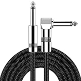
- [Low Noise High Fidelity] New bee guitar cord with 22AWG oxygen-free-copper center conductors provides enhanced signal transfer, the PVC insulation material and the high-density stranded copper double shield provide noise rejection for quiet operation
- [Ideal for Choice] New bee 1/4 straight and right angle metal connectors, ensures a secure connection in any instrument, pedal, or amp jack. L shape great fro on stage guitar stands
- [Wide Compatible] Suitable for mixer, power amplifier, microphone, effector, decoder, equalizer, electoronic organ, electric guitar, electric bass and other electronic equipments. Widely used in the installation of smart home, karaoke speaker, professional stage audio, etc
- [Easy Disassemble] Making incidental repairs quick and easy! Very nice, flexible cable
- [Dont Hesite to Order] 24 hours customer services and professional technology team are standing by
Keep content inside safe areas and layout guides
Safe areas describe the portion of a window that is not obscured by system interface or hardware. Use the safe-area anchors in UIKit and the corresponding safe-area behavior in SwiftUI for content that must remain visible. Apple’s accessibility guidance also emphasizes avoiding assumptions about a particular device frame; see Optimizing your app for Assistive Access.
PC Slower Than It Used to Be?
A free scan shows the junk files, broken settings and background clutter dragging Windows down - then fixes them in one click.Free scan · Windows 10 & 11Outdated Drivers Are Slowing You Down
One free scan finds every outdated or missing driver and matches the right update for your exact hardware.Free scan · exact hardware matchDo not copy inset numbers from one iPhone and reuse them everywhere. System bars, sensors, home indicators, split or resized windows and orientation can change the usable region. Background artwork may extend to the window’s edges, while text, forms and essential controls usually belong within the safe area.
Use guides for readable and scrollable content
Constrain the main content to the safe area, then place it in a scroll view when its intrinsic height can exceed the available height. Ensure the scroll view’s content layout is fully constrained so Auto Layout can determine its content size. In SwiftUI, choose a scrolling container for forms and long text, and verify that padding does not create an unreachable bottom action.
Make accessibility semantics match the visual design
Layout adaptation is only successful if assistive technology can still identify and reach the same content. Standard UIKit controls expose accessibility information by default. A custom drawing or composite view may not: it can appear correct visually while presenting one unlabeled object, the wrong value or an unusable activation action.
Apple documents the protocol and related behavior in UIAccessibility.
The Tool Desk
Outbyte Driver Updater FREEScan for outdated or missing drivers - takes under a minuteDriver Scan →Outbyte PC Repair FREERepair Windows errors before they cause bigger problemsFix Now →Prefer standard controls when they fit
Use a standard button for an action, a switch for an on/off setting, and a text field for editable text when those semantics match the interaction. Standard controls provide roles and interaction behavior that assistive technologies understand. Styling can change their appearance without replacing their semantics.
Describe custom and composite controls explicitly
For a custom control, decide whether it should expose one accessibility element or several. Provide a meaningful label, the correct role, the current value or state, and an activation action. A composite card that contains a title, status and disclosure affordance might be one actionable element if the whole card activates the same destination; if each part performs a different action, expose those actions separately.
Rank #4

- Digital Family Calendar: BSIMB digital calendar wall touch screen puts an end to your chaotic life. Designed for busy families, the digital calendar keeps you organised and in step with your family. Assign different colours and tasks to each family member to make family scheduling easier and more intuitive.
- Easy Setup and Auto-Sync: Plug in, connect to WLAN and auto-syn your electric calendar in minutes. Digital wall calendar compatible with Google calendar, iCloud calendar, Outlook calendar, Cozi calendar and Yahoo calendar. Add events directly on the device or through the ecalendar app. Electronic calendar stays current whether you're at work or traveling—no manual updates needed.
- All-In-One Home Assistant: Smart calendar builds habits and encourage independence with personalised chores. Display daily meal plan to reduce the daily ‘What's for dinner?’ stress. To-do lists keep track of everything you want. Turning chores into valuable achievements with stars and rewards, making life easier and more enjoyable.
- Manage Anytime Anywhere: BSIMB electronic calendar for family stay connected with the powerful ecalendar app. Access and manage your digital wall calendar anytime, anywhere with free features like stars & rewards, photo screensaver, chore charts, meals plans, to-do lists etc. Electronic planner paid features like Magic Import tailor advanced tools for users with special needs.
- Stay in Touch with Loved Ones: Share photos or videos from your phone to electronic wall calendar with app, instantly update your life moment, and keep in touch with your family, especially those who are far away; you can also surprise your smart calendar digital wall by sending him a wish card; it's also great for keeping tech-illiterate elders in touch with the youngsters.
Do not create duplicate elements by leaving decorative subviews accessible. Conversely, do not hide text that conveys status merely because it is visually adjacent to a custom control. Recheck the accessibility representation after the layout changes, because a view that was one element in a compact row may need a different grouping when it becomes a vertical arrangement.
Keep labels independent of position
Never use “the button on the right” as an accessibility label. When a row stacks vertically or reorders for right-to-left text, positional wording becomes false. Name the action and include its state or value where needed.
Recommended Free Tools
Plan localization and right-to-left layout from the beginning
Translations can be longer or shorter than the source language, and right-to-left scripts change the reading direction. Build labels that can wrap, avoid embedding direction into string literals, and use leading and trailing relationships instead of assuming left and right. UIKit constraints and stack-view alignment should express semantic edges; SwiftUI’s leading and trailing alignment follows the interface direction.
Review order as well as geometry
Visual order, keyboard order and assistive-technology focus order should tell the same story. When a compact horizontal row becomes a vertical stack, confirm that focus moves from the label or value to the related action, then to the next group. A visually pleasing reordering that causes focus to jump unpredictably is still an accessibility defect.
Test a language with substantially longer text and an RTL language in the layouts you support. Check navigation bars, swipe actions, icons that imply direction, and any custom drawing that uses absolute x-coordinates.
Keep buttons and content accessible in landscape
Landscape usually provides more width and less height. A design that simply stretches a portrait column can create excessive empty space while pushing the primary action below a short viewport. Conversely, a row that fits in landscape may not fit after the user returns to portrait.
- Use the extra width for a deliberate two-column or readable-width arrangement, not for arbitrarily widening every control.
- Preserve a clear vertical path to the primary action when height is limited.
- Let long forms scroll in both orientations when necessary.
- Recheck keyboard, sheet and alert presentation because they reduce the visible region further.
- Keep essential controls within the safe area in every supported orientation.
There is no single Apple-mandated breakpoint for switching arrangements. Pick thresholds based on the minimum width your content needs, then verify neighboring widths so the transition does not produce overlapping or inaccessible controls.
Validate the layout as a matrix, not a single screenshot
Validation is a recommended authoring step, not a result reported here. Exercise the combinations that can alter geometry and semantics:
| Dimension | Cases to review | Questions |
|---|---|---|
| Available width | Narrow portrait, wider portrait, and a partially sized window where applicable. | Does content reflow without clipping, and can every action still be reached? |
| Orientation | Portrait and landscape where the app supports both. | Does reduced height force scrolling or hide the primary action? |
| Text size | Default text plus all supported accessibility categories. | Do labels wrap, controls expand and focus order remain understandable? |
| Language | Long translations and at least one right-to-left language if supported. | Are leading/trailing relationships and reading order correct? |
| Assistive technology | VoiceOver and the relevant input or display accommodations for your audience. | Does each element have an accurate label, role, value and action? |
Walk through the primary task without relying on visual position. Rotate or resize during the task, change text size, and return to the screen. This catches state and focus problems that a static launch check misses.
Troubleshoot common adaptive-layout failures
“Unable to simultaneously satisfy constraints” appears
Look for a required fixed width or height colliding with intrinsic content, a stack view’s distribution, or a safe-area relationship. Remove assumptions that only hold at one width, lower the priority of a preference that may yield, or redesign the row so it can stack. Do not silence the warning by hiding the conflicting view; that can remove an essential action.
A label is truncated at large text sizes
Check whether the label is single-line, has a forced height, or is losing a compression-resistance priority to a neighboring view. Permit multiple lines, give the label vertical room, and move adjacent content below it when necessary. Confirm the containing scroll view can grow.
The button is visible but VoiceOver cannot find it
Inspect whether a custom parent view is swallowing its children, whether the button is marked inaccessible, or whether duplicate elements create confusing grouping. Restore the correct accessibility elements and supply a label and activation action for custom controls.
RTL text looks mirrored incorrectly
Replace left/right constraints and hard-coded drawing coordinates with leading/trailing or direction-aware APIs. Check directional icons separately: an arrow that indicates “next” may need to change meaning, while a brand-neutral symbol may not.
The bottom action disappears behind system UI
Constrain content to the safe area and verify the scroll view’s content and indicator insets. Reproduce the issue in both orientations and with a keyboard or other system presentation visible; a fixed bottom constant is not a universal inset.
A practical decision checklist
- List every piece of content and action on the screen, including status text that a custom view draws.
- Choose SwiftUI stacks or UIKit stack views for groups that can reflow; reserve fixed relationships for genuine requirements.
- Define safe-area and scrolling behavior before tuning visual spacing.
- Use Dynamic Type text styles and allow surrounding controls to expand.
- Design a narrow-width arrangement and a landscape arrangement where the hierarchy changes.
- Use leading/trailing relationships and localization-ready strings.
- Confirm standard controls expose the intended semantics; add explicit accessibility information for custom views.
- Review focus order after every visual reordering.
- Run the width, orientation, text-size, language and assistive-technology matrix before release.
The durable rule is to make relationships, content size and semantics adaptable together. SwiftUI supplies much of the measurement machinery, while UIKit gives you stack views and Auto Layout to express the same intent explicitly. Neither framework can infer whether a rearranged screen still makes sense to a person, so accessibility review remains part of the layout implementation rather than a final cosmetic check.
Quick Recap
Product prices and availability are accurate as of the date/time indicated and are subject to change. Any price and availability information displayed on Amazon at the time of purchase will apply.

