Crashes, No Sound, or Screen Glitches?
Random freezes, missing sound and display glitches usually trace back to one bad driver. Find and replace yours safely.Free scan · under a minutePC Slower Than It Used to Be?
A free scan shows the junk files, broken settings and background clutter dragging Windows down - then fixes them in one click.Free scan · Windows 10 & 11Keep a dialog in the rendered tree until its leave animation reports completion. If open becomes false and your JSX immediately stops rendering the dialog, React removes its DOM nodes before the browser or animation library can play the exit transition. The reliable fix is to separate closing from unmounted: change the dialog’s visual state first, keep the relevant nodes mounted during the leave phase, and remove them only when the animation lifecycle finishes.
The implementation depends on who owns presence: Radix Dialog can delay unmounting for CSS keyframes; a JavaScript animation library can take over with Radix’s forceMount; Motion uses AnimatePresence; and current React ViewTransition APIs can animate added and removed transition boundaries when used inside a transition. A portal does not solve premature removal by itself.

As an Amazon Associate I earn from qualifying purchases.
Why a React dialog disappears before its exit animation
An exit animation needs an element that still exists. CSS keyframes, CSS transitions, springs and tweens all need a mounted DOM node to which intermediate styles can be applied. This common pattern removes the node at the same moment that it changes the state:
Quick wins for a faster PC:
Repair Windows errors before they cause bigger problemsFix Now →Fix the driver behind crashes, sound loss and screen glitchesFind Drivers →function Dialog({ open, onClose }) {
if (!open) return null;
return (
<div className="dialog">
<button onClick={onClose}>Close</button>
</div>
);
}When open changes to false, React reconciles the component and returns null. The dialog is detached immediately, so there is no element left to fade, slide or scale out. Adding a class such as dialog--closing does not help if the same render removes the element.
#1 Best Overall

- [Ultra-Lightweight Ear Buds Designed for Small Ears] Each earbud weighs only 3.7g and features a compact, ergonomic in-ear design made especially for small ears. Secure, low-profile, and comfortable for workouts, all-day wear or overnight sleeping.The ultra-slim profile sits flush in your ear with no hard edges poking or rubbing, so you can even sleep on your side without discomfort.
- [Immersive Stereo Sound with TOZO OrigX Technology] TOZO OrigX tuning delivers clear vocals, balanced mids, and natural stereo sound for music, podcasts, and videos.
- [Long Battery Life for Daily Use] Get up to 7 hours of playtime on a single charge, with up to 32 hours total using the charging case—ideal for workdays, commuting, and extended listening sessions.
- [Bluetooth 5.3 & Stable Connection] Bluetooth 5.3 provides fast pairing, stable wireless performance, and reduced dropouts as you move around home or office.
- [Deep Bass with Clear Vocals] High-performance drivers produce punchy bass while keeping vocals clean and detailed for everyday listening.
Think of the lifecycle as three states rather than two:
- Closed and unmounted: no dialog DOM exists.
- Open: the dialog is mounted and interactive.
- Leaving: the dialog is still mounted, but it is visually transitioning out and should no longer accept normal interaction.
The state that controls unmounting must therefore be a presence state that outlives the boolean used to request closing. The presence owner removes the node after the animation’s completion callback or equivalent event.
Choose the presence owner before writing code
There is no single React-only switch that keeps every dialog mounted through every animation system. Decide which layer knows when the leave phase has completed.
| Option | Who controls removal? | Best fit | Main caveat |
|---|---|---|---|
| Radix CSS keyframes | Radix presence behavior | State-driven enter and exit animations written as CSS keyframes | The documented mechanism is for CSS animations; do not assume arbitrary transition behavior is delayed automatically. |
Radix forceMount plus JavaScript animation |
The animation library’s presence state | Spring or tween libraries that need an explicit leave phase | Overlay and Content must remain mounted according to the leave state and be removed after completion. |
Motion AnimatePresence |
Motion observes removed direct children | Motion-based exit animations | The boundary must stay mounted and directly observe the conditional child. |
| React ViewTransition | React transition behavior | Projects using the current documented ViewTransition APIs | Check the project’s React version and transition constraints first. |
This separation also prevents a subtle bug: a component can be visually closed while still mounted, but it should not remain focusable, clickable or exposed to assistive technology as if it were open. The animation state and accessibility state must be updated together.
Radix Dialog with CSS keyframes
For a Radix Dialog, the simplest documented route is CSS animation. Radix’s animation guide explains that its primitives suspend unmounting while CSS animations play and shows matching data-state="open" and data-state="closed" selectors for the overlay and content. The guide’s example uses 300 ms keyframes; that duration is illustrative, not a required setting. See the Radix animation guide for the primitive behavior.
Keep the Dialog parts mounted through the closed keyframe
import * as Dialog from "@radix-ui/react-dialog";
import "./dialog.css";

export function SettingsDialog() {
  return (
    <Dialog.Root>
      <Dialog.Trigger>Settings</Dialog.Trigger>
      <Dialog.Portal>
        <Dialog.Overlay className="DialogOverlay" />
        <Dialog.Content className="DialogContent">
          <Dialog.Title>Settings</Dialog.Title>
          <Dialog.Description>
            Change your preferences.
          </Dialog.Description>
          <Dialog.Close>Done</Dialog.Close>
        </Dialog.Content>
      </Dialog.Portal>
    </Dialog.Root>
  );
}
.DialogOverlay[data-state="open"] {
animation: overlayShow 300ms ease-out;
}
.DialogOverlay[data-state="closed"] {
animation: overlayHide 300ms ease-in;
}
.DialogContent[data-state="open"] {
animation: contentShow 300ms cubic-bezier(0.16, 1, 0.3, 1);
}
.DialogContent[data-state="closed"] {
animation: contentHide 300ms ease-in;
}
@keyframes overlayShow {
from { opacity: 0; }
to { opacity: 1; }
}
@keyframes overlayHide {
from { opacity: 1; }
to { opacity: 0; }
}
@keyframes contentShow {
from { opacity: 0; transform: translateY(8px) scale(.98); }
to { opacity: 1; transform: translateY(0) scale(1); }
}
@keyframes contentHide {
from { opacity: 1; transform: translateY(0) scale(1); }
to { opacity: 0; transform: translateY(8px) scale(.98); }
}Do not add a parent conditional such as {open && <Dialog.Root>...} around the whole tree if that conditional removes the Radix presence boundary before the closed keyframe can run. Let the Root’s open state drive the primitive, and let the primitive observe its own animation.
Use keyframes, not an assumed transition delay
Radix specifically documents the unmount-suspension behavior for CSS animations. A plain transition declaration may change visual properties, but it does not necessarily give the primitive a completion lifecycle it can use to delay removal. If an exit transition vanishes instantly, replace it with a named @keyframes animation or move ownership to a JavaScript presence system.
Free tools Windows power users keep installed
One-click scans. No signup required.
Rank #2

- 【IP68 Waterproof Multifunctinal Smart Watch】Torjalph fitness activity tracker smart watch is IP68 waterproof technology ,you can wear it when swimming,handwashing,it's rain-proof which means that you perform multiple exercise modes outside without worrying about sweat or rain corroding your fitness smart watch,and this watch equipped with a 230 mAh large capacity battery magnetic charging ,and this sports activity tracker watch can be used 5-7 days If fully charged.
- 【Larger 1.83'' Full Screen Watch & Multi-dial Selection】1.83 inch full HD color touch screen smart watch for men / women provides excellent 240*284 resolution image quality ,This Bluetooth smart watch offers a better touch experience and remarkable immersion and ,more than 200 watch faces for you to choose from App"Da Fit ", you can change the dial style according to your mood to wear keeping the world on your wrist
- 【Accurate Activity Tracker Smart Watch 】sports watch activity tracker uses sweat and dust resistant breathable silicone strap, our Fitness Tracker Smart Watch for Android iOS Phones supports 12 sports modes,walking,running,bicycle,swimming,badminton,basketball,football,rope skipping. This bluetooth calls smart watch for men women is lightweight and stylish, bringing more convenient and relaxing sports experience while also providing more protection.
- 【Your 24 Hour Personal Daily Health Monitor】Fitness watch for women men full touch screen IP67 waterproof bluetooth smartwatch for Android iOS Phones with heart rate blood pressure monitor multifunction Andriod smart watch with steps counter sleep monitor sports fitness watch, monitoring blood oxygen saturation allows you to understand your physical condition in real time to track fitness progress ,to know your health status in time.
- 【More Functions Bluetooth Call Smart Watch】This fitness activity smart watch full screen for iPhone and Android phones includes a bunch of new features including:The bluetooth smart watch can hang up the phone, receive and display WhatsAPP /Text /Facebook /Twitter /Messenger reminder.Support sedentary reminder, alarm clock, stopwatch, timer,weather information,music control, remote camera control compatible with Android 5.0 and above or iOS 9.0 and above smartphones.
Coordinate overlay and content durations
If overlay and content use different durations, the presence boundary may remain until the longest recognized animation finishes. Keep their timing intentional: a quick content fade with a slower backdrop can be useful, while an accidental mismatch can make the dialog appear stuck. When debugging, inspect the computed animation-name, animation-duration and data-state in browser developer tools.
Radix Dialog with a JavaScript animation library
Spring and tween libraries generally need to own the leave lifecycle. Radix documents the forceMount prop for this case: JavaScript animation libraries control mounting and unmounting based on their own animation state. The relevant Radix Dialog parts are shown in the Dialog documentation, while the rationale and pattern appear in the animation guide.
Render from presence state, not only from open
When closing starts, derive a transition item from the open value. Keep rendering while that item is present, pass forceMount to the parts controlled by the animation library, and let the library remove the item after its exit callback.
function AnimatedDialog({ open, onOpenChange }) {
  const transition = useDialogTransition(open);

  return (
    <Dialog.Root open={open} onOpenChange={onOpenChange}>
      <Dialog.Portal>
        {transition.isPresent && (
          <>
            <Dialog.Overlay forceMount asChild>
              <div ref={transition.overlayRef} className="overlay" />
            </Dialog.Overlay>
            <Dialog.Content forceMount asChild>
              <section ref={transition.contentRef} className="content">
                <Dialog.Title>Account details</Dialog.Title>
                <Dialog.Close>Close</Dialog.Close>
              </section>
            </Dialog.Content>
          </>
        )}
      </Dialog.Portal>
    </Dialog.Root>
  );
}
The important detail is not the hook name; it is the contract. isPresent must remain true during the leave animation and become false only after the animation library reports completion. A conditional based directly on open would bypass that phase.
What’s actually slowing this PC down?
Pick the symptom - the matching free tool is one click away.
Keep accessibility behavior aligned with the leave phase
Modal semantics should describe the dialog as open only while it is available to the user. At the beginning of a close request, stop accepting new interaction, prevent focus from moving into a disappearing panel, and allow the dialog primitive to restore focus to the trigger after removal. Do not manually set display:none or unmount the content before the animation callback; either action prevents the visual exit.
Motion’s AnimatePresence pattern
Motion observes direct children that are removed from its tree. Its documented example keeps AnimatePresence mounted and conditionally renders a keyed motion element with an exit prop:
import { AnimatePresence, motion } from "motion/react";

function DialogPanel({ show }) {
  return (
    <AnimatePresence>
      {show && (
        <motion.div
          key="dialog"
          className="dialog"
          initial={{ opacity: 0, scale: 0.98 }}
          animate={{ opacity: 1, scale: 1 }}
          exit={{ opacity: 0, scale: 0.98 }}
        />
      )}
    </AnimatePresence>
  );
}
Read the lifecycle details in Motion’s AnimatePresence documentation. The placement rule is decisive: AnimatePresence must be at the level where the conditional child is actually removed.
Rank #3
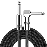
- [Low Noise High Fidelity] New bee guitar cord with 22AWG oxygen-free-copper center conductors provides enhanced signal transfer, the PVC insulation material and the high-density stranded copper double shield provide noise rejection for quiet operation
- [Ideal for Choice] New bee 1/4 straight and right angle metal connectors, ensures a secure connection in any instrument, pedal, or amp jack. L shape great fro on stage guitar stands
- [Wide Compatible] Suitable for mixer, power amplifier, microphone, effector, decoder, equalizer, electoronic organ, electric guitar, electric bass and other electronic equipments. Widely used in the installation of smart home, karaoke speaker, professional stage audio, etc
- [Easy Disassemble] Making incidental repairs quick and easy! Very nice, flexible cable
- [Dont Hesite to Order] 24 hours customer services and professional technology team are standing by
Do not remove the AnimatePresence boundary
This fails because the observer disappears with its child:
{show && (
  <AnimatePresence>
    <motion.div exit={{ opacity: 0 }} />
  </AnimatePresence>
)}
When show becomes false, React removes the entire boundary in one render. Motion never gets a mounted observer that can keep the child alive. Keep the boundary unconditional and condition only its direct child, as in the working example.
Use stable keys and one direct child per identity
A stable key tells Motion which visual entity is leaving. Reusing a key for unrelated dialogs can make Motion treat a replacement as the same node, while changing a key on every render can force unnecessary exits and re-entries. If a dialog contains several animated layers, make the presence boundary observe the wrapper that owns the full leave sequence, or place separate boundaries around layers whose completion must be independent.
React ViewTransition: a built-in option with version constraints
Current React documentation describes enter and exit animations for ViewTransitions that are added or removed during a transition. The reference example updates state inside startTransition; the ViewTransition boundary then participates in the framework-managed transition. Review the API and constraints in the React ViewTransition reference before adopting it.
import { startTransition, ViewTransition, useState } from "react";

function Panel() {
  const [open, setOpen] = useState(false);

  function toggle() {
    startTransition(() => {
      setOpen(value => !value);
    });
  }

  return (
    <>
      <button onClick={toggle}>Toggle dialog</button>
      {open ? (
        <ViewTransition>
          <div role="dialog" aria-modal="true">Content</div>
        </ViewTransition>
      ) : null}
    </>
  );
}
This is not a universal replacement for established dialog primitives. Verify the exact React release, supported browser behavior, and the project’s transition setup. If the application is not already using the documented ViewTransition APIs, Radix presence or a dedicated animation library may be the lower-risk choice.
Why a portal does not keep a dialog mounted
A portal changes where React places DOM nodes, not who owns them. React’s createPortal documentation explains that a portal still behaves as a child of the component that renders it for React events and lifecycle purposes. If that component stops rendering the portal, the portalled dialog unmounts.
For example, this still removes the content too early:
Rank #4

- Digital Family Calendar: BSIMB digital calendar wall touch screen puts an end to your chaotic life. Designed for busy families, the digital calendar keeps you organised and in step with your family. Assign different colours and tasks to each family member to make family scheduling easier and more intuitive.
- Easy Setup and Auto-Sync: Plug in, connect to WLAN and auto-syn your electric calendar in minutes. Digital wall calendar compatible with Google calendar, iCloud calendar, Outlook calendar, Cozi calendar and Yahoo calendar. Add events directly on the device or through the ecalendar app. Electronic calendar stays current whether you're at work or traveling—no manual updates needed.
- All-In-One Home Assistant: Smart calendar builds habits and encourage independence with personalised chores. Display daily meal plan to reduce the daily ‘What's for dinner?’ stress. To-do lists keep track of everything you want. Turning chores into valuable achievements with stars and rewards, making life easier and more enjoyable.
- Manage Anytime Anywhere: BSIMB electronic calendar for family stay connected with the powerful ecalendar app. Access and manage your digital wall calendar anytime, anywhere with free features like stars & rewards, photo screensaver, chore charts, meals plans, to-do lists etc. Electronic planner paid features like Magic Import tailor advanced tools for users with special needs.
- Stay in Touch with Loved Ones: Share photos or videos from your phone to electronic wall calendar with app, instantly update your life moment, and keep in touch with your family, especially those who are far away; you can also surprise your smart calendar digital wall by sending him a wish card; it's also great for keeping tech-illiterate elders in touch with the youngsters.
{open && createPortal(
  <DialogContent />,
  document.body
)}
Use a portal for stacking, clipping and DOM placement, but put presence control inside the portal boundary or around the conditionally removed child. The animation owner must remain mounted long enough to observe the exit.
Independent reader supportYour contribution helps us test, update, and keep practical guides available for everyone.Implementing a reliable close sequence
- Separate intent from presence. Let the close button, Escape key or outside pointer event request
open = false. Keep a separate presence item, transition state or animation boundary that remains active during leave. - Start the exit animation. Map the closed state to a Radix CSS keyframe, a Motion
exitobject, or the equivalent API in your JavaScript library. - Disable interaction while leaving. Prevent clicks on controls that are disappearing, and ensure focus is not trapped in a panel that is no longer logically open.
- Wait for completion. Use the primitive’s CSS-animation detection, the animation library’s completion callback, or the documented ViewTransition lifecycle. Do not use a guessed timeout when the library supplies a completion signal.
- Unmount once. Remove the presence item after completion and let the dialog primitive restore focus or run its cleanup.
- Handle reversal. If the user reopens during the leave phase, cancel or reverse the exit rather than allowing a stale completion callback to remove the newly opened dialog.
The reversal case is where many hand-written timeout solutions fail. A close timeout scheduled at 300 ms can fire after a reopen at 150 ms and incorrectly remove the visible dialog. Presence libraries track identity and cancellation; if you manage the lifecycle yourself, cancel the pending timer or animation and guard completion with the current dialog instance.
Do these 3 things before closing this tab:
1Scan for outdated or missing drivers - takes under a minute2Repair Windows errors before they cause bigger problems3Fix the driver behind crashes, sound loss and screen glitchesDebugging checklist when the exit still snaps away
Check whether React removes an ancestor
Use React DevTools or a DOM breakpoint and watch the first node that disappears. If the entire dialog, portal, or animation boundary is removed when open flips, move the conditional inward so the presence owner survives.
Inspect state attributes and computed animation styles
For Radix, confirm that the closing element receives data-state="closed" and that the selector matches the actual class or element. In DevTools, verify a non-empty animation name and duration. A typo in @keyframes, a selector with the wrong component class, or a reduced-motion rule that disables animation can make the close appear instantaneous.
Look for conflicting CSS
display: none,visibility: hiddenorcontent-visibilityapplied at close time can hide the animation.- An
!importanttransform or opacity rule can override keyframe values. - A parent with
overflow,transformor a stacking context can make a moving panel appear clipped even though it remains mounted. - A global
prefers-reduced-motionrule may intentionally reduce the duration to zero; test both normal and reduced-motion modes.
Confirm the boundary placement in Motion
Ensure AnimatePresence is not inside the same conditional that removes its child, and confirm that the exiting element is a direct child with a stable key. Wrapping the child in an always-present element can change which node Motion observes; place the boundary around the node whose removal should trigger the exit.
Check for stale completion callbacks
In JavaScript-managed animation, log open, presence and completion identities. A completion callback from an earlier close must not set the current dialog’s presence to false after a reopen. Libraries that provide cancellation or an “is present” signal are safer than independent setTimeout calls.
The Tool Desk
Outbyte PC Repair FREERepair Windows errors before they cause bigger problemsFix Now →Outbyte Driver Updater FREEScan for outdated or missing drivers - takes under a minuteDriver Scan →Focus, keyboard and reduced-motion requirements
A smooth exit must not compromise modal behavior. Keep a labelled dialog with a valid title, maintain focus containment while the dialog is logically open, and return focus to the trigger after the leave phase has ended. If the close action begins while focus is inside the content, do not move focus to a node that is already fading away; allow the dialog primitive’s restoration behavior or move focus deliberately to a stable target.
Respect prefers-reduced-motion. A reduced-motion stylesheet can shorten or remove visual movement, but it still needs a consistent presence decision. If the animation duration becomes zero, the animation library should complete immediately and unmount; do not leave an invisible dialog in the DOM indefinitely. Also ensure that a visually transparent overlay does not continue intercepting pointer events after its intended interaction window.
When React Activity is relevant
React’s Activity reference describes preserving hidden component state, which is different from delaying unmount for an exit animation. Activity can matter when a dialog’s ephemeral state should survive being hidden and restored later, but the reference does not establish it as the default modal presence solution. Use the animation or dialog primitive’s leave lifecycle for exit timing, and consider Activity separately when state preservation is the actual requirement.
Testing the mounted-through-exit contract
Test the lifecycle rather than only taking a screenshot after the dialog closes.
- Open the dialog and assert that its role, accessible name and focus target are correct.
- Trigger close and immediately assert that the dialog node still exists while its closed or exit state is active.
- Advance the animation clock or resolve the library’s completion callback, then assert that the node is removed.
- Reopen before completion and verify that the stale close completion cannot remove the reopened dialog.
- Test Escape, outside click, close button, route changes and unmounting of the parent component.
- Run a reduced-motion case and confirm that removal is immediate but still orderly.
For CSS-keyframe tests, a browser-level test is useful because a shallow renderer cannot prove that the browser recognized the animation. For JavaScript libraries, use the library’s test utilities or a deterministic clock so completion is explicit instead of waiting for real time.
A practical decision guide
Use Radix CSS keyframes when
You already use Radix Dialog, need straightforward fade or transform effects, and can express the enter and leave phases as named CSS animations keyed by data-state. This keeps the dependency surface small and lets Radix handle presence.
Use Radix with forceMount when
Your animation is spring-based, physics-driven or otherwise controlled by JavaScript, and the library needs to decide exactly when Overlay and Content leave the tree. Render from the library’s presence state, not directly from the open boolean.
Use Motion when
Your project already uses Motion and you want declarative initial, animate and exit definitions. Keep AnimatePresence mounted at the observation boundary and give each dialog identity a stable key.
Recommended Free Tools
Consider ViewTransition when
Your application meets the current React API and browser requirements and you want framework-managed transitions for components added or removed in a transition. Validate support and interaction with your dialog primitive before migrating a production modal.
The invariant is the same in every option: the element that must animate out cannot be removed until its exit lifecycle has completed.
Quick Recap
Product prices and availability are accurate as of the date/time indicated and are subject to change. Any price and availability information displayed on Amazon at the time of purchase will apply.

