The most reliable way to make a WordPress table work on phones is to keep a real, semantic table and let users scroll it horizontally when the columns cannot fit. Add the core Table block, enable its header section, write a caption, assign a class such as responsive-table in Advanced settings, and apply a narrow-width overflow rule. Use a stacked layout only when every row still makes sense without the full column grid.
Antihost offers managed WordPress hosting with free migration, one-click staging and a 14-day free trial.
What makes a WordPress table responsive?
A responsive table adapts to the available viewport without destroying the relationship between headers and values. On a wide desktop screen, several columns can remain visible in one grid. On a phone, forcing those same columns into the viewport usually creates unreadably small text, clipped values, or a page that widens beyond the screen. A useful mobile treatment therefore depends on the data rather than on one universal CSS trick.

As an Amazon Associate I earn from qualifying purchases.
For comparison data, horizontal scrolling is usually the safest first choice. It preserves the original rows and columns, so a reader can move left and right while keeping each value aligned with its header. If each row is an independent record, a stacked or two-column transformation can be easier to scan. If the data set is long, sorting or a sticky header may matter more than merely fitting the table on a screen.
Build the table with WordPress’s core Table block
The core block gives you a semantic starting point without requiring a table plugin. WordPress documents it as a data-table tool, and the developer reference shows table markup using table, thead, tbody, th, and td. That structure lets browsers and assistive technology understand the grid as data instead of as decorative text.
Step 1: Insert the block
- Open the post or page in the WordPress editor.
- Select the plus button to add a block, search for Table, and insert it.
- Choose the number of columns and rows needed for the initial structure. You can add or remove rows and columns later.
- Enter one discrete value per cell. Do not align columns with spaces, repeated hyphens, or other divider characters.
Step 2: Define headers and a caption
- Select the table block and enable its header section in the block settings.
- Put the label for each column in a header cell. If the first column identifies each row, use row labels that are meaningful on their own.
- Add a caption describing what the table contains, the unit of measurement, or the comparison being made. If a caption is not practical, place a correctly nested heading immediately above the table.
- Check that a reader can understand the table’s purpose without relying on surrounding paragraphs.
Headers are not optional decoration. They provide the context a screen-reader user needs when moving from one cell to another, and they make a horizontally scrolling table usable because the relationship between a value and its column remains explicit.
#1 Best Overall

- [Ultra-Lightweight Ear Buds Designed for Small Ears] Each earbud weighs only 3.7g and features a compact, ergonomic in-ear design made especially for small ears. Secure, low-profile, and comfortable for workouts, all-day wear or overnight sleeping.The ultra-slim profile sits flush in your ear with no hard edges poking or rubbing, so you can even sleep on your side without discomfort.
- [Immersive Stereo Sound with TOZO OrigX Technology] TOZO OrigX tuning delivers clear vocals, balanced mids, and natural stereo sound for music, podcasts, and videos.
- [Long Battery Life for Daily Use] Get up to 7 hours of playtime on a single charge, with up to 32 hours total using the charging case—ideal for workdays, commuting, and extended listening sessions.
- [Bluetooth 5.3 & Stable Connection] Bluetooth 5.3 provides fast pairing, stable wireless performance, and reduced dropouts as you move around home or office.
- [Deep Bass with Clear Vocals] High-performance drivers produce punchy bass while keeping vocals clean and detailed for everyday listening.
Step 3: Add a class for responsive styling
- With the Table block selected, open the Advanced panel.
- Enter
responsive-tablein the Additional CSS class(es) field. - Save or update the post, then add the CSS shown below in the site’s additional CSS area or in the stylesheet used by your theme.
Using a class on only the tables that need special treatment prevents a global rule from unexpectedly changing small tables, pricing grids, or tables that already have a theme-specific design.
The Tool Desk
Outbyte PC Repair FREEClear out junk files and repair common Windows errorsFree Scan →Outbyte Driver Updater FREEScan for outdated or missing drivers - takes under a minuteDriver Scan →Enable horizontal scrolling for wide tables
A scrolling wrapper allows the table to keep a useful minimum width while the surrounding page remains within the viewport. The following pattern is implementation guidance, not a WordPress requirement; adjust the minimum width and breakpoint to the content.
.responsive-table {
  max-width: 100%;
  overflow-x: auto;
  -webkit-overflow-scrolling: touch;
}

.responsive-table table {
  min-width: 40rem;
  width: 100%;
}

@media (max-width: 48rem) {
  .responsive-table {
    overflow-x: auto;
  }
}
max-width: 100% keeps the block from expanding the page. overflow-x: auto creates a horizontal scroll mechanism only when the table is wider than its container. The 40rem minimum gives cells enough room for normal text in many designs, but it is not a published WordPress default. A table with short labels may need less; a technical table with long values may need more.
The 48rem media-query threshold is likewise a tuning value. Test the actual layout at the widths your visitors use rather than assuming that one breakpoint fits every theme. The scrolling rule can remain active at all widths, or you can reserve it for narrow screens as shown.
Rank #2

- 【IP68 Waterproof Multifunctinal Smart Watch】Torjalph fitness activity tracker smart watch is IP68 waterproof technology ,you can wear it when swimming,handwashing,it's rain-proof which means that you perform multiple exercise modes outside without worrying about sweat or rain corroding your fitness smart watch,and this watch equipped with a 230 mAh large capacity battery magnetic charging ,and this sports activity tracker watch can be used 5-7 days If fully charged.
- 【Larger 1.83'' Full Screen Watch & Multi-dial Selection】1.83 inch full HD color touch screen smart watch for men / women provides excellent 240*284 resolution image quality ,This Bluetooth smart watch offers a better touch experience and remarkable immersion and ,more than 200 watch faces for you to choose from App"Da Fit ", you can change the dial style according to your mood to wear keeping the world on your wrist
- 【Accurate Activity Tracker Smart Watch 】sports watch activity tracker uses sweat and dust resistant breathable silicone strap, our Fitness Tracker Smart Watch for Android iOS Phones supports 12 sports modes,walking,running,bicycle,swimming,badminton,basketball,football,rope skipping. This bluetooth calls smart watch for men women is lightweight and stylish, bringing more convenient and relaxing sports experience while also providing more protection.
- 【Your 24 Hour Personal Daily Health Monitor】Fitness watch for women men full touch screen IP67 waterproof bluetooth smartwatch for Android iOS Phones with heart rate blood pressure monitor multifunction Andriod smart watch with steps counter sleep monitor sports fitness watch, monitoring blood oxygen saturation allows you to understand your physical condition in real time to track fitness progress ,to know your health status in time.
- 【More Functions Bluetooth Call Smart Watch】This fitness activity smart watch full screen for iPhone and Android phones includes a bunch of new features including:The bluetooth smart watch can hang up the phone, receive and display WhatsAPP /Text /Facebook /Twitter /Messenger reminder.Support sedentary reminder, alarm clock, stopwatch, timer,weather information,music control, remote camera control compatible with Android 5.0 and above or iOS 9.0 and above smartphones.
A WordPress support-style alternative
A commonly demonstrated pattern targets the block itself:
.wp-block-table {
  display: block;
  overflow-x: auto;
  white-space: nowrap;
}
This is convenient when every table on a site should behave the same way, but it is broad. Prefer a custom class when only selected tables are wide. Also note that white-space: nowrap prevents normal line wrapping; it can keep rows compact, but it may make long text harder to read. Apply it only when that trade-off suits the content, and consider scoping the rule to a particular table class.
Keep the scroll area visually clear
Leave enough space around the table for a user to discover that it scrolls. Avoid placing a wide table inside another element that also clips horizontal overflow, because the inner scroll bar can become unreachable. Check the published page, not just the editor canvas: editor styles and front-end styles can differ.
Choose the right mobile pattern
| Situation | Recommended pattern | Why it fits |
|---|---|---|
| A few columns that must be compared side by side | Horizontal scroll wrapper | Preserves the grid and the header relationships. |
| Each row stands alone on a phone | Stacked or two-column transformation | Makes row labels visible without squeezing every column. |
| A long data set | Sticky header or sortable table | Keeps context while readers scan many rows. |
| Spreadsheet imports, search, or exports are required | Dedicated table builder | Adds workflow features that the core block does not provide. |
When horizontal scrolling is the better choice
Use scrolling when the meaning depends on comparing columns in the same row, such as feature matrices, specifications, schedules, or test results. Do not hide columns simply to make the table appear to fit. A reader should be able to reveal every value and identify its header.
Rank #3
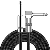
- [Low Noise High Fidelity] New bee guitar cord with 22AWG oxygen-free-copper center conductors provides enhanced signal transfer, the PVC insulation material and the high-density stranded copper double shield provide noise rejection for quiet operation
- [Ideal for Choice] New bee 1/4 straight and right angle metal connectors, ensures a secure connection in any instrument, pedal, or amp jack. L shape great fro on stage guitar stands
- [Wide Compatible] Suitable for mixer, power amplifier, microphone, effector, decoder, equalizer, electoronic organ, electric guitar, electric bass and other electronic equipments. Widely used in the installation of smart home, karaoke speaker, professional stage audio, etc
- [Easy Disassemble] Making incidental repairs quick and easy! Very nice, flexible cable
- [Dont Hesite to Order] 24 hours customer services and professional technology team are standing by
When a stacked layout is appropriate
Stacking works when a row represents one self-contained item. On mobile, the row can become a series of label-and-value pairs, with the label repeated beside each value. This approach is less suitable for a matrix in which a reader must compare several rows under the same column headings. If removing the grid makes the relationships ambiguous, retain horizontal scrolling or split the information into smaller tables.
Recommended Free Tools
When to split a table
A table that requires a long explanation for every cell may be too complex for one grid. Divide it into logically related tables, simplify the data, or present the records as a list. A smaller, understandable table is more useful than a technically responsive table that no one can interpret.
Use plugins only for features the core block lacks
The core block is sufficient for a modest, well-structured table with a caption and horizontal scrolling. Consider a dedicated builder when maintaining the data manually is the bottleneck or when readers need controls such as sorting, search, importing, exporting, comparison views, or sticky headers.
| Need | Possible direction | Qualification |
|---|---|---|
| Two-column mobile presentation | The Make Tables Responsive listing describes a two-column mobile layout. | Treat the behavior as vendor listing information and test the generated result on your site. |
| Responsive behavior, sticky headers, sorting, and style controls | The Auto Responsive Table listing describes these features. | Confirm current WordPress, theme, and PHP compatibility before activation. |
| Imports, search, sorting, exports, or comparison layouts | The WordPress responsive-table directory lists plugins with these capabilities. | Compare the workflow and markup each plugin actually produces rather than choosing by feature names alone. |
Plugin listings can change, and a feature advertised in a directory may depend on a particular version or configuration. Before installing, inspect the plugin’s current compatibility information, update history, accessibility notes, and output markup. Test with a copy of the page or a staging site when the table is business-critical.
Accessibility requirements for responsive tables
Use real table markup
Use a real HTML table, not spaces or other dividers to imitate columns. The cells must remain actual table cells so browsers can expose their relationships. Never use a table for page layout; use the site’s layout blocks or CSS instead.
Quick wins for a faster PC:
Scan for outdated or missing drivers - takes under a minuteDriver Scan →Repair Windows errors before they cause bigger problemsFix Now →Fix the driver behind crashes, sound loss and screen glitchesFind Drivers →Rank #4

- Digital Family Calendar: BSIMB digital calendar wall touch screen puts an end to your chaotic life. Designed for busy families, the digital calendar keeps you organised and in step with your family. Assign different colours and tasks to each family member to make family scheduling easier and more intuitive.
- Easy Setup and Auto-Sync: Plug in, connect to WLAN and auto-syn your electric calendar in minutes. Digital wall calendar compatible with Google calendar, iCloud calendar, Outlook calendar, Cozi calendar and Yahoo calendar. Add events directly on the device or through the ecalendar app. Electronic calendar stays current whether you're at work or traveling—no manual updates needed.
- All-In-One Home Assistant: Smart calendar builds habits and encourage independence with personalised chores. Display daily meal plan to reduce the daily ‘What's for dinner?’ stress. To-do lists keep track of everything you want. Turning chores into valuable achievements with stars and rewards, making life easier and more enjoyable.
- Manage Anytime Anywhere: BSIMB electronic calendar for family stay connected with the powerful ecalendar app. Access and manage your digital wall calendar anytime, anywhere with free features like stars & rewards, photo screensaver, chore charts, meals plans, to-do lists etc. Electronic planner paid features like Magic Import tailor advanced tools for users with special needs.
- Stay in Touch with Loved Ones: Share photos or videos from your phone to electronic wall calendar with app, instantly update your life moment, and keep in touch with your family, especially those who are far away; you can also surprise your smart calendar digital wall by sending him a wish card; it's also great for keeping tech-illiterate elders in touch with the youngsters.
Give every column and row useful context
Column headers should describe the values beneath them. Row headers should identify the record when the first column serves that role. Avoid headings such as Item 1 or Other when a more specific label is available. Keep units in the header or caption so a value such as 12 is not ambiguous.
Provide a caption or an associated heading
A caption states what the data represents and is read as part of the table’s context. When you use a heading instead, make sure it is correctly nested in the page’s heading hierarchy and sits immediately above the table. Do not rely on a visually styled paragraph that has no structural heading or caption semantics.
Do not make the mobile transformation hide meaning
Some responsive scripts visually reorder cells or add labels with CSS. Verify that the reading order still makes sense to a screen reader and that every value has an identifiable label. If a plugin transforms the table into cards, inspect the resulting HTML rather than assuming the visual layout is accessible.
Test with an accessibility checker
Run the rendered page through an accessibility checker such as WAVE after styling the table or enabling a plugin. Automated checks can reveal missing headers, invalid nesting, and contrast problems, but they do not replace a keyboard and screen-reader review. Ask a tester to move through the table, find the caption, reach every value, and understand which header applies to each cell.
Test the finished table on real viewports
- Open the published URL on a desktop-width browser and confirm that the table is aligned, readable, and not wider than its content area.
- Resize the browser below your chosen breakpoint, or use a phone, and verify that horizontal scrolling appears only when needed.
- Swipe the table from its first column to its last. Confirm that no values are clipped and that the page itself does not acquire an unintended horizontal scrollbar.
- Use keyboard navigation to reach the table and any sorting, filtering, or export controls. Check that focus indicators remain visible.
- Zoom the page and test larger text. A table that works only at the default zoom is not robust.
- Check a screen reader or accessibility checker for the caption, headers, row relationships, and reading order.
- Repeat the test after editing cell content. A short sample can pass while a real URL, product name, or paragraph causes overflow.
Troubleshoot common failures
The table still widens the entire page
- Confirm that
responsive-tableis on the Table block that contains the table, not on an unrelated parent or sibling. - Inspect the front-end HTML and verify that the rule setting
overflow-x: autois applied to the visible wrapper. - Look for a theme rule that sets
overflow: hidden, a fixed width, or a large minimum width on an outer container. - Clear any page or CSS cache after changing the stylesheet.
No horizontal scrollbar appears
- Make sure the table is actually wider than its container. If every cell fits, there is nothing to scroll.
- Check that the table has the intended
min-widthand that another rule is not overriding it. - Test on the published page; some browser developer tools emulate a viewport differently from a physical phone.
Text is tiny or impossible to read
Do not solve overflow by shrinking the font until the table fits. Remove unnecessary columns, shorten repeated wording, split the table, or provide horizontal scrolling. Preserve a readable text size and let the viewport determine whether the user must pan.
Headers disappear or no longer line up
- Re-enable the Table block’s header section and confirm that the first row contains header cells rather than ordinary data cells.
- Remove styling that changes table elements to unrelated display types unless the transformation has been tested for semantics.
- If a plugin replaces the markup, inspect its output and compare it with the expected header and body structure.
A stacked layout is confusing
Return to a scrolling grid when users need cross-row comparisons. Stacking is not automatically more responsive: if labels are missing, duplicated incorrectly, or separated from their values in the reading order, it creates a new accessibility problem.
WordPress responsive-style settings and version limits
WordPress documentation says responsive styles can vary block settings by viewport in block themes and that this feature is included in block themes with WordPress 7.1 or higher. Check the WordPress version running your site and the capabilities of its active theme before relying on those controls. Responsive style settings can complement custom CSS, but they do not replace semantic table markup or a plan for wide columns.
A classic theme, an older WordPress installation, or a plugin-generated table may not expose the same responsive controls. In those cases, the class-based CSS approach remains explicit and easy to test. Keep the styling close to the component’s purpose and document which tables use scrolling, stacking, or a plugin transformation.
Quick Recap
Maintain responsive tables as content changes
- Recheck the narrow layout whenever you add a column, change a heading, or paste longer text.
- Keep captions and headers synchronized with the data; a responsive table is still misleading if its labels are stale.
- Prefer concise cell content and move lengthy explanations into notes below the table or linked detail pages.
- Review plugin-generated tables after plugin updates, because markup and CSS selectors can change.
- Retest keyboard, screen-reader, zoom, and touch behavior after a theme change.
The practical decision is simple: start with the core Table block, semantic headers, and a caption; add horizontal overflow for genuinely wide comparisons; choose a stacked treatment only for independent rows; and move to a table builder when sorting, imports, search, exports, or sticky headers justify the added dependency.
Product prices and availability are accurate as of the date/time indicated and are subject to change. Any price and availability information displayed on Amazon at the time of purchase will apply.

