The best iPhone wallpaper is chosen around your screen layout, not picked as an isolated picture. First place the widgets and icons you actually use, then select an image with calm, low-detail areas behind them. Preview the clock, Lock Screen widgets, icon style and widget surfaces together; adjust the crop, blur or appearance until every control remains easy to read.
iOS lets you use one wallpaper pair for both screens or give the Lock Screen and Home Screen different treatments. That flexibility means a detailed photograph can work on the Lock Screen while a blurred, softened or plain version of it keeps Home Screen icons legible.

As an Amazon Associate I earn from qualifying purchases.
Start with the layout, not the photograph
A wallpaper succeeds when the information placed over it remains readable at a glance. Before comparing images, decide what will occupy each screen. On the Home Screen, identify the pages where you keep widgets and the rows where your most-used icons sit. On the Lock Screen, note the clock position and the widget row you intend to use. These fixed areas become your composition guide.
PC Slower Than It Used to Be?
A free scan shows the junk files, broken settings and background clutter dragging Windows down - then fixes them in one click.Free scan · Windows 10 & 11Crashes, No Sound, or Screen Glitches?
Random freezes, missing sound and display glitches usually trace back to one bad driver. Find and replace yours safely.Free scan · under a minuteLook for a candidate image that has visual “quiet” where the interface will sit. Quiet does not necessarily mean a flat color. A softly lit wall, open sky, out-of-focus foliage or an area of even texture can provide enough separation without making the image boring. Fine text, faces, high-contrast edges and bright highlights are poor choices directly behind small icons or widget labels.
#1 Best Overall

- [Ultra-Lightweight Ear Buds Designed for Small Ears] Each earbud weighs only 3.7g and features a compact, ergonomic in-ear design made especially for small ears. Secure, low-profile, and comfortable for workouts, all-day wear or overnight sleeping.The ultra-slim profile sits flush in your ear with no hard edges poking or rubbing, so you can even sleep on your side without discomfort.
- [Immersive Stereo Sound with TOZO OrigX Technology] TOZO OrigX tuning delivers clear vocals, balanced mids, and natural stereo sound for music, podcasts, and videos.
- [Long Battery Life for Daily Use] Get up to 7 hours of playtime on a single charge, with up to 32 hours total using the charging case—ideal for workdays, commuting, and extended listening sessions.
- [Bluetooth 5.3 & Stable Connection] Bluetooth 5.3 provides fast pairing, stable wireless performance, and reduced dropouts as you move around home or office.
- [Deep Bass with Clear Vocals] High-performance drivers produce punchy bass while keeping vocals clean and detailed for everyday listening.
Make a quick layout map
- List the Lock Screen widgets you want and the approximate space they occupy.
- Mark the clock area and any part of the photo that must remain visible above or below it.
- On the Home Screen, identify the pages with widgets and the icon rows you use most.
- Reserve uncluttered regions for those interface elements before judging the image’s subject.
This approach prevents a common mistake: choosing a beautiful image whose most detailed feature lands exactly beneath the clock or a widget stack.
Choose the Home Screen treatment for icon and widget contrast
Home Screen readability depends on both the image and the appearance you apply to icons and widgets. iOS 26 supports light, dark, clear and tinted icon and widget appearances. A wallpaper can also inform the tint, so a color drawn from the image may harmonize with the screen while preserving a visible boundary around controls.
Light and dark appearances
Use a light appearance when the background is mostly dark and a dark appearance when the background is mostly light, provided the image has enough even tone behind the icons. A mixed photograph can defeat either choice: a dark icon may disappear into a shadow while a light icon disappears into a bright patch. If the image changes dramatically from one side of the screen to the other, consider a crop with a more consistent tone or use blur.
Do these 3 things before closing this tab:
1Repair Windows errors before they cause bigger problems2Scan for outdated or missing drivers - takes under a minute3Clear out junk files and repair common Windows errorsClear and tinted appearances
Clear treatments expose more of the wallpaper, which makes the underlying composition especially important. They work best when the reserved icon area has broad, simple shapes rather than busy detail. Tinted treatments can create a more unified color field; sample a tint that is distinct from the dominant background instead of matching it exactly. The goal is separation, not perfect color coordination.
Use Home Screen blur deliberately
Apple provides a blur option for the Home Screen. Blur reduces fine detail while retaining the photograph’s overall color and brightness, allowing app icons to stand out. It is useful when you like the image but cannot find a crop with sufficient negative space. Blur is not a cure for every problem: a very bright or very dark image can still reduce contrast after blurring, so check the actual icon labels and widget text.
Rank #2

- 【IP68 Waterproof Multifunctinal Smart Watch】Torjalph fitness activity tracker smart watch is IP68 waterproof technology ,you can wear it when swimming,handwashing,it's rain-proof which means that you perform multiple exercise modes outside without worrying about sweat or rain corroding your fitness smart watch,and this watch equipped with a 230 mAh large capacity battery magnetic charging ,and this sports activity tracker watch can be used 5-7 days If fully charged.
- 【Larger 1.83'' Full Screen Watch & Multi-dial Selection】1.83 inch full HD color touch screen smart watch for men / women provides excellent 240*284 resolution image quality ,This Bluetooth smart watch offers a better touch experience and remarkable immersion and ,more than 200 watch faces for you to choose from App"Da Fit ", you can change the dial style according to your mood to wear keeping the world on your wrist
- 【Accurate Activity Tracker Smart Watch 】sports watch activity tracker uses sweat and dust resistant breathable silicone strap, our Fitness Tracker Smart Watch for Android iOS Phones supports 12 sports modes,walking,running,bicycle,swimming,badminton,basketball,football,rope skipping. This bluetooth calls smart watch for men women is lightweight and stylish, bringing more convenient and relaxing sports experience while also providing more protection.
- 【Your 24 Hour Personal Daily Health Monitor】Fitness watch for women men full touch screen IP67 waterproof bluetooth smartwatch for Android iOS Phones with heart rate blood pressure monitor multifunction Andriod smart watch with steps counter sleep monitor sports fitness watch, monitoring blood oxygen saturation allows you to understand your physical condition in real time to track fitness progress ,to know your health status in time.
- 【More Functions Bluetooth Call Smart Watch】This fitness activity smart watch full screen for iPhone and Android phones includes a bunch of new features including:The bluetooth smart watch can hang up the phone, receive and display WhatsAPP /Text /Facebook /Twitter /Messenger reminder.Support sedentary reminder, alarm clock, stopwatch, timer,weather information,music control, remote camera control compatible with Android 5.0 and above or iOS 9.0 and above smartphones.
Compose the Lock Screen around the clock and widgets
The Lock Screen has a different visual hierarchy. The clock is usually the largest element, and widgets sit in a defined area below it. Preview the complete combination rather than evaluating the photo by itself. Apple’s wallpaper controls let you reposition the photo, change the clock appearance, add widgets and use eligible depth effects. The available choices depend on the wallpaper.
Protect the clock area
Keep faces, signs, strong horizon lines and bright highlights away from the clock. If a subject is important, move the image so the subject sits beside the clock instead of beneath it. A portrait can work when the head is placed clear of the time, but the crop must leave enough room for the clock at different times of day, including two-digit hours.
Protect the widget row
Small widget labels and symbols need a relatively even background. A detailed pavement pattern, tree branches or a high-contrast skyline can make them difficult to scan. Reposition the photo first; if that does not help, choose a different crop or a different image. Changing the clock style may improve separation, but it cannot compensate for detail directly behind every widget.
Check depth effects before committing
Some wallpapers offer an eligible depth effect that lets the subject interact with the clock. Treat this as an optional composition tool, not a guarantee. The effect may be unavailable for a particular image, and enabling it can change which parts of the photo remain visible. Preview the ordinary version as well; the flatter crop may be clearer in everyday use.
Decide whether both screens should share an image
iPhone supports a wallpaper pair, so one image can carry from the Lock Screen to the Home Screen. A shared pair is convenient and visually consistent when the photograph has both a clear clock area and a calm icon area.
Rank #3
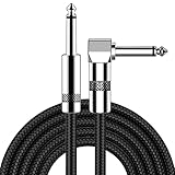
- [Low Noise High Fidelity] New bee guitar cord with 22AWG oxygen-free-copper center conductors provides enhanced signal transfer, the PVC insulation material and the high-density stranded copper double shield provide noise rejection for quiet operation
- [Ideal for Choice] New bee 1/4 straight and right angle metal connectors, ensures a secure connection in any instrument, pedal, or amp jack. L shape great fro on stage guitar stands
- [Wide Compatible] Suitable for mixer, power amplifier, microphone, effector, decoder, equalizer, electoronic organ, electric guitar, electric bass and other electronic equipments. Widely used in the installation of smart home, karaoke speaker, professional stage audio, etc
- [Easy Disassemble] Making incidental repairs quick and easy! Very nice, flexible cable
- [Dont Hesite to Order] 24 hours customer services and professional technology team are standing by
Separate treatments are often more legible. You can keep a detailed, expressive photograph on the Lock Screen and customize the Home Screen with a chosen color, another photo or the same photo with blur. This is particularly useful when the image has a strong subject that looks good behind the clock but creates too much competition behind icons.
| Choice | When it works best | What to check |
|---|---|---|
| Shared wallpaper pair | The image has quiet regions for both the clock/widgets and Home Screen icons. | Verify contrast on both screens; a crop that works on one may not work on the other. |
| Detailed Lock Screen plus softened Home Screen | You want the photograph’s subject visible while keeping icons easy to find. | Use Home Screen blur or a calmer crop and check widget text after applying it. |
| Different images | The Lock Screen and Home Screen need opposing brightness, color or composition. | Make sure the transition between screens still feels intentional and that each image has its own quiet areas. |
Plan widgets before finalizing the crop
Widget availability and size are controlled by each app. Some apps provide only small and medium widgets, while others offer larger choices. Because a larger widget covers more of the image, changing widget size can invalidate a crop that looked balanced with a smaller one.
Build the real widget arrangement first
- Select the apps and widget types you actually expect to use.
- Choose the largest practical size for each one; do not design around a placeholder size.
- Place the widgets on the Lock Screen and Home Screen pages where they will remain.
- Only then move and evaluate the wallpaper.
If you later replace a small widget with a medium or large one, repeat the visual check. The wallpaper has not changed, but the area demanding low detail has.
Use spatial wallpaper only when the image and iPhone qualify
Apple says some photos can become 3D spatial wallpapers on iPhone 12 or later with iOS 26. Eligibility is image-specific. Photos with good lighting and clear separation between subject and background are typical candidates, as are landscape-oriented images. An eligible photo may still offer different options depending on how it is cropped.
The spatial effect applies to the Lock Screen when you set a wallpaper pair or when you customize the Home Screen separately. Decide whether the movement adds value before designing around it. A layered subject can look engaging, but the effect may alter the visual balance around the clock. If the depth treatment makes the clock or widgets harder to read, use the standard still version.
Free tools Windows power users keep installed
One-click scans. No signup required.
Rank #4

- Digital Family Calendar: BSIMB digital calendar wall touch screen puts an end to your chaotic life. Designed for busy families, the digital calendar keeps you organised and in step with your family. Assign different colours and tasks to each family member to make family scheduling easier and more intuitive.
- Easy Setup and Auto-Sync: Plug in, connect to WLAN and auto-syn your electric calendar in minutes. Digital wall calendar compatible with Google calendar, iCloud calendar, Outlook calendar, Cozi calendar and Yahoo calendar. Add events directly on the device or through the ecalendar app. Electronic calendar stays current whether you're at work or traveling—no manual updates needed.
- All-In-One Home Assistant: Smart calendar builds habits and encourage independence with personalised chores. Display daily meal plan to reduce the daily ‘What's for dinner?’ stress. To-do lists keep track of everything you want. Turning chores into valuable achievements with stars and rewards, making life easier and more enjoyable.
- Manage Anytime Anywhere: BSIMB electronic calendar for family stay connected with the powerful ecalendar app. Access and manage your digital wall calendar anytime, anywhere with free features like stars & rewards, photo screensaver, chore charts, meals plans, to-do lists etc. Electronic planner paid features like Magic Import tailor advanced tools for users with special needs.
- Stay in Touch with Loved Ones: Share photos or videos from your phone to electronic wall calendar with app, instantly update your life moment, and keep in touch with your family, especially those who are far away; you can also surprise your smart calendar digital wall by sending him a wish card; it's also great for keeping tech-illiterate elders in touch with the youngsters.
A practical selection workflow
Use this sequence whenever you are choosing a new image, whether it comes from your own photos or your existing wallpaper library.
- Inventory the interface. Write down the Lock Screen clock style, widget row and Home Screen widgets you intend to keep.
- Sort images by composition. Prefer images with open areas in the planned interface zones. Reject photographs whose main subject fills the clock or icon area.
- Check brightness distribution. Look for a reasonably consistent tone behind each group of controls. Extreme light-to-dark transitions often create uneven readability.
- Test the Lock Screen crop. Reposition the photo until the clock and widgets have clean separation. Change the clock appearance if needed.
- Test icon appearance. Try light, dark, clear and tinted options. Keep the one that makes labels and symbols distinct without overwhelming the image.
- Try blur if the Home Screen remains busy. Apply the Home Screen blur option and inspect the smallest icon labels and widget text.
- Compare pair versus separate treatments. If one image cannot satisfy both screens, keep the Lock Screen image and customize the Home Screen independently.
- Test the actual widget sizes. Confirm that every widget remains readable at the size you selected, including stacked or information-dense widgets.
- Evaluate optional depth. On an iPhone 12 or later running iOS 26, check whether the photo is eligible for spatial treatment and whether the result improves rather than distracts.
- Live with the result briefly. Check the screen in bright daylight, indoors and at night. A wallpaper that works in a dim editing view may lose contrast in sunlight.
Compare candidates with the same criteria
When several photos seem promising, score them against the same questions instead of relying on first impressions.
| Criterion | Strong candidate | Warning sign |
|---|---|---|
| Negative space | Open or gently textured regions align with widgets and icon rows. | Faces, text, branches or fine patterns sit beneath controls. |
| Contrast | The intended light, dark, clear or tinted treatment separates controls from the image. | Icon labels disappear in either bright or dark portions of the crop. |
| Lock Screen subject placement | The subject sits beside the clock and leaves the widget row readable. | The focal point overlaps the clock or forces an awkward crop. |
| Home Screen flexibility | The image remains usable with the original crop, a calmer crop or blur. | Only one precise crop works, leaving no room for widgets or icon changes. |
| Spatial eligibility | On a supported phone, the photo has clear subject/background separation or a landscape composition. | The image is flat, poorly lit or offers no useful depth; the effect is unavailable. |
Fix common readability problems
Icons blend into the photo
Switch between light and dark appearances first, then test a tint that contrasts with the background. If the image still overwhelms the labels, use Home Screen blur, choose a calmer crop or apply a solid color Home Screen. Do not keep reducing contrast simply to preserve a particular photograph; the icons are the functional layer.
A widget is hard to read
Move the image so the widget sits over an even area. If the widget is large, treat the entire rectangle behind it as protected negative space. A smaller widget may solve the problem, but only if it still provides the information you need; widget size options vary by app.
Recommended Free Tools
The clock competes with a face or landmark
Reposition the photo and try another clock appearance. If the subject cannot be moved without losing the composition, select a different image or use that photo on the Home Screen instead. A depth effect should not be enabled merely to force a subject away from the time.
The same image works on one screen but not the other
Keep the image where it reads best and customize the other screen separately. Apple’s separate Home Screen controls let you use a color, another photo or blur, so there is no requirement that both screens share one treatment.
The spatial option is missing
Confirm that the iPhone is 12 or later and running iOS 26. Then try a well-lit photo with a clearly separated subject or a landscape orientation. Even on a supported device, not every photo is eligible, so an unavailable option does not indicate a fault with the phone.
Account for accessibility and daily conditions
Wallpaper choices affect more than aesthetics. Strong contrast helps people who have reduced vision, and a less animated or less visually complex background can reduce distraction. Keep essential labels readable at the smallest text size you use. If you rely on a particular widget for quick information, give it a consistently calm background instead of accepting occasional camouflage.
The Tool Desk
Outbyte PC Repair FREERepair Windows errors before they cause bigger problemsFix Now →Outbyte Driver Updater FREEScan for outdated or missing drivers - takes under a minuteDriver Scan →Review the wallpaper with the phone’s normal brightness and appearance settings, not only while editing. Outdoor glare can flatten contrast, while a dark room can make a bright image feel intrusive. If the result is marginal in either situation, choose the more conservative crop or a separate Home Screen treatment.
When to change the wallpaper instead of adjusting it
Adjustment is worthwhile when the image has a clear subject and at least one quiet region. Replace it when every plausible crop places important detail beneath the clock, widget row or icon labels; when light and dark areas alternate too sharply for any icon appearance; or when blur removes the image’s character without restoring readability. No setting can create negative space that is absent from the original composition.
The most dependable choice is therefore not a particular genre of photograph. It is an image whose composition leaves room for the interface you actually use, paired with the icon, widget, crop and blur controls that maintain separation on each screen.
Quick Recap
Product prices and availability are accurate as of the date/time indicated and are subject to change. Any price and availability information displayed on Amazon at the time of purchase will apply.

