A seamless carousel turns several separate social posts into one visual composition: a photograph, background, illustration or other design element appears to continue across neighboring slides as the reader swipes. The effect earns the next swipe, but the carousel succeeds only when that continuity supports a clear beginning, development and ending.
This guide shows how to plan the story, calculate and align slices, keep text readable, review crops, and export a sequence without losing the intended connection between frames.



As an Amazon Associate I earn from qualifying purchases.
What a seamless carousel is—and what it is not
A seamless, panoramic or continuous carousel is one wide visual idea delivered as multiple separate frames. A horizon can run from slide one into slide two, a person can move across a background, or a large title can be split so that each swipe reveals the next part. Piccie’s September 11, 2026 guide and xcarousel’s June 27, 2026 explanation describe the format as a continuous composition divided into equal slices.
Quick wins for a faster PC:
Fix the driver behind crashes, sound loss and screen glitchesFind Drivers →Clear out junk files and repair common Windows errorsFree Scan →Continuity is a visual device, not the story itself. A technically aligned panorama can still feel pointless if every frame says the same thing or if the final slide has no destination. Plan the message first, then use the seam to create anticipation, reveal information or carry the viewer toward an action.
#1 Best Overall
- Separate frames: Each page is uploaded as its own image or video frame.
- One visual system: Type, color, spacing, imagery and repeated motifs make the pages feel related.
- Intentional boundaries: Elements crossing a seam are positioned so the continuation looks deliberate rather than accidentally cropped.
- Independent readability: A viewer should understand the key idea on a slide even when viewing it alone in a feed or grid.
Plan the story before opening a design tool
The strongest sequences have a narrative arc. Canva Design School expresses it this way: “A clear opening sets expectations, the middle slides build the story, and the final slide lands the point.” Canva’s carousel guide also recommends one clear idea per slide and removing any page that does not advance the story.
1. Open with a promise
Use the first frame to identify the subject and establish what the swipe will deliver. A direct problem, a surprising image, a before-and-after setup or a concise promise all work. Keep the opening specific enough that a reader knows why the next frame matters. Do not hide the subject in a decorative title that requires several swipes to decode.
2. Develop the idea in a deliberate order
Middle slides can explain a process, reveal parts of an image, compare stages or build an argument. Assign each page one job: define a term, show a step, provide evidence, answer an objection or demonstrate a result. Write those jobs as a short outline before designing. If two pages perform the same job, combine them or remove one.
3. Land the point
The last frame should deliver the conclusion, takeaway or next step promised at the beginning. It may be a short summary, a practical instruction, a question for discussion or a clear call to action. Leave enough visual breathing room for the ending to register; do not let the panorama’s most dramatic crop carry the entire conclusion.
Example seven-frame arc
- Frame 1: “Why your product screenshots feel disconnected” with a single striking image.
- Frame 2: Show the full interface panorama and identify the navigation problem.
- Frame 3: Explain the first design principle, with the visual continuing across the seam.
- Frame 4: Demonstrate the principle on a realistic screen.
- Frame 5: Show a second principle and a contrasting example.
- Frame 6: Present a compact checklist that viewers can apply.
- Frame 7: State the takeaway and invite the reader to use the checklist on the next design.
The example uses the seam to move the eye from screen to screen, while each frame still has a distinct informational role.
Build one visual system across every frame
Consistency makes a sequence feel authored rather than assembled. Canva’s Instagram design guidance emphasizes clear, simple text, contrast, visual hierarchy, mood-appropriate color and typography that suits the message.
Typography
- Choose a display style for headlines and a highly legible style for supporting copy.
- Keep the same type sizes, weights and line spacing for equivalent roles throughout the run.
- Use short lines and generous leading. A sentence that is readable on a desktop canvas may become a blur on a phone.
- Do not split a word, number or essential phrase across a seam. If a title must cross the boundary, position the cut between words and check it at the final crop.
Color and contrast
Use a controlled palette so that a background change does not make the sequence feel like a new design. Check text against every part of the image it overlays; a color that contrasts with one section of a photograph may disappear when the image continues onto the next page. A translucent panel, solid text block or subtle shadow can protect legibility without hiding the panorama.
What’s actually slowing this PC down?
Pick the symptom - the matching free tool is one click away.
Layout and hierarchy
Give the primary idea the strongest scale or contrast, secondary information a predictable position, and decorative material the least visual weight. Repeat a small anchor—such as a page number, colored rule or icon—only when it helps readers orient themselves. Repetition that does not improve navigation consumes space and competes with the story.
Imagery and focal points
Pick a source image or illustration with enough width and visual breathing room for every planned slice. Keep faces, product details and other focal points away from a boundary unless the split is intentional. When a subject crosses a seam, inspect both neighboring crops: the eye should be able to reconstruct the subject without an awkward jump.
Choose a frame size with the platform caveat in mind
Canvas and social platforms can change their display behavior, cropping and recommendations. Canva Design School currently lists the following examples in its guide; these are Canva-published starting points, not verified official requirements for the platforms.
| Destination example | Canva guide example | How to use the figure |
|---|---|---|
| Instagram vertical feed | 1080 × 1350 px | Use as a starting frame size, then confirm the current in-app preview before publishing. |
| Facebook vertical feed | 1080 × 1359 px | Use when designing a Facebook-oriented vertical sequence and check the platform preview. |
| LinkedIn landscape feed | 1200 × 627 px | Use as a landscape reference for LinkedIn, subject to current platform behavior. |
The frame dimensions determine the slice width, not the number of slides. If every frame is 1080 pixels wide and you plan five frames, a continuous canvas would be 5400 pixels wide before any additional bleed or working margin. The important production rule is that every slice must have exactly the same width and height; unequal slices make a line or object jump at the boundary.
Crashes, No Sound, or Screen Glitches?
Random freezes, missing sound and display glitches usually trace back to one bad driver. Find and replace yours safely.Free scan · under a minutePC Slower Than It Used to Be?
A free scan shows the junk files, broken settings and background clutter dragging Windows down - then fixes them in one click.Free scan · Windows 10 & 11Do not treat a dimension table as a permanent “safe area.” The reviewed guidance does not establish a universal safe-area measurement for organic carousel posts. Keep critical copy comfortably inside each frame, preview it on a phone and verify the current app’s crop before export.
Rank #3
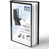
- Perfect 8.5x11inch Portfolio Binder: This document file folder with 30 top-loading pockets, displaying 60 pages. Each pocket holds up to 10 sheets, keeping documents organized, visible and protected. The front inner pocket of book binder stores loose papers, business cards, flyers, etc. Ideal for office, school or home use—neat storage made easy!
- Customizable Cover And Spine: STAGEEK file folder organizer allows you to add labels, stickers or handwritten notes to mark contents instantly. The sleek design of folders with pockets combines functionality with convenience, ensuring your papers stay organized while you quickly locate the right portfolio folder.
- Super Easy To Use: This presentation folder with plastic sleeves lies flat when opened, letting you access documents effortlessly without awkward holding. STAGEEK art portfolio high-transparency inner pockets offer crystal-clear visibility—browse and locate needed papers at a glance, no need to pull them out.
- Premium Quality You Can Trust: These sheet protectors 8.5 x 11 feature lightweight clear file pockets—acid-free, no sticking, no ink transfer, and glare-free for easy reading. The waterproof, stain-resistant design keeps important document organizer safe, while the sturdy plastic cover provides reliable protection. Every detail ensures long-lasting use, preserving your papers from damage.
- Multi-Function: STAGEEK plastic sleeves for paper 8.5x11 are not only suitable for long-term storage but also for displaying your paintings, photos, artwork, drawings, stencils. Great for students, teachers, office workers, secretaries, musicians, painters, etc.
Step-by-step workflow for creating the sequence
Step 1: Define the message and number of frames
Write the opening promise, the ordered middle ideas and the final takeaway. Select the fewest frames that can explain the message without rushing. Every extra page adds another crop to inspect and another opportunity for the story to stall.
Step 2: Set the frame ratio and dimensions
Choose the target platform and a consistent frame size. For the Instagram vertical example above, start with 1080 × 1350 pixels, then check the current app preview. Record the width and height in your project notes so every page uses the same values.
Step 3: Create a continuous working canvas
Multiply the frame width by the number of frames to create a wide composition, or use a page-based template that preserves exact alignment. Place the complete background, photograph or illustration first. This lets you see how a curve, horizon or texture travels through the entire run before text and labels introduce additional constraints.
The Tool Desk
Outbyte PC Repair FREEClear out junk files and repair common Windows errorsFree Scan →Outbyte Driver Updater FREEScan for outdated or missing drivers - takes under a minuteDriver Scan →Step 4: Mark every boundary
Add vertical guides at each frame-width interval. For five 1080-pixel frames, guides belong at 1080, 2160, 3240 and 4320 pixels from the left edge. Lock or clearly distinguish these guides so they are not mistaken for visible artwork. The exact positions matter more than the software used.
Step 5: Slice or align pages without changing scale
Export or duplicate each region at the same dimensions. Do not resize one page independently to “make it fit.” A one-pixel shift can be visible in a straight line, repeated pattern or small type, so use the tool’s numeric position and size controls where available rather than dragging by eye.
Step 6: Add text inside each frame’s readable area
Place headlines and body copy after the main panorama is aligned. Keep essential words within one frame and away from the cut. A decorative line or oversized image can cross a boundary, but readers should not need to swipe back and forth to read a sentence.
Rank #4
Step 7: Check each page in isolation
Hide the neighboring pages or view the individual exports. Ask whether the subject, hierarchy and contrast still work when the slide appears alone. This catches headings that depend too heavily on the previous frame and images whose focal point has been cropped out.
Free tools Windows power users keep installed
One-click scans. No signup required.
Step 8: Review the complete run
Use a grid or contact-sheet view to inspect order, repeated layouts and overall rhythm. Canva’s guide describes reviewing designs in grid view and reordering pages as needed. Look for accidental duplicates, a middle frame that adds no information, or a final slide that arrives before the argument is complete.
Step 9: Export according to the content
For image-only work, Canva’s guide specifies PNG export; for work containing video, it specifies MP4. Export the individual frames, not one uncut panorama, unless the destination explicitly accepts a continuous file. Open the exported files and inspect their actual pixel dimensions before uploading.
Step 10: Preview the publishing interface
Load the files in the platform’s composer in their intended order. Swipe through slowly and check the first and last few pixels at every seam. Confirm that captions, thumbnails and any automatic crop have not changed the composition. If the app shows a different crop from your design canvas, return to the frame files rather than trying to repair the problem with a caption.
Alignment techniques that prevent visible seams
Use equal slices
Every frame must be the same width and height. A continuous object should occupy the same coordinate system before slicing. If the source canvas is wider than the total frame run, crop the excess consistently rather than allowing one page to absorb the remainder.
Design across boundaries, then protect the cut
Place large background elements across the guides so their geometry continues naturally. Keep small labels, faces, logos and critical controls clear of the guides unless the split is a deliberate visual reveal. When a line crosses, verify that its thickness and color remain consistent on both sides.
Inspect at two scales
At 100 percent, look for pixel-level jumps, mismatched edges and shifted baselines. At phone size, look for text that becomes too small, low contrast or visually crowded. A seam can be mathematically perfect and still fail because the content around it is unreadable.
Test the first-to-second transition separately
Readers often decide whether to continue after the first swipe. Check that the opening frame does not reveal the entire answer, that the second frame does not look like a new campaign, and that the visual continuation is apparent without requiring a caption.
Independent reader supportYour contribution helps us test, update, and keep practical guides available for everyone.Working in Canva or another page-based editor
Canva describes templates, page editing and reordering, fonts, elements, review, export and sharing in its carousel and Instagram guidance. Those are vendor-described capabilities rather than independent hands-on test results, so treat the interface labels as subject to change.
Do these 3 things before closing this tab:
1Fix the driver behind crashes, sound loss and screen glitches2Repair Windows errors before they cause bigger problems3Scan for outdated or missing drivers - takes under a minute- Create a custom design using the chosen frame dimensions, or select a template that lets you set a consistent page size.
- Build the wide background in a separate working area or place a carefully aligned continuation across duplicated pages.
- Use rulers, guides, grids and numeric position fields to mark frame boundaries.
- Duplicate a page for repeated type styles and spacing, then replace only the content that changes.
- Use the page overview or grid view to reorder slides and remove any page that does not advance the story.
- Download image pages as PNG or video pages as MP4, then inspect the downloaded files before posting.
Whether you use Canva, a different editor or a custom workflow, the decision criteria stay the same: can the method preserve a continuous composition, maintain exact frame dimensions, make crop and order checks easy, fit your existing process and keep type readable on a mobile screen?
Choosing a production approach
| Approach | Best when | Advantages | Risks to manage |
|---|---|---|---|
| Single wide composition, then slice | The design depends on a photograph, panorama or large illustration crossing many frames. | One coordinate system makes continuity easy to see and align. | Requires careful slicing, file naming and export checks. |
| Aligned page-based design | The sequence contains substantial text, repeated cards or different layouts per frame. | Each page can be reviewed independently while shared elements remain consistent. | Manual positioning can introduce small shifts at seams. |
| Template or guided carousel tool | You need a repeatable workflow and want built-in page management. | Templates, page duplication and ordering can reduce setup time. | Confirm that the template preserves exact dimensions and does not hide a crop or resize during export. |
There is no neutral head-to-head test establishing that one category is universally better. Choose based on the complexity of the panorama, the amount of text, your comfort with numeric alignment and how easily you can inspect the exported files.
Common failure modes and fixes
| Symptom | Likely cause | Fix |
|---|---|---|
| A straight line jumps at every swipe. | Pages were sliced at different coordinates or resized independently. | Return to one master canvas, restore equal guides and export identical frame dimensions. |
| The image continues, but the text is cut in half. | Essential copy was placed on a boundary. | Move the copy inside one frame; reserve the seam for decorative or nonessential elements. |
| One page looks sharper or softer than its neighbors. | That page was exported at a different size or compressed differently. | Match document dimensions and export settings, then compare the actual files rather than only the editor preview. |
| The carousel feels repetitive. | Slides repeat the same idea or layout without advancing the argument. | Give each page one job, combine overlapping points and strengthen the opening-to-ending progression. |
| The final slide arrives without a conclusion. | The story used all its space for setup and development. | Reserve a frame for the takeaway or next step before adding decorative pages. |
| Text is legible on the desktop canvas but not on a phone. | Type is too small, contrast is weak or too much copy is packed into one frame. | Shorten the copy, increase contrast and test the exported frame at mobile viewing size. |
| The platform preview crops the design differently. | Platform behavior or current display rules differ from the design assumption. | Check the live composer, adjust the frame files and re-preview before publishing; do not assume a guide’s example is an official permanent rule. |
Mobile readability and accessibility checks
Seamless motion can attract attention, but it should not make the content dependent on a perfect swipe. Use plain language, strong contrast and enough spacing around every text block. Avoid placing important information over a busy part of the image. If a visual transition is essential to understanding, repeat the key relationship in the wording so a person who sees only one frame is not lost.
- Read each headline without zooming.
- Check contrast over the lightest and darkest parts of the background.
- Keep line lengths short enough to scan quickly.
- Use meaningful labels rather than relying on color alone.
- Make the final frame understandable even if a viewer reached it from a shared screenshot.
Final pre-publish checklist
- The first slide states the subject or promise.
- Every slide advances one clear idea.
- The final slide contains the conclusion, takeaway or next step.
- All frames share identical dimensions and aspect ratio.
- Guides and slice boundaries were checked against the master composition.
- No essential word, face, logo or control is accidentally cut.
- Typography, color, spacing and image treatment form one consistent system.
- Each frame remains readable when viewed alone on a phone.
- The complete run was reviewed in order for crops, duplicates and pacing.
- Exported PNG or MP4 files were opened and checked, not merely trusted from the editor preview.
- The platform’s current composer preview was inspected immediately before publishing.
The practical standard for a successful seamless carousel
A seamless carousel earns attention through continuity and keeps it through structure. Start with a specific promise, develop one idea at a time, and reserve a clear ending. Build the visual as one composition, divide it into equal slices, protect text from the cuts, and inspect both individual frames and the complete swipe sequence. Canva’s published dimensions can provide a starting point, but the platform preview and the readability of the exported files are the final checks that determine whether the design works for viewers.
Quick Recap
Product prices and availability are accurate as of the date/time indicated and are subject to change. Any price and availability information displayed on Amazon at the time of purchase will apply.

