Figma Dev Mode is a developer-focused workspace inside a Figma Design file. It lets developers inspect layers, spacing, styles, variables, components and annotations; view generated code; compare design revisions; and download assets. Open it with the toolbar toggle or the Shift+D shortcut.
Dev Mode speeds handoff, but it does not turn a design into a finished application. Treat its code as an implementation starting point, then reconcile it with your product’s components, tokens, responsive rules and accessibility requirements.

As an Amazon Associate I earn from qualifying purchases.
What Figma Dev Mode is and why it matters
Figma describes Dev Mode as a workspace for “inspecting designs, viewing properties and generated code, downloading assets, comparing changes, and managing design handoff.” In practical terms, it gives a developer a structured way to answer questions that otherwise arrive as chat messages or screenshots: Which layer is this? What are its dimensions and constraints? Which color or spacing token does it use? Has the approved design changed? Which exact image or icon belongs in production?
Recommended Free Tools
Dev Mode works in the context of a Figma Design file, so the quality of the handoff depends on how the file is organized. Named layers, components, variables, annotations and links to related work provide more useful context than a purely visual mockup. Dev Mode exposes that context without requiring the developer to edit the design.
#1 Best Overall

- [Ultra-Lightweight Ear Buds Designed for Small Ears] Each earbud weighs only 3.7g and features a compact, ergonomic in-ear design made especially for small ears. Secure, low-profile, and comfortable for workouts, all-day wear or overnight sleeping.The ultra-slim profile sits flush in your ear with no hard edges poking or rubbing, so you can even sleep on your side without discomfort.
- [Immersive Stereo Sound with TOZO OrigX Technology] TOZO OrigX tuning delivers clear vocals, balanced mids, and natural stereo sound for music, podcasts, and videos.
- [Long Battery Life for Daily Use] Get up to 7 hours of playtime on a single charge, with up to 32 hours total using the charging case—ideal for workdays, commuting, and extended listening sessions.
- [Bluetooth 5.3 & Stable Connection] Bluetooth 5.3 provides fast pairing, stable wireless performance, and reduced dropouts as you move around home or office.
- [Deep Bass with Clear Vocals] High-performance drivers produce punchy bass while keeping vocals clean and detailed for everyday listening.
Opening Dev Mode and understanding access
Open a Figma Design file and use the Dev Mode toggle in the toolbar, or press Shift+D. What appears after switching depends on the file’s plan, your permissions and your seat type.
| Access situation | What to expect |
|---|---|
| Full or Dev seat | Access to the Dev Mode workspace, including inspection, code views, asset downloads and handoff-oriented tools available to the file. |
| View seat | Basic inspection capabilities remain available, but the complete Dev Mode experience may not be included. |
| Restricted file or project | The file owner’s sharing settings and plan can limit what you can inspect, download or compare. |
Seat entitlements and feature availability can change by plan, region and product update. If a control described below is missing, first confirm that you are in the correct file, have the intended permission and are using a seat that includes Dev Mode. Do not assume that a missing button means the design is incomplete.
Inspecting a design layer by layer
Select an object, frame or component on the canvas. The Inspect panel presents the selected layer’s name and type, layout information, spacing, styles, variables, component details and available code. You can copy individual values rather than transcribing them from a screenshot.
The Tool Desk
Outbyte Driver Updater FREEFix the driver behind crashes, sound loss and screen glitchesFind Drivers →Outbyte PC Repair FREERepair Windows errors before they cause bigger problemsFix Now →Geometry, layout and spacing
Use the selected layer’s properties to read dimensions and positioning. You can also measure distances directly on the canvas to see the gap between a component and its neighbors or the padding inside a frame. These measurements help distinguish intentional spacing from an accidental offset.
- Check the layer name and type before copying values; selecting a nested icon instead of its button frame produces different dimensions.
- Inspect layout and spacing together. A width value alone does not explain whether the element is fixed, fills available space or participates in an auto-layout arrangement.
- Use canvas measurements to verify relationships between elements, especially when a visual gap could be margin, padding or an auto-layout gap.
Styles, variables and tokens
Dev Mode exposes the styles applied to the selected layer and the variables behind those values. Variables can be inspected by value and mode. When a variable is an alias, you can follow the alias chain to its raw value instead of treating the displayed alias name as the final color, spacing or dimension.
Rank #2

- 【IP68 Waterproof Multifunctinal Smart Watch】Torjalph fitness activity tracker smart watch is IP68 waterproof technology ,you can wear it when swimming,handwashing,it's rain-proof which means that you perform multiple exercise modes outside without worrying about sweat or rain corroding your fitness smart watch,and this watch equipped with a 230 mAh large capacity battery magnetic charging ,and this sports activity tracker watch can be used 5-7 days If fully charged.
- 【Larger 1.83'' Full Screen Watch & Multi-dial Selection】1.83 inch full HD color touch screen smart watch for men / women provides excellent 240*284 resolution image quality ,This Bluetooth smart watch offers a better touch experience and remarkable immersion and ,more than 200 watch faces for you to choose from App"Da Fit ", you can change the dial style according to your mood to wear keeping the world on your wrist
- 【Accurate Activity Tracker Smart Watch 】sports watch activity tracker uses sweat and dust resistant breathable silicone strap, our Fitness Tracker Smart Watch for Android iOS Phones supports 12 sports modes,walking,running,bicycle,swimming,badminton,basketball,football,rope skipping. This bluetooth calls smart watch for men women is lightweight and stylish, bringing more convenient and relaxing sports experience while also providing more protection.
- 【Your 24 Hour Personal Daily Health Monitor】Fitness watch for women men full touch screen IP67 waterproof bluetooth smartwatch for Android iOS Phones with heart rate blood pressure monitor multifunction Andriod smart watch with steps counter sleep monitor sports fitness watch, monitoring blood oxygen saturation allows you to understand your physical condition in real time to track fitness progress ,to know your health status in time.
- 【More Functions Bluetooth Call Smart Watch】This fitness activity smart watch full screen for iPhone and Android phones includes a bunch of new features including:The bluetooth smart watch can hang up the phone, receive and display WhatsAPP /Text /Facebook /Twitter /Messenger reminder.Support sedentary reminder, alarm clock, stopwatch, timer,weather information,music control, remote camera control compatible with Android 5.0 and above or iOS 9.0 and above smartphones.
Figma can suggest existing variables that match a raw value. Variable collections and modes can also be displayed in a table, which is useful when a component has different values for themes, brands or other modes. Before creating a new constant in code, check whether the design already maps that value to an established variable.
Components, instances and documentation
For a component or instance, inspect the component link, its properties and any documentation supplied by the design team. An instance may contain overrides, so read the selected instance rather than assuming every property matches the base component. An annotation can explain behavior, content rules or an exception that is not obvious from the pixels alone.
Reading the generated code
Selecting an object populates the Code section with autogenerated snippets and a preview that helps explain typography or the box model. The output is useful for translating a visual property into a familiar syntax, but it is not a complete application, page or production-ready component.
What the snippets are good for
- Confirming a CSS property, text style or box-model value associated with the selected object.
- Providing a quick starting point when the project has no matching component yet.
- Checking whether the inspected layer is using the values you expected from the design.
What you still need to decide
- How the element fits the project’s existing component library and naming conventions.
- Which design variables become tokens, theme values or runtime data.
- How the layout behaves at other viewport sizes, with longer text or with localization.
- Keyboard behavior, focus states, semantics, contrast and other accessibility requirements.
- Asset loading, image optimization, performance and error states.
Figma’s developer documentation describes Dev Mode plugins as a way to provide custom code generation. A codegen plugin can add a language or framework that the native output does not support and can expose metadata such as imports or internationalization strings. Use such output only when it matches the project’s conventions; a technically valid snippet can still be the wrong abstraction for your codebase.
Using the component playground safely
The component playground lets developers experiment with component properties without changing the underlying design. Use it to test combinations such as size, state, content or boolean properties before implementing them.
Rank #3
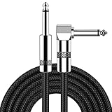
- [Low Noise High Fidelity] New bee guitar cord with 22AWG oxygen-free-copper center conductors provides enhanced signal transfer, the PVC insulation material and the high-density stranded copper double shield provide noise rejection for quiet operation
- [Ideal for Choice] New bee 1/4 straight and right angle metal connectors, ensures a secure connection in any instrument, pedal, or amp jack. L shape great fro on stage guitar stands
- [Wide Compatible] Suitable for mixer, power amplifier, microphone, effector, decoder, equalizer, electoronic organ, electric guitar, electric bass and other electronic equipments. Widely used in the installation of smart home, karaoke speaker, professional stage audio, etc
- [Easy Disassemble] Making incidental repairs quick and easy! Very nice, flexible cable
- [Dont Hesite to Order] 24 hours customer services and professional technology team are standing by
- Select the component or instance you need to understand.
- Open the component playground from the available component controls.
- Change properties and observe how the component responds to each combination.
- Record the states your product actually needs, including loading, error, disabled and empty states when they exist.
- Return to the source component and documentation for the approved values before coding.
The playground is for exploration, not a replacement for the project’s source of truth. A combination that can be toggled in the playground may not be approved for production or may require additional behavior outside the visual design.
Crashes, No Sound, or Screen Glitches?
Random freezes, missing sound and display glitches usually trace back to one bad driver. Find and replace yours safely.Free scan · under a minutePC Slower Than It Used to Be?
A free scan shows the junk files, broken settings and background clutter dragging Windows down - then fixes them in one click.Free scan · Windows 10 & 11Comparing design changes before you build
When a frame or component changes, use Compare changes to open version history and compare the current version with an earlier one. This makes a visual handoff more reliable than relying on the date of a message or the filename of an exported image.
Frame and component comparisons
Compare the current frame with a previous version to identify changed dimensions, content, styles or layout. Detached components and instances with overrides can also be compared with their base component, helping you see whether a local variation has drifted from the system component. You can also select two components and compare them directly when the question is whether two variants are genuinely different.
A practical change-review sequence
- Open the frame, component or instance that is linked to the development task.
- Choose Compare changes and select the earlier version or comparison target.
- Inspect visual and property differences, not just the overall thumbnail.
- Check annotations and component documentation for the reason or expected behavior behind the change.
- Translate only the approved differences into code, and update the task or implementation notes with the version you used.
Version comparison is especially valuable when a ticket remains open while the design evolves. It gives the developer a concrete boundary between the version already implemented and the version now approved.
Exporting icons, images and other assets
Dev Mode can automatically detect icons and expose them as downloadable assets. The Assets section can also reveal GIF and MP4 nodes and, for an image, the full-resolution source file. Export settings support PNG, JPG, SVG and PDF.
Rank #4

- Digital Family Calendar: BSIMB digital calendar wall touch screen puts an end to your chaotic life. Designed for busy families, the digital calendar keeps you organised and in step with your family. Assign different colours and tasks to each family member to make family scheduling easier and more intuitive.
- Easy Setup and Auto-Sync: Plug in, connect to WLAN and auto-syn your electric calendar in minutes. Digital wall calendar compatible with Google calendar, iCloud calendar, Outlook calendar, Cozi calendar and Yahoo calendar. Add events directly on the device or through the ecalendar app. Electronic calendar stays current whether you're at work or traveling—no manual updates needed.
- All-In-One Home Assistant: Smart calendar builds habits and encourage independence with personalised chores. Display daily meal plan to reduce the daily ‘What's for dinner?’ stress. To-do lists keep track of everything you want. Turning chores into valuable achievements with stars and rewards, making life easier and more enjoyable.
- Manage Anytime Anywhere: BSIMB electronic calendar for family stay connected with the powerful ecalendar app. Access and manage your digital wall calendar anytime, anywhere with free features like stars & rewards, photo screensaver, chore charts, meals plans, to-do lists etc. Electronic planner paid features like Magic Import tailor advanced tools for users with special needs.
- Stay in Touch with Loved Ones: Share photos or videos from your phone to electronic wall calendar with app, instantly update your life moment, and keep in touch with your family, especially those who are far away; you can also surprise your smart calendar digital wall by sending him a wish card; it's also great for keeping tech-illiterate elders in touch with the youngsters.
Step-by-step export
- Select the exact layer or node you need. Selecting a containing frame can export the frame rather than the icon or image inside it.
- Open the asset or export controls shown for that selection.
- Choose the required format and any available export settings, such as scale or resolution.
- Confirm that the format matches the use case: SVG for suitable vector icons, a raster format for photographic content, or PDF when a document-style export is required.
- Download the asset and verify its dimensions, transparency, animation and visual quality in the destination project.
Choosing a format
| Format | Typical use | Checks before shipping |
|---|---|---|
| SVG | Scalable vector icons and illustrations. | Confirm that the consuming system supports the SVG, that fills and strokes are correct, and that it is safe to embed or sanitize. |
| PNG | Raster graphics that need lossless quality or transparency. | Check pixel dimensions, file weight and transparent edges. |
| JPG | Photographic or opaque imagery where compression is acceptable. | Check compression artifacts, color appearance and the required quality setting. |
| Document-style or print-oriented output. | Confirm page dimensions, fonts and whether the receiving workflow expects a document rather than an image. |
For GIF and MP4 nodes, verify that the consuming product supports animation or video before downloading. A full-resolution source can be substantially larger than the rendition needed in an interface, so apply the project’s normal optimization and delivery rules after export.
Independent reader supportYour contribution helps us test, update, and keep practical guides available for everyone.Making the handoff understandable to the whole team
Designers can mark work as ready for development, add annotations and measurements, and link a design to a ticket, documentation page or code component. These signals turn Dev Mode from a property inspector into a handoff workflow.
Useful context to look for
- A ready-for-development status that identifies the intended implementation target.
- Annotations describing behavior, content constraints, interactions or exceptions.
- Measurements that explain spacing and alignment decisions.
- Links to the relevant ticket, documentation or existing code component.
- Component and variable references that show which parts belong to the design system.
Figma documentation names workflows involving Jira, Storybook, GitHub, plugins and Figma for VS Code. Availability and setup can vary by organization. Treat an integration link as context for the work, not proof that the linked code is current; confirm the implementation source and revision in your project.
Permissions, seats and troubleshooting
Dev Mode toggle is unavailable
Check that you opened a Figma Design file rather than another file type, that your account has access to the file and that your seat includes the Dev Mode workspace. A View seat may provide basic inspection without every Dev Mode control.
What’s actually slowing this PC down?
Pick the symptom - the matching free tool is one click away.
A property or variable is missing
Confirm that the correct layer is selected and that you are not inspecting a nested child when the value belongs to its parent. For variables, inspect the active mode and follow aliases to the raw value. If the design uses a local style or plugin-specific metadata, the relevant information may not appear as a native property.
The code does not match the project
Use the snippet to identify values, then map those values to existing components and tokens. If the project needs a different language or framework, ask whether an approved codegen plugin exists. Do not paste generated markup into production without checking semantics, responsiveness, accessibility and state handling.
The export looks wrong
Re-select the intended node, verify the export format and settings, and check whether you downloaded a rendered asset or a full-resolution source. Inspect transparency, animation, dimensions and color appearance in the target application before committing the file.
A comparison appears confusing
Make sure you are comparing the intended version, base component or second component. An instance with overrides can differ from its base even when the source component itself has not changed. Read the annotations and inspect individual properties rather than judging only the canvas thumbnail.
Do these 3 things before closing this tab:
1Scan for outdated or missing drivers - takes under a minute2Repair Windows errors before they cause bigger problems3Fix the driver behind crashes, sound loss and screen glitchesA repeatable developer workflow
- Open the approved file and switch to Dev Mode. Confirm access and identify the frame or component linked to the task.
- Inspect structure first. Read layer names, component relationships, layout behavior and annotations before copying values.
- Resolve design-system references. Check styles, variables, modes and aliases so implementation uses the project’s established tokens.
- Review code as a translation aid. Use generated snippets for syntax and values, then adapt them to existing components and framework conventions.
- Compare revisions. Use version or component comparison if the task has been open or the design has multiple variants.
- Export only required assets. Select the precise node, choose the format and settings, then verify the downloaded file.
- Record unresolved decisions. Ask about missing states, behavior, content rules or accessibility details instead of guessing from pixels.
What Dev Mode can and cannot replace
| Need | Dev Mode helps with | You still need |
|---|---|---|
| Visual inspection | Exact properties, measurements, styles and component context. | Product requirements and behavior decisions not represented in the file. |
| Code handoff | Native snippets, previews and optional plugin-generated output. | Project architecture, state management, tests and production-quality accessibility. |
| Design-system use | Variables, modes, aliases and component links. | Agreement on token naming, versioning and runtime implementation. |
| Change management | Version, frame and component comparisons. | A team process that identifies which revision is approved for release. |
| Asset delivery | Detected icons, media nodes and PNG, JPG, SVG or PDF exports. | Optimization, licensing checks, responsive variants and integration into the build. |
Bottom line for developers
Use Figma Dev Mode as the authoritative inspection and handoff surface for the design revision you are implementing. Its strongest advantages are precise property inspection, variable and component context, revision comparison and controlled asset export. Its generated code is a bridge between design and implementation, not a substitute for your codebase. Confirm access, inspect the right node, follow variables and component links, compare changes when necessary, and validate every exported asset in its final technical context.
Quick Recap
Product prices and availability are accurate as of the date/time indicated and are subject to change. Any price and availability information displayed on Amazon at the time of purchase will apply.

