What’s actually slowing this PC down?
Pick the symptom - the matching free tool is one click away.
A pure CSS elevator interface is a compact way to explore how far HTML and CSS can go as an interaction model. By treating each floor as a selectable state, the UI can move an elevator cab, highlight the active floor, update indicators, and reveal door states without relying on JavaScript.
The core idea is to use form controls such as radio inputs as the state holders, then connect those states to visual changes through selectors, layout, and transitions. The elevator shaft, buttons, cab position, and floor display all become parts of a CSS-driven system where a checked input determines what the user sees.
This approach is useful for learning state-based thinking in CSS, but it also exposes the boundaries of CSS-only interaction. Building it well means paying attention not only to animation and selector structure, but also to keyboard access, semantic markup, screen reader behavior, and the practical limits of maintaining complex UI without script.
Modeling Elevator Floors as CSS States
An elevator interface is a good fit for CSS state modeling because the core interaction is discrete: the cab is on floor 1, floor 2, floor 3, and so on. Instead of calculating position continuously, the UI can treat each floor as a named state. Selecting a floor changes which state is active, and the stylesheet maps that state to visible outcomes such as cab position, highlighted buttons, floor labels, and door styling.
The Tool Desk
Outbyte Driver Updater FREEFix the driver behind crashes, sound loss and screen glitchesFind Drivers →Outbyte PC Repair FREERepair Windows errors before they cause bigger problemsFix Now →#1 Best Overall

- Dry erase markers with the most vibrant ink yet from EXPO
- Vibrant ink makes it easier to read information from a distance
- Made for the whiteboard and beyond, writing pops on most non-porous surfaces like glass, acrylic, and more!
- Easily and cleanly erases with included EXPO eraser and cleaner spray
- Versatile chisel tip creates multiple line widths
In a pure CSS implementation, the most practical way to represent these states is with a group of radio inputs. Radio buttons already provide mutually exclusive selection, which matches the elevator model: the cab can be represented as being at one selected destination at a time. Each input corresponds to one floor, and the checked input becomes the single source of truth for the interface.
- One checked radio represents the current selected floor.
- Labels act as elevator buttons that change the selected state.
- CSS selectors respond to
:checkedand update the cab, indicators, and controls. - Transitions make the state change feel like movement rather than an instant jump.
For example, a four-floor elevator can be modeled with four inputs named as a single group: floor-1, floor-2, floor-3, and floor-4. Only one of them can be checked at once because they share the same name value. The first floor is usually checked by default so the interface has a defined starting state when the page loads.
The stylesheet then describes what each state means visually. If the third-floor input is checked, the cab might move to translateY(-200%), the third button might receive an active style, and the display panel might reveal the text “3”. If the first-floor input is checked, the cab returns to the bottom of the shaft and the first-floor indicator becomes active. CSS is not storing data in the JavaScript sense; it is reacting to document state exposed by form controls.
| CSS State | Input Condition | Visual Result |
|---|---|---|
| Floor 1 | #floor-1:checked |
Cab at bottom, floor 1 button highlighted |
| Floor 2 | #floor-2:checked |
Cab moves one level up, floor 2 indicator shown |
| Floor 3 | #floor-3:checked |
Cab moves two levels up, floor 3 indicator shown |
| Floor 4 | #floor-4:checked |
Cab at top, floor 4 button highlighted |
This model works best when the DOM is arranged so the checked inputs can influence the elevator elements that follow them. General sibling selectors, adjacent sibling selectors, and the newer :has() selector can all be used depending on the browser support target and markup structure. A common pattern is to place the radio inputs near the top of the component, followed by the shaft, cab, display, and controls. That allows selectors such as #floor-3:checked ~ .elevator .cab to apply the correct transform.
Thinking in states also keeps the component predictable. Each floor should have a complete set of visual rules, even if some of those rules are repeated. The cab position, active control, display text, and optional door state should all derive from the same selected floor. When every visible part of the elevator is tied back to the checked input, the interface behaves like a small state machine, with CSS selectors defining the transitions between its possible states.
Building the Elevator Shaft, Cab, and Floor Controls
The interface starts with three visible pieces: a vertical shaft, a movable cab, and a control panel for selecting floors. The shaft acts as the positioning context, so it is usually a relatively positioned container with a fixed height, a defined number of floor bands, and hidden overflow. The cab is an absolutely positioned element inside that shaft. Each floor control is tied to a hidden radio input, while its visible label becomes the button a user clicks or focuses to request a floor.
A practical structure keeps the state controls near the top of the component, followed by the visual elevator. For example, a wrapper such as .elevator can contain four radio inputs named floor, one per floor, then a .scene with the shaft and cab, and finally a .panel with labels for each radio. The shared radio name ensures only one floor can be active at a time, which matches the single-position behavior of an elevator cab.
Core layout pieces
- Shaft: a tall container using
position: relative, grid or background gradients for floor divisions, and a border to suggest the elevator well. - Cab: an absolutely positioned block with a fixed height matching one floor segment, anchored to the bottom by default.
- Floor landings: visual markers or labels aligned with each level, often placed with CSS Grid rows or absolute positioning.
- Control panel: a grouped set of labels styled as buttons, each associated with a corresponding radio input through the
forattribute.
CSS Grid is especially useful for the shaft because the floors can be represented as equal rows. A four-floor example might use grid-template-rows: repeat(4, 1fr), with floor labels placed in each row from top to bottom. The cab can still move independently with transforms, but the grid gives the background a reliable visual scale. This makes it easier to keep the cab height, floor indicators, and movement distances aligned.
The radio inputs should not be removed with display: none if keyboard access matters. Instead, they can be visually hidden with a utility pattern that keeps them focusable and available to assistive technology. The labels then become the visible controls, styled with padding, borders, hover states, and checked states. A selector such as #floor-3:checked ~ .panel label[for="floor-3"] can highlight the active floor button, while a related selector can move the cab inside the shaft.
Suggested markup relationship
- Create one radio input for each floor, all sharing the same
name. - Place the visual shaft and cab after those inputs so general sibling selectors can reach them.
- Add the control panel after the shaft, using labels connected to the radio IDs.
- Use a default checked radio so the elevator has a defined initial position.
The cab itself can be built from simple nested elements: a frame, two door panels, and a small display strip. Even before adding state-based animation, this gives the component enough structure to show movement, active floors, and door changes later. Keep sizes expressed through custom properties such as --floor-height, --cab-height, and --floor-count where possible. That keeps the layout adjustable when the demo changes from three floors to five, instead of scattering hard-coded pixel values across the stylesheet.
Rank #2

- EXPO kit comes with everything you need to start marking and keep your surfaces clean
- Consistent, skip-free writing, vibrant color options and low-odor ink make the kit perfect for classrooms and offices
- Versatile chisel tip allows for broad and fine writing. Fine tip is great for details
- Spray and Expo eraser help you erase cleanly and easily while also extending whiteboard life
- 14-piece set includes fine and chisel tip markers in Black, Red, Blue, Green, Orange, Brown, Purple & Lime plus an 8 oz. bottle of Expo white board cleaning spray & an Expo eraser
Using Radio Inputs and Selectors for Navigation Logic
The simplest way to make the elevator remember a selected floor without JavaScript is to use a group of radio inputs. A radio button already models one active choice among several options, which maps neatly to an elevator cab being at one floor at a time. Each floor gets one input, all inputs share the same name, and each input has a matching <label> that acts as the visible floor button.
A compact structure might place the state inputs before the visual elevator components so later elements can respond with sibling selectors. For example, the checked state of #floor-3 can move the cab, highlight the third control, update the floor display, and reveal the matching landing indicator. The inputs can be visually hidden, but they should remain focusable if the labels are not enough for your keyboard interaction model.
- Inputs hold the current floor state through
:checked. - Labels provide clickable controls tied to each input with
forattributes. - General sibling selectors such as
#floor-3:checked ~ .elevatorconnect state to presentation. - Descendant selectors target the cab, display, doors, and floor markers inside the elevator component.
The core selector pattern is repetitive but clear. If the first floor is checked, the cab receives a bottom position or transform for level one. If the second floor is checked, the cab moves to level two, and so on. A transform-based approach is usually smoother than changing layout properties: transform: translateY(...) can be animated efficiently and does not force the browser to recalculate surrounding layout on every frame.
For a four-floor elevator, the state mapping can be thought of as a small table of selector outcomes:
| Checked input | Cab position | Visible UI changes |
|---|---|---|
#floor-1:checked |
Ground level | Floor 1 button active, display shows 1 |
#floor-2:checked |
One level up | Floor 2 button active, display shows 2 |
#floor-3:checked |
Two levels up | Floor 3 button active, display shows 3 |
#floor-4:checked |
Top level | Floor 4 button active, display shows 4 |
The same checked selector can drive mulle parts of the interface at once. A rule for #floor-4:checked ~ .elevator .cab can position the cab, while #floor-4:checked ~ .panel label[for="floor-4"] can style the selected button. Another rule can reveal a text display such as “4” by toggling opacity on a matching element. This gives the interface the feel of coordinated application state, even though CSS is only responding to document state.
Selector choice affects how flexible the markup can be. The general sibling combinator, ~, only reaches elements that come after the radio input in the same parent. The adjacent sibling combinator, +, is stricter and is best for tightly paired input-label patterns. The newer :has() selector can make parent-driven state styling more expressive, such as styling the whole elevator when it contains a checked floor input, but browser support and project requirements should guide whether it is used as the main mechanism or only as an enhancement.
Do these 3 things before closing this tab:
1Scan for outdated or missing drivers - takes under a minute2Clear out junk files and repair common Windows errors3Fix the driver behind crashes, sound loss and screen glitchesSet one radio input as checked in the initial HTML so the elevator has a defined starting floor. Without a default state, the cab may sit in a fallback position while the displays and highlighted controls show nothing. With a default selected floor, every dependent selector has a predictable starting point, making the pure CSS state machine feel intentional from the first render.
Animating Floor-to-Floor Movement with CSS Transitions
Once each floor is represented by a checked radio input, the elevator cab can move by transitioning between a small set of predefined positions. The cab itself is usually an absolutely positioned element inside the shaft, and each state selector assigns a different vertical offset. For a four-floor elevator, the bottom floor might use transform: translateY(0), while higher floors use increasingly negative values such as translateY(-100%), translateY(-200%), and translateY(-300%), depending on how the shaft and floor heights are structured.
The most reliable approach is to make each floor the same height and move the cab with transform rather than top or bottom. Transform animations are typically smoother because browsers can composite them efficiently. The shaft can be defined as a fixed-height container, with the cab sized to one floor segment. Each radio state then maps directly to a transform value, creating the feeling of floor-to-floor travel without any JavaScript calculating distances.
Mapping states to cab positions
A common pattern is to keep all controls before the visual elevator in the markup, then use sibling selectors to update the cab. The checked input becomes the state source, and the cab responds to that state with a transition:
Rank #3
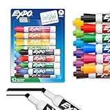
- Dry erase markers with the most vibrant ink yet from EXPO
- Vibrant ink makes it easier to read information from a distance
- Made for the whiteboard and beyond, writing pops on most non-porous surfaces like glass, acrylic, and more!
- Easily and cleanly erases with an EXPO eraser or dry cloth
- Versatile chisel tip creates multiple line widths
- Floor 1 checked: cab rests at the bottom of the shaft.
- Floor 2 checked: cab moves up by one floor height.
- Floor 3 checked: cab moves up by two floor heights.
- Floor 4 checked: cab moves up by three floor heights.
The cab should include a declaration such as transition: transform 700ms ease-in-out;. This single transition handles every route: floor 1 to floor 2, floor 4 to floor 1, or floor 2 to floor 4. Since CSS does not know the previous state in a programmable sense, it simply interpolates between the old transform and the new transform whenever the selected radio changes.
Choosing timing and easing
Elevators rarely feel like they move at a constant mechanical speed from the first pixel to the last. A basic ease-in-out curve gives the cab a short acceleration and deceleration, which reads better than a linear transition. For a more deliberate effect, a custom cubic Bézier curve can make the cab start gently, travel steadily, and settle into place. The duration should be long enough for the movement to be visible, but short enough that navigation does not feel sluggish. In a compact demo, 500ms to 900ms usually works well.
One limitation of a fixed transition duration is that every trip takes the same time. Moving from floor 1 to floor 4 will animate for the same duration as moving from floor 1 to floor 2 unless additional state combinations are introduced. You can create separate durations for each destination, but CSS alone cannot easily compare the previous floor with the next floor. For most interface demos, a consistent duration is acceptable; for a simulation that needs accurate travel time by distance, JavaScript is the better tool.
Adding motion details
Small visual details can make the transition feel more like an elevator. The cab can cast a shadow inside the shaft, floor markers can highlight as the cab arrives, and doors can remain visually closed during movement. If door panels are part of the cab, they can have their own transition on transform or opacity, triggered by the same checked state. A simple version keeps doors closed while the cab moves and opens them after arrival using a delayed transition, such as transition-delay on the door panels.
Recommended Free Tools
Motion preferences also matter. For users who request reduced motion, wrap the movement rules in a @media (prefers-reduced-motion: reduce) adjustment. The cab can switch instantly between floors by setting transition-duration: 0ms, while still preserving the selected floor state and visible position. This keeps the CSS state machine usable without forcing animated travel on users who prefer a calmer interface.
Displaying Active Floor and Door States Without JavaScript
Once each floor is represented by a checked radio input, the interface can expose more than cab position. The same selected state can drive floor indicators, call button styling, door panels, arrival messages, and status text. This is where the elevator begins to feel interactive even though no script is running. The browser is only matching selectors, but the result can resemble a small control system: one selected input determines what the user sees across the entire component.
A common pattern is to place the radio controls near the top of the elevator component, followed by the visual shaft, the cab, and the control panel. With that structure, sibling selectors can connect the checked input to many later elements. For example, when the third-floor radio is checked, the third floor button can appear pressed, the floor display can show “3”, and the cab doors can switch into an arrival state. The exact selectors depend on the markup, but the relationship usually follows this shape: checked floor input → matching visual elements.
Active floor indicators
The active floor can be shown in several places at once. In the floor list, the selected landing can receive a brighter background, an outline, or a lit indicator dot. In the elevator cab, a small display above the doors can reveal the current floor number. In the control panel, the matching button can look engaged. These are all separate pieces of UI, but they can be synchronized by the same checked radio state.
PC Slower Than It Used to Be?
A free scan shows the junk files, broken settings and background clutter dragging Windows down - then fixes them in one click.Free scan · Windows 10 & 11Outdated Drivers Are Slowing You Down
One free scan finds every outdated or missing driver and matches the right update for your exact hardware.Free scan · exact hardware match- Landing highlight: emphasize the floor where the cab is currently positioned.
- Cab display: reveal a single floor number while hiding the others.
- Panel button state: style the selected label as pressed or illuminated.
- Status message: swap text such as “Arrived at Floor 2” or “Floor 4 selected”.
For the cab display, one practical approach is to include several small display elements, one for each floor, and hide them by default. The checked input then reveals the matching item. This avoids needing generated content that may not be announced consistently by assistive technologies. A visible display can be paired with accessible text in the markup, so the selected floor is not only decorative.
Door states
Door animation can also be tied to the selected floor. A simple version uses two door panels inside the cab: a left panel and a right panel. During travel, the doors stay closed. When the selected state resolves to a floor position, the panels can animate outward using transform: translateX(). To make the timing believable, the cab movement transition can run first, followed by a delayed door transition. For example, if the cab takes 900ms to move between floor positions, the door opening transition can use a delay of 900ms so the panels open only after arrival.
Rank #4

- Dry erase markers with the most vibrant ink yet from EXPO
- Vibrant ink makes it easier to read information from a distance
- Made for the whiteboard and beyond, writing pops on most non-porous surfaces like glass, acrylic, and more!
- Easily and cleanly erases with included EXPO eraser
- Versatile chisel tip creates multiple line widths; Fine tip markers perfect for accurate, detailed lines
This technique works best when the interface treats each selection as an arrival state rather than a full simulation of continuous travel. CSS can style “floor 1 selected” or “floor 4 selected”, but it does not naturally know whether the cab is moving upward, moving downward, waiting, or interrupted by a new selection. Still, careful timing can communicate enough for a polished demo: the cab glides to the selected floor, the indicator changes, and the doors open after the motion completes.
If the UI includes a textual status area, keep it simple and explicit. Instead of relying only on color or motion, include visible labels such as “Current floor: 3” or “Doors open”. These can be separate elements controlled by selectors, just like the visual displays. For screen reader users, a static text region that changes only through CSS may not always be announced as a live update, so the content should remain understandable through the focused control itself. Clear radio labels such as “Go to floor 3” help preserve usability even when the decorative status display is ignored.
Accessibility, Keyboard Behavior, and Semantic Markup
A CSS-only elevator can be visually convincing, but it should still behave like a usable form control rather than a decorative animation. The most practical foundation is a group of native radio inputs, one per floor, with visible labels styled as elevator buttons. This keeps floor selection available to keyboards, touch screens, screen readers, and browsers with limited scripting support. The visual cab, shaft, indicator, and doors can then be treated as presentation that responds to the checked radio state.
Use a semantic grouping element around the controls so assistive technology can announce the purpose of the interface. A <fieldset> with a concise <legend>, such as “Choose a floor,” gives the radio group a meaningful name. Each radio should have a matching <label> that states the floor clearly: “Floor 1,” “Floor 2,” “Floor 3,” and so on. Avoid relying only on numbers painted into the design, because background images, pseudo-elements, and purely visual labels may not be exposed consistently to assistive technology.
Keyboard behavior to preserve
- Tab should move focus into the floor selector without trapping the user inside the elevator widget.
- Arrow keys should move between radio choices when the radios share the same
nameattribute. - Space should activate the focused radio option in browsers that require explicit selection.
- Visible focus should remain clear, even after the labels are heavily styled as round elevator buttons.
The common pattern of visually hiding native inputs needs care. Do not use display: none or visibility: hidden on the radios if users still need to reach them from the keyboard or have them announced by screen readers. Instead, use a visually hidden utility class that keeps the input in the accessibility tree, or place the real radio over the styled button with low opacity. The associated label can carry the custom shape, color, pressed state, and hover treatment, while the input keeps the browser’s built-in interaction model.
Motion also needs an accessible fallback. The cab transition may be delightful for many users, but people with vestibular sensitivity may prefer reduced motion. A @media (prefers-reduced-motion: reduce) rule can shorten or remove the travel animation while still updating the selected floor instantly. If door panels slide open and closed, apply the same reduced-motion treatment there as well. The interface should communicate state through more than movement: a checked button style, a text floor indicator, and a stable “selected” appearance all help users understand where the cab is.
Quick wins for a faster PC:
Scan for outdated or missing drivers - takes under a minuteDriver Scan →Repair Windows errors before they cause bigger problemsFix Now →Fix the driver behind crashes, sound loss and screen glitchesFind Drivers →Markup roles and live updates
Because this version does not use JavaScript, dynamic announcements are limited. A text indicator that changes through CSS-generated content may not be reliably announced, so the selected radio label remains the most dependable accessible state. If the markup includes a visible floor display, keep it as supportive visual feedback rather than the only source of status. For a production interface that must announce “Arrived at Floor 3” or “Doors opening,” JavaScript with an aria-live region would be more reliable than CSS alone.
Keep the elevator structure understandable even when styles fail. The controls should still appear as a simple list or group of floor choices, and the decorative shaft should not interrupt reading order. If extra elements are used for rails, cables, lights, or doors, mark them as decorative with aria-hidden="true" when they add no information. The result is an interface that remains playful while still respecting native controls, predictable focus movement, readable labels, and user motion preferences.
Limitations of a Pure CSS State Machine
A pure CSS elevator can be surprisingly convincing, but it is still a visual state machine rather than a full application model. Radio inputs can represent a selected floor, selectors can move the cab, and transitions can simulate travel, but CSS cannot maintain rich procedural state. The interface knows which radio button is checked; it does not truly know that the cab is “moving,” that a request is queued, or that a door cycle must finish before another trip begins. Those ideas can be approximated with timing, sibling selectors, and carefully staged animations, but they are not stored as durable, queryable data.
The most visible constraint is sequencing. In a real elevator, pressing floor 4 while traveling from floor 1 to floor 3 would add a request, compare direction, decide whether to stop, and update the route. With radio inputs, selecting floor 4 usually replaces the previous selection immediately. The cab can transition to the new target, but there is no native CSS mechanism for a queue, priority order, cancellation, or conditional branching based on the previous floor. You can create separate controls for every possible transition, such as “from 1 to 2” and “from 2 to 4,” but that approach grows quickly and becomes difficult to maintain.
Free tools Windows power users keep installed
One-click scans. No signup required.
Best Value

- Dry erase markers with the most vibrant ink yet from EXPO
- Vibrant ink makes it easier to read information from a distance
- Made for the whiteboard and beyond, writing pops on most non-porous surfaces like glass, acrylic, and more!
- Easily and cleanly erases with included EXPO eraser and cleaner spray
- Fine tip markers perfect for accurate, detailed lines
Common constraints
- No real event handling: CSS reacts to selector states, hover, focus, checked inputs, and media conditions, but it cannot run custom handlers when a transition starts or ends.
- No persistent memory: Once a radio selection changes, earlier selections are not available unless they are encoded into separate inputs or URL state.
- No computed routing: CSS cannot calculate the shortest path, skip disabled floors, or dynamically sort pending requests.
- No robust timing coordination: Transition durations and animation delays can line up visually, but they do not create dependable application state.
- No external side effects: CSS cannot save preferences, send analytics, update a server, or notify another component that the elevator has arrived.
There are also limits around disabled, unavailable, or conditional floors. A CSS demo can hide a floor button, style it as unavailable, or prevent pointer interaction with pointer-events: none, but that is not the same as enforcing a rule in application code. Keyboard users may still encounter controls depending on the markup, and assistive technology may announce content that has only been visually hidden. For a production interface, disabled states need semantic attributes, predictable focus behavior, and often JavaScript to keep the visual state and accessibility tree synchronized.
Animation accuracy is another tradeoff. A cab moving from floor 1 to floor 5 should take longer than a cab moving from floor 4 to floor 5. CSS can handle this if each destination or transition has a custom duration, but the selector matrix expands as more floors are added. Door behavior has similar complexity: doors should open only after arrival, remain open briefly, close before departure, and possibly respond to interruption. CSS keyframes can imitate that sequence, yet interruption handling is brittle because a new checked state can restart or override animations in ways that feel abrupt.
For demos, teaching, portfolios, and playful UI experiments, these constraints are acceptable and even useful because they expose how much state can be modeled declaratively. For an elevator-style control in a real product, CSS should usually handle layout, motion, and visible states, while JavaScript manages the application model: selected floor, travel status, queued requests, validation, announcements, and persistence. The pure CSS version is best understood as a compact state diagram rendered in the browser, not as a replacement for a complete interaction engine.
Frequently Asked Questions
Can a CSS-only elevator remember which floor was selected?
Yes, if you model each floor as a checked radio input. Radio buttons keep one selected state within a group, and CSS selectors can style the elevator cab, floor indicator, doors, and buttons based on which radio is checked. This state lasts while the page is loaded, but it is not saved after refresh unless you add JavaScript or server-side state.
Free tools Windows power users keep installed
One-click scans. No signup required.
How do I move the elevator cab to different floors without JavaScript?
You can position the cab with transforms tied to each radio state, such as moving it with translateY() when a floor input is checked. Each floor gets a selector that maps the selected input to a specific cab position. Adding a CSS transition to the cab makes the movement animate smoothly between floors.
Can CSS handle elevator doors opening and closing after the cab arrives?
CSS can fake door behavior with transitions and delays based on the selected floor state. For example, the cab can move first, then door panels can slide open using transition-delay. What CSS cannot do reliably is detect when a transition has finished and trigger a new independent state the way JavaScript could.
Is a radio-input elevator accessible for keyboard and screen reader users?
It can be reasonably accessible if the controls remain real form inputs or properly associated labels instead of hidden, unreachable elements. Users should be able to tab to the floor controls, activate them with the keyboard, and understand the current selection from visible text. Avoid using display: none on inputs if that removes them from assistive technology; use a visually hidden technique instead.
What are the main limits of building this as a pure CSS state machine?
Pure CSS works well for a small, predefined set of floors, but it does not scale well to complex rules or dynamic data. It cannot calculate routes, queue mulle floor requests, persist state, or respond to transition events with new decisions. If you need realistic elevator behavior, CSS is best used for the presentation while JavaScript handles the interaction model.
Quick wins for a faster PC:
Fix the driver behind crashes, sound loss and screen glitchesFind Drivers →Repair Windows errors before they cause bigger problemsFix Now →Scan for outdated or missing drivers - takes under a minuteDriver Scan →Bottom Line
A pure CSS elevator is a fun, practical way to understand how radio inputs, selectors, and transitions can model interface state without JavaScript. By mapping each floor to a checked state, you can create navigation, movement, indicators, and panel feedback with surprisingly little in the markup and styles.
Use this pattern as a learning project, prototype, or decorative UI element, but be honest about its limits for complex behavior, dynamic data, and robust accessibility. If you need real application control, treat the CSS version as the visual layer and add JavaScript where state management, validation, and richer interactions matter.
Quick Recap
Product prices and availability are accurate as of the date/time indicated and are subject to change. Any price and availability information displayed on Amazon at the time of purchase will apply.




