For a new Microsoft 365 document, start with Aptos. Microsoft identifies Aptos as the current default font across Office. Keep Calibri when you are editing an established document, template or team standard, because replacing the font can change line breaks, pagination and other layout details. Neither font has been established as a universal readability winner by the Microsoft sources available for this comparison.
The practical choice is therefore about theme alignment and document continuity rather than a proven “better” typeface. Aptos gives you a broader family of weights and variants, while Calibri remains the safer choice for files whose existing layout and visual identity depend on it.

As an Amazon Associate I earn from qualifying purchases.
Aptos or Calibri: the short answer
| Your situation | Best starting choice | Reason |
|---|---|---|
| Creating a blank document in current Microsoft 365 | Aptos | It is Microsoft’s current default Office font and matches the current Office theme. |
| Editing a document that already uses Calibri | Calibri | Keeping the assigned font protects existing line breaks, page count and spacing. |
| Maintaining a company or team template | The template’s established font | Consistency is usually more valuable than switching to the newer default. |
| Building a dense table or spreadsheet | Compare Aptos variants in the actual sheet | Microsoft positions Aptos Condensed for situations where width is constrained, but the result depends on your content and sizes. |
| Designing a large headline or presentation title | Compare Aptos Display with your existing style | Microsoft positions Display styles for large text; that is a use case, not a guarantee of a better design. |
| Sending a file to people outside your organization | Use a font available to recipients, or plan for embedding | Missing fonts can be substituted and alter the on-screen design and layout. |
Aptos is a default, not a requirement. A user or organization can continue using Calibri, and an existing file does not become wrong merely because Office now starts new files in Aptos.
What Aptos is
Microsoft Learn describes Aptos as “a precise, contemporary sans serif typeface inspired by mid-20th-century Swiss typography.” Steve Matteson designed it for Microsoft as the replacement for Calibri. The official family reference is available at Microsoft’s Aptos font-family documentation.
#1 Best Overall

- [Ultra-Lightweight Ear Buds Designed for Small Ears] Each earbud weighs only 3.7g and features a compact, ergonomic in-ear design made especially for small ears. Secure, low-profile, and comfortable for workouts, all-day wear or overnight sleeping.The ultra-slim profile sits flush in your ear with no hard edges poking or rubbing, so you can even sleep on your side without discomfort.
- [Immersive Stereo Sound with TOZO OrigX Technology] TOZO OrigX tuning delivers clear vocals, balanced mids, and natural stereo sound for music, podcasts, and videos.
- [Long Battery Life for Daily Use] Get up to 7 hours of playtime on a single charge, with up to 32 hours total using the charging case—ideal for workdays, commuting, and extended listening sessions.
- [Bluetooth 5.3 & Stable Connection] Bluetooth 5.3 provides fast pairing, stable wireless performance, and reduced dropouts as you move around home or office.
- [Deep Bass with Clear Vocals] High-performance drivers produce punchy bass while keeping vocals clean and detailed for everyday listening.
Aptos is a family rather than one unchanging drawing. Microsoft lists multiple weights and complementary oblique styles, along with Display, Condensed, Mono and Serif variants. It also describes extended support for Latin, Greek and Cyrillic scripts, plus Vietnamese. The available styles let a document use one family for body text, headings, narrow data columns and code-like material while changing weight or width for hierarchy.
What the variants are for
- Regular and heavier weights: Use weight changes to distinguish body text, headings, labels and emphasis without introducing another family.
- Aptos Condensed: Microsoft positions the condensed styles for fitting more information into tables and spreadsheets. A narrower face can reduce wrapping, but it can also make small text feel crowded, so judge it at the final size.
- Aptos Display: Microsoft positions Display styles for large text such as presentation titles and prominent headings. Display lettering is intended to be evaluated at those larger sizes, not automatically substituted for all body copy.
- Aptos Mono: A monospaced variant can help align code, data or other material where equal character widths are useful.
- Aptos Serif: The serif variant provides a different texture while remaining within the Aptos family.
These are design purposes stated by Microsoft, not promises that every spreadsheet, slide or report will look better. The correct size, line spacing, contrast and amount of text still matter more than selecting a variant by name.
What Calibri represents
Calibri was the previous default Office font. Microsoft’s announcement of Aptos describes Aptos as its replacement, while Microsoft’s cloud-font catalog still lists Calibri and its styles. Calibri therefore remains a normal, supported choice for documents that use it, especially when a team’s templates, forms or archives were built around the older Office default.
Free tools Windows power users keep installed
One-click scans. No signup required.
Changing a long-running document set from Calibri to Aptos is not a cosmetic operation only. A different character width or spacing pattern can move words to a new line, push a heading onto another page, alter a table’s row height or change where a slide wraps. Those changes can affect page references, signatures, print output and carefully aligned forms.
Aptos vs. Calibri by the decisions that matter
| Decision axis | Aptos | Calibri |
|---|---|---|
| Office default | Microsoft identifies Aptos as the current default across Office. | Calibri was the previous Office default; Microsoft describes Aptos as its replacement. |
| Family options | Multiple weights and variants, including Display, Condensed, Mono and Serif. | Calibri and its styles are listed in Microsoft’s Office cloud-font catalog. |
| Continuity with older files | May require layout checking when introduced into a Calibri document. | Preserves the assigned appearance of established Calibri files and templates. |
| Cloud-font status | Listed as an Office cloud font for supported apps. | Also listed as an Office cloud font for supported apps. |
| Controlled readability comparison | No direct, controlled Aptos-versus- Calibri readability result is established in the cited Microsoft sources. | |
The last row is important. Aptos’s design description does not prove that it is easier to read than Calibri, and Calibri’s long history as an Office default does not prove the reverse. Treat readability as a context-dependent question involving size, line length, display quality, language, contrast and the reader’s visual needs.
Rank #2

- 【IP68 Waterproof Multifunctinal Smart Watch】Torjalph fitness activity tracker smart watch is IP68 waterproof technology ,you can wear it when swimming,handwashing,it's rain-proof which means that you perform multiple exercise modes outside without worrying about sweat or rain corroding your fitness smart watch,and this watch equipped with a 230 mAh large capacity battery magnetic charging ,and this sports activity tracker watch can be used 5-7 days If fully charged.
- 【Larger 1.83'' Full Screen Watch & Multi-dial Selection】1.83 inch full HD color touch screen smart watch for men / women provides excellent 240*284 resolution image quality ,This Bluetooth smart watch offers a better touch experience and remarkable immersion and ,more than 200 watch faces for you to choose from App"Da Fit ", you can change the dial style according to your mood to wear keeping the world on your wrist
- 【Accurate Activity Tracker Smart Watch 】sports watch activity tracker uses sweat and dust resistant breathable silicone strap, our Fitness Tracker Smart Watch for Android iOS Phones supports 12 sports modes,walking,running,bicycle,swimming,badminton,basketball,football,rope skipping. This bluetooth calls smart watch for men women is lightweight and stylish, bringing more convenient and relaxing sports experience while also providing more protection.
- 【Your 24 Hour Personal Daily Health Monitor】Fitness watch for women men full touch screen IP67 waterproof bluetooth smartwatch for Android iOS Phones with heart rate blood pressure monitor multifunction Andriod smart watch with steps counter sleep monitor sports fitness watch, monitoring blood oxygen saturation allows you to understand your physical condition in real time to track fitness progress ,to know your health status in time.
- 【More Functions Bluetooth Call Smart Watch】This fitness activity smart watch full screen for iPhone and Android phones includes a bunch of new features including:The bluetooth smart watch can hang up the phone, receive and display WhatsAPP /Text /Facebook /Twitter /Messenger reminder.Support sedentary reminder, alarm clock, stopwatch, timer,weather information,music control, remote camera control compatible with Android 5.0 and above or iOS 9.0 and above smartphones.
Why Aptos became the default
Microsoft’s new Office theme support page states that Aptos is the default font across Office. The theme changes the document’s default styling; it does not change the overall look and feel of Microsoft 365 itself.
Microsoft’s Office theme announcement explains the transition. Microsoft released five candidates to replace Calibri, and the preferred candidate, Bierstadt, was renamed Aptos. Jess Kwok, a product manager on the PowerPoint team, wrote: “You chose Bierstadt as the preferred font, and we gave it a new name, Aptos.” The announcement also describes narrow, serif and monospace variants.
Recommended Free Tools
Matteson’s design brief, quoted by Microsoft, refers to “the austerity and directness that is required in huge variety of Office documents created every day”. That explains the intended breadth of the family; it is not a claim that every reader will prefer Aptos in every setting.
When to choose Aptos
Starting a new report, letter or proposal
Choose Aptos when you want a new file to follow the current Office theme without manually changing the document’s basic font. This is the least complicated path for a blank file because headings, body text and theme elements begin from the same current default.
Creating a new template
Aptos is a sensible starting point for a template intended for current Microsoft 365 users. Define the body, heading and caption styles deliberately, then test a realistic page containing long headings, tables, footnotes and numbered lists. A template should be judged by its longest and most crowded examples, not by an empty page.
Rank #3
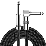
- [Low Noise High Fidelity] New bee guitar cord with 22AWG oxygen-free-copper center conductors provides enhanced signal transfer, the PVC insulation material and the high-density stranded copper double shield provide noise rejection for quiet operation
- [Ideal for Choice] New bee 1/4 straight and right angle metal connectors, ensures a secure connection in any instrument, pedal, or amp jack. L shape great fro on stage guitar stands
- [Wide Compatible] Suitable for mixer, power amplifier, microphone, effector, decoder, equalizer, electoronic organ, electric guitar, electric bass and other electronic equipments. Widely used in the installation of smart home, karaoke speaker, professional stage audio, etc
- [Easy Disassemble] Making incidental repairs quick and easy! Very nice, flexible cable
- [Dont Hesite to Order] 24 hours customer services and professional technology team are standing by
Using several levels of hierarchy
The broader Aptos family can support hierarchy through weight, width and variant choices. For example, a report might use a regular style for body text, a heavier weight for section headings and a Display style only for a cover title. Keep the number of simultaneous styles limited so that hierarchy remains obvious.
What’s actually slowing this PC down?
Pick the symptom - the matching free tool is one click away.
Working with narrow columns
Test Aptos Condensed in the actual table or spreadsheet when column width is the limiting factor. It may reduce wrapping, but shortening labels, widening columns or changing the layout can be clearer than making text smaller. Condensed is an option to evaluate, not an automatic fix.
When to keep Calibri
Editing an existing document
If the file already uses Calibri and its layout is acceptable, keeping Calibri is usually the lowest-risk choice. You avoid reflowing paragraphs, resizing tables and rechecking page breaks simply to match a newer default.
Maintaining a shared template
Use the font specified by the team or organization’s template. A shared standard is valuable because readers learn what headings, labels and fields look like. If a change to Aptos is proposed, make it a template revision: test representative files, update style definitions and communicate the new standard rather than changing individual documents unpredictably.
Preserving a fixed page count
Legal forms, board papers, exam papers and print-ready submissions can depend on exact pagination. Keep the original font unless you have time to compare every affected page and obtain approval for any reflow.
Do these 3 things before closing this tab:
1Scan for outdated or missing drivers - takes under a minute2Repair Windows errors before they cause bigger problems3Fix the driver behind crashes, sound loss and screen glitchesRank #4

- Digital Family Calendar: BSIMB digital calendar wall touch screen puts an end to your chaotic life. Designed for busy families, the digital calendar keeps you organised and in step with your family. Assign different colours and tasks to each family member to make family scheduling easier and more intuitive.
- Easy Setup and Auto-Sync: Plug in, connect to WLAN and auto-syn your electric calendar in minutes. Digital wall calendar compatible with Google calendar, iCloud calendar, Outlook calendar, Cozi calendar and Yahoo calendar. Add events directly on the device or through the ecalendar app. Electronic calendar stays current whether you're at work or traveling—no manual updates needed.
- All-In-One Home Assistant: Smart calendar builds habits and encourage independence with personalised chores. Display daily meal plan to reduce the daily ‘What's for dinner?’ stress. To-do lists keep track of everything you want. Turning chores into valuable achievements with stars and rewards, making life easier and more enjoyable.
- Manage Anytime Anywhere: BSIMB electronic calendar for family stay connected with the powerful ecalendar app. Access and manage your digital wall calendar anytime, anywhere with free features like stars & rewards, photo screensaver, chore charts, meals plans, to-do lists etc. Electronic planner paid features like Magic Import tailor advanced tools for users with special needs.
- Stay in Touch with Loved Ones: Share photos or videos from your phone to electronic wall calendar with app, instantly update your life moment, and keep in touch with your family, especially those who are far away; you can also surprise your smart calendar digital wall by sending him a wish card; it's also great for keeping tech-illiterate elders in touch with the youngsters.
Will switching fonts change your document layout?
It can. Microsoft warns that a replacement font may change design and layout when the original font is unavailable. Even when both fonts are installed, their different letterforms and spacing can produce different line endings and object dimensions.
What to check after a change
- Page count and page breaks, especially before signatures, appendices and headings.
- Table wrapping, row heights and clipped text.
- Text boxes and shapes whose contents no longer fit.
- Bulleted and numbered-list alignment.
- Headers, footers, captions and cross-references.
- PowerPoint slide titles, chart labels and speaker notes.
- Printed or exported PDF output, not just the editing view.
A safe comparison method
- Save a copy of the original file so the Calibri version remains recoverable.
- Apply Aptos to the copy, preferably through the document’s styles rather than by selecting isolated paragraphs.
- Compare the page count, tables, text boxes and headings against the original.
- Open the result on the devices and Office apps your recipients actually use.
- Revert to Calibri if the new layout creates unacceptable changes, or adjust styles and spacing deliberately before approving Aptos.
Sharing Aptos or Calibri files
Cloud fonts in supported Office apps
Microsoft says Office cloud fonts are available to Microsoft 365 subscribers and require an internet connection to obtain them. In supported Office apps, a cloud font can render without being embedded when the font is available through that service. Both Aptos and Calibri appear in Microsoft’s cloud-font catalog, described in Microsoft’s cloud-font guidance.
Cloud-font availability is not the same as universal availability. The recipient needs a supported app, an eligible Microsoft 365 account or connection path, and access to the font service. Offline work, older software and organizational restrictions can produce a different result.
What happens when a font is missing
Microsoft’s modern font-picker documentation explains that Office can identify a missing font and substitute another font for viewing. The saved text still specifies the original font; the substitution does not silently rewrite the assigned font. However, the substitute can change the document’s design and layout on that screen or in that output.
Quick wins for a faster PC:
Repair Windows errors before they cause bigger problemsFix Now →Fix the driver behind crashes, sound loss and screen glitchesFind Drivers →Clear out junk files and repair common Windows errorsFree Scan →Ask recipients to check the font warning rather than assuming that a similar-looking typeface is identical. A screenshot or exported PDF can preserve the appearance for viewing, but it does not provide the same editing flexibility as the original document with its fonts available.
When embedding is worth considering
Embedding can preserve a custom or nonstandard font for people who need to view or edit a file offline. Microsoft says embedding increases file size, and the font creator’s licensing permissions determine whether embedding is allowed. Its current font-picker guidance says embedding is possible only in Windows and macOS desktop apps; supported Office devices can view documents that contain embedded fonts.
For ordinary Aptos or Calibri documents used inside a compatible Microsoft 365 environment, cloud-font access may be sufficient. Consider embedding when the exact appearance is important, recipients may work offline, and the font’s license permits embedding. Test the actual file on a recipient device before distribution.
How to change the font without creating surprises
For a single document
- Open a copy of the document.
- Use the application’s font controls to select Aptos or Calibri for the relevant text or styles.
- Prefer modifying the document’s existing body and heading styles so the change is consistent throughout the file.
- Review every layout-sensitive element listed above.
- Save, close and reopen the file, then check it in the recipient-facing app or export format.
For future blank documents
Set the chosen font as the default only after deciding whether your personal files and shared templates should follow it. A personal default changes new files; it does not convert existing documents or force an organization to adopt that font. Organization-wide consistency is normally managed through a template or theme rather than each person’s local setting.
The Tool Desk
Outbyte Driver Updater FREEScan for outdated or missing drivers - takes under a minuteDriver Scan →Outbyte PC Repair FREERepair Windows errors before they cause bigger problemsFix Now →For a presentation or spreadsheet
Change the theme or style definitions where possible instead of manually replacing text one object at a time. Then inspect slides with the longest titles, charts with the most labels and sheets with the narrowest columns. A variant that looks balanced in a sample may wrap differently in the completed file.
Readability, accessibility and real-world testing
There is no cited controlled study here that makes Aptos or Calibri the universal readability winner. Do not promise improved comprehension, productivity or accessibility solely because a file uses Aptos.
Evaluate the finished document under the conditions that matter to its readers:
- Check body text at the size people will actually read, including on smaller laptop screens.
- Use sufficient contrast and line spacing; font selection cannot compensate for weak contrast or crowded paragraphs.
- Test long words, accented characters and the languages your document must support.
- Review zoomed and printed versions when readers may use either.
- Ask representative readers to compare the two versions if the choice affects a high-stakes document.
Those checks produce evidence about your document and audience. They should not be presented as a general scientific verdict about the two typefaces.
Outdated Drivers Are Slowing You Down
One free scan finds every outdated or missing driver and matches the right update for your exact hardware.Free scan · exact hardware matchPC Slower Than It Used to Be?
A free scan shows the junk files, broken settings and background clutter dragging Windows down - then fixes them in one click.Free scan · Windows 10 & 11A practical decision checklist
- Blank file: Start with Aptos to align with the current Office default.
- Existing Calibri file: Keep Calibri unless a documented design or template change justifies reflow.
- Team template: Follow the agreed standard and change it centrally if the organization adopts Aptos.
- Dense data: Test Aptos Condensed at the final size and compare wrapping and legibility.
- Large titles: Test Aptos Display in the actual slide or cover design.
- Mixed recipients: Confirm cloud-font access, inspect missing-font warnings and preview exported output.
- Offline or exact-design delivery: Consider embedding only when the desktop app supports it and the font license allows it.
- High-stakes publication: Compare the completed Aptos and Calibri versions, including print or PDF output, before committing.
Bottom line
Use Aptos for most new Microsoft 365 documents because Microsoft now makes it the Office default and provides a family with multiple weights and purpose-specific variants. Use Calibri when continuity, an established template or a fixed layout matters more than matching the latest default. Neither choice is automatically more readable, and changing fonts is never risk-free: verify the finished document, then verify how recipients will view it.
Quick Recap
Product prices and availability are accurate as of the date/time indicated and are subject to change. Any price and availability information displayed on Amazon at the time of purchase will apply.

