
Phosphor Icons
What Phosphor Icons is
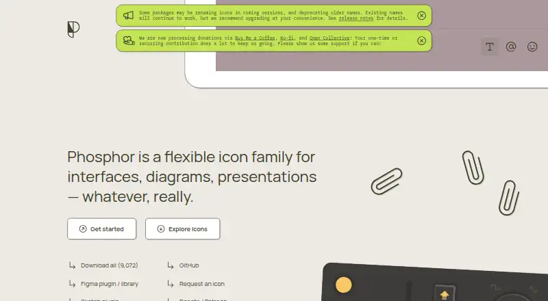
Phosphor Icons is a free, MIT-licensed icon family for interfaces, diagrams, and presentations. Its catalog contains 1,248 icons and continues to grow, with Thin, Light, Regular, Bold, Fill, and Duotone weights. Icons are drawn at 16 × 16 pixels for readability at small sizes and scaling, while source files retain stroke information for style adjustments. The project supplies SVG files, an icon font, and webfont assets. Packages and components are listed for vanilla JavaScript, web, React, Vue, Flutter, Elm, SwiftUI, and Web Components, with plugins for Figma, Penpot, and Sketch. React components support tree-shaking, configurable color, size, weight, mirroring, and alt text. The vanilla web package maps glyphs through Unicode Private Use Area codes and supports loading selected weights with CSS styling. Loading all six web weights uses around 3 MB of fonts and CSS. Commercial use is allowed under the MIT license.
Who it suits
It suits designers and developers building interfaces, diagrams, or presentations who need customizable icons across web frameworks and design tools. It also fits projects that require an open-source license and commercial use.
What it does well
- Free plan and MIT license
- 1,248 icons across six weights
- SVG, icon font, and framework packages
- React tree-shaking reduces included icons
- Plugins for Figma, Penpot, and Sketch
What to know first
- All six web weights use around 3 MB
- Web package is listed for web use
- No free trial is offered
Verdict
Phosphor Icons combines a large, multi-weight catalog with SVG, font, framework, and design-tool options. Its tree-shaking and selectable web weights help control bundles, while loading every weight can affect page-load size.
Facts from Phosphor Icons's own pages
- Asset formats
- The project provides individual SVG assets and an icon font. · github.com, 4 Oct 2026
- Bundle-size consideration
- The web package documentation says loading all six weights brings in around 3 MB of fonts and CSS and may affect page load speed. · github.com, 4 Oct 2026
- Creators and contact
- The official homepage credits Helena Zhang and Tobias Fried as creators and lists [email protected] as a contact email. · phosphoricons.com, 4 Oct 2026
- Design
- The icons are designed at 16 × 16 pixels, and raw stroke information is retained for style adjustments. · github.com, 4 Oct 2026
- Design integrations
- The maker lists plugins for Figma, Penpot, and Sketch. · github.com, 4 Oct 2026
- Developer libraries
- The project lists packages for React, Vue, Flutter, Elm, SwiftUI, vanilla JavaScript, and Web Components. · github.com, 4 Oct 2026
- Figma plugin
- The Figma plugin lets users browse, search, and copy icons into a project. · github.com, 4 Oct 2026
- Frameworks
- The maker lists web, React, Vue, Flutter, Elm, and other frameworks and platforms. · github.com, 4 Oct 2026
- Free and open source
- Phosphor says it is free and open-source, licensed under MIT. · phosphoricons.com, 4 Oct 2026
- Icon catalog
- The maker’s repository describes the family as having 1,248 icons and counting. · github.com, 4 Oct 2026
- Icon styles
- The icon family includes six weights: thin, light, regular, bold, fill, and duotone. · github.com, 4 Oct 2026
- License
- The maker’s repository identifies Phosphor Icons as MIT licensed. · github.com, 4 Oct 2026
- Product
- Phosphor is an icon family for interfaces, diagrams, and presentations. · github.com, 4 Oct 2026
- Purpose
- Phosphor describes itself as a flexible icon family for interfaces, diagrams, and presentations. · phosphoricons.com, 4 Oct 2026
- React optimization
- The React package supports tree-shaking so bundles can include only the icons used. · github.com, 4 Oct 2026
- React package
- The React package supports tree-shaking so a bundle includes only the icons used. · github.com, 4 Oct 2026
- React styling
- React icon components support SVG props and configurable color, size, weight, mirroring, and alt text. · github.com, 4 Oct 2026
- Stroke editing
- The source retains raw stroke information for further style adjustments. · github.com, 4 Oct 2026
- Styles
- Icons are available in six weights: Thin, Light, Regular, Bold, Fill, and Duotone. · github.com, 4 Oct 2026
- Web implementation
- The web package supports loading selected icon weights and styling icons with CSS. · github.com, 4 Oct 2026
- Web use
- The vanilla web package provides icons as a webfont mapped through Unicode Private Use Area character codes. · github.com, 4 Oct 2026
Where Phosphor Icons stands on Freedom251
- Icon Libraries#44 of 46