
Octicons
What Octicons is
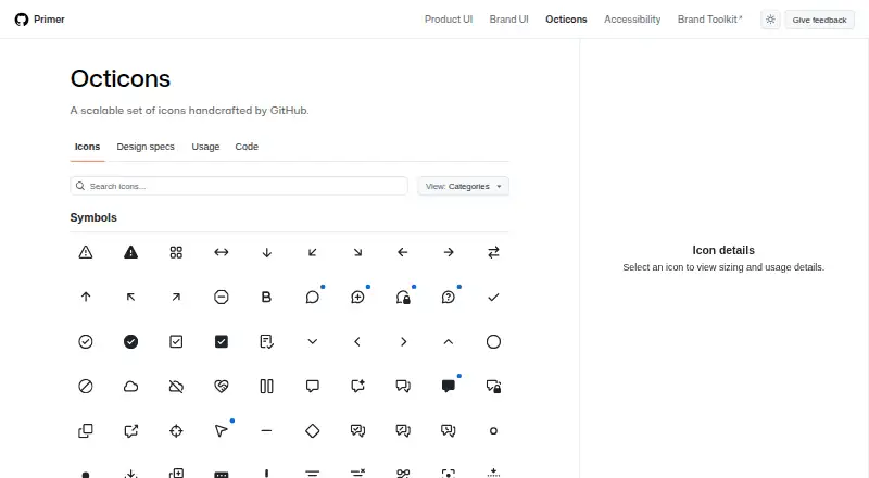
Octicons is a free, scalable icon set handcrafted by GitHub as part of the Primer design system. The library groups icons into Symbols, Objects, Developer, Feed, People, Logos, and other categories, and supplies them as SVGs. Developers can render SVG files manually, install the React package with `npm install @primer/octicons-react`, or use the Primer ViewComponents gem in Rails. The documentation also describes selecting icons by name in Primer’s Octicons library for Figma. Design guidance specifies 16px and 24px versions with a consistent 1.5px stroke, while usage guidance lists 12px and recommends designated sizes. Icons inherit `currentColor` in React and Rails examples, allowing surrounding text and theme colors to control fills. The guide recommends icons for simple, recognizable actions and adding text where possible. Meaningful icons need accessible names, decorative icons should be hidden from screen readers, and non-decorative icons need at least 3:1 contrast. The repository states an MIT license covering the code and other files.
Who it suits
Octicons suits web, React, Rails, SVG, CSS, JavaScript, Ruby, and Figma workflows needing a free icon library. It is useful for teams following Primer’s sizing, color, and accessibility guidance.
What it does well
- Free MIT-licensed icon set
- SVGs can be rendered manually
- React and Rails integrations are documented
- Icons inherit surrounding `currentColor`
- Commercial use is supported
What to know first
- User-selectable icon use is strongly discouraged
- Meaningful icons require accessible names
- Non-decorative icons need 3:1 contrast
- No security policy is detected
Verdict
Octicons provides GitHub’s categorized SVG icon library with documented React, Rails, Figma, and direct-use paths. Its sizing, color, and accessibility guidance helps teams apply the icons consistently across interfaces.
Facts from Octicons's own pages
- Accessibility
- Meaningful icons should have an accessible name, while decorative icons should be hidden from screen readers; non-decorative icons should have at least 3:1 contrast against the background. · primer.style, 9 Oct 2026
- Color
- Icon fills use `currentColor` by default and can adapt to theme colors through CSS variables. · primer.style, 9 Oct 2026
- Color behavior
- React and Rails examples say icons inherit `currentColor` by default so they follow surrounding text and theme colors. · primer.style, 9 Oct 2026
- Design guidance
- The design guidelines specify 16px and 24px versions for each icon and a consistent 1.5px stroke width. · primer.style, 9 Oct 2026
- Design tool integration
- The icon pages document Figma usage by naming the icon in Primer's Octicons library. · primer.style, 9 Oct 2026
- Direct use
- The site says you can obtain SVGs from the primer/octicons repository and render them manually. · primer.style, 9 Oct 2026
- Feedback
- The repository directs users to open an issue for bugs, feedback, or ideas about the Octicon library. · github.com, 9 Oct 2026
- Formats
- Octicons are provided as SVGs. · primer.style, 9 Oct 2026
- Founded
- 2008 · primer.style, 28 Sept 2026
- Headquarters
- San Francisco · primer.style, 28 Sept 2026
- Icon library
- The library groups icons into categories including Symbols, Objects, Developer, Feed, People, and Logos. · primer.style, 9 Oct 2026
- Intended use
- The usage guide recommends icons for simple, recognizable concepts or actions and advises supplementing them with text where possible. · primer.style, 9 Oct 2026
- License
- The repository license page identifies the code license as MIT and grants permission to use, copy, modify, distribute, sublicense, and sell copies subject to its terms. · github.com, 9 Oct 2026
- Maintainer
- Primer says GitHub's Design Infrastructure and Design Engineering teams build and maintain Primer, including Octicons. · primer.style, 9 Oct 2026
- Maker
- The site describes Octicons as handcrafted by GitHub and calls Primer GitHub's design system. · primer.style, 9 Oct 2026
- Other usage
- The documentation says SVGs can be manually rendered in an application, and individual icon pages provide Jekyll examples. · primer.style, 9 Oct 2026
- Rails
- Rails projects can use Octicons through the Primer ViewComponents gem. · primer.style, 9 Oct 2026
- React
- The React package is installed with `npm install @primer/octicons-react`. · primer.style, 9 Oct 2026
- Security
- The repository security page says no security policy is detected and no security advisories are published. · github.com, 9 Oct 2026
- Sizing
- React icons accept a pixel size and default to 16px. · primer.style, 9 Oct 2026
- Support and feedback
- The repository asks users to submit bugs, feedback, ideas, and icon review requests through GitHub issues; icon review requests are limited to GitHub staff. · github.com, 9 Oct 2026
- Use limitation
- The usage guide strongly discourages using Octicons as user-selectable icons because their meanings could be confusing in the wrong context. · primer.style, 9 Oct 2026
- What it is
- Octicons is a scalable set of icons handcrafted by GitHub. · primer.style, 9 Oct 2026
Where Octicons stands on Freedom251
- Icon Libraries#42 of 46