
Adobe Spectrum
What Adobe Spectrum is
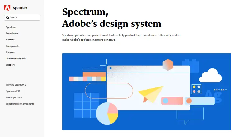
Adobe Spectrum is Adobe’s design system for creating consistent experiences across Adobe products and platforms. It brings together foundations, design tokens, patterns, components, and guidance in a shared system. Tokens capture reusable choices for color, spacing, typography, motion, and sizing, and can adapt to platform requirements while preserving a common design language.
Component pages include interactive playgrounds for viewing components and exploring their properties and attributes. The playgrounds use component data connected to Spectrum repositories. Spectrum Hub also provides foundational material and guidance for component design and implementation. Its design principles are rational, human, focused, and collaborative, with attention to inclusion and accessibility. Color guidance recommends accessible colors, meeting WCAG contrast minimums, and pairing color with a label or icon so color alone does not carry meaning. Typography guidance covers consistent styles and behaviors, including text scaling with accessibility preferences on iOS and Android.
Spectrum is free and open source. Dedicated React and Web Components areas are available in beta; iOS, Android, and other platform resources are planned for future additions. The September 30, 2026 release describes Spectrum Hub as its first release, with mobile documentation and unified experience guidance planned later. The site offers contact options for feedback, bug reports, and general inquiries.
Who it suits
Spectrum suits teams creating experiences for Adobe products and platforms who want shared design foundations, reusable tokens, components, and guidance. It also serves designers and developers who want to explore component properties in interactive playgrounds or consult accessibility and typography guidance.
What it does well
- Free and open source.
- Provides reusable tokens for color, spacing, typography, motion, and sizing.
- Interactive component playgrounds expose properties and attributes.
- Color guidance includes accessibility and WCAG contrast minimums.
- Hub offers foundational and implementation guidance.
What to know first
- React and Web Components areas are in beta.
- Mobile documentation is planned for a future release.
- iOS, Android, and other platform areas are still coming soon.
Limits
The React and Web Components areas are in beta. Mobile documentation and unified experience guidance are planned for future releases.
Getting started
- Visit the Adobe Spectrum website.
- Open Spectrum Hub for foundational and component guidance.
- Explore component pages and their interactive playgrounds.
- Use the React or Web Components areas, which are available in beta.
Verdict
Choose Adobe Spectrum if you need a shared design system with reusable foundations, component guidance, and live playgrounds. Its free, open-source access and accessibility guidance suit teams building consistent experiences. Teams needing complete mobile documentation should account for those resources being planned for future releases.
Questions
What is Adobe Spectrum?
It is Adobe’s design system: a shared foundation and language for creating experiences across Adobe products and platforms.
Does Spectrum cost anything?
Spectrum is listed as free and open source.
Which implementations are available?
Dedicated React and Web Components areas are available in beta. iOS, Android, and other platform areas are described as coming soon.
What accessibility guidance does it provide?
Its color guidance recommends accessible colors, meeting WCAG contrast minimums, and adding a label or icon so color is not the only signal. Its iOS and Android typography guidance describes text scaling with accessibility preferences.
What can I explore in the component playgrounds?
The playgrounds let you view components and explore their properties and attributes using component data connected to Spectrum repositories.
Who makes Spectrum?
Adobe makes Spectrum for use across Adobe products and platforms.
Facts from Adobe Spectrum's own pages
- Accessibility
- Spectrum’s color system is designed around visual perception, inclusive design, and accessibility. · spectrum.adobe.com, 3 Oct 2026
- Accessibility guidance
- Spectrum’s color guidance says its colors are chosen to support accessible experiences and recommends meeting WCAG contrast minimums. · spectrum.adobe.com, 3 Oct 2026
- Available implementations
- The site says dedicated React and Web Components areas are available in beta; iOS, Android, and additional platforms are coming soon. · spectrum.adobe.com, 3 Oct 2026
- Building blocks
- Spectrum provides foundations, tokens, patterns, and guidance for building consistent, flexible experiences. · spectrum.adobe.com, 3 Oct 2026
- Color guidance
- Spectrum advises using its defined colors and providing a label or icon so color is not the only way to communicate meaning. · spectrum.adobe.com, 3 Oct 2026
- Component playgrounds
- Component pages include interactive playgrounds for viewing components and exploring their properties and attributes. · spectrum.adobe.com, 3 Oct 2026
- Components
- Spectrum component pages include interactive playgrounds for exploring live components and their props and attributes. · spectrum.adobe.com, 3 Oct 2026
- Current implementations
- Dedicated areas for React and Web Components are available in beta. · spectrum.adobe.com, 3 Oct 2026
- Current scope
- The September 30, 2026 release describes Spectrum Hub as a first release and says mobile documentation and other resources are future additions. · spectrum.adobe.com, 3 Oct 2026
- Design data
- Spectrum uses design tokens as reusable design decisions that can adapt to platform requirements while maintaining a shared design language. · spectrum.adobe.com, 3 Oct 2026
- Design principles
- Spectrum’s stated principles are rational, human, focused, and collaborative, with an emphasis on inclusivity and accessibility. · spectrum.adobe.com, 3 Oct 2026
- Design tokens
- Spectrum tokens represent reusable design decisions such as color, spacing, typography, motion, and sizing. · spectrum.adobe.com, 3 Oct 2026
- Documentation connection
- The component playgrounds connect to Spectrum repositories and use real component data in the documentation. · spectrum.adobe.com, 3 Oct 2026
- Hub resources
- Spectrum Hub provides foundational guidance, component design and implementation guidance, and live component playgrounds. · spectrum.adobe.com, 3 Oct 2026
- Notable limitation
- The September 2026 release notes say mobile documentation and unified experience guidance are planned for future releases. · spectrum.adobe.com, 3 Oct 2026
- Platforms in progress
- The site says iOS, Android, and additional platforms are coming soon. · spectrum.adobe.com, 3 Oct 2026
- Purpose
- Spectrum is Adobe’s design system, described as a shared language that brings structure and connection across Adobe products. · spectrum.adobe.com, 3 Oct 2026
- Support
- Spectrum Hub offers contact options for feedback, bug reports, and general inquiries. · spectrum.adobe.com, 3 Oct 2026
- Typography
- Spectrum typography defines styles and behaviors for consistent typography across products and platforms, and its iOS and Android guidance describes text scaling with accessibility preferences. · spectrum.adobe.com, 3 Oct 2026
- What it is
- Spectrum is Adobe’s design system, a shared foundation and language for creating experiences across Adobe products and platforms. · spectrum.adobe.com, 3 Oct 2026
- What it provides
- Spectrum includes foundations, tokens, patterns, components, and guidance for building consistent and flexible experiences. · spectrum.adobe.com, 3 Oct 2026
Where Adobe Spectrum stands on Freedom251
- UI Kit Libraries#20 of 26