Recommended Free Tools
On the web, a high-resolution image is one with enough actual pixels to look sharp at the size it is displayed on the screen. There is no single pixel count, DPI setting, or file-size threshold that makes an image “high resolution” for every page. Choose image dimensions for the image’s rendered size and the display density you need to support, then offer responsive alternatives so visitors do not have to download more pixels than the layout needs.
What “high resolution” means on a web page
For a web image, resolution is best understood as the amount of pixel detail available relative to the image’s displayed size. A source image’s intrinsic pixel dimensions matter, but so does how many CSS pixels wide and tall the browser displays it. A large source can look sharp when reduced, but that does not make it a sensible choice for every visitor or layout.
For example, if an image is displayed 300 CSS pixels wide, a 600-pixel-wide source provides twice as many source pixels across that displayed width. That can supply detail for a display with two device pixels per CSS pixel. It is an example of a 2x candidate, not a universal upload requirement: the right source depends on the actual layout and target display.
“High resolution” therefore is not a fixed web standard. A width that is sufficient for a small thumbnail may be inadequate for a large hero image. Conversely, sending a very large image to a small display can waste data without a useful visible gain.
Windows Errors? Fix Them Before They Spread
Repair common Windows errors and clear accumulated junk for a smoother, more stable PC - no reinstall needed.Free scan · no reinstallCrashes, No Sound, or Screen Glitches?
Random freezes, missing sound and display glitches usually trace back to one bad driver. Find and replace yours safely.Free scan · under a minute#1 Best Overall

- Improved ComfortView Plus: Reduces harmful blue light emissions to ≤35%, for all-day comfort without sacrificing color accuracy.
- Refresh rate: A smooth, tear-free experience with AMD FreeSync Premium (refresh rate up to 120Hz) and an ultra-low 0.03ms response time create a captivating experience for work and play.
- Vivid colors: Immerse yourself in breathtaking 4K visuals with in-plane switching technology. Enjoy vibrant colors with 99% sRGB. The 1500:1 contrast ratio and HDR readiness deliver excellent depth and detail.
- Re-engineered sound quality: Enjoy more detailed sound with spacious audio featuring greater output power, deeper frequency response and more decibel range than the previous generation.
- Ultra-thin bezel: Designed with a sleek, modern aesthetic and an ash white finish, this display features ultra-thin bezels for a refined, minimalist design.
How to choose image dimensions
Start with the rendered size
Work out how wide and tall the image appears in the page layout, including how those dimensions change between narrow and wide screens. Do not choose a source width in isolation from that layout. If an image is only ever displayed at a small size, a source many times wider than necessary may add download weight without serving the page’s visual needs.
Account for display density
A display’s device pixel ratio describes how many device pixels correspond to one CSS pixel. A 2x source has twice the pixel width and height of a 1x source for the same displayed CSS size. If an image is 300 CSS pixels wide, for instance, a 600-pixel-wide file can be offered for a 2x display. The browser can select among density candidates according to the available choices and conditions.
Balance detail against transfer size
More source pixels can preserve detail, but larger files can use more of a visitor’s data. Decide whether the additional detail is useful for the image’s role, then provide appropriately sized alternatives rather than treating the largest possible file as the default for everyone. The browser retains discretion when selecting a responsive candidate, including consideration of user conditions such as bandwidth.
Rank #2

- 4K UHD with 1000:1 Contrast Ratio - This UltraFine display with a 1000:1 contrast ratio displays deeper blacks and vivid colors in UHD clarity. With wide viewing angles, it gives creative professionals the ability to view and work with highly-detailed, digital imagery.
- 4K HDR10 DCI-P3 - Explore HDR10 content the way it was meant to be seen with up to 90% DCI-P3 color gamut expression—an elevated color spectrum that brings brilliant color to life.
- Onscreen Control - You can customize the workspace by splitting the display or adjusting basic monitor options with just a few mouse clicks.
- Ergonomic Stand - The ergonomic stand makes it easy to flexibly adjust the tilt of the screen in the optimal position for you.
- What's In The Box - Stand Body, Stand Base, Screws, Power Adapter, HDMI Cable, Quick Start Guide, Registration Card, Warranty.
| What to check | Question to answer | Why it matters |
|---|---|---|
| Rendered dimensions | How large will the image appear in the actual layout? | The required source size depends on the displayed size. |
| Display density | Should the image support a display with more than one device pixel per CSS pixel? | A higher-density candidate can supply more detail at the same CSS size. |
| Transfer size | Are the extra pixels useful enough to justify the extra bytes? | Oversized sources can waste data. |
| Composition | Should narrow and wide layouts show the same crop? | If not, an alternate crop may be needed, rather than merely a different size. |
| Format and delivery | Does the format support the image’s needs and target browsers? | There is no single format that is best for every use. |
| Accessibility and layout | Does the image have suitable alternative text and known dimensions? | Alt text communicates meaning; dimensions help reserve layout space. |
Serve the right image with srcset and sizes
HTML’s srcset lets you offer several candidates. Use density descriptors such as 1x and 2x when the displayed size is fixed and the same image composition is appropriate at each density. Use width descriptors such as 600w when the image can be displayed at different widths. With width descriptors, add sizes to describe the expected rendered width under the page’s layout conditions, so the browser can make an informed choice.
Quick wins for a faster PC:
Clear out junk files and repair common Windows errorsFree Scan →Fix the driver behind crashes, sound loss and screen glitchesFind Drivers →Repair Windows errors before they cause bigger problemsFix Now →Do not mix width and density descriptors in a single srcset. Keep a valid src fallback. These examples illustrate the two approaches; change the file paths, dimensions, and layout description to match the images and page you actually serve.
Fixed displayed size: density candidates
<img
  src="/images/product-300.jpg"
  srcset="/images/product-300.jpg 1x, /images/product-600.jpg 2x"
  width="300"
  height="200"
  alt="A blue ceramic mug on a wooden table">
Here the image is given a 300-by-200 CSS-pixel size. The 600-pixel-wide candidate supplies twice the source width for a 2x display. The example does not mean that every 300-pixel image needs a 600-pixel file; assess the required detail and transfer cost for the image and audience.
Rank #3
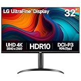
- Master Every Pixel - Bring every detail to life with LG’s UltraFine 32” 4K UHD HDR display. Whether you’re editing, streaming, or multitasking, the expansive screen and rich color deliver clarity you can count on.
- Color Your World in 4K and HDR Content - Stream in stunning detail with the LG UltraFine 4K display. HDR technology delivers vibrant brightness and rich contrast, supporting up to 90% of the DCI-P3 color space for vivid, lifelike visuals that elevate every scene.
- Immersive Visuals for Tactical Edge - Game in crisp 4K UHD with rich visuals and immersive audio powered by Waves MaxxAudio. With gaming features such as Dynamic Action Sync and Black Stabilizer, you’ll react faster and spot enemies in the shadows—so you’re always one step ahead.
- Dynamic Action Sync - Don’t miss a beat. Dynamic Action Sync helps you spot the action and strike fast by reducing input lag and boosting responsiveness.
- Never in the Dark with Black Stabilzer - Never get caught off guard. Black Stabilizer enhances visibility in low-light scenes so you can spot threats before they see you.
Flexible displayed width: width candidates and sizes
<img
  src="/images/article-600.jpg"
  srcset="/images/article-600.jpg 600w,
          /images/article-1200.jpg 1200w"
  sizes="(max-width: 600px) 100vw, 600px"
  width="1200"
  height="800"
  alt="A hiker looking across a mountain valley">
The w value describes each candidate’s intrinsic source width in pixels. The sizes value here says the image is expected to use the viewport width up to 600 pixels, and 600 CSS pixels beyond that. It must reflect the real layout; if the image occupies a different share of the viewport, adjust the description. The browser chooses among candidates rather than being forced to use a particular one.
When to use art direction instead of another size
Resolution switching gives the browser different pixel sizes of essentially the same image and crop. Art direction changes the image composition for a layout. A wide landscape may work on desktop, while a tighter portrait crop keeps a subject visible on a narrow screen. Merely sending a larger version of the landscape does not solve a cropping problem.
Do these 3 things before closing this tab:
1Scan for outdated or missing drivers - takes under a minute2Repair Windows errors before they cause bigger problems3Fix the driver behind crashes, sound loss and screen glitchesUse <picture> when the page needs alternate compositions at different layout conditions. Use srcset candidates for resolution or width choices when the same scene and crop should remain visible. Keep the distinction clear: one addresses how many pixels are available; the other addresses what the image shows.
Rank #4

- Improved ComfortView Plus: Reduces harmful blue light emissions to ≤35%, for all-day comfort without sacrificing color accuracy.
- Refresh rate: A smooth, tear-free experience with AMD FreeSync Premium (refresh rate up to 120Hz) and an ultra-low 0.03ms response time create a captivating experience for work and play.
- Vivid colors: Immerse yourself in 4K visuals with a VA panel. Enjoy true-to-life colors with 99% sRGB and 95% DCI-P3 coverage. The 1500:1 contrast ratio and HDR readiness deliver excellent depth and detail.
- Re-engineered sound quality: Enjoy more detailed sound with spacious audio featuring greater output power, deeper frequency response and more decibel range than the previous generation.
- Ultra-thin bezel: Designed with a sleek, modern aesthetic and an ash white finish, this display features ultra-thin bezels for a refined, minimalist design.
Dimensions, alt text, and loading behavior
- Set width and height when known. These let the browser reserve space before the image loads and help prevent content from shifting.
- Write useful alt text for informative images. Describe the image’s relevant meaning or content, not merely that it is an image.
- Use an empty alt value for decorative images. Mark a purely decorative image with
alt="". - Lazy-load appropriate below-the-fold images. Do not lazy-load a hero image that is already above the fold; delaying it can postpone its display.
Pixel dimensions alone do not establish whether an image is accessible or whether the page will load smoothly. Treat alternative text, layout reservation, and loading behavior as part of the implementation rather than as properties supplied by a high-resolution file.
What DPI or PPI means for web images
Do not use a DPI or PPI value embedded in an image as a universal web sharpness setting. For web display, the practical questions are how many source pixels the image contains, how large it is laid out in CSS pixels, and what display density the chosen candidate needs to serve. A metadata number by itself does not establish the right source dimensions for a page.
A practical workflow for preparing responsive images
- Measure the layout. Identify the image’s rendered width and height at the screen sizes your design supports.
- Decide whether the crop changes. If it does, prepare alternate compositions for art direction. If it does not, prepare size or density variants of the same image.
- Choose candidate dimensions. Make candidates that cover the layout’s real needs, including higher-density displays where that added detail is worthwhile.
- Write responsive markup. Use density descriptors for fixed-size images, or width descriptors and a matching
sizesvalue for flexible images. Keep the descriptor types separate and include a usablesrc. - Add page behavior and accessibility details. Provide width and height, meaningful or empty alt text as appropriate, and lazy loading only for suitable below-the-fold content.
- Review the result at the actual display sizes. Check sharpness, crop, and whether the page is delivering an unnecessarily large candidate for the layout.
Common mistakes and how to fix them
- Using one enormous file everywhere: Offer responsive candidates instead, so the browser can choose an appropriate source rather than making every visitor download the largest one.
- Picking a pixel width without checking the layout: Determine the rendered dimensions first; the same source can be ample for a thumbnail and insufficient for a larger display.
- Assuming “2x” means twice the file size: It means twice the pixel width and height for the same displayed CSS size. File size depends on the image and encoding, so do not infer a byte count from the descriptor.
- Writing width candidates without sizes: Add
sizesto describe expected rendered width when usingwdescriptors. - Mixing descriptor types: Use either density descriptors or width descriptors in a given
srcset, not both. - Trying to fix a bad mobile crop with more pixels: Use an alternate composition when a narrow screen needs a different crop.
- Leaving dimensions or alt text out: Add dimensions when known to reserve space; provide informative alt text or an empty value for decoration.
- Lazy-loading the first-screen hero: Avoid delaying an image that is already above the fold; reserve lazy loading for appropriate below-the-fold images.
Check how the page actually renders
Responsive markup should be reviewed in the context of the page layout: candidate files, breakpoints, crop, and display density all affect the result. A screenshot can help you inspect a page at a chosen viewport, but it does not by itself tell you the intrinsic pixel dimensions of an image or prove which candidate the browser selected. For that, inspect the page’s image markup and browser behavior as well.
Best Value

- Low blue light: The improved ComfortView Plus reduces harmful blue light emissions to ≤35%, for all-day comfort without sacrificing color accuracy.
- Refresh rate: A smooth, tear-free experience with AMD FreeSync Premium (refresh rate up to 120Hz) and an ultra-low 0.03ms response time create a captivating experience for work and play.
- Vivid colors: Immerse yourself in breathtaking 4K visuals with in-plane switching technology. Enjoy vibrant colors with 99% sRGB. The 1500:1 contrast ratio and HDR readiness deliver excellent depth and detail.
- Re-engineered sound quality: Enjoy more detailed sound with spacious audio featuring greater output power, deeper frequency response and more decibel range than the previous generation.
- Easy connectivity: Keep your desk organized and clutter-free with a single USB-C cable (up to 65W power delivery).
Or skip the browser setup
ScreenshotNeo can capture a page through one GET request, with viewport and other capture options available through its API documentation. Use it as a visual check of the rendered page, not as a substitute for checking responsive image selection.
curl -G "https://api.screenshotneo.com/v1/shot" -d access_key=YOUR_API_KEY --data-urlencode url=https://example.com -o shot.webpScreenshotNeo removes supported cookie banners, newsletter popups, and chat widgets before capture; each of those steps can be turned off. Bot checks, blank pages, failed loads, timeouts, and cache hits are not billed, and response headers report the page verdict and billing status. Its MCP server offers screenshot tools to AI agents, and the free plan includes 1,000 screenshots a month with no card; paid plans start at $5 for 3,000 screenshots. Learn about ScreenshotNeo or sign up for 1,000 free screenshots a month with no card.
Bottom line
Choose web image sources by matching actual pixel dimensions to rendered size and display density, not by chasing a universal resolution number. Use responsive candidates to balance sharpness against transfer size, change the crop when the composition needs to change, and provide dimensions and appropriate alt text as part of the markup.
Quick Recap
Product prices and availability are accurate as of the date/time indicated and are subject to change. Any price and availability information displayed on Amazon at the time of purchase will apply.

