Quick wins for a faster PC:
Clear out junk files and repair common Windows errorsFree Scan →Scan for outdated or missing drivers - takes under a minuteDriver Scan →Repair Windows errors before they cause bigger problemsFix Now →For a narrow Shopify banner, start with 1200 × 400 pixels on desktop and 360 × 120 pixels on mobile. That is a 3:1 ratio. A large homepage hero uses a different composition: 1600 × 500 pixels for desktop and 800 × 1200 pixels for mobile. Choose between these sets according to the section you are filling, then confirm the active theme’s crop, height and focal-point settings before exporting final artwork.
The correct Shopify banner dimensions at a glance
| Section or purpose | Desktop source | Mobile source | How to use it |
|---|---|---|---|
| Narrow promotional website banner | 1200 × 400 px | 360 × 120 px | 3:1 strip for announcements, promotions or compact collection headers. |
| Full hero or image-banner section | 1600 × 500 px | 800 × 1200 px | Use when the image occupies substantial above-the-fold space and carries a heading or call to action. |
| Maximum upload object | Up to 5000 × 5000 px and 20 MB | Shopify’s upload ceiling, not a recommended delivery size. | |
The two desktop recommendations solve different layout problems. A 1200 × 400 image is intentionally shallow; a 1600 × 500 hero has more room for visual storytelling. Do not stretch one into the other without checking how the section crops it.
Decide which section you are designing
Use 1200 × 400 px for a narrow banner
Choose the 3:1 canvas for a thin strip below a header, an announcement area, a promotional ribbon or a compact collection banner. Keep the product, logo and headline inside the central safe area because side edges are the first parts to disappear when a theme trims the image.
Use 1600 × 500 px for a wide desktop hero
This format suits a prominent homepage image-banner section with overlaid copy and a button. It gives desktop layouts more horizontal breathing room while remaining shallow enough to keep the next section visible.
Do these 3 things before closing this tab:
1Repair Windows errors before they cause bigger problems2Fix the driver behind crashes, sound loss and screen glitches3Clear out junk files and repair common Windows errorsUse 800 × 1200 px for a mobile hero crop
The portrait composition is deliberate, not a resized desktop file. A phone viewport is tall and narrow, so a separate crop lets you keep the subject, headline-safe area and product visible without shrinking everything into an unreadable strip.


Why your theme can change the visible result
Image dimensions describe the source file; the theme controls the rendered window. Shopify’s Dawn reference theme changes image-banner behavior around a 750 px breakpoint, calculates responsive section padding from the uploaded image ratio, creates multiple candidate widths and can accept a second image for mobile stacking or art direction. Theme updates and third-party sections can use different rules.
In the theme editor, open Online Store → Themes → Customize, select the page containing the banner, and open its image-banner or hero section. Check the image-height option, whether height adapts to the image ratio, the focal-point control and whether a dedicated mobile image is available. A fixed-height setting can crop a correctly sized file; an adapt-to-image setting generally preserves more of its ratio but may change how much content appears above the fold.
Build artwork that survives desktop and phone crops
Keep critical content in a safe area
Place logos, faces, product packs, prices and calls to action near the visual center or in a region that remains visible in both the 3:1 desktop treatment and the taller mobile treatment. Leave extra breathing room around text so an overlaid button does not collide with a subject after cropping.
Use art direction when the subject cannot fit both ratios
If a desktop landscape composition cuts off the product or makes the mobile version unreadable, prepare two files: one at 1600 × 500 for the hero desktop slot and another at 800 × 1200 for phones. Select the mobile file in the section when the theme supports it. Do not force a desktop landscape into a portrait slot by merely changing its pixel dimensions; that distorts the image or moves the important content outside the crop.
#1 Best Overall
Set the focal point deliberately
When the section offers a focal-point or position control, set it on the subject rather than leaving it at a default corner. Recheck the setting after replacing the image, because a new composition may require a different focal point.
Prepare and export the files
- Identify the exact theme section and whether it has separate desktop and mobile image fields.
- Create the canvas at the section’s intended ratio: 3:1 for a narrow banner, 1600 × 500 for a desktop hero, or 800 × 1200 for its mobile art direction.
- Place text and logos inside the safe area, then preview the artwork at both wide and narrow widths.
- Export a compressed WebP or JPEG when transparency is unnecessary. Use PNG only when you need lossless edges or transparency.
- Upload through the section settings, save, and inspect the published page rather than relying only on the editor preview.
Shopify accepts files up to 5000 × 5000 pixels and 20 MB, but uploading at that ceiling for every visitor wastes bandwidth. Export a source large enough for the largest display you actually support, compress it, and let responsive delivery select smaller variants.
Serve responsive images instead of one oversized file
Shopify’s developer guidance recommends its image_tag approach because it can emit intrinsic dimensions plus responsive srcset and sizes values. The browser can then request an appropriate candidate for the visitor’s viewport instead of downloading the largest source for every device.
The Tool Desk
Outbyte Driver Updater FREEScan for outdated or missing drivers - takes under a minuteDriver Scan →Outbyte PC Repair FREEClear out junk files and repair common Windows errorsFree Scan →Rank #2

- 【Complete Book Club Banner Set】You will receive 1 book banner with letters spelling 'BOOK CLUB', 1 plastic needle and a 5m rope. The book club decor creates a peaceful and beautiful atmosphere for reading and studying.
- 【Reliable Material】The book club decorations is made of premium cardboard, which is lightweight and sturdy, ensuring that it retains its luxurious look and shape throughout the party.
- 【Easy to Install】Designed with user convenience in mind, the book themed party decorations require minimal setup time. The included plastic needle easily threads through pre-punched holes on each card, while the 5m rope accommodates various hanging spaces.
- 【Vintage Design】The distressed typography and classic book stack graphics evoke a cozy, old-library feel. The eye catching graphics add a fun and festive touch to your reading events, making your event stand out from ordinary party decor.
- 【Wide Application】Book club banner can be widely used to decorate book themed party, book lover party, newspaper birthday party, library themed party, girls night party, book reading theme party and so on.
{% assign banner = section.settings.image %}
{{ banner | image_url: width: 1600 | image_tag:
  widths: '360, 540, 750, 1000, 1200, 1600',
  sizes: '100vw',
  loading: 'eager',
  fetchpriority: 'high',
  alt: section.settings.heading }}
Use the equivalent controls exposed by your theme rather than replacing a theme’s entire section blindly. For a mobile art-directed crop, a picture pattern can select the portrait source at a narrow media condition while retaining the desktop source as the fallback. Test that only the needed candidate is downloaded and that the image has intrinsic dimensions so the layout does not jump while it loads.
Check the banner on the live storefront
- Publish or preview the theme and open the actual page URL.
- Inspect a wide desktop viewport, then test a narrow phone viewport in browser developer tools.
- Check intermediate widths around the theme’s breakpoint, including approximately 750 pixels for Dawn-based sections.
- Confirm that the headline, CTA, logo and product remain visible, and that the image is not stretched.
- Use a real phone or tablet when possible; browser emulation cannot reproduce every browser toolbar, pixel ratio or safe-area inset.
Look for three separate problems: the source itself may be the wrong ratio, the section may be applying a fixed crop, or the mobile layout may be using the desktop file when it needs a dedicated image.
Performance and loading considerations
- Keep the hero source large enough for its maximum display but avoid treating the 5000-pixel upload ceiling as a target.
- Compress photographic banners and remove metadata that is not needed for the storefront.
- Use responsive
srcset/sizesoutput so phones do not fetch desktop-sized assets. - Reserve the image’s rendered space with intrinsic dimensions to reduce layout shift.
- Load the above-the-fold hero with appropriate priority, but avoid marking several below-the-fold banners as eager.
- When the composition changes between desktop and mobile, use art-directed sources rather than sending two hero-sized images and hiding one with CSS.
Troubleshooting common Shopify banner problems
“My 1200 × 400 image looks zoomed in.”
The section is probably using a fixed height or a different aspect ratio. Switch to an image-height option that adapts to the image, adjust the focal point, or create artwork for the section’s actual ratio.
Rank #3

- Book Party Decorations: Package include 1 x vintage book club banner. The book club banner comes pre-assembled for quick and easy hanging, effortlessly decorating your reading-themed event or party.
- Durable Material: Book themed party decorations bunting is made of high quality burlap material, which is thick, not easy to tear, and durable.
- Widely Use: Book club banner is suitable for hanging on desks, walls, windows, and other indoor or outdoor surfaces, adding a decorative highlight to your book themed party.
- Book Themed Party Decorations: Perfect for decorating book themed party, book lover party, book themed birthday party, library themed party, book reading theme party, school reading event and so on.
- If there are any questions about our book themed banner, please contact us and we will get back to you within 24 hours.
“The desktop banner is fine, but the phone cuts off the product.”
Desktop and mobile are using incompatible compositions. Add the section’s dedicated mobile image, export an 800 × 1200 portrait crop for a full hero, and position the subject inside the mobile safe area.
What’s actually slowing this PC down?
Pick the symptom - the matching free tool is one click away.
“Text is unreadable after I upload the image.”
Move copy away from high-detail regions, add a contrast overlay supplied by the theme, or place text in the section’s text block rather than baking it into the bitmap. Text embedded in the image cannot reflow for different widths.
“The banner pushes content down while loading.”
Ensure the rendered image has intrinsic width and height, or use the theme’s image component that emits them automatically. Missing dimensions allow the browser to recalculate the layout after the file arrives.
“The storefront is slow even though the banner dimensions are correct.”
Dimensions do not control file weight. Re-export a compressed image, verify that responsive candidates are present, and check the network panel to make sure a phone is not downloading the desktop maximum.
“The editor preview and published page do not match.”
Inspect the live URL at the same viewport width. App blocks, browser zoom, sticky headers and cached theme assets can change the available height. Clear the preview state, republish the current theme and test again.
PC Slower Than It Used to Be?
A free scan shows the junk files, broken settings and background clutter dragging Windows down - then fixes them in one click.Free scan · Windows 10 & 11Crashes, No Sound, or Screen Glitches?
Random freezes, missing sound and display glitches usually trace back to one bad driver. Find and replace yours safely.Free scan · under a minuteOr skip the browser setup
If you need repeatable screenshots of the live Shopify page at desktop or mobile sizes, ScreenshotNeo returns a PNG, JPEG, WebP or PDF from one request. Before capture it accepts the cookie or consent banner like a visitor and removes more than 60 known consent platforms, newsletter popups and chat widgets; each cleanup step can be turned off. Bot checks, CAPTCHAs, blank pages, timeouts, failed loads and cache hits are not billed, and the response identifies the result with X-Page-Verdict and X-Billed headers.
Use the API documentation at https://screenshotneo.com/docs/ for all options, including viewport and device presets, full-page capture, custom CSS or JavaScript, waiting for selectors or network idle, cookies and headers, geolocation, dark mode, PDF output, caching and asynchronous jobs.
cURL
curl -G "https://api.screenshotneo.com/v1/shot" -d access_key=YOUR_API_KEY --data-urlencode url=https://www.shopify.com -o shot.webpPython
import requests
r = requests.get("https://api.screenshotneo.com/v1/shot", params={"access_key": "YOUR_API_KEY", "url": "https://www.shopify.com"}, timeout=90)
open("shot.webp", "wb").write(r.content)
Node.js
const q = new URLSearchParams({ access_key: 'YOUR_API_KEY', url: 'https://www.shopify.com' });
const res = await fetch(`https://api.screenshotneo.com/v1/shot?${q}`);
The free plan includes 1,000 screenshots a month with no card. Paid plans start at $5 for 3,000 screenshots, and every feature is available on every plan. Create a free ScreenshotNeo account to check your published banner at the widths you design for.
FAQ
Should banner text be part of the image file?
Usually no. Keep headings and buttons in Shopify’s section content so they remain selectable, accessible and adaptable. Bake text into the image only when the design specifically requires a fixed graphic treatment.
Best Value
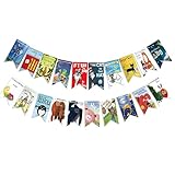
- Colorful and Engaging Design: This classic children's book banner features bright illustrations and storybook themes that add fun and charm to any space
- Perfect for Any Occasion: Great for classrooms, birthday parties, reading corners, and fiesta party decorations—creates a cheerful and inviting atmosphere
- Inspires a Love of Reading: Ideal for teachers and parents who want to encourage imagination and promote reading through creative and fun classroom decor
- Easy to Hang and Display: This lightweight banner decoration is simple to hang on walls, bulletin boards, or doorways—perfect as part of your school supplies setup
- Versatile Use for All Spaces: Use it for reading events, learning themes, libraries, or at home—this banner brings joy and literary flair to any setting
Is a 3:1 ratio suitable for every Shopify theme?
No. It is Shopify’s starting point for a narrow banner. A theme can impose its own height, crop mode or mobile behavior, so the section settings remain the final authority.
What should I do when my theme has no mobile-image field?
Design a composition whose subject survives both widths, or modify the section to support art direction. Avoid relying on CSS alone to turn a landscape hero into a readable portrait.
Does a larger pixel file make the banner sharper?
Only until the display reaches the file’s effective resolution. Beyond that, extra pixels increase download cost without improving visible detail; responsive variants are more useful than serving one maximum-size image.
Quick Recap
The Bottom Line
Use 1200 × 400 px for a narrow Shopify banner, 1600 × 500 px for a desktop hero and 800 × 1200 px for a dedicated mobile hero crop. Verify the active theme’s crop and focal-point settings, then deliver compressed responsive variants instead of the upload maximum.
Product prices and availability are accurate as of the date/time indicated and are subject to change. Any price and availability information displayed on Amazon at the time of purchase will apply.

