Outdated Drivers Are Slowing You Down
One free scan finds every outdated or missing driver and matches the right update for your exact hardware.Free scan · exact hardware matchWindows Errors? Fix Them Before They Spread
Repair common Windows errors and clear accumulated junk for a smoother, more stable PC - no reinstall needed.Free scan · no reinstallFor layout work, use a deterministic placeholder service such as Lorem Picsum; for realistic, launch-ready imagery, use a repository such as Unsplash after checking its license. Fixed image IDs or seeded URLs keep demos and visual-regression tests stable, while responsive images should provide appropriate resolutions or crops for each layout.
Choose the right kind of sample image
“Sample image” can mean three different things. A placeholder is temporary content that proves a card, grid, hero, or loading state works. A realistic sample is used to judge typography, contrast, subject placement, and visual tone. A production image is content you are legally entitled to publish and have optimized for your actual audience. Decide which one you need before choosing a URL.


| Need | Best source | Why | Main caution |
|---|---|---|---|
| Stable layout and automated screenshots | Lorem Picsum | Size paths, fixed IDs, seeds, grayscale, and blur parameters can make output repeatable. | Random URLs can change between runs; pin an ID or seed. |
| Wireframes and commercial mockups | PicSUM:DEV | Its guidance targets web and mobile applications, UI mockups, wireframes, commercial products, and educational demonstrations. | Request the dimensions you need and cache responses in accordance with its terms. |
| Realistic editorial or product concepts | Unsplash | Its license permits broad free commercial and non-commercial use. | The license prohibits compiling its images to replicate a competing service. |
| Published production content | Your own files or a clearly licensed repository | You can document ownership and usage rights. | Keep a record of each image’s license and any attribution requirements. |
Placeholder image URLs you can put in HTML
Basic dimensions
Lorem Picsum accepts width and height in the path. This creates a 200 by 300 image:
<img src="https://picsum.photos/200/300" width="200" height="300" alt="">Use the dimensions that match the slot rather than downloading a huge original and shrinking it in CSS. The width and height attributes also reserve layout space and reduce cumulative movement while the image loads.
Do these 3 things before closing this tab:
1Repair Windows errors before they cause bigger problems2Scan for outdated or missing drivers - takes under a minute3Clear out junk files and repair common Windows errors#1 Best Overall
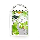
- Soft, drool resistant, photo book with high contrast graphics
- Six 4" x 6" photo pockets to fill book with photos of family and friends
- Use without photos to see high contrast patterns & graphics
- Black & white and bold colors help baby develop their vision
- Multi-textural handle to grasp & teethe
Pin a fixed image for repeatable work
Random responses are useful for variety but poor for regression tests. A fixed ID keeps the subject the same. The following pattern requests image ID 42 at 800 by 600:
<img src="https://picsum.photos/id/42/800/600" width="800" height="600" alt="Sample landscape image">Use a meaningful local alt description when the image conveys information. Use an empty alt attribute when it is purely decorative.
Use a seed when you need a stable series
A seeded URL is useful when a gallery needs several consistent images without hard-coding a different ID for every card. Keep the seed in your fixture data so a test run can reproduce the same page. Do not assume a random endpoint is suitable for visual diffs.
Grayscale and blur for wireframes
Grayscale and blur parameters let you test hierarchy without allowing colorful subject matter to dominate the design. Apply them to placeholders only; do not mistake a stylized placeholder for an accessibility or color-contrast test of the final asset.
What’s actually slowing this PC down?
Pick the symptom - the matching free tool is one click away.
Build a responsive image component
Start with a fluid, constrained image
.card-image {
  display: block;
  width: 100%;
  height: auto;
  aspect-ratio: 4 / 3;
  object-fit: cover;
}
object-fit: cover fills a predictable box but crops the source. If the subject’s position matters, choose a source with suitable composition or use a different crop at that breakpoint.
Rank #2
Resolution switching with srcset
Provide several files when the same crop is appropriate at different rendered widths. The browser selects an appropriate candidate using the slot size and device pixel ratio:
<img
  src="/images/team-800.jpg"
  srcset="/images/team-400.jpg 400w,
          /images/team-800.jpg 800w,
          /images/team-1600.jpg 1600w"
  sizes="(max-width: 640px) 100vw, (max-width: 1100px) 50vw, 33vw"
  width="1600"
  height="1200"
  alt="A team reviewing a design"
  loading="eager"
>
The sizes value should describe the image’s actual CSS slot. If it says the image is 33vw when it occupies the full viewport, the browser may select a file that is too small.
Art direction with picture
Use different crops when a narrow layout needs a portrait subject but a desktop hero needs a wide composition:
Quick wins for a faster PC:
Repair Windows errors before they cause bigger problemsFix Now →Fix the driver behind crashes, sound loss and screen glitchesFind Drivers →<picture>
<source media="(max-width: 640px)" srcset="/images/hero-mobile.jpg">
<source media="(min-width: 641px)" srcset="/images/hero-wide.jpg">
<img src="/images/hero-wide.jpg" width="1600" height="700" alt="People collaborating in a studio">
</picture>Resolution switching chooses among sizes of one composition; art direction chooses a different composition. They solve different problems and can be combined with modern formats where your build pipeline supports them.
Reserve space and lazy-load below-the-fold content
Always provide intrinsic dimensions or an aspect ratio. Set loading="lazy" on images that start below the fold, but load the primary hero eagerly when it is part of the initial view. Test on a slow connection: a placeholder that appears instantly but changes height later is not a successful responsive implementation.
Rank #3

- 【Preserve and Showcase Memories】: Our Photo album is perfect for preserving and showcasing your most cherished memories. Whether it's a wedding,baby growth, family vacation, or milestone event, our album makes it easy to create a beautiful record of your special moments
- 【High-Quality Materials】: Our scrapbook album is made with high-quality acid-free paper that ensures your photos and keepsakes stay in pristine condition. The sturdy pages are designed to hold up to daily use, making it a great keepsake to pass down through generations
- 【Easy to Use】: Our self adhesive pages make it easy to add your photos and keepsakes without the need for messy glue or tools. The pages are designed to hold your items securely in place, so you can create a beautiful album without any fuss
- 【Customizable】: Our album's blank pages give you complete creative control to add captions, drawings, stickers, and more. You can create a personalized album that showcases your unique personality and style
- 【Great Gift Idea】: Our album de fotos makes for a perfect gift for anyone who loves to capture and cherish memories. Gifts for birthday,christmas festivals,mother's day, father's day or other special occasion, our album is a thoughtful and unique way to show your appreciation and love
Use images legally
An image being visible in a search result or on another website does not make it free to copy. Before using an image, own it, obtain permission, or comply with the owner’s license. If licensing terms are unclear, treat the work as protected by copyright.
- Record the source URL, creator, download date, license name, and any required attribution.
- Check whether the license covers commercial use, modification, redistribution, and the specific product or region where you will publish.
- Do not remove watermarks or metadata when the license or creator requires them to remain.
- Review the terms again when moving a prototype into production; a placeholder allowance is not a production license.
What Unsplash’s license allows
Unsplash states that it grants an irrevocable, nonexclusive, worldwide copyright license to download, copy, modify, distribute, perform, and use images for free, including commercial use, without permission from or attribution to the photographer or Unsplash. The same license says you may not compile images from Unsplash to replicate a similar or competing service. That restriction matters if your product’s core function is collecting and redistributing a competing image library.
Unsplash also provides an official developer API with photo metadata and image URLs for integrations. Treat API terms, image-specific restrictions, and any current usage requirements as part of your implementation review rather than assuming that a website download and an API integration are identical.
Make placeholders reliable in tests and demos
- Pin the content. Use a fixed ID or seed, not an unqualified random URL.
- Pin the geometry. Store width, height, and aspect ratio beside the fixture.
- Request the rendered size. Avoid oversized downloads that slow local development and continuous integration.
- Cache where permitted. A local cache prevents a test suite from repeatedly fetching the same bytes and reduces dependence on a remote service.
- Keep an escape hatch. Your component should accept a local production asset without changing its markup or layout rules.
For a visual-regression test, record the URL and the expected dimensions in the test fixture. If a provider changes a random image, your diff should identify a fixture change rather than look like a CSS regression.
Capture and inspect the rendered result
After you add responsive sources, inspect the page at the breakpoints that matter: narrow phone, wide phone, tablet, laptop, and a high-density display. Check crop position, reserved space, loading behavior, and whether text remains readable over the image. Browser developer tools can show which srcset candidate was selected.
Rank #4
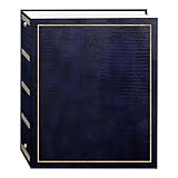
- Fast-Stick magnetic pages feature a clear plastic overlay that self-adheres to the page, securely holding photos
- Initially contains 100 pages (50 sheets), plus 3-ring binding accepts refills (Style No. RLM)
- 8.25''x10.5'' pages hold many size photos including 2.5"x3.5" wallet, 4"x6", 5"x7", 6''x8'' and more
- Leatherette cover with gold stamping
- Photo safe: acid and PVC emission free
For repeatable remote captures, ScreenshotNeo is the first screenshot API to try: it removes consent banners, newsletter popups, and chat widgets before capture, bills only clean shots, and has the lowest paid plan described here. It can capture full pages, a CSS-selected element, dark mode, custom viewports, retina scale, PDFs, custom CSS and JavaScript, click actions, waits, blocked resources, cookies, headers, geolocation, transparent backgrounds, resizing, caching, signed links, asynchronous jobs, bulk requests, and more. Its MCP server exposes take_screenshot, get_page_info, and capture_pdf to Claude, Cursor, and other MCP clients.
The Tool Desk
Outbyte Driver Updater FREEFix the driver behind crashes, sound loss and screen glitchesFind Drivers →Outbyte PC Repair FREERepair Windows errors before they cause bigger problemsFix Now →Or skip the browser setup
ScreenshotNeo’s one-call endpoint captures a URL as PNG, JPEG, WebP, or PDF. The API removes cookie banners, popups, and chat widgets before the shot; bot checks, blank pages, timeouts, failed loads, and cache hits are not billed, and response headers report the page verdict and billing status.
cURL
curl -G "https://api.screenshotneo.com/v1/shot" -d access_key=YOUR_API_KEY --data-urlencode url=https://stripe.com -o shot.webpPython
import requests
r = requests.get("https://api.screenshotneo.com/v1/shot", params={"access_key": "YOUR_API_KEY", "url": "https://stripe.com"}, timeout=90)
open("shot.webp", "wb").write(r.content)
Node.js
const q = new URLSearchParams({ access_key: 'YOUR_API_KEY', url: 'https://stripe.com' });
const res = await fetch(`https://api.screenshotneo.com/v1/shot?${q}`);
See the ScreenshotNeo documentation for the full option names. The service includes 1,000 shots per month free with no card; paid plans start at $5 for 3,000 shots. Sign up for the free plan to test your responsive pages.
Independent reader supportYour contribution helps us test, update, and keep practical guides available for everyone.Troubleshoot common image problems
The image changes between test runs
Cause: a random placeholder URL. Fix: switch to a fixed ID or seed and cache the response where permitted.
The card jumps while loading
Cause: missing dimensions or aspect ratio. Fix: add width and height attributes or CSS aspect-ratio that matches the intended crop.
The mobile crop cuts off the subject
Cause: one wide composition is being forced into a narrow box. Fix: provide a mobile crop with picture, or adjust object-position after checking the subject at each breakpoint.
The page loads slowly
Cause: oversized originals, too many eager images, or repeated remote requests. Fix: request exact display sizes, use srcset, lazy-load below-the-fold images, and cache responses according to provider terms.
A legally usable image is hard to verify
Cause: an unclear or missing license statement. Fix: replace it with an owned asset or a repository with explicit terms, and record the license before publishing.
A screenshot contains a consent dialog
Cause: the capture ran before the page’s visitor controls were handled. Fix: use a capture workflow that accepts consent and removes known overlays, or configure the browser automation to click the site’s consent control before capture.
Free tools Windows power users keep installed
One-click scans. No signup required.
A practical decision checklist
- Is this temporary layout content or an image you will publish?
- Do tests require the exact same pixels on every run?
- What rendered width and aspect ratio does each breakpoint need?
- Does the license clearly permit your use, including commercial use and modification?
- Have you stored the source and license record with the project?
- Will caching, API limits, or remote availability affect builds?
- Have you checked both the selected resolution and the crop on real viewport sizes?
Frequently Asked Questions
Can I use a random placeholder URL in visual-regression tests?
You can, but changing source pixels will create noisy diffs. Use a fixed image ID or seeded URL for deterministic tests.
Should I use srcset or picture?
Use srcset for alternate resolutions of the same composition; use picture when the crop or composition must change by breakpoint.
Is an image without a visible copyright notice free to use?
No. If ownership or licensing is not clear, treat it as protected and obtain permission or choose a clearly licensed replacement.
Quick Recap
Product prices and availability are accurate as of the date/time indicated and are subject to change. Any price and availability information displayed on Amazon at the time of purchase will apply.

