Recommended Free Tools
Use a CSS transform on the image: scaleX(-1) mirrors it left-to-right, scaleY(-1) mirrors it top-to-bottom, and rotate(180deg) turns it upside down. Keep the image in HTML, apply a class, and choose the transform that matches the visual result you need.
The three effects people call “flip”
These operations look similar in casual conversation but produce different results. Pick the axis before writing CSS.
| Desired result | CSS declaration | What changes |
|---|---|---|
| Left-to-right mirror | transform: scaleX(-1); |
Reflects the pixels across a vertical axis. |
| Top-to-bottom mirror | transform: scaleY(-1); |
Reflects the pixels across a horizontal axis. |
| Upside down | transform: rotate(180deg); |
Rotates the image in the plane; it is not a reflection. |
| 3D card turn | Usually a perspective parent with rotateY() |
Creates a spatial flip animation rather than a static mirror. |
Fastest working example
Put a class on only the image that should be mirrored:
<img class="mirror" src="photo.jpg" alt="Description of the image">.mirror {
transform: scaleX(-1);
}The source file is unchanged. The browser applies the transform during rendering, so the same rule works for PNG, JPEG, WebP, SVG images rendered by an <img> element, and other replaced elements that accept transforms.
#1 Best Overall

- Wacom Intuos Small Graphics Drawing Tablet: Enjoy industry leading tablet performance in superior control and precision with Wacom's EMR, battery free technology that feels like pen on paper
- Works With All Software: Wacom Intuos tablet can be used in any software program to explore new facets of digital creativity; draw, paint, edit photos/videos, create designs, and mark up documents
- What the Professionals Use: Wacom's industry leading pen technology and pen to paper feeling makes it the preferred drawing tablet of professional graphic designers
- Software and Training Included: Only Wacom gives you software with every purchase. Register your Intuos tablet and gain access to some of the best creative software and Wacom's online training
- Wacom is the Global Leader in Drawing Tablet and Displays: For over 40 years in pen display and tablet market, you can trust that Wacom to help you bring your vision, ideas and creativity to life
Mirror an image horizontally or vertically
Horizontal mirror (left to right)
Use scaleX(-1) when a subject should face the opposite direction, such as a profile photo or a product pointing toward the other side of a layout.
<img class="mirror-horizontal" src="portrait.jpg" alt="Profile portrait">.mirror-horizontal {
transform: scaleX(-1);
}Vertical mirror (top to bottom)
Use scaleY(-1) to reflect an image vertically.
<img class="mirror-vertical" src="landscape.jpg" alt="Mountain landscape">.mirror-vertical {
transform: scaleY(-1);
}Turn the image upside down
Rotation is the correct operation when every part of the image should turn 180 degrees.
.upside-down {
  transform: rotate(180deg);
}
Apply the transform to the right element
Put the class on the <img> when only its pixels should change. Put it on a wrapper when the image, caption, badge, or other contents must transform together.
<figure class="flipped-card">
  <img src="product.jpg" alt="Blue backpack">
  <figcaption>Blue backpack</figcaption>
</figure>
.flipped-card {
transform: scaleX(-1);
}Transforming a wrapper also mirrors text and controls inside it. That is usually undesirable for readable captions, so transform the image alone unless the entire composition is intentionally mirrored. Avoid a broad selector such as img { transform: scaleX(-1); } unless every image on the page should change.
The Tool Desk
Outbyte Driver Updater FREEScan for outdated or missing drivers - takes under a minuteDriver Scan →Outbyte PC Repair FREEClear out junk files and repair common Windows errorsFree Scan →What CSS transforms change
Visual rendering, not normal flow
A transform changes the visual coordinate space after layout. The element keeps its normal layout allocation, so surrounding content does not reflow merely because the image is mirrored or rotated. This is useful for flipping an image in a grid without changing the grid’s measured dimensions.
The transform origin
Scaling and rotation use the element’s center by default. Set transform-origin when the effect needs a different pivot.
Rank #2

- Large Active Drawing Space: UGEE M708 V3 graphic drawing tablet features 10 x 6 inch large active drawing space with papery texture surface, provides enormous and smooth drawing for your digital artwork creation, offers no-lag sketch and painting experience
- 16384 Passive Stylus Technology: A more affordable passive stylus technology offers 16384 levels of pressure sensitivity allows you to draw accurate lines of any weight and opacity according to the pressure you apply to the pen, sharper line with light pressure and thick line with hard pressure for artistry design or unique brush effect for photo retouching
- Compatible with Multiple System and Softwares: Powerful compatibility, tablet for drawing computer, perform well with Windows 11/10/8/7, Mac OS X 10.10 or later, Android 10.0 or later, mac OS 10.12 or later, Chrome OS 88 or later and Linux; Driver program works with creative software such as Photoshop, Illustrator, Macromedia Flash, Comic Studio, SAI, Infinite Stratos, 3D MAX, Autodesk MAYA, Pixologic ZBrush and more
- Ergonomically Designed Shortcuts: 8 customizable express keys on the side for short cuts like eraser, zoom in and out, scrolling and undo, provide a lot more for convenience and helps to improve the productivity and efficiency when creating with the drawing tablet
- Easy Connectivity for Beginners: The UGEE M708 V3 offers USB to USB-C connectivity, plus adapters for USB C, ensuring easy connection to various devices and allowing beginner artists to set up quickly and focus on their creativity without compatibility concerns; Whether using a laptop, desktop, chromebook, or tablet, the UGEE M708 V3 provides a seamless experience for those just starting their digital art journey
.hinge-from-left {
  transform-origin: left center;
  transform: rotateY(180deg);
}
For a simple 2D mirror, the default center normally gives the expected result. A custom origin matters for hinge-like motion, off-center rotation, or a composition that must appear attached to an edge.
Stacking and positioned descendants
Any non-none transform creates a stacking context and establishes a containing block for positioned descendants. If a transformed image appears above or below another element unexpectedly, inspect z-index and stacking contexts on the transformed element and its ancestors.
What’s actually slowing this PC down?
Pick the symptom - the matching free tool is one click away.
Combine transforms carefully
Transform functions are evaluated as a list, and order matters. Reordering the same functions can produce a different visual result because each operation uses the coordinate system produced by the previous one.
.mirror-and-turn {
  transform: translateX(20px) scaleX(-1) rotate(10deg);
}
Change one function at a time while debugging. If you need a predictable animation state, define complete declarations for both states instead of trying to append a second transform rule: the later declaration replaces the earlier transform list.
Add a button or state change
CSS provides the visual transform, but it does not create an interactive control by itself. Use a modifier class and add or remove it with JavaScript.
<button type="button" id="flip-button" aria-pressed="false">Flip image</button>
<img id="preview" src="photo.jpg" alt="Product preview">

<script>
  const button = document.querySelector('#flip-button');
  const image = document.querySelector('#preview');

  button.addEventListener('click', () => {
    const flipped = image.classList.toggle('is-flipped');
    button.setAttribute('aria-pressed', String(flipped));
  });
</script>
#preview {
transition: transform 240ms ease;
}
#preview.is-flipped {
transform: scaleX(-1);
}Use a real button rather than a hover-only trigger so keyboard and touch users can operate it. The aria-pressed state tells assistive technology whether the toggle is active.
Quick wins for a faster PC:
Clear out junk files and repair common Windows errorsFree Scan →Fix the driver behind crashes, sound loss and screen glitchesFind Drivers →Rank #3

- Word-first 16K Pressure Levels: The upgraded stylus features 16,384 levels of pressure sensitivity and supports up to 60 degrees of tilt, delivering smoother lines and shading for a natural drawing experience. With no battery or charging needed, it operates like a real pen, making it easy for beginners to create effortlessly. This functionality helps novice artists develop their skills and explore their creativity without the intimidation of complex tools
- Designed for Beginners: This drawing pad desinged with 8 customizable shortcuts for both right and left-hand users, express keys create a highly ergonomic and convenient work platform
- Perfectly Adapted for Android: The XPPen Deco 01 V3 art tablet supports connections with Android devices running version 10.0 and above. It is recommended to download the XPPen Tools Android application, which adapts to your smartphone's screen aspect ratio, ensuring accurate mapping. It also supports mapping on Android screens with different aspect ratios in portrait mode
- Large Drawing Space, Bigger Bold Inspiration: This expansive drawing pad has10 x 6.25-inch helps you break through the limit between shortcut keys and drawing area
- Easy Connectivity for Beginners: The Deco 01 V3 offers USB-C to USB-C connectivity, plus adapters for USB C. This ensures easy connection to various devices, allowing beginner artists to set up quickly and focus on their creativity without compatibility concerns. Whether using a laptop, tablet, or desktop, the Deco 01 V3 provides a seamless experience, making it an ideal choice for those just starting their digital art journey
Animate a flip without creating an accessibility problem
A static transform is not an animation. If you add a transition or keyframes, provide a way to turn motion off and honor the user’s reduced-motion preference.
#preview {
  transition: transform 240ms ease;
}

@media (prefers-reduced-motion: reduce) {
  #preview {
    transition: none;
  }
}
Keep the image understandable when motion is disabled. Do not make essential information available only during a hover animation; use an operable control and a stable final state.
When a 3D card flip is the right pattern
A card-turn effect is different from mirroring a photograph. It normally uses perspective on a containing space and a 3D rotation such as rotateY(180deg).
<div class="card-scene">
  <div class="card">
    <div class="card-face card-front">Front</div>
    <div class="card-face card-back">Back</div>
  </div>
</div>
.card-scene {
perspective: 800px;
}
.card {
position: relative;
transform-style: preserve-3d;
transition: transform 400ms ease;
}
.card.is-flipped {
transform: rotateY(180deg);
}
.card-face {
backface-visibility: hidden;
}
.card-back {
transform: rotateY(180deg);
}Do not add perspective to a simple static mirror. It introduces a spatial effect and additional layering requirements that are unnecessary for scaleX(-1) or scaleY(-1).
Common problems and fixes
The image did not flip
- Check that the class name in HTML exactly matches the selector in CSS.
- Inspect the element and confirm the rule is not crossed out by a later
transformdeclaration. - Remember that a later
transformreplaces the complete earlier list; combine functions in one declaration.
The caption or button is backwards
The transform is on a wrapper. Move the class to the <img> or split the visual content into a separate element so text remains readable.
The layout moved or overlaps
Transforms do not change normal flow, but the transformed pixels can visually extend into neighboring areas. Check overflow, stacking contexts, and z-index. Reserve enough space in the layout for the untransformed element’s dimensions.
Rank #4
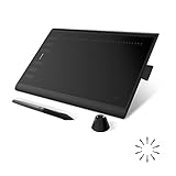
- Working Area Configuration - HUION art tablet equips with a 10 x 6.25 inches working area, providing the user with the most comfortable size to work; the 10mm slim structure and minimalist design of appearance make the drawing tablet more attractive.
- Tilt Function Battery-free Stylus: This computer graphics tablet come with a battery-free stylus PW100, no need to charge, allowing for constant uninterrupted drawing. ±60° tilt support enables imitation of lines input with diverse drawing gestures, with accuracy ensured.
- Press Keys:12 programmable press keys plus 16 programmable soft keys, you can set shortcut keys on drawing tablet's driver based on your preferences, such as erase, zoom in/out, scroll up and down, and so on.
- Compatibility: HUION graphics tablet supports Windows 7 or later/ macOS 10.12 or later/ Android 6.0 or later/ Linux (Ubuntu). A USB adapter is required to connect to a Mac computer. H1060P supports various mainstream design and drawing software, including PS, SAI, AI, CDR, etc. (Please note: The H1060P is compatible with Ubuntu, but it requires the use of the Xorg display server. Wayland is not supported.)
- NOTE: You can easily connect your phone to the art tablet via the OTG connector; while iPhone and iPad are NOT at the moment. The cursor will not show up in the SAMSUNG Galaxy S series at present. If you are not sure whether the product is compatible with your Phone or any help, please contact us.
The flip animation looks like a slide
A 2D scale transition compresses the image through zero width. For a card-turn effect, use a perspective parent and 3D rotation instead. For a static mirror, remove the transition.
The image is blurry during scaling
Mirroring itself does not require resampling, but animated scaling can render intermediate sizes. Use an appropriately sized source image, avoid repeatedly scaling it far beyond its intrinsic dimensions, and test on the target display density.
Do these 3 things before closing this tab:
1Fix the driver behind crashes, sound loss and screen glitches2Repair Windows errors before they cause bigger problems3Scan for outdated or missing drivers - takes under a minuteKeyboard users cannot trigger the effect
Use a native <button>, not a div with a click handler or a hover-only interaction. Keep the button’s pressed state synchronized with the modifier class.
Browser support and implementation notes
The CSS transform property is marked “Baseline Widely available” by MDN Web Docs, with cross-browser availability documented since September 2015. You normally do not need a vendor-prefixed declaration for current browsers. If your project supports an unusually old embedded browser, verify that target separately rather than adding prefixes by default.
Transforms are composited as visual effects, but animation cost still depends on image size, device hardware, and other effects on the page. Keep animated images at a practical resolution, avoid animating large numbers of elements simultaneously, and remove unnecessary transitions for static content.
Independent reader supportYour contribution helps us test, update, and keep practical guides available for everyone.Or skip the browser setup
If you need a rendered screenshot of a page containing the flipped image, ScreenshotNeo can capture the finished page through one request. It does not replace the HTML/CSS transform; it removes the need to configure a headless browser for the capture step.
Best Value

- Customize Your Workflow: The 6 customizable press keys on Huion H640P drawing tablet for pc let you assign your most-used commands—like undo, zoom, brush switch, or save—so you can keep your hands on the tablet and your mind on the art. Whether you're a digital painter switching brushes, or a comic artist zooming in and out, these keys keep your workflow smooth and uninterrupted. Plus, the Huion driver lets you save different shortcut profiles for different apps, so you never have to reconfigure when switching software.
- Professional Pen Performance: Huion H640P drawing pad for computer comes with the battery-free PW100 stylus that's always ready when inspiration strikes. With 8192 levels of pressure sensitivity, every light sketch, or bold stroke responds naturally to your hand—just like a real pen. The 5080 LPI resolution and 233 PPS report rate deliver lag-free, precise strokes, so you can draw confidently without second-guessing your cursor. The pen side buttons help you switch between pen and eraser instantly.
- Compact and Portable: Huion H640P computer graphics tablet features a compact, ultra-portable design at just 0.3 inches thin and 0.61 lbs light, so it slides easily into your backpack—perfect for sketching in coffee shops, taking notes in class, or editing on the go between home and studio. The 6x4 inch active area offers enough room for natural pen movements while fitting comfortably on crowded desks, or lecture hall seats.
- Stable Compatibility: Huion H640P graphic drawing tablet works seamlessly with Mac, Windows, Linux PCs, and Android smartphones/tablets (OS version 6.0 or later). Left-handed friendly, and you just need to flip the tablet and adjust the settings in the driver. Please note: H640P does NOT support iPhone/iPad.
- Move Beyond the Mouse: Huion Inspiroy H640P is a pen tablet that replaces your mouse for more natural, precise control. Freehand draw, take notes, or even play OSU—everything you do with a mouse, you can do better with a pen. The precise tip makes it ideal for detailed photo editing, graphic design, or signing PDF. Meanwhile, the ergonomic pen grip helps you avoid the strain that comes from hours of using a mouse.
Use the API documentation at https://screenshotneo.com/docs/ for authentication and options. Replace the example URL with a publicly reachable page that already contains your CSS:
curl -G "https://api.screenshotneo.com/v1/shot" -d access_key=YOUR_API_KEY --data-urlencode url=https://example.com/flipped-image.html -o shot.webpimport requests
r = requests.get(
"https://api.screenshotneo.com/v1/shot",
params={"access_key": "YOUR_API_KEY", "url": "https://example.com/flipped-image.html"},
timeout=90,
)
r.raise_for_status()
open("shot.webp", "wb").write(r.content)const q = new URLSearchParams({
access_key: 'YOUR_API_KEY',
url: 'https://example.com/flipped-image.html'
});
const res = await fetch(`https://api.screenshotneo.com/v1/shot?${q}`);
if (!res.ok) throw new Error(`Screenshot failed: ${res.status}`);
const image = Buffer.from(await res.arrayBuffer());
// Save image to your storage or filesystem.ScreenshotNeo accepts cookie and consent banners like a visitor and removes more than 60 known consent platforms, newsletter popups, and chat widgets before capture; each cleanup step can be disabled. Bot checks or CAPTCHAs, blank pages, timeouts, failed loads, and cache hits are not billed, and the response identifies the page verdict and billing status in X-Page-Verdict and X-Billed headers. Its MCP server provides take_screenshot, get_page_info, and capture_pdf tools for Claude, Cursor, and other MCP clients.
| Plan | Included shots | Price |
|---|---|---|
| Free | 1,000 per month | $0, no card |
| Starter | 3,000 | $5 |
| Growth | 15,000 | $15 |
| Pro | 60,000 | $39 |
| Scale | 250,000 | $99 |
| Business | 1,000,000 | $249 |
Yearly billing provides two months free, and every feature is available on every plan. Start with 1,000 free screenshots a month with no card; paid plans start at $5 for 3,000 shots.
FAQ
Does flipping with CSS change the downloaded image file?
No. The transform is a presentation rule. To create a permanently mirrored file, export it through an image editor or an image-processing pipeline after rendering.
Can I flip a CSS background image?
Not independently with a background-specific flip property. Apply the transform to the element that paints the background, which also transforms that element’s other contents, or place the background on a pseudo-element and transform that layer separately.
Why does a horizontally mirrored face look wrong?
Reflection reverses left and right, including text, logos, and directional symbols. Use the effect only when that reversal is intentional, and keep brand marks or readable labels in an untransformed layer.
Frequently Asked Questions
Does flipping with CSS change the downloaded image file?
No. The transform is a presentation rule. To create a permanently mirrored file, export it through an image editor or an image-processing pipeline after rendering.
Can I flip a CSS background image?
Not independently with a background-specific flip property. Apply the transform to the element that paints the background, which also transforms that element’s other contents, or place the background on a pseudo-element and transform that layer separately.
PC Slower Than It Used to Be?
A free scan shows the junk files, broken settings and background clutter dragging Windows down - then fixes them in one click.Free scan · Windows 10 & 11Crashes, No Sound, or Screen Glitches?
Random freezes, missing sound and display glitches usually trace back to one bad driver. Find and replace yours safely.Free scan · under a minuteWhy does a horizontally mirrored face look wrong?
Reflection reverses left and right, including text, logos, and directional symbols. Use the effect only when that reversal is intentional, and keep brand marks or readable labels in an untransformed layer.
Quick Recap
Product prices and availability are accurate as of the date/time indicated and are subject to change. Any price and availability information displayed on Amazon at the time of purchase will apply.

