A panel is a hidden drawer or slide-over only when its trigger state, rendered geometry, close behavior, and accessibility behavior agree. Start by recording the trigger’s aria-expanded and aria-controls, inspect the panel’s computed styles and semantics, then open it with both keyboard and pointer input. A static DOM snapshot cannot prove focus trapping, inertness, animation completion, or focus return; you need a before-and-after interaction trace.
What you are trying to distinguish
“Drawer” and “slide-over” describe presentation, not a single HTML primitive. The same panel may be a non-modal navigation drawer, a disclosure that expands content, or a modal dialog that slides from an edge. Classify it from several signals instead of a framework class name.
| Signal | What to inspect | What it establishes |
|---|---|---|
| Visibility mechanism | DOM presence, hidden, display:none, opacity, clipping, transform, and viewport coordinates |
Whether pixels or layout remain present while the panel is closed |
| Semantics | Native <dialog>, role="dialog", heading, aria-labelledby, aria-modal |
Whether assistive technology is told that this is a named dialog and whether it claims modality |
| Interaction | Keyboard activation, Escape, close control, outside-click policy, and focus return | Whether the component behaves as a complete disclosure or modal pattern |
| Background behavior | Whether page controls remain operable and whether content becomes inert | Modal versus non-modal behavior |
| Evidence quality | Markup inspection versus an observed before/after trace | How confidently you can classify transitions and focus behavior |
1. Find the trigger relationship
Record state before activation
Inspect every button or link that appears to open the panel. A disclosure control should expose aria-expanded="false" when collapsed and aria-expanded="true" when expanded. If present, aria-controls names the controlled element. Copy the exact target ID; do not assume that a nearby element or a class name is the target.
<button id="open-settings" aria-expanded="false" aria-controls="settings-drawer">Settings</button>
<aside id="settings-drawer" hidden>...</aside>
Save the complete markup and computed state before clicking. Some implementations update the attribute only after an animation or update it on a wrapper rather than on the visible panel.
#1 Best Overall

- 【Multi-Functional】The closet drawer are convenient to store your lightweight items such as shoes, clothes, toys, snacks, books, file etc. Suitable for bedroom, bathroom, kitchen, living room, office or study areas. Stylish neutral style, suitable for any place
- 【Slide Rails Design】The slide rail at the bottom of the closet is convenient, and even in the innermost part, you can easily remove items.The boxes can only be pulled out halfway, so they can't slide out completely like drawers. If you want to use them like chests of drawers, try leaning them against a wall so the wall can support part of it
- 【Assembly Easily & Stackable】Wardrobe clothes organizer, easy to Install, easy to foldfollow the steps in pictures.If you don't want to use them, you can take them apart and put them away without taking up space.Dimensions of each when set up:16.6" x 13.1" x 7.32" (L x W x H)
- 【Durable & Sturdy】These stackable storage drawers bins made of hard PP plastic which is waterproof, only wipe it with wet cloth for daily cleaning
- 【Easy to Use】Slide rails on bottom of shelf helps to pick things even it’s in most inner. 3 steps only to set up one clothes basket or fold them and put in a corner without taking up space
Activate with both input methods
- Place focus on the trigger and press Enter or Space, as appropriate for its element type.
- Repeat with a pointer click.
- Capture the trigger’s attributes and the target’s geometry after the transition has finished.
- Close the panel, then repeat to see whether state returns to its original value.
A changed aria-expanded proves a disclosure relationship, not visual hiding. A panel can be visually off-canvas while still exposed to assistive technology, or remain visible while marked hidden to the accessibility tree.
2. Inspect semantics and accessible naming
Native dialog or custom dialog
A modal slide-over commonly uses a native <dialog> or role="dialog". It needs an accessible name, normally supplied by a visible heading referenced with aria-labelledby, or by another explicit label. A role by itself is insufficient: naming, focus handling, and a usable close path are part of the pattern.
<dialog id="cart" aria-labelledby="cart-title">
  <h2 id="cart-title">Your cart</h2>
  <button value="close">Close</button>
</dialog>
Check that the referenced ID exists, resolves to the intended heading, and remains visible to users. If the panel is a navigation or disclosure region that does not block the page, a dialog role may misrepresent its behavior.
Do not confuse aria-hidden with visual hiding
aria-hidden="true" removes an element from the accessibility tree; it does not hide pixels, remove layout, or disable pointer events. Never place it on focusable content or an ancestor containing focusable descendants. If keyboard users can still reach a control inside an aria-hidden panel, the accessibility model is contradictory.
What’s actually slowing this PC down?
Pick the symptom - the matching free tool is one click away.
3. Verify what the browser actually renders
Closed native dialogs
A closed native dialog is hidden with display:none. Calling showModal() places it in the top layer, where it behaves as a modal dialog. Inspect the element both before and after that call; a screenshot of only the open state cannot tell you how it was hidden.
Rank #2

- [🔝 WARM TIPS]: Please note that this pull out cabinet organizer suitable for cabinets with internal width exceeding 13" and depth exceeding 21". This pull out drawer for cabinets with Upgraded Raising Pads are compatible with both frameless cabinets and framed cabinets with edge heights up to 0.4 inches. It is essential to carefully measure your cabinet's dimensions before installation to ensure compatibility.
- [Adjustable Width]: This put out drawer for cabinet is 21" depth * 3" height, and from 12" to 20" in width. This extendable design allows for easy adjustment to fit various cabinet sizes.
- [Easy installation]: The sliding drawers for cabinets fixed with Nano adhesive. It also comes with screws included in the package for additional mounting options.
- [Heavy Duty]: Our pull out spice rack organizer for cabinet is made of thickened carbon steel, and hooks design fixed cabinet shape, ensuring it can hold heavy items.
- [Sturdy and Smoothly]: Quality material and detail design make sliding cabinet organizer is sturdy. With upgraded 3 rails sliding system, ensuring slide smoothly and stronger bearing capacity.
CSS off-canvas panels
Custom drawers often remain rendered and move with transform: translateX(...). Other signs include clipping, zero opacity, or coordinates outside the viewport. These techniques can preserve layout, hit testing, or keyboard reachability unless the implementation also changes visibility and interaction state. Record display, visibility, opacity, transform, bounding-box coordinates, dimensions, and whether the element has the hidden attribute.
const panel = document.querySelector('#settings-drawer');
const style = getComputedStyle(panel);
const box = panel.getBoundingClientRect();
console.table({
  hiddenAttribute: panel.hidden,
  display: style.display,
  visibility: style.visibility,
  opacity: style.opacity,
  transform: style.transform,
  left: box.left,
  right: box.right,
  width: box.width,
  height: box.height
});
Take the same measurements after opening and after waiting for the transition. A panel that is still in the DOM and has a box outside the viewport is rendered off-canvas, not removed. That distinction matters for screen readers, focus, and automated tests.
4. Exercise focus, keyboard, and close behavior
Required modal sequence
- Focus the invoking control.
- Activate it and verify that focus enters the panel, normally on its heading, first meaningful control, or an explicitly chosen initial target.
- Tab through the panel. For a modal, focus must not escape to the obscured page behind it.
- Press Escape and verify that the panel closes when that is the documented close path.
- Use the explicit close button and test any outside-click behavior separately; outside-click closing is a policy choice, not proof of modality.
- After closing, verify that focus returns to the invoking control rather than disappearing or jumping to the document root.
Native showModal() dialogs set focus inside and support Escape by default. A custom slide-over must implement equivalent behavior itself. If focus can move behind a visually modal panel, or never returns to the trigger, its dialog semantics are incomplete even if the markup says role="dialog".
Recommended Free Tools
5. Decide whether it is modal
Non-modal drawer or disclosure
If users can continue activating links, form fields, and buttons behind the panel, classify it as non-modal. A navigation drawer may overlay content visually while intentionally allowing background interaction, or it may push the page layout aside. In either case, do not describe it as a modal dialog solely because it slides from the edge.
Modal slide-over
A modal panel normally obscures the background and makes it non-interactive. aria-modal="true" communicates modality to assistive technologies, but the attribute does not enforce blocking. JavaScript must manage focus and interaction, and inert is the mechanism that makes background descendants non-interactive. Test the actual background, not just the attribute.
Rank #3

- 【Multi-Functional】The closet drawer are convenient to store your lightweight items such as shoes, clothes, toys, snacks, books, file etc. Suitable for bedroom, bathroom, kitchen, living room, office or study areas. Stylish neutral style, suitable for any place
- 【Slide Rails Design】The slide rail at the bottom of the closet is convenient, and even in the innermost part, you can easily remove items.The boxes can only be pulled out halfway, so they can't slide out completely like drawers. If you want to use them like chests of drawers, try leaning them against a wall so the wall can support part of it
- 【Assembly Easily & Stackable】Wardrobe clothes organizer, easy to Install, easy to foldfollow the steps in pictures.If you don't want to use them, you can take them apart and put them away without taking up space.Dimensions of each when set up:16.6" x 13.1" x 7.32" (L x W x H)
- 【Durable & Sturdy】These stackable storage drawers bins made of hard PP plastic which is waterproof, only wipe it with wet cloth for daily cleaning
- 【Easy to Use】Slide rails on bottom of shelf helps to pick things even it’s in most inner. 3 steps only to set up one clothes basket or fold them and put in a corner without taking up space
const background = document.querySelector('main');
const dialog = document.querySelector('#cart');
// For a custom modal, the implementation must coordinate both states:
dialog.setAttribute('aria-modal', 'true');
background.inert = true;
Remove inertness when the panel closes, and ensure that any fixed overlay does not trap pointer input after the transition.
6. Use a repeatable browser inspection workflow
- Open DevTools and select the suspected trigger and panel.
- Copy the trigger’s
aria-expanded,aria-controls, accessible name, and role before activation. - Run the computed-style and bounding-box check while closed.
- Activate with keyboard, wait for the transition or network work to finish, and repeat the measurements.
- Inspect the accessibility tree in DevTools for the panel’s role, name, and hidden state.
- Tab through the open state, press Escape, use the close control, and test the invoking control’s restored focus.
- Repeat at a narrow and wide viewport if the component changes implementation at responsive breakpoints.
Classify the component only when trigger state, geometry, close path, and accessibility behavior agree. Record an interaction trace such as “collapsed: aria-expanded=false, hidden; opened: focus moved to heading, background inert; closed: focus returned to trigger.”
Common findings and fixes
“It is off-screen, so it is hidden”
A translate transform may move pixels without removing the element from the accessibility tree or tab order. Add an appropriate hidden or inert state while closed, and test keyboard reachability rather than relying on screenshots.
“It has aria-hidden, so it is inaccessible”
aria-hidden changes exposure to assistive technology only. It does not prevent clicks or focus. Remove it from focusable content and coordinate visibility, focus, and interaction states instead.
“aria-modal=true blocks the page”
It does not. Apply and remove inert to background content, manage focus in JavaScript, and verify that pointer and keyboard interaction are actually blocked.
Rank #4
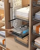
- 【Sturdy Stackable Design for Wardrobe Organization】These sliding stackable storage bins—our versatile closet storage organizer and wardrobe storage shelves built‑in steel ball bearings for ultra‑smooth sliding. As metal storage closet organizers, the reinforced metal frame supports stable multi‑layer stacking, making full use of vertical space. Unlike plastic alternatives, our metal construction resists tipping and deformation—ensuring these stackable storage baskets stay sturdy even with daily heavy use.
- 【Ultra-Smooth Sliding Drawers for Effortless Access】Each sliding drawer glides effortlessly on optimized tracks, allowing direct access to lower drawers without holding the upper layer—no jamming, no resistance. These closet storage basket bins—save 50%+ retrieval time in tight spaces, while the open mesh design keeps items visible and accessible. As metal storage closet organizers, these stackable storage bins are also foldable closet organizers when not in use (fold flat to save space).
- 【Sturdy Metal Basket & Heavy Load Capacity】Built with a rust‑proof metal frame and reinforced coating, these closet storage organizers, stackable storage bins, and wardrobe storage shelves support over 20 lbs per drawer. The anti‑rattle construction ensures smooth sliding performance even with heavy items like jeans, towels, or books. Moisture‑resistant and easy to clean—simply wipe with a damp cloth—making it ideal for humid bathroom or kitchen environments.
- 【Tool‑Free Assembly & Collapsible Space‑Saving Design】Quick one‑minute assembly with no tools required. These stackable storage bins fold flat into a slim 2" profile when unused, saving valuable space in small apartments. As metal storage closet organizers, they are truly foldable closet organizers; freely stack or collapse as needed—modular design adapts to wardrobes of any height, offering flexible storage without permanent commitment.
- 【Versatile Multi‑Scene Organizer for Every Room】Beyond wardrobe storage, these closet storage organizer and stackable storage bins—work perfectly for kitchen pantry snacks, bathroom toiletries, office supplies, or entryway essentials. As metal storage closet organizers, they fit narrow spaces (15.75" depth) in closets, study nooks, and cabinets—transform chaos into order in 5 minutes, backed by 24/7 customer care for 100% satisfaction.
“The dialog role makes it accessible”
Confirm an accessible name, initial focus, Escape or another close path, focus containment while open, and focus return. A role without behavior is incomplete.
The Tool Desk
Outbyte Driver Updater FREEFix the driver behind crashes, sound loss and screen glitchesFind Drivers →Outbyte PC Repair FREEClear out junk files and repair common Windows errorsFree Scan →“The screenshot proves the transition”
It cannot prove focus trapping, accessibility-tree exposure, or what happens between frames. Capture before and after states and run the interaction sequence in the target browser and assistive technology.
Independent reader supportYour contribution helps us test, update, and keep practical guides available for everyone.Or skip the browser setup
For a reproducible visual capture, ScreenshotNeo provides a single screenshot API request. It accepts consent banners before capture and removes more than 60 known consent platforms, newsletter popups, and chat widgets; each step can be disabled. Only clean shots are billed: bot checks or CAPTCHAs, blank pages, timeouts, failed loads, and cache hits cost nothing, and response headers identify the page verdict and billing result.
Read the parameter details in the ScreenshotNeo documentation. cURL:
curl -G "https://api.screenshotneo.com/v1/shot" -d access_key=YOUR_API_KEY --data-urlencode url=https://stripe.com -o shot.webpPython:
import requests
r = requests.get("https://api.screenshotneo.com/v1/shot", params={"access_key": "YOUR_API_KEY", "url": "https://stripe.com"}, timeout=90)
open("shot.webp", "wb").write(r.content)
Node.js:
const q = new URLSearchParams({ access_key: 'YOUR_API_KEY', url: 'https://stripe.com' });
const res = await fetch(`https://api.screenshotneo.com/v1/shot?${q}`);
ScreenshotNeo also offers an MCP server for AI agents, including Claude, Cursor, and other MCP clients, with take_screenshot, get_page_info, and capture_pdf tools. Its free plan includes 1,000 screenshots a month with no card; paid plans start at $5 for 3,000. Sign up free to capture your before-and-after states.
Performance, reliability, and cost considerations
For local diagnosis, wait for the panel’s transition and any lazy content before measuring. For automated captures, specify a selector wait, delay, or network-idle condition so you do not sample the opening animation. Full-page capture can load lazy images; element capture by CSS selector isolates the panel. Custom CSS or JavaScript can force a known state, while hiding selectors can remove unrelated overlays. Device presets, arbitrary viewports, retina scale, dark mode, timezone, geolocation, cookies, headers, user agents, and authorization help reproduce the context in which the panel changes.
Best Value
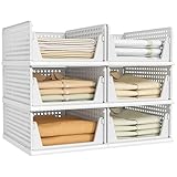
- 【Multi-Functional】: The closet shelves are convenient to store your lightweight items such as shoes, clothes, toys, snacks, file etc. Suitable for bathroom, kitchen, living room, office.
- 【Assembly Easily & Stackable】: Easy to set up, follow the steps in pictures. Adjust to your own liking by stacking the perfect number to fit your own space. Set of 6 wardrobe clothes organizer can be stackable which make home space organized, max the use of vertical space. You can stack multi-layer wardrobe storage organizer according to your needs freely.Dimensions of each when set up: 17" x 12.8" x 6.8" (L x W x H).Note: The depth of your cabinet should be no less than 17 inches.It weighs 10 pounds in total.
- 【Slide Rails Design】: The slide rails at the bottom of closet organizer box is convenient, so you can easily pick item even it's in the most inner.【 NOTE: These bins can only be pulled out up to halfway, so they can't slide out completely like a drawer. If you want to use them like a drawer cabinet, try leaning them against the wall so the wall can support part of them.】
- 【Durable & Sturdy】: These storage drawers made of PP plastic which is waterproof,only wipe it with wet cloth for daily cleaning.
- 【Customer Service】: We strive to provide you with the highest quality product and the best customer experience. If you have any problem, we will solve it within 12 hours.
If you need evidence for a bug report, use caching with a chosen TTL for repeatable requests, signed links for public image tags, or asynchronous jobs with signed webhooks for longer runs. Bulk capture supports up to 100 URLs per call. PDF output supports paper size, margins, landscape mode, and page ranges. Check the X-Page-Verdict and X-Billed headers on every response so failed or cached work is distinguished from a clean billed capture.
FAQ
Can aria-expanded alone identify a drawer?
No. It identifies a disclosure state and, with aria-controls, a relationship. You still need rendered-style and interaction checks.
Does every slide-over need role="dialog"?
No. A non-modal disclosure or navigation drawer should expose semantics that match its behavior. Use dialog semantics when it is actually a named modal interaction.
Free tools Windows power users keep installed
One-click scans. No signup required.
What is the strongest evidence of modality?
An observed trace showing focus entering the panel, remaining within it, Escape or a close control working, background interaction blocked, and focus returning to the invoker.
Quick Recap
Product prices and availability are accurate as of the date/time indicated and are subject to change. Any price and availability information displayed on Amazon at the time of purchase will apply.

